Search the Community
Showing results for tags 'photoshop'.
Found 12 results
-
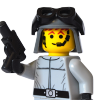
Hello everyone 1- I hope this subject is in the right place. 2- Sorry for my bad english I think you all have at one time or another during a construction, wanted to have a room that does not exist to carry out your project. So, you've probably imagined several over the years. 1- I imagined myself to create several in recent days (others to come) You can find them on Flickr HERE you can react on what you see. 2- Would you like to propose some already, in 3D or other? I opened a group for: - the techniques, - tutorials - new coins 1 month ago on Flickr HERE 3- Do you have any ideas? => Could you describe by embellishing an image that you would like to have? I can try to create on request if my limitation 2D (photoshop) allows it. By the way for your information, I also realized baseplates that are on Flickr. I would like your opinions, your reactions, your proposals ... TYVM Some exemples:
-
*Your entry has earned 4 XP* As the clone wars draw to a dramatic close, the empire takes hold on Mustafar, with frequent patrols over the hellish world. v-wing [1] by simulterious, on Flickr v-wing [2] by simulterious, on Flickr v-wing [3] by simulterious, on Flickr v-wing [4] by simulterious, on Flickr
-
-
Spider-sense tingling! The Devil rides again!
-
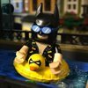
Enter Mr. Freeze Based upon his entrance in "Heart of Ice" from Batman: The Animated Series
-
-
The Photoshop Game how it works is: a photo that I like is posted here then someone will edit that photo and repost it then another person will do the same and so on until the end photo looks nothing like the original heres the photo (of course it had to be something from frozen)
-
Some more Photoshop work! Desert Patrol by Henry Alekna, on Flickr Edit: scroll down to post #9 for a new one!
-
Sometimes the pictures of your creation don’t quite convey the feeling you’re aiming at. That’s when your picture editor becomes your best friend. You can use it to enhance the colors of your picture, get rid of hard shadows, install a new background, or add some special effect. It can be too much, but if you do it right, your picture will be more vivid, it well tell a story. One special effect that is particularly handy for Star Wars fans is placing a hologram in your picture, and that’s what I’ll be trying to teach you today. 1. Taking a picture Picture editing already starts when you take the picture. You have to take it so that it is fit for what you’ll try to edit in. In this case, you might consider shooting the backdrop and the minifig (or whatever object you want to make a hologram of) separately. This is because you’ll want to select the minifig quite easily later on. This will be more easy if you have a monochrome background with high contrast with the minifig. These separate pictures also have the advantage that you have the area of the background that will be behind the minifig as well, so that you can play with transparency later on. If it’s impossible to separate the shots (because the minifig is interacting with the environment), you can always shoot the background with and without the minifig, from exactly the same camera angle, or just leave it at one picture if you don’t want the extra effects and are willing to spend some more time on it all. 2. Importing the picture in GIMP Apart from a picture, you’ll need a picture editor. The professional software is known to be insanely expensive, but luckily there are some great free, open source editors out there. I recommend using GIMP, as it is widely supported. You can download it here for free. Once you’ve got the software up and running, you have to import the picture in GIMP. You can do this by going to File -> Open, or if you found a picture on the internet you want to experiment on, to Edit -> Paste As -> New Image. I’ll be using a picture of a Darth Vader minifig I found on the internet. 3. Preparing the picture You’ll need to work on the minifig alone, without disturbing the background if you have one. If you don’t have one, you’ll want a transparent background to paste the hologram seamlessly in some environment. Anyway, you’ll need to delete the background (if you’re working on a picture with a background you want to keep, duplicate the layer first). You can do this right clicking on the layer of your image (in the box on the right), and selecting “Add Alpha Channel”. Then you can use a combination of the magic wand tool and the free select tool. There are a lot of tips on background removal on the internet if you’re not quite confident. When you have the picture of the minifig without anything else (the checkered background indicates that it is transparent), duplicate the layer once. You can do this by clicking on the icon with the two windows at the bottom of the layers box. 4. Coloring the image The first real step in the making of the hologram, is giving it its typical blue color. You can use the colorise tool for this. The disadvantage is that it every color will have the same hue. So everything will be blue, while you can see there are some slight color variations in the ‘real’ Star Wars holograms. To fix this, you can set the transparency of the topmost layer to about 75 percent first. This will allow the colors to shimer through a bit. Then, go to Colours -> Colorise. You will get a dialog box that lets you play around with the hue, lightness and contrast of the picture. You can play around with it to get the best colors. Hit the OK button when you’re finished. 5. Adding the stripes Probably one of the most iconic features of the hologram are its horizontal stripes. There are several ways to accomplish them with filters or patterns, but I find gradients the easiest to use as they allow for total control of the size. To apply them, you first have to indicate the area they need to fill. To go to the topmost layer, right click and select “Alpha to selection”. This will select everything that is opaque in the picture, so that you certainly won’t miss any spots. Then, create a new layer by clicking on the white page icon at the bottom left of the layers dialog. Next, double click on your gradient tool. A tool options menu should pop up. Your colors are by default set to black and white, and this is exactly what we want. Leave all the setting unchanged, apart from the one that says “Repeat:”. Set it to “Triangular Wave”, so that the gradient will keep repeating itself in exactly the pattern we want. With your selection still active, hold control/command and drag your mouse straight up for a short distance (the ctrl will make sure the line is perfectly vertical, as we don’t want tilted stripes). The length of your stroke will determine the width of the stripes. Experiment until you’re happy with your stripes. Now your image should look like some bar code. To convey this texture to the underlying image, return to your layer dialog and set the mode (in the box at the very top) to overlay. You can also adjust the opacity to your liking. 6. Giving it the glow To add to the feeling of projected light, your hologram still needs a glow. Repeat the first few steps of the previous section to create a new layer and a selection of the minifig. The layer should go at the bottom of your minifig layers. Next, go to Select -> Grow. Here you can fill in the amount of pixels you want the selection to grow in every direction. This amount is different for every image size, but you don’t want to go too big. Here, I went with an expansion of 20 px in both directions. With this selection active on the new layer, click on the black rectangle that is probably your foreground color. Set it to a color close to the hologram. You can do this by using the color bars, or clicking on the color picker icon at the right hand side. Choose one of the lighter colors in your image. (excuse me for the stretched picture, I don't know what's going on here) Then select the bucket tool and fill in the selected area. You will see a crisp colored outline around your figure. To make it glow more, go to Filters -> Blur -> Gaussian Blur. Select the amount you want to blur, and hit OK. 7. Finishing the picture You can end here and put the picture against your background. If you want to make it a bit transparent, select the topmost layer, right click and select “Merge Down”. This will unify it with the layer below. Continue the process until you’ve had all the minifig layers. Then you can just play with the opacity of the unified layer to make it work with the background. You can also delve deeper into the filters and add some more noise to the picture etc, but I don’t find that necessary. When you’re satisfied with your hologram, you can export it as an image, and you’re done. The final result could look something like this (but hopefully better) That’s it! I hope you enjoyed it and learnt something to make your creations even better. If there are any questions, I will be very happy to answer them!
-
One of the integral parts of comics is character dialogue, which is as valuable as the images themselves in conveying the story of the comics (of course with the obvious exception of “speech-less”/”silent-type” comic strips). Adding the character dialogue is usually done in conjunction with the post-editing of the images after the principal photography. At this particular stage of comic-making, one is expected to already have a general idea (or even better - a working script) on how the exchange of dialogue would be. This lesson will teach you how to add character dialogue in your comics – with emphasis to the proper usage of speech balloons and comic-book grammar. Lesson Sections Section 1: Types of Speech Balloons Section 2: Adding Speech Balloons to Comics Using Adobe Photoshop Using speech balloon custom shapes Manual drawing of speech balloons [*]Using Microsoft Office Word Speech Balloon Positioning Section 3: Traditional Comic Book Lettering and Grammar Deviating from the Norm & Exercising Creative Freedom Section 1: Types of Speech Balloons The visual tool used to represent speech/dialogue/conversation of characters in comics is Speech Balloons (also referred to as Speech Bubbles, Dialogue Balloons, Word Balloons). There are different types of speech balloons depending on the emotion of the dialogue, the nature/manner of delivery, and the source of the speech/sound. This lesson will tackle the various types of speech balloons used in comic books and its conventional proper usage in comic-making. Examples: (Click on images for higher resolution.) Left: LOTR Funnies by Sextant Images Middle: Tabloit by Oky - Space Ranger Right: Wolverine's Worshipers by Oky - Space Ranger Examples: (Click on images for higher resolution.) Left: Forever Alone by The Penguin Middle: No Wiener? by Kiel.Da.Man Right: Princess Quest by Sandy Examples: (Click on images for higher resolution.) Left: Raging Plankton by Kiel.Da.Man Middle: Unlimited Powah by Oky - Space Ranger Right: To Infinity and Beyond? by TinyPiesRUs Examples: (Click on images for higher resolution.) Left: Hey I just met you by Kiel.Da.Man Middle: Lego Bin Laden Watching TV by Here Be Zombies Right: Do the Robot by pong0814 Examples: (Click on images for higher resolution.) Left: Shhh by Kiel.Da.Man Middle: Day 346 by Dan (LEGO365) Right: Day 270 by pasukaru76 Examples: (Click on images for higher resolution.) Left: Must save Friends by Kiel.Da.Man Middle: Day 271 by Dan (LEGO365) Right: supercutstext by TheLegoJoker Examples: (Click on images for higher resolution.) Left: Pay Attention by darkdragon Middle: Puny God by Oky - Space Ranger Right: My Precious by Kiel.Da.Man Examples: (Click on images for higher resolution.) Left: Triceratops Dewback by J.V.D. Middle: Civilian Marvel Heroes by Hobbestimus Right: Forgot to blow dry by Clone O'Patra Sources: 1. Speech Balloon , Wikipedia 2. Comic Book Grammar & Tradition , by Nate Piekos (www.blambot.com)
-
LEGO is a medium with which virtually anything can be built - oceans, landscapes, ships, castles, spacecraft and more. But now that you've created that great set for your brick flick or comic, you might be thinking, "What about the sky?". Yes, you could build a big blue wall and various clouds and celestial bodies to attach to it, but maybe you don't have enough bricks, or maybe you just don't like the way that looks, and you would prefer the simpler look of a sky and its atmospheric effects created in photo-editing. This will be done in this lesson using Adobe's Photoshop. Prerequisites: You'll need to know how to use your camera and how to take a crisp and well-composed photo with it. Photoshop is a terrific piece of software, but it can't completely fix an image that's out of focus, blurry, significantly grainy, poorly composed, or otherwise lacking. If you want to know, I shot my photos for this lesson with an entry-level DSLR, the Nikon D-3100, with a basic 18-55mm lens and an exposure time between two and six seconds and an aperture of f13. You will of course need Photoshop. This lesson was written using Photoshop CS5 Extended, but the techniques should work with other versions, though I have no experience with them. (I do know that the only features that CS5 Extended has and CS5 does not are 3D tools and image data analysis tools - you won't need them for the editing described in this lesson, so if regular CS5 is what you have, you're fine) Contents: Preparation: Setting up to take the Photo Daytime Effects Adding a Daytime Sky Adding a Sun Adding Daytime Clouds Nighttime Effects Adding a Nighttime Sky Adding Moon and Stars Adding a Starfield Adding Nighttime Clouds Adding a Sky to a White Background Assignment
-
DYNAMIC PANELING Thinking like a comic-stripper At its basest form, comics are just a series of boxes assembled on a page, but that’s much the same way that music can be said to be simply a series of notes. Those descriptions belie how complicated they both can be. Those boxes can be manipulated in countless ways, to change the way people read the work, how fast they take in the pace of the action, and the mood communicated. As this is tutorial is for Brick Comics, I doubt anyone here is aiming to win an Eisner award for their work, and if they were, they probably wouldn’t need my advice. All the same, consideration of how images are arranged can make your work look that much more exciting and fresh. Placing a series of photos online and calling it comic is all well and good, but it’s not making use of the screen, and not adding much for the reader. With a little effort, you can dramatically improve the quality of your brick comics. Pacing Comics have gone through a lot of shifts over 100 years. If you check out an old comic from the 30’s to the 60’s, each panel often represents a fair chunk of time, usually assisted by narration. (Click images to enlarge) Art by Steve Ditko Looking at that work now can often feel clunky and slow, not to mention shallow. Even the greatest artists of the past feel pretty dull by modern standards. These days, the trend is toward something called “decompressed story telling,” where scenes are spread out into multiple panels. Art by John Cassidy It’s generally more pleasant to read (in my opinion), but the result is that what used to be told in one page is now told in ten, and story arcs that used to be told in one or two issues are now told in six. Within these polar opposites of story telling, a tense moment can be blown up and magnified, so that a second seems to take a minute to occur. Art by Frank Miller It’s up to you and the story you’re telling as to how you choose to approach it. Ideally, you should want to be comfortable with a wide variety of techniques to suit your story, but not feel compelled to use them all. Comics have time built into them, and they convey it in different ways. After a series of medium shots, throwing in a long shot in a larger panel dramatically slows down the page. Conversely, having a number of smaller staccato close-up shots has a brisk rhythm. Generally, you’re going to want to have a somewhat consistent rhythm, except in places where you want to highlight something out of the ordinary. For example, a series of small panels are used to show Batman quickly tossing off batarangs and incapacitating a number of small time crooks, to emphasize his efficiency. Or the end of a heavy fight scene pulls out to a long shot with multiple subjects and their surrounds to let the reader take in the awesomeness of what has come before them. In comics, you can even have the subject in multiple places in one picture, and the reader reads it as time passing, rather than somebody being cloned. This sort of technique is used with the Flash all the time, but it could be used to show someone puttering around the house. With multiple mini-figs, the choice it yours. Art by Chris Ware Structure One thing that I strongly recommend is to start with a simple structure, maybe four to six panels a page, in a clear sequence, regardless of how ‘compressed’ your story is. There are a few reasons for this. The first is that this is the easiest way to tell a story clearly. The reason people have done it for 100 years is because it works. Crazy lay-outs can be mind-blowing, but they require a lot more thought from the reader to process, and can be tiring. The second is that the simple approach allows you to be mind-blowing when you want to be. If you always have big splashy images, then the end result is none of it is very splashy. Rather, keeping your images restrained allows you to have an effective punch when the time calls for it. Let’s imagine the panel is a video image, and we’ll rank the image from 1 (boring) to 10 (zany). 1 in this case is a static image, just the same image repeated, as if the camera was locked in place. 10 is a crazy, Men In Black-style flying around the room and between people’s legs camera. 5 is in the middle; your average movie, with close ups, establishing shots and the like. Enough camera changes to give the scene a mood, but not enough to make an octogenarian sick. In the 90’s, comics got splash page heavy (a splash page is a page with a single large panel), and the effect was that they had little effect. Rather, a splash should be saved for a big moment. A comic book like the Walking Dead is a great example of something which uses effective splash pages, with usually one per issue, always the most emotional moment of the issue. It hits you like a punch in the gut. If you’re creating an action sequence and you repeatedly have in-your-face images, the reader will be as numb as someone watching a Michael Bay film marathon. Rather, save it for the right time. Techniques like this should be used sparingly. In modern comics, there are lots of images overlaid on images. Whereas in the past, every panel had its own white space, now most artists layer panels on top of panels, like windows on a computer screen. This can be exciting, but the best artists are still showing the action in a fairly traditional way, where the order of the panels is never in doubt. Design should never overwhelm your page. Art by Frank Quitely Technique Okay, enough theory. Let’s put it into practice. This being a Brick Comic forum, there is a good chance of humor being used here, and all the stuff about drama and effect still holds true for comedy. Actually, keeping a straight face can be very important in humor, so utilizing these techniques can improve your comedy even more. Art by The Perry Bible Fellowship For my example comic page, I'm going to work with something already completed, since I'm not here to tell you about taking photos or even writing. The idea is to punch up and present something to the best of our abilities. I use Photoshop to throw things together, though for a simple project like this, other programs might do the job. I'm merely assembling pictures, not editing them or doing special effects on them. I've chosen to work on the four-photo zombie tale that Darkdragon has done recently (at the time of typing). Please go look at it now, I'll wait Pay Attention It's well-thought out and conceived. Not exactly as a comic strip, but as a story. If it were conceived of as a comic page in the first place, I would have done a few things differently, which I’ll mention after looking at the finished product. Anyway, there is a lot to work with. So, my first thing is to sketch it out. THIS DOES NOT REQUIRE TECHNICAL SKILL. Just a concept. My sketch was done on the back of scrap paper while I was 'working.' The point is to decide on the images you’ll need when taking photos, and have an idea of how they'll flow on the page. This can be changed of course, but it's a heck of a lot easier to draft it on paper than it is just to start with a blank computer screen. The key points I went for are these: -The first photo is broken down into two panels. The main one is a larger establishing panel, with a quieter one to establish the zombie danger. Essentially, it's now got two beats, despite being one cohesive scene, and also makes the happy face on the character even more natural, since there is no 'danger' in the first panel. -The second photo is broken up into two close up shots, and shown at Dutch angles. The original was a full body shot, but all that info wasn't necessary to the story. The key info is the fear on the human's face, and the violent action. The smaller panels done in close-up give it a faster pace, and the tilt on them make them a little more action-y. -The third photo donates an image to the violence mini-panels, though the whole of the main picture is used in the next panel, with a little cropping to fit the page. Because the first one is a close-up, you don’t even notice the image is used twice. I give it an enlarged border to give the image a stronger beat. This is a technique Calvin & Hobbes used a lot, and, sparingly, it's neat. -The final one is large panel, pulling back to shown the punchline/true scene. By making it larger, the characters can stay near the same size, helping keep the rhythm, but also slowing down for a dramatic final image. The rhythm of the page should go: Bum-da-da-da-DUM-duhhhhhhhh! Let's see how it turns out. I like it Love, no, but it's satisfying. If I were to change a few things with the original pictures, I would take a one more action pic to throw into the violence montage, like of the arm swinging. Also, in the final pic, I would change the expression of the main character to an "oops," as he realizes what’s happened, simply because the facial expression is repeated and it doesn't add new info to the page. Much like I took out the background in picture two, there is no reason to repeat info, unless it's for a purpose. Each panel should portray something, be it narrative or simply mood. These things are in order to create a comic page, as opposed to a critique of the original, which works as it is. As for what I might change with what I did, I like most of it, but the second-last panel could have had a colored border instead of a white one. Maybe something in red might give is more zazz. As well, I’m not deeply attached to the color of the page or the lettering, but those are not so related to the paneling. The three violence panels could have sharper borders, to get that action across more. But, overall, I think the page works, and has made the original story more readable. Now, how about you give it a try? Create something dramatic, something romantic, something gut-busting! It’s up to you. ASSIGNMENT For this lesson, you need to create a comic page (or even pages, if you like). Step 1: sketch out your idea. It doesn't need to be fancy, just get an idea of what you're going to do. Do you have a variety of panels? If not, why not? Is the information in each panel important to the mood or the story? Has anything superfluous been removed? Step 2: Build it, photograph it, use the other tutorials here. Step 3: Put it together, tweaking your original idea as you go along to see what works. Step 4: Explain it. A good comic stripper usually doesn't over-analyze their own work, or get very conscious about it when making it. But, after the fact, there are things that work and that don't, and part of being a competent artist is understanding why things work. So, much like I explained why I did my page the way I did, I'd like you to give some conscious thought to what you've done. In the future, you never need to do this again For this assignment, you need only show the finished product, and an explanation of it, though if you want some guidance early on, you may post your sketch. Please start a new thread to show your WIP strip. ~~~~~~~~~~~~~~~~~~~~~~~~~~~~~~~~~~~~~~~~~~~~ Addendum These are some artists whose page designs I respect, just if you're curious, or want inspiration outside your sphere. Eiichiro Oda- artist on Japan's number one manga, One Piece. A vibrant, kinetic artist. I'm not a fan of manga, but his work stands out for its liveliness. Frank Quitely- A Scottish artist known for slowly-produced, but impeccable work. Mind-bendingly exciting work on Batman & Robin and All-Star Superman. He has a very flexible structure, but always clear story-telling. Bill Watterson- The creator of Calvin & Hobbes. He had a brilliant jazz-like page, especially in the later years. His Sunday strips put the rest of the comics page to shame. Chris Ware- In my opinion, the greatest comic artist alive. His page and panel design drastically overshoots what most on this site would aim for, but his stuff is simply the most complicated, intricately created comic work ever done. You don't have to love it (and a lot of people consider it overly depressing), but you need to respect it (like this bastard of a page that needs to be turned in all directions to read). He might be the only comic artist in the MOMA in New York. There are many others, but those are the artists which jump out at me when I think of exciting pages, you will likely have your own inspiration. Go for it!