Clone OPatra
-
Posts
9,107 -
Joined
-
Last visited
Content Type
Profiles
Forums
Gallery
Everything posted by Clone OPatra
-

DC Superheroes 2016 - Rumors and Discussion
Clone OPatra replied to just2good's topic in LEGO Licensed
I should hope Warner Brothers has not gone full 'Terminator Genysis' on us and actually revealed the entirety of the film in this trailer. Maybe Sky High Battle makes sense, maybe not - either way it's got some great minifigures (who actually appear in the film) and a decent bat-ship-thingy, so we could be in much worse shape.At least these BvS sets may only be lacking things instead of containing stuff that's just dead wrong, like Mandarin's Go-Kart or other builds that are irrelevant (though perhaps Lex's copter will be irrelevant, it remains to be seen). -
LEGO Collectable Minifigures Series 15 Rumors and Discussion
Clone OPatra replied to Robert8's topic in Special LEGO Themes
I see a lot of individual things in this series that I like - the wrestler's amazing mullet, the jewel thief's hair, the skunk - but then I remember how expensive these figures are now and I have to make choices. I don't want to pay 4 bucks if I just want a hair piece. The no brainer buys to me are the Satyr and Clumsy Guy - they've both got parts that might not be reused any time soon, and look good as whole figures while also having desirable parts (to me). I'll probably get the Farmer and the Queen too - the new pig print is cool and I generally like the farmer's prints/parts, even if they're a bit plain. I wish the Queen had an accessory - the king at least had a sword - but she's probably still worth picking up for the cool dress. I do like the look of the janitor, but he's not really necessary to me. -
REVIEW: 41068 Arendelle Castle Celebration
Clone OPatra replied to Clone OPatra's topic in LEGO Licensed
The snow heads are just normal technic ball pieces that have been around for ages. So, sure, you can attach them to the top of the minifigure neck, but it doesn't look very good: -
Disney Princess 2016 Rumors and Discussion
Clone OPatra replied to Amazing Bricks's topic in LEGO Licensed
Totally agree with you. One look at this set - the box size, the piece count, the models - tells you it's a $20 pricepoint set, but instead it's $30. Sven is the only thing that could possibly make the set worth more than 20, but even then, it's a stretch.The Arendelle Castle isn't quite as bad because at least you get a substantial-enough build for your money. By the way, it's 'Oaken's' trading post, not 'Daken.' The font used is a bit misleading. -
Marvel Superheroes 2016 Rumors And Discussion
Clone OPatra replied to Quicksilver's topic in LEGO Licensed
In my post anyway, I was saying I could imagine a Black Panther with literally two different head pieces, not two faces on the same head. Captain Marvel in the Avenjet has two heads - one to be her wearing here helmet, and one to be her when not wearing her helmet. -
Marvel Superheroes 2016 Rumors And Discussion
Clone OPatra replied to Quicksilver's topic in LEGO Licensed
As always, if anyone's post seems out of line please use the 'Report' button instead of telling someone what is or is not the wrong thread. In this case, we do know that we're getting Black Panther and this is one of the best looks at the movie-version to date, so it's ok. I'm mixed on whether or not I'd like a cowl for Black Panther. The helmet is just so skin-tight, a big helmet piece would look off. Two heads, like Captain Marvel, would probably be best. The new Avengers Assemble sets are pretty underwhelming. I've seen a lot of comparison between the Avenjet and the Darkseid Invasion, but one key difference to me is that the Javelin was actually a nice looking model. As for the Avenjet, I feel like people will only be in it for the minifigures (of course I don't fault them for that). The Iron Skull sub looks better to me. Not a wonderful model, but still a cool vibe. It's sad that Captain America is exactly the same in both sets, though. -
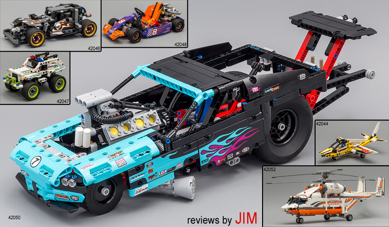
Eurobricks Technic Moderator Jim has brought us a whopping six new 1st Half 2016 LEGO Technic set reviews! That includes 42044 Display Team Jet, 42046 Getaway Racer, 42047 Police Interceptor, 42048 Race Kart, 42050 Drag Racer, & 42052 Heavy Lift Helicopter! Also check out Sariel's video reviews of the entire 1H 2016 Technic wave in this topic!
-
What Video Game(s) are you playing?
Clone OPatra replied to Lego Spy's topic in Culture & Multimedia
This is the Community Section, specifically the Culture & Multimedia forum. You'll find that nothing in here has to do with LEGO, and that's just as it should be. Please refrain from making such unnecessary and potentially argumentative posts in the future. -
This one really is itty bitty; my pictures probably make it look larger than it even is. Since LEGO is likely continuing their single-building line as well, I like that they're offering some real teeny micro stuff. Thanks very much! I too would love to know why those 'cautionary' graphics have been added. I mean, sure, those parts are somewhat similar, but there are only 212 parts in the entire set! Plus, technic bricks with holes can't really be confused with the 1x2 protruding stud brick. Even more perplexing, the graphic about the 1x1 bricks appears on the step with the headlight bricks, which comes AFTER the other 1x1 SNOT bricks are already in use. It all seems quite extraneous to me, even putting myself in the shoes of an unexperienced builder.To address your other question, I find no choke warning in this manual.
-
REVIEW: 41068 Arendelle Castle Celebration
Clone OPatra replied to Clone OPatra's topic in LEGO Licensed
I'm pleased to bring the wonderful Licensed forum this EB-exclusive review. I hope all of the pictures don't make your computer Frozen. *ahem* Anyway, enjoy! -
Just in time for Christmas 2015, LEGO has cashed in once again on the Frozen fever with… Special thanks to CopMike and the LEGO CEE team for providing this set! Set Name: Arendelle Castle Celebration Set #: 41068 Theme: Disney Princess - Frozen Parts: 477 Figures: 2 Minidolls + Olaf Year of Release: 2015 Price at Release: USD 60 Brickset Bricklink(not yet available) Flickr Set You might've noticed my slight pun in the first line - this set is based upon Disney's short film Frozen Fever, which I found so aptly named due to there being a Frozen fever in the sense of everybody going gaga over Frozen, while this short makes people even more gaga over Frozen and provides new outfits for Elsa and Anna that parents will surely have to buy for their little girls. I did see Disney's recent live-action Cinderella, so I saw Frozen Fever in the theater, but I watched it again online before writing this review. Rest assured that this review will be about the LEGO set and not about Frozen, but how come Elsa can suddenly sprout flowers and design clothing with the flick of her wrist in Frozen Fever? I thought ice was her thing? It makes absolutely no sense, and that's why Frozen Fever strikes me as a marketing ploy to sell more dresses to children. Anywho, I'm not going to let my gripes with the source material get in the way of reviewing, so let's get on to the pretty set before us. PACKAGING The front of the box has some lovely, vibrant colors as you'd expect from a Disney Princess product. The animated Elsa and Anna wear their Frozen Fever outfits, letting you know with subtlety what the set's based upon. LEGO has wasted no time in assuring you that the facade-like Castle contains an interior, including a Castle-rear pic right on the front. The back highlights the interior, with a bunch of scenes meant to show… roleplay, I guess? It shows you right off the bat that there are next to no true 'play features' in this set, not that a dollhouse-style building needs them anyway. The snowflake atop the Castle was too tall for the front of the box, so it's been wrapped onto the top. Else looks a bit lonely in the 1:1 picture, with no other pictures up here. I would have expected a scene with Anna, Olaf, and the mini snow-things. INSTRUCTIONS The instructions come in a single glue-bound booklet, similar to that of large sets like the Ninjago Airjitzu Temple, for example. I prefer this over multiple smaller booklets, if only because it means you can't misplace one out of three instruction booklets. I do speak from experience… The inside has just a simple lavender color with no frills added. I actually wanted to highlight this particular step because the designer chose to use two 1x1 bricks with clip to attach the door instead of the 1x3 brick with two clips. Perhaps it was done for structure, but I appreciate that the color scheme of the parts was kept consistent, as it often is not with the 1x3 being used. The back contains an ad for the Palace Pets sets and their show Whisker Haven. Note that it features Pocahontas, who has not yet appeared in LEGO form. Is it a hint? For the parts-list pages, please see here and here. STICKER SHEET Stickers are no fun and I'm less good at applying them than I once thought. Luckily all of the stickers in this set go on tiles or sides of bricks, if that makes it any better. For those that like to use stickers for customization, this set offers some lovely designs. I wanted to stay true to the intent of the design, so I applied them all. PARTS & THE BUILD Straight outta the box come four numbered bags (still transitioning from the old design to the new), one larger and one smaller dark tan plate, and the agua/light bluish green slide. Doesn't feel like a whole lot, but I already love all that aqua. NOTE: I inevitably missed some interesting parts in (I think) every parts picture. I will do my best to highlight them in text. Also, while I will try to be as accurate as possible, a lot of these colors look very similar and I might muck up the names of them now and again. Feel free to correct me. Bag 1 If it wasn't clear to you already, this set is a bright-parts and recolor treasure trove. Certainly new and very exciting are the stem pieces in lavender. The plain heads in medium lavender, light royal blue (Chima Eris color), and whichever pink color that is are also pretty cool, and I think one or both of the flower colors I picked are new as well. I forgot to highlight the 2x2 round plates with center stud, aka round 2x2 jumpers, which come in dark azure and white. Feast your eyes on the piles for anything else I forgot. Bag 1 builds the outdoor celebration stuff and the beginnings of the Castle, including nice ice tile-age. I was a bit worried building the balloon decorations that use the lavender stems - too much force might break them, and even placing the heads atop the flowers felt dangerous. Placing all of the flowers outside the Castle gets a bit tedious, but the result is worth it. Bag 2 Bag 2 contains considerably less colorful goodness than Bag 1, but still plenty of goodness on the whole. The real standouts would have to be the small leaf pieces new in white. A little bit of purple, sand green, and shades of pink help liven things up, as well as those roof-topping pieces in light aqua. I picked out those two light/Barraki eye pieces to show that, while all four included should be the same color, the one I put on the left is a lighter shade than the other three (one of which is on the right). Odd. The parts in this bag basically finish off the first floor of the Castle, and include Anna. Applying the stickers, especially on the door, was a bit of a pain (and my fingerprints are now embedded in the set), but the designs do look nice. Bag 3 In Bag 3 we hit the blues, or really the trans blues and the light aquas. I have really loved that light aqua color ever since I first got it in the Cars Tokyo Pitstop set, and it's great to see all of the useful slopes in that color (which are all exclusive to this set for now, if Bricklink leads me true). I was quite surprised to see that the 1x6 tiles are in fact printed, which confounds me a bit even though three are included in the set. But heck, of course I'll take prints! At this point we've made a lot of progress on the Castle, though it still needs a fake 1-brick wide roof to top itself off. Bag 4 Getting over the wonderful explosion of aqua in this final bag, there are some other exclusive parts like those Scala dishes in dark bley and Chima fire wings cast in glitter trans-light blue veering on trans-clear. I have no idea why the trans 1x2 brick isn't trans-light blue seeing as it's used as a continuation of the windows. It's a pretty color on its own, but it doesn't make much sense. Surprise! The Castle is finished at the end of this final bag. Leftovers Some people hate eating leftovers, but we can all agree to appreciate LEGO leftovers (I hope). Lots of pretty things here, like another lavender stem and orange unicorn horn, as well as many wonderful colors of bits and bobs. MINIDOLLS & Other Characters As usual for Minidoll sets, not a lot of characters. Luckily, you only need to purchase the other new Frozen set to get the other characters necessary for the scene, so things could be worse (like having Jasmine but no Aladdin). I'm really mixed on the Elsa and Anna in this set. Nearly everything positive about them has a negative. The unique hairpieces are nice (including Anna's new one), but Elsa's still needs to be white and not blonde-ish. The detailing on the outfits looks lovely, but Elsa's doesn't match the color in the source material, which has much more blue in it. Elsa's face kind of works, but Anna's really doesn't remind me of her at all, even with the freckles. I wish LEGO would gives its Minidolls more expressive exp<b></b>ressions, especially in the Disney line where they represent expressive characters. I'm also not a fan of the huge flower and how it sits on Anna's hair, but Elsa's new crown looks good. Those hairpieces do have really great styling all around. Interestingly, Elsa's cape is longer than the minidoll body, so that it can 'flow.' The effect kind of works, though it makes her fall over sometimes since the cape is somewhat stiff. Both hairpieces also have a spot to attach another accessory on the back. The cape has a nice design, despite being the wrong color. Unlike a lot of Friends hairpieces which are quite voluminous, these more contained ones look right at home on minifigures. Ginny and Luna are trying out some new styles. The buildable figures round out the characters of the set. Olaf looks recognizable, but as others have pointed out he looks a bit off without the strands of hair. He just looks a little wrong. The little snow-things that Elsa coughs up (literally) are bundles of cuteness, though. Even a little hair printing on Olaf would've helped. ACCESSORIES Unusually, this set falls a little light in the true accessory department. We only get Loki's staff, a few cups, ice skates, a bow, glittery blue fire, and Harry's acceptance letter from Hogwarts. Some other parts used as decoration could instead be used as accessories, though, such as the water wings and LEGO's version of the Halo sword. Chima breastplate not included. FINISHED SET Here's everything you get - the Castle, the party stuff, the characters. The colors all go together quite well, creating a bright and lively set in wonderful pastels, which I greatly prefer to bright primaries. As I like to do, let me take you on the grand LEGO tour. Outdoor Decor For the outdoor party scene, we get a table with some foodstuffs, stools that make wonderful use of the old rocket tip piece, a gift, and some balloon ornaments. I've already mentioned how the balloon ornaments were a bit frightening to put together, but they look absolutely stunning when done. The cake is nowhere near the size of the cake in Frozen Fever, of course, but it does approximate the design at a tiny scale. The gift makes use of some cool new-ish parts, but is otherwise lackluster as it's quite small and only contains a bow. I hope Anna wanted a new bow. Removable Furniture For whatever reason, a chosen few items from the interior get attached via jumper plates and are thus easily removed. I'm not sure why anyone would want to remove the fireplaces, and I can't see how that facilitates more play, but there you have it. The sand green fireplace looks really lovely, while the white one is just ok. The color scheme of the white one doesn't strike me as very fireplace-y. The bed has a pleasant girly color scheme with lovely sticker designs. The interior looks a bit bare without the furniture, so I don't really recommend removing those pieces. What's really odd is that not all of the furniture is as easily removable. If everything came out easily, it would make more sense to me. The Castle - Exterior The designer has really done a splendid job making the Castle recognizable. If you Google Image 'Arendelle Castle' you'll find that this set is really not so accurate at all, but I'd say it doesn't matter since one look at this tells me what it is. It's like the difference between what you think a person looks like in your head and that person's appearance in real life - both represent the person. This Castle really looks quite right, and quite pleasing. Of course, the whole facade design does strike one as kind of odd. Even dead-on you can tell it's flat, but turn it just a little and it really starts to show. Since the whole design works on the principle of merely approximating the shape of Arendelle Castle, I'm not against the facade choice. The sloping roofs would have been hard to pull off with legal building techniques and looking good at this scale (by my estimation, anyway), and this way the Castle has both a good shape and a very open, playable interior. On the ground floor, the Chima wings work really well as Elsa's ice fountain sculptures (albeit at a very small scale, once again). The dark tan of the ground doesn't mesh very well with trans-light blue, but it's understandable that the designer wanted to differentiate the ground from the color of the Castle walls. The tiling does make posing minidolls quite easy. Looks, some of Anna's Friends have arrived to join the party! The only design choice on the outside that I don't really like is the lack of window glass in the upstairs side windows. I would think the design could have been altered just a little to accommodate some large window panes. This way, Anna can comically escape her icy sister. The Castle - Interior Here's an overview of the backside. It doesn't have an awful lot going on, especially on the lower level which is left with quite some empty space, but it does have enough for plenty of fun. On the right side of the ground floor we have a nice grandfather clock that reminds me a bit of the one in The Burrow (though all they have in common is that they are both clocks), some cheery flowers, a bright chez for Anna to lollygag about, and a painting on/in the wall. If the trapeze artist losing her shoe is some sort of reference, it's lost on me. There are ice skates in the clock (makes perfect sense), which have the unfortunate side of effect of forcing you to always have a container were you to re-use the stickered part. On the other side is a pretty stickered rug that ties the room together (literally, it's structural), and the sand green removable fireplace, re-instated in its rightful place. Elsa can sit by it to get warm, which I'm sure she loves to do. In the bedroom upstairs, I've painstakingly recreated the scene from Frozen Fever in which Elsa wakes up Anna. I hope you like my expert figure-posing skills. Another nice rug in here, by the way. Or perhaps it's Elsa's bedroom, and Anna would like to know if she wants to build a snowman. If not, Anna can make a quick getaway on the conveniently located slide. Speaking of the slide, it's the only real 'play feature.' Elsa does indeed slide around on ice in Frozen Fever, so it kind of works in the context of the scene, though I had to try many times to even get the figures to slide down so it doesn't really work as a toy thing. Oh well. Better than another spiral staircase, maybe? THE END I've already said a lot, so if you've read it all, I commend you. If you haven't, here's where I recap everything. Parts - This set is a tremendous parts pack, provided you like the sorts of colors on offer. There are exclusive re-colors to be had, the highlights of which would have to be the lavender stems, white foliage, and all of the aqua. Really great stuff there. Figures - As I detailed above, I have issues with these figures. The have pretty dresses, but there are problems. The hairpieces are quite good and usable on minifigures, which is a big plus. Unless you or your loved one is gaga about Frozen, I wouldn't buy this set for the figures by any means (especially since Olaf is coming in a polybag sometime). Design - Some may fault the facade design, but I don't. Overally, the model pleases the eye, and reminds one of the source material well. Tan and 'normal' shades work well with the aqua and pinks, coming together for a fun-looking and vibrant set. Price - Here's the one thing I haven't touched upon yet. Almost all of the Disney Princess sets seem a little overpriced, by five or ten dollars if we're talking USD (which I always am). This set would make a much better buy at 50 USD than 60, but even at 60 I can feel it. The Castle is almost substantial enough that 60 seems ok. I can't comment on the price in other parts of the world, which will be much higher as always, but perhaps the differences in price possibilities apply to your currency as well. Overall, I'd say this is a fun and worthwhile set, one that I would definitely recommend for your consideration either at full price or eventually for a few dollars/euros/yen less. Yours truly, CloneyO, signing off.
-
Disney Collectible Minifigures Series 1 Discussion
Clone OPatra replied to just2good's topic in LEGO Licensed
It's all pure speculation. There have been no actual rumors about a chase figure. -
Marvel Superheroes 2016 Rumors And Discussion
Clone OPatra replied to Quicksilver's topic in LEGO Licensed
We do already have a full review of the Hulk set. I'm sure most basic questions are answered within. -
DC Superheroes 2016 - Rumors and Discussion
Clone OPatra replied to just2good's topic in LEGO Licensed
Please don't tell people to stop. This is verging on mini-modding. Please refer to the first post before asking questions, as you may find the answers there. -
As the current Licensed Mod I jumped at the chance to review this set based on the LEGO Batman 3 level where Brainiac shrinks cities. *AHEM* kidding of course. It's… Set Name: Venice Set # 21026 Theme: Architecture Pieces: 212 Year of Release: 2015 Price at Release: ?? Bricklink Flickr Set (links to be added) INTRODUCTION I was intrigued to see the (fully legal and meant-to-be-disclosed) pictures of the three new 'skyline' sets when they first appeared. Even though there are still tons of architectural landmarks around the world waiting to be transformed into LEGO sets, new directions for the Architecture line make perfect sense to me. We've gotten large houses, tiny skyscrapers, mid-size monuments, and now a bunch of little buildings arranged in a line whether they appear that way in the real world or not (mostly not). That's a diversity of offerings right there. I will be frank (though it's not my name) that I've never been to Venice, am not well versed in the landmarks of Venice, and if you'd asked me what the different things in this set are supposed to represent, you would've gotten a big old shrug. Of course, LEGO has provided that information right on the box, so I didn't have to know. Lucky me. What I'm trying to say, though, is that I'm not going to be too harsh on the 'accuracy' of the thing, since I didn't know what any of these things are supposed to look like anyway. I do happen to know that Venice doesn't actually have much of a skyline, so the choice to include Venice as one of the inaugural three skyline sets is a bit… odd. Anyway, on with it… PACKAGING As usual for the Architecture line, the set comes in really sexy packaging. The front advertises the booklet with information inside, to assure people like me that if you have no idea what you're looking at, you can find out inside. Note that the top uses the top-of-tower piece as the 1:1 image. In case you might not want the set since you have no idea what the buildings are, LEGO has handily told you on the back. Ohhh, that clip piece is a winged lion, ok now I'll buy this. Though the booklet only contains English and Italian text, the back of the box touts the 'unique architectural experience' of Venice in a bunch of languages. Of course, the idea that Venice even has a skyline strikes me as a bit of a stretch. As usual, if you don't enjoy your building experience, LEGO will come to your place of residence and reclaim this product in order to re-gift it to someone appreciative, aka not you. PAPER THINGS LEGO really wants to know how you find their driving. They also want to tempt you with the Trevi Fountain. You can't hook me, LEGO… but ooh look at all that trans-blue. (Still not as much as the UN) The front of the instructions let you know that the text is available online in a multitude of languages, though I don't understand why both the US and Canada are represented. Does the Canadian version end every sentence with 'eh?' Sorrynotsorry. The booklet only comes so thick because it has all of the text pages twice (English and Italian) and because the build goes sooo. darrrnnn. sloooowww. As the Architecture line is geared towards non-LEGO-regulars, I sort of understand. I've chosen to highlight this particular page because it has interesting graphics warning you against screwing up by using incorrect parts. I'd personally never seen these graphics before. They appear on every step that features these parts. For your reference, I present the parts list. The light bley parts do look more dark bley in the booklet, but there are no dark bley parts in this set, so you can't muck that up. PARTS The set contains just three fairly small bags of parts, non-numbered so you can enjoy the nostalgic pleasure of dumping all of the parts in one messy pile. You can see here already (if you didn't on the parts-list picture) that a lot of restraint has been used in terms of color palette. Unlike many other Architecture sets, this one does not offer much in the way of interesting parts in quantity, color, or variety. The only unique parts are the trophy-fig in white, the printed brown 2x2, and the Venice plate. There are 12 sand green cheese and 14 brown grooved bricks, which are both semi uncommon colors for those parts. Trans-blue tiles are still cool and 'apollo' studs are just reaching the end of their run as a novelty. The 3L bar is also still somewhat uncommon in white. Not pictured are the SNOT parts, though it's slim pickins and I wouldn't recommend this set as a SNOT parts-pack. The best thing about sets that have desirable small parts is that you always get MOAR. Make that TWO exclusive white trophy-figs. BUILD As I noted above, the build is sloooowww. Almost painfully slow, for an experienced builder. At 10 steps you'll have done just under half of the base. At step 28, you'll have finally finished the base. This is just under half of the entire build (56 overall steps, though things like the Tower aka Campanile are complete sub-builds unto themselves). There's plenty of nice tileage here, providing the completed model with nearly no studs showing. Unlike a lot of past Architecture sets, this one doesn't particularly feature any interesting techniques. I'd reckon you can figure out the entire build from the front-of-box picture. For this reason, I stopped taking in-build pictures at step 40 since I thought they'd be rather boring. If there's anything else you'd like to know or see build-wise, ask away in the comments. COMPLETED MODEL Though I wasn't previously familiar with these buildings (as I've said countless times at this point, or I could count the times but won't), my first impression upon completing the model was one of surprised liking. It really comes together quite well as an impressionistic little display - the spare color choices add to the aesthetic, and it strikes you as a whimsical collection of buildings that have been sliced out of their respective settings and arranged miraculously in a line. A lot of these buildings appear more tan than white in real life, but in the vein of the Architecture Studio set I like the choice of white as a through-line color of the set. The back is nothing much to behold. This model can really only be displayed from the front, but that's perfectly fine for what it is. Now I'll run through the various buildings left-to-right before I show off some up-close glory shots and wrap things up… Rialto Bridge Hailing from the 16th Century, the Rialto bridge contains three parallel walkways - two on the outer sides and one through the center lined with shops. The center is open across the width, allowing passage between the three different walkways. Of course, at this scale the walkways running the length of the bridge simply cannot be approximated. The designer did commendably manage to convey the opening in the middle with the 1x2 brick with technic hole. I'm not 100% on board with the positioning of the cheese slopes on the ascending sides - the pictures included in the booklet don't make the bridge look like it has a roof that peaks across the width. Still, overall it's a cute little build that conveys what it's supposed to. St. Mark's Basilica As the oldest of the buildings presented, built to its current specifications in the 11th Century, St. Mark's Basilica looks pretty darn impressive and ornate in real life. It's decorated with friezes, murals, and golden statues. The real thing has five domes, and the three that line up aren't on the face of any side, as presented on the model. Despite the debatable 'inaccuracies,' the model presents a lovely slice of the Basilica with what I'd call a recognizable profile (if I'd known what the real Basilica looks like, that is). The use of brown and sand green confound me somewhat for the building itself, but in the context of the larger set they look great. As I've said, I actually enjoy the color inaccuracies in this set. That old printed 2x2 round tile was also a good choice to approximate the latticed semicircle on the real building. St. Mark's Campanile Near the Basilica in real life stands this tower, 'one of the tallest structures in the city' (according to the instructions), originally from the 16th Century. The tower does indeed have protruding 'columns' of brick-work, which informed the use of the groove bricks. Then comes a white section with open arches on each face, conveyed by the log bricks in white. The brick section above does appear to have friezes on all four faces, but a quick Google Image search of the Campanile shows that it's very often photographed from the lion side, so the print chosen makes sense and I don't fault the set much for having just one print. Additional prints on the two sides would have been a nice bonus, though, since you will see the tower from those angles when displaying the set. Finally comes the pointed roof, which really does appear to be an oxidized copper (aka sand green) color in real life. Overall, this is the most 'accurate' building of all in terms of detailing and colors chosen. Though a simple build of stacking, it comes together quite well and provides some nice height contrast for the set. St. Theodore & The Lion of Venice Columns I really enjoy the fact that all three skyline sets use a trophy fig to convey completely different statues in completely different scales. These two columns topped with statues sit on the edge of a tiled courtyard, which is why the tiled pattern for the ground was chosen. The columns are near the Campanile in real life, so being juxtaposed with it makes them recognizable for what they are supposed to be. It's almost humorous that a clip piece is supposed to be a winged lion, but on the other hand it's also a testament to creative microscale. You can tell that these are columns topped with statues even if you had no reference for them, and that makes them a job well done. They're also simply cute. Bridge of Sighs Coming in last is the Bridge of Sighs, a 17th Century ornate little bridge that runs between the Doge's Palace and the old city prison. The real thing has some latticed windows, which is why those slotted tiles have been used. I must say that this model strikes me as unsuccessful and a rather odd choice. The real Bridge of Sighs runs high over a canal between two buildings - this looks like a free-standing structure that could really be anything. It looks more like a small mausoleum or temple than a bridge. Internet Searches reveal to me that the Bridge of Sighs is one of the famous landmarks of Venice (which I could've guessed from the fact that LEGO chose it), but it just doesn't work at this scale. It's still a pleasant little thing, but it's quite a stretch to see this model as what it's supposed to be. GLORY SHOTS & CONCLUSION I love micro photography, so I had some fun with this set. I hope you'll enjoy these few shots I've chosen. On the whole, I enjoy this set a lot more than I expected to. The official pictures make it look almost bland, but in front of me the model works really well. The restraint used in color selection works swimmingly. Each structure individually does a decent job of approximating the look of its source material, besides for the Bridge of Sighs which really should not have been chosen. Nobody would normally expect a model of architecture to be termed 'adorable,' but I'd call this set adorable. As a parts pack, it's not great. There are a few decent parts on offer, but if you're only in it for the parts I would't particularly recommend it. At the time of this writing I don't yet know the price, so it's hard to comment on the value of the set. Purely as a model and display piece, LEGO's Venice does a great job. If you're at all interested in architecture or small tasteful displays, I'd say grab this set when you can. Thanks for reading!
-
Marvel Superheroes 2016 Rumors And Discussion
Clone OPatra replied to Quicksilver's topic in LEGO Licensed
Everything known should be in the first post, besides a rumored Doctor Strange set which will presumably come with Strange (plus maybe Baron Mordo and someone else). -
Disney Collectible Minifigures Series 1 Discussion
Clone OPatra replied to just2good's topic in LEGO Licensed
That Kubrik advertisement posted above has a Mike that basically has mini figure proportions. I wouldn't call it impossible. All LEGO would really need is a part to go over the torso for his rounded head/face. It might not look exactly like the character, but minifigures never do. -
DC Superheroes 2016 - Rumors and Discussion
Clone OPatra replied to just2good's topic in LEGO Licensed
I like that figure as a cool, different Superman minifig. I'm not sure it's a great representation of the character in the film (seems too bright and cheery to me), but as a Superman minifig I like the look. There have been lots of slightly different iterations of Supes over the years. -
LEGO Collectable Minifigures Series 15 Rumors and Discussion
Clone OPatra replied to Robert8's topic in Special LEGO Themes
Hmm, I'm not expecting a new bent-arm mould. I think the image is just the typical promotional stylization, and the crutches won't be able to go under the arms at all. I could be wrong, but that's my feeling. -
Lego UCS-MOC: Batman™ Arkham Knight ''Batmobile''
Clone OPatra replied to Hass Kabal's topic in LEGO Licensed
I felt it was high time to give this a Frontpage so that more people could get in on the fun of seeing your progress. I bet the finished thing will be deserving of a Frontpage post too! -
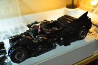
Sometimes following a WIP topic can be just as fun (or more) as seeing a finished MOC! Hass Kabal is documenting his progress on a stunning UCS-style LEGO Batmobile from the Arkham Knight videogame! Click the picture to watch it unfold in the Licensed forum.
-
75827 Ghostbusters Firehouse Headquarters Discussion
Clone OPatra replied to kelceycoe's topic in LEGO Licensed
Wow, I guess I missed over that particular image when browsing through them. That wall is indeed horrendously ugly! Yuck! I've often found it a shame that LEGO didn't keep the old version of that panel piece in production. The new one with the indent is good for some things, but the old one with no indent was very useful for building walls that actually, you know, look good from either side. The older non-indent version would've saved the Kwik-E-Mart from the same issue with no sweat. -
DC Superheroes 2016 - Rumors and Discussion
Clone OPatra replied to just2good's topic in LEGO Licensed
For the Licensed forum at this point in time, I am allowing people to kindly point others to the proper websites on which to find images. Other rules about deeplinked images and direct image links remain in place, but you can say things like 'search on Reddit' or 'search on ttv' as the case may be. NOTE: This policy could change in the future, but that's what it is for now. Since we're going to be discussing leaks anyway, might as well tell everyone where to find them so everyone has a chance to join in on the discussion. -
It looked like there were two topics with the exact same agenda, so I've merged them! As for my favorite film: In Bruges. It's wonderful on every viewing.
-
Marvel Superheroes 2016 Rumors And Discussion
Clone OPatra replied to Quicksilver's topic in LEGO Licensed
You guys. People very rarely get banned from this site, and certainly not without warning and discussion! The staff is not some team of evil overlords trying to get rid of people. We work for everybody's mutual enjoyment of the site and the hobby. Obviously this entire post is 'off topic' but I just wanted to put it out there.