

strangely
-
Posts
2,112 -
Joined
-
Last visited
Content Type
Profiles
Forums
Gallery
Everything posted by strangely
-
I think they're trying to avoid using too many classic villains at once, hence the wide variety of inspiration. Based on the TV special and several movies planned for release over years I'm guessing they intend to do more than one wave and are trying to keep a few classic monsters so they can stretch the theme as long as needed. I mean they've already used three very iconic monsters from the original show(So iconic the shows recycle them every so often) and one of the more recognizable monsters from the Scooby Doo show. Had they stuck to just Where Are You monsters they'd be almost halfway through the iconic monsters from that series (Some of the generic monsters I tend not to count).
-
Well the new show is using some of the classic monsters. A recent preview showed that one episode is using the Ghost of Elias Kingston, so there is some possibility the show is reusing older monsters (Maybe the show is more along the lines of a remake or reboot). So it is possible some of these monsters are classic monsters that have been reused in the new show. But I tend to believe Lego based some them directly on the original source material. The Zombie and Vampire are completely the same to the original show. The Black Knight is also a really close match even having the same eye color as the show version, the only difference is the helmet, but that might simply be due to Lego using existing inventory for it. Headless Horseman is a complete match too. The Mummy, the Swamp Monster and the Lighthouse Keeper are the three that aren't a direct match. The lighthouse keeper is very similar to the Creepy Keeper. Same colors, same hair and beard. The differences are the belt, and the lack of hat (Though the hat could be missing as the hairpiece makes it impossible to use a hat). The Mummy isn't an exact match either. The museum setting does link it to the Mummy of Ankha, but the headdress was not present in that episode. The headdress was used in What's New Scooby Doo, but that Mummy wasn't as plain as this one. I think it's highly possible the Mummy and Swamp Monster are from something new. I wouldn't be surprised if some of these monsters were created to be used in the special episode that they're supposed to air later this year.
-
I have to agree, I would have preferred a second head. That would have given us a diverse group of heads with multiple uses, this method ultimately limits the usefulness of these heads. I don't mind that much though, Lego managed to find a method that works well enough. And truthfully any of these monsters really only needed one expression as most Scooby Doo monsters tend to have only one expression on their face throughout most of any given episode (Except during injury or a gag, otherwise they don't do much with their face).
-
I don't think it's really representing one particular series as these monsters don't all come from the same show. From Scooby Doo Where are you: Black Knight, Vampire, Zombie and possibly the Mummy (The Mummy of Ankha didn't wear a headdress, but the museum setting does match the episode) The Scooby Doo Show: The Headless Horseman What's New Scooby Doo: Creepy Keeper (This is the closest guess on this monster, he's missing a hat, but otherwise he looks exactly like the Creepy Keeper) and possibly the Mummy (This series did feature a Mummy with a headdress, but the setting doesn't match) Unknown: Swamp Monster (This character might be from something new as there doesn't seem to be an existing monster it matches. People keep on mistaking it as the Moat Monster, but that monster had red eyes and no purple) The ghost could be from just about any series as they've pretty much all featured generic ghosts at some point. If there's a printed face that might reveal which episode they're trying to reference.
-
That face is certainly interesting, but it definitely doesn't tell me who the monster is supposed to be. On a side-note now I'm sort of hoping the alternate face for the lighthouse keeper looks like the Joker... I'm really looking forward to seeing what the other alt-faces look like. So far we've seen two, six to go (Assuming the ghost has a printed face at all and the Zombie has another head).
-
Marvel Superheroes 2015 Rumors & Discussion
strangely replied to CorneliusMurdock's topic in LEGO Licensed
That's true, but I'm not holding my breath since the same heads are on the box art. And you're missing mine, just because it's a juniors set doesn't mean it should be lazy. And what you just said about the Juniors set applies to most of the regular sets too which generally carry the age range of 7-14, another group who probably aren't going to care that much about a sets flawed logic and lazy printing. I don't expect it to be art but I expect it to be good on some level and if people are ultimately buying this set to get a hold of one minifigure and little else than I'd say it should have been better. Just because it's a toy for children doesn't give them a free pass to push out lazy products which still cost a considerable amount. The build should have been better and more well thought out and two of three minifigures shouldn't have been recycled. Even a five year old deserves better than that. -
Marvel Superheroes 2015 Rumors & Discussion
strangely replied to CorneliusMurdock's topic in LEGO Licensed
I like the new Green Goblin and I'll get used to the legs. But honestly it just makes me realize how little effort was put into this years Spider-man sets. I mean the Rhino and Sandman re-use old heads. They pulled a "new hat" for Spider-man with his only costume change being new boots and nothing else. And no civilian characters for any of the sets. Spider-man has a lot of supporting characters and so far we've got J. Jonah Jameson and Mary Jane. We still really need Gwen Stacy. Plus the builds are kind of all over the place, the Shield vehicle in particular is kind of odd. I'll admit the line has improved from the first few years (The fact that they seem to take less and less inspiration from USM is helping), but there's still a lot of work before they get to a point where the sets are great. -
Marvel Superheroes 2015 Rumors & Discussion
strangely replied to CorneliusMurdock's topic in LEGO Licensed
That doesn't mean it has to be horrible by default. The only new thing about the set is one minifigure and a handful of printed elements. That's incredibly lazy even for a juniors set. Just because it's intended for a younger group doesn't mean it should be a lazy mess of random parts and ideas. The Batcave they did in the same line was actually a nice and creative build with a couple of nice new minifigures (Sort of new anyways). There's no reason this set should have been doomed to be a made up slide based hideout that apparently everybody knows about (I'm doubting he's doing much hiding in a building with his face on it) featuring a cop from the city line, the same old Spider-man (They could have at least given us the new legs) and the Green Goblin with terrible legs. If they were going to phone it in with this obvious cash grab they could have at least done the legs properly for the one new minifigure they included. -
Marvel Superheroes 2015 Rumors & Discussion
strangely replied to CorneliusMurdock's topic in LEGO Licensed
I just realized they can print on the molded legs, they did for CMF series 14, four minifigures at least got printing on top of the molded legs. So really there is just no excuse for why Lego didn't do this. I guess budget for that set might have been an issue, but they probably could have sacrificed some of the useless printed elements in that set and the police officer and given us proper legs instead. -
Marvel Superheroes 2015 Rumors & Discussion
strangely replied to CorneliusMurdock's topic in LEGO Licensed
They did it for his torso and that looks good. -
Marvel Superheroes 2015 Rumors & Discussion
strangely replied to CorneliusMurdock's topic in LEGO Licensed
That's a fair point. But Lego could have just used purple legs and printed the green on, scales included. It's not like they haven't done that before. Really we could have gotten boots and scales no problem if they had simply used the techniques they've done before. So it baffles me they went the direction they went when they had other, better, options. -
Marvel Superheroes 2015 Rumors & Discussion
strangely replied to CorneliusMurdock's topic in LEGO Licensed
I think it's the legs that make it look childish. Without boots he sort of looks like a guy in pajamas. Otherwise I think he's fine, and his coloring is a bit more adult than his comic appearances through the 60's where he was colored almost a lime green and pinkish purple... Yeah, I don't understand why he didn't get boot printing. Even if they didn't have the budget to do two-colored molding for the legs they could have just printed green on purple legs. -
Marvel Superheroes 2015 Rumors & Discussion
strangely replied to CorneliusMurdock's topic in LEGO Licensed
*everything. -
They wouldn't need to do two-tone legs for Raven. If they use either the game design or the show design they'd only need printing. And realistically Lego would probably just print on the front of the legs only like they did with Storm. Really the biggest problem isn't the budget or the parts, it's the Lego strategy. Lego isn't going to give us four Teen Titans in one set, obviously Raven is going to be used later on. I'm almost betting on her appearing in one of those Target cubes. We got Superboy that way and he had all new prints and two-toned arms.
-
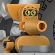
I'm glad to finally see the inside of the Mystery Machine. I have to say I'll be taking out a lot of the stuff back there, particularly those two orange walls that hold the camera and flashlight. I just think it'll look better with that unobstructed. I had hoped there would be doors in the back, but admittedly that probably wasn't possible while retaining the angles of the vehicle, so I'm okay with them choosing look over function. Granted I wish they had managed to give us one door that functioned properly. Oh well... All in all I'm really impressed by these sets, I especially like how the colors are done. They managed to create some very good looking sets. The purples and greens in the mansion are really eye catching and the Mummy set is just awesome for that price point. I'm really impressed that Lego managed to do a mix of vehicles and location sets with such superb detail. Also is it just me or is there printing under the Black Knights armor? I'm looking at the bottom of his armor in one picture and seeing a little bit of printing. I'm wondering if maybe he has a flesh head with black and the eyes printed on one side and a suit under the armor to portray Mr. Wickles. That would be pretty nice. It would be even better if they included a bald hairpiece for him.
-
Hopefully we get some shots of the interiors before too much longer.
-
Marvel Superheroes 2015 Rumors & Discussion
strangely replied to CorneliusMurdock's topic in LEGO Licensed
Kind of a mixed bag for me. Sandman, Carnage and Rhino are all awesome and I'm going to have to buy them immediately. Iron Spider and Miles Morales are awesome to. New Spider-man suffers from "new hat" syndrome. Boots really don't make up for that tired old print and I'm disappointed that Lego has done this to us once again. The Juniors set looks awful and the only reason I want it is for the Green Goblin. Unfortunately the Goblin doesn't wow me by any means. He looks fine, but ultimately he's a little phoned in. The legs are terrifically lazy. They really should have given him purple legs with the green printed on so that he could have boots. I like his torso and face though. I'm looking forward to seeing if he has an alternate face. I will say all the builds are pretty good. Ant-man bores me though, but I'll get it for the minifigures at least. -
Harley's eyes are weird... I'm loving Beast Boy and Starfire though. Granted I'm wondering how many more times Lego is going to make me buy that same Poison Ivy. Re-using Penguin is fine in my book since that variation only appeared in one super expensive set before. The rides look pretty awesome and I can't wait to get a hold of that set. I'm bummed out they didn't bother to include Raven.
-
Finally Princess Leia has her own face! Luke's last face was too detailed and now his new one is too simple, I love the irony. I love all the Naboo sets. They may not have a lot of new stuff but if you combine them together you can get a pretty good war out of them. New Anakin head is nice, but I wish they'd given him some new hair.
-
That mummy set is awesome. The Johnny Thunder reference is inspired! Shaggy seems to have three faces total, so that's a nice surprise.
-
No matter how many times Lego tries to make action figures I never end up liking them even a little. Oh well, the rest of the sets are looking pretty awesome. I might even feel compelled to buy the advent calendar this year.
-
It all looks pretty good. The real problem is that I'm thinking how much more I'd rather have stuff from the original movie over this... But it all looks so good, so I'll pick up a few of the sets.
-
Marvel Superheroes 2015 Rumors & Discussion
strangely replied to CorneliusMurdock's topic in LEGO Licensed
I need close-ups of that Spidey. It looks like all they did was give him new boots. Which if that's the case I'm going to be super disappointed. Boots do not make up for that terrible minifigure being used yet again. Other than that everything looks pretty good so far. I don't know how to feel about that Goblin. The legs are really bothering me. No boots! And you can definitely tell it's a juniors set, that glider design is pretty awful. -
Joker, Poison Ivy and Penguin are old designs... That's a bit disappointing. Loving everything else though.
-
Everything looks good so far. The truck could have been a bit better, the wheels don't seem quite right to me. The minifigures are nice though. Owen looks pretty awesome. Claire could have used leg printing, but otherwise she looks great. I'm glad to see that hairpiece in a new color finally. On a side note I'm suddenly realizing how many women in the licensed sets have either red or orange hair...