BEAVeR
-
Posts
1,384 -
Joined
-
Last visited
Content Type
Profiles
Forums
Gallery
Everything posted by BEAVeR
-
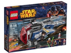
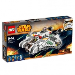
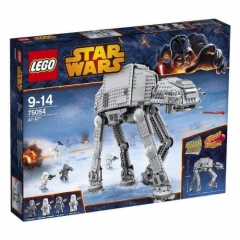
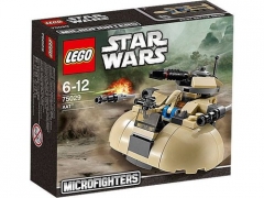
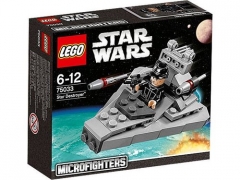
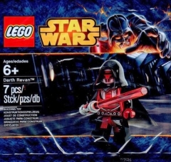
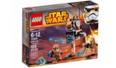
From the album: 2015 Star Wars sets
-
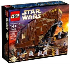
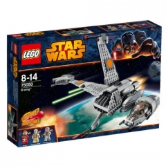
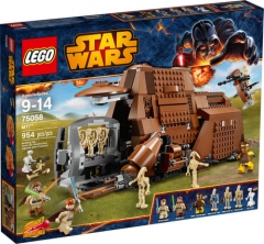
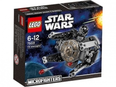
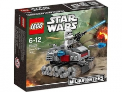
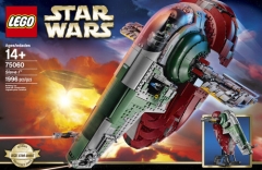
From the album: 2015 Star Wars sets
-
Everything about this entry is incredible. From the title over the story over the big picture over the details... Warning: this might be a long content I really like your present scene. It's not big, it doesn't have any insane details. But it just looks so good, with some very nice textures, shapes, and a couple of surprises. The concept of that hologram is fantastic. It really looks like the next stage in maps. It contrasts really well with the ancient map on the wall. It's good that you didn't show any pieces connecting the holograms to the table, which would be quite weird. Still, it might have been better if there were no studs at all, but something more projector-like. Covering all those studs with 1x1 round tiles might already work. And don't come saying you have none. I can almost literally see the microfighter MF in that table . I love your hexagonal door, although it might be a bit too high for a minifig. I don't see an easy fix. However, the shape of the door doesn't fit perfectly in the hole, and that can be easily fixed by adding a plate between the top and bottom slopes of the door. Then it would fit perfectly, giving your scene a more polished look. You could give the door more detail as well, but I wouldn't overdo it. Maybe you could replace the two columns of 1*1 bricks in the middle with a stack of 1*2 plates, so that the seems would make for some nice detailing for once. But overall I like the interesting textures on the walls, like those crates (offsetting them like that makes the technique new again), and on the floor, like those grill tiles. The wall with the maps could use some more diagrams etc to give it a clearer function. I massively enjoy the in-universe feel you always try to deliver. Having three walls here really gives it the enclosed look it needs. It's a bit of a pity you can see the top of those inverted slope bricks at the top, because they seem supposed to support the ceiling. Those tops could be cropped of the picture, or you could re purpose them as indirect lighting. As for the lighting, I very much like those transparent slopes near the floor with the light shining true (or reflecting of?) it. It doesn't really show well though, so reducing the ambient lighting would again improve the in-universe effect. It's brilliant that you pay attention to that kind of details though! A final tip for better photography would be to build your creations with the eye on photography, from a practical point of view. In the first picture, it shows that it is a tight shot. To give you more freedom, you could build removable walls. That way you could comfortably photograph each and every corner of the build. Having a room all around the scene would be quite unique... and it would make the in-universe feel perfect, so that we can experience your stories to the fullest! The past scene is the real star ( ) though! You've created something new, something never seen before. But it works perfectly. And the more I look at it, the more interesting references and details I pick up on. It's clear that you based Starman Jones on Indiana Jones, but setting it in a perfect Star Wars setting (After some reseach, it appears that Starman Jones is an actual hero from a '53 novel. Not linked to SW of course. Maybe a reference to your own youth?). I really like how you translated IJ's fear of snakes into this incredible dianoga. After some research, I can confirm that this is the first decent attempt at recreating a dianoga monster in Lego, and it turned out beautiful. It is really dynamic and very threatening. Forget about those snakes, here is something really scary. The mix of different tentacle/tail/elephant trunk parts make it very organic. You really made the perfect choice there. And great attention to detail for giving it exactly seven tentacles! It also goes really well with that architecture. It is the perfect representation of what scifi archaelogy might look like. I can't stop thinking of the Chamber of Secrets though, especially with that snaky monster. Yet, it captures something alien and ancient. Excellent use by those prefab skull pieces by the way. You actually succeeded in making them look magnificent, as they were made for this purpose and this purpose only. The high brow and the thin mouth go perfectly with it. I'm wondering, might it be based on Pau'ans? The only thing that seems a bit off, is the nose part. You could have filled it in, or added a vertical bar, just to bring the prefab piece to an even higher level. And while that dot in the center of the brow is unfortunate, there is nothing to be done about it... Everything else around the set itself is lovely as well. I love those hydraulics that power the dianoga. It looks very dynamic and very functional. Everything about the set looks functional! The walls are just clean hangar walls, but for once, I welcome that. The floor is covered with all kinds of utilities. There's the water dispenser, the cookie bowl, the camera, the wealth of chairs, the spotlights and the fantastic crashmat (those half cylinders leading to it really give the impression of it being filled with air, something I thought I'd never see recreated in Lego.). There's even that secondary set. And everyone who is there, has his reasons. The actors at rest, the medical crew, the sound recorders, the people in control of the camera's, monsters... even the repair mechanic is there! And there are even safety stripes... It's really incredible that you thought about every single piece of the set! I can't imagine how you went through all the equipment and crew needed to make your scene complete. Deep respect for going that far to give us a realistic scene. So amazing work! Unbelievable! Normally I'd say the walls are too blank, but right here it's better they are. The only thing that could still be added, would be some props for future scenes standing in a corner. And a fire extinguish. And honestly, those are the only things I can think of. Your scene is that comprehensive. Let me say it again: it is just perfect. Do we still have some time to talk about the story? Of course, because it is great. It starts of once again as a regular looking mission. I still think no one can write a dialogue as realistic as you do: I've come to a stage where I go "Oh, that's sooo typical something for Romeo to say...", without making them a caricature. You're truly gifted in creating real characters. And while the humor is never far off, this story takes a meaningful turn at the end. It might just be a couple of sentence, but they come with a lot of weight, enhanced by the past story and the title of course. I find it really well chosen. The idea of a action hero inspiring you to be a real hero is highly interesting. I love how you manage to capture the magic from your childhood and let it speak about your present life. It's a really unique choice of scenes, talking about a lot without using buckets of words (I know I'm guilty!). That's some true storytelling. And some marvelous building. How can this not be This is probably the twentieth time I say it, but absolutely stunning work! I can't wait to see what the future has in store!
-
Shadows of Nar Eurbrikka — Avenger (Imperial Headquarters)
BEAVeR replied to Brickdoctor's topic in Nar Eurbrikka Archive
I changed the title as you requested. -
That story... Totally unexpected, and yet, when your read it, so natural! That's true genius. And yet so typical you. You really are a great writer. And a great builder as well! Let's begin with the present scene. To be honest, your builds tend not to be, while good, unimpressive at first sight. I don't really know why though. Maybe it's the lack of contrast and color? Anyway, on closer inspection, I'm always overwhelmed by all the clever and beautiful things you put in there. I don't know if a lot of people noticed it, but that ceiling you have there is exquisite. It's so smooth... no antistuds whatsoever: that really helps to make us forget we're watching a LEGO creation and transport us into a sterile Imperial 'office'. I'm really glad you thought of that ceiling, as it gives your MOC that much extra quality. The inclusion of the lamps/smoke detectors ( ) is nice as well, although they might be a bit too close to each other. The layout of the building is interesting as well. You really have a lot of angles, giving the impression you have a pretty big building in such a tight space: well thought out! The ladder is a bit awkward in such an establishment, but the space didn't give you a lot of options. Remember though that such elements aren't really necessary, so if you can't make it work perfectly, you might just as well omit it and replace it with something more interesting (a security gate, for instance). And while the fact of having a ladder feels a bit weird, it's quite interesting: the way you made the top with those rounded railings really is quite inventive. It's so clear you make the most of the room you have. With that limited space, I also found it interesting that you chose to build another cell without ever mentioning it. I'm sure the person next to you will appear in some sequel though . The doors look pretty impressive though. It's nice to see you reused that technique from your Ep. V build, and I think it fits better here. Another thing I really like is that hexagonal hole in the wall on the second floor. You could just have built a plain wall there, but now it is more interesting and more logical. It gives you the opportunity for in-universe photography as well. I really like that you're trying to do that, but it isn't perfect yet. Photography-wise, there are some pictures that show a little border of the creation that could have easily been cropped off to distract us less. Build-wise, I would get rid of those single studs you use to hold your minifigs. You could easily replace them with regular tiles when they're not occupied. Getting rid of those funny bumps would increase the realism even further. I noticed there are a lot of big elements in your build. You have a lot of long horizontal lines going on, and a lot of plain walls. So to make your buildings more interesting, you could consider adding in some vertical elements here and there, to break it up more. They don't have to be prominent, as that would create chaotic detailing, but they could be very subtle. You could use the inside of panel pieces, for instance, to get some nice ridges. Or you could consciously put the tile-ridge to good use. These elements give everything some more texture, and they help to give the impression that the entire build is to scale with the minifig (in real life, there are quite some details too, you can't depict all of them of course, but to make your creations more believable, try making the environment look more complex, even if it is an Imperial office). And more of those fancy chairs and fountains please . Don't be afraid to decorate a place that is supposed to be simple: if you have a corridor with not a single object/door in it, then what is that corridor for? And that was only the present scene! I like it as well. Again, it has some interesting features. Using apples as crop, for example is very inspired! The road is very nice as well, and I see what effect you were going for. But... right now, it all looks like loose dirt. That doesn't occur very much, and would never get on a road like that without anyone removing it. I think vegetation would have looked better. I've seldom seen a tree grow in plain ground as well. There are always other plants nearby. And if you don't have enough plant pieces, consider the following option: since the trees are supposed to be cultivated, depict them like that. There could be a border around each one, maybe with some monitoring equipment. That would give more of a scifi feel to your rural build. The trees themselves look quite sparse to be of practical value though. And they can't be young, given their thick trunks. You could use plain plates as foliage as well. The tractor itself is quite nice: it brings some more color to the scene. If possible, it might be better to avoid all grey whatsoever though, as it would stand out even more. While it looks cute, I'm missing the function a bit. That smokestack for instance... the key to making a new vehicle is to make it feel familiar, but still make it look functional. It's good to mimic our tractors, but only if you give it a new twist and make it look plausible. So that smokestack could be assigned a different function: maybe it contains an array of sensors. And you already have repulsors, now you need something that specifically looks like it can do something agriculturally. I can only say: be creative! Furthermore, it would help if you didn't put the tractor at the edge of the scene, but in the middle. Then you get a before and after effect, and can see what it does. Because now, it only looks as if it will crush the crops. The thing with these comments is that I always sound like nothing is good to me. I hope that by now you've experienced that is not true. Just to say that road is awesome, and that I really like the poles separating the road from the field. I already said how much I like the story. Not (exclusively) because you end up in prison, but also because of the interesting symbolism. The focusing crystal is an interesting choice. To me, it shows that you can no longer be as random as a blaster. No, you're like the more elegant, more efficient lightsaber. A weapon mainly used to defend. A weapon used by the peacekeepers of all time, the jedi. Amazing parallels you're drawing there! Then can even the small plot holes be overlooked (like why Josh even signed up under his own name, and the Imperials are actually counting on that). I'm really excited for the continuation! And in the meantime, don't be sad to be in prison. You're not alone. Who knows, you might even meet me there...
-
I can hear them. In the distance, the group of Rebels that shot us out of the sky and forced us into this gorge. It’s quite beautiful here, but something gruesome is about to happen. We don’t have a lot of time. “They have a laser cannon with them. I bet that was what shot us out of the sky. It slows them down though. They won’t attack until they have its support here.” [soNE Ep. VII] What you can't do by Bert.VR, on Flickr “I can take out those troops, but I won’t stand a chance with that cannon here. They will just shoot and make us an icy grave. Someone needs to take it out. Someone needs to find a way around that armour.” I already feel what’s coming. I’m the only one with a precision blaster. I’m the only one who knows how to handle it. “Tyrus and I will stay here. I’ll try to get those troops to leave the safety of the cannon. The bends in this gorge will prevent that cannon from shooting from a distance, so they’ll be without cover. Even though they’re Rebels, they’re not stupid, I guess. So they won’t go too far ahead. It only spreads their attack out, and what’s more, it will draw their attention. But whatever you do, officer VeR, stay low when you hide in the top floor of that building there. Wait until you get a clear shot at the gunner. You won’t get a second chance. And shoot before they do. That’s our only chance of survival. Now quickly, take your position. Tyrus, you stay here with me. Let’s give them a surprise.” It’s clear how agent An rose through the ranks so quickly. I can’t see a better way to save ourselves. But I have to do it. I have to pull the trigger. If I don’t, we’re dead. I have to do it. No time for compassion, no time for reason. What a beautiful building. I can see a haunting glow coming through the hallway, but that’s not the way I have to take. The ancient stairs take me to the place where it’ll have to become thirteen. Just as I squeeze myself into a dark corner with a good view of the bridge, agent An makes eye contact and starts shouting, starts shooting. And hides. [soNE Ep. VII] No time for architecture by Bert.VR, on Flickr The shouting grows louder, and a Rebel appears from around the corner. It’s the first time I actually see a Rebel trooper. I only took out fighters. He could be one of my comrades. But he isn’t. He wants to kil lus, and so do the other Rebels that start crossing the gap to examine the shouting. Soon, they will be no more. Agent An prepares to take them out. I can just wait, watch and shiver. There’s nothing I can do. Nothing I can do to avoid the killing. Nothing I can do to stop this war. Now, I can only do what I need to do to survive. The cannon is here. [soNE Ep. VII] It's what I can't do that makes me who I am by Bert.VR, on Flickr I have to do it. But can I do it? The shot is possible, especially with this particular blaster… A blaster that once was thrown away to save a life. A blaster that was used to talk about bravery in battle. A blaster that was given to me to be brave. To take this one shot. It was an object of battle, but the acts of a very special person made it an object of love. But that’s not how people saw it. That’s not how my parents saw it. That’s as I can’t see it right now. It has to become an object of horror once again. My finger is around the trigger. If I shoot, my shot will only make two victims. The Rebel will die, a part of me will die, for the thirteenth time. If I don’t shoot, my comrades will be killed. I will, eventually, be killed. One against three. It can’t be clearer. Do it. Make it thirteen. It won’t stay with one dead Rebel. The thought resonates through my head. If I shoot, not only the one Rebel I hit will be killed. Not only the others will be killed by my comrades. Hundreds, thousands, millions will die. If I kill, it will be yet another death in the long, interrupted chain of killings in this terrible war. It will hit the next homino and war will keep raging, the horrible killing will continue. Who knows where it’ll end. Don’t do it. Don’t make it yet another million. If I shoot, I’ll lose all hope of ever defeating war. It can’t be vanquished by always more killing and killing. It can only be vanquished by throwing away this blaster. If I shoot, no matter what someone will get killed and war will have yet another victory. And if I don’t… There’s an overwhelming chance I might die and war will have yet another victory. But if those Rebels decide not to shoot as well… If we, by some kind of beautiful Force, would now decide to throw our weapons down, war would be defeated. It can’t be clearer. If I shoot, I will lose all hope. If I don’t, I might lose my life. If I do, I will lose all hope. I’ll destroy everyone else’s hope that this war might come to a peaceful end, that all wars might come to an end right here, right now. It has never been so clear. It’s what I can’t do that makes me who I am. I can’t pull this trigger. But that gives me so much more power than someone who can. Finally, after months of ‘training’, of dedicating myself to this cause, I can’t kill. It’s something that a lot of people never learn. Everyone’s always busy to learn to do new things. No one ever wonders what they have to learn not to do. But I did. And there’s a minuscule chance it might stop this war. With what we can’t do, we can change the world. My thoughts never rushed so quickly as in this moment. And yet, I’ve never felt more enlightened. In these buildings, made by a civilization I believe was captured by that same light. Yes, that’s what these buildings were made for. But now, they’re going to be destroyed. The cannon still hasn’t fired. I wonder… But the gunner has his finger around the trigger. But I have hope. I’m prepared to die, because if I don’t, the world will be a very different place. [soNE Ep. VII] How to survive by Bert.VR, on Flickr __________________________ This blaster has become a symbol of love and hope once again. I called Alderaan my home. It’s where I was raised. It’s where my parents were raised. It’s where my great-granduncle threw this blaster away. To many people, Alderaan is the most peaceful planet possible. But not entirely. People of my planet always had that sense for opposition somewhere inside them. It’s one of the reasons they were the only ones to stand against this Empire, to no avail. That opposition was especially strong in my family. For generations, we stood against the rule of Alderaan. The reason why didn’t matter much. There’s always a fault to be found. There’s always the need for someone going in against the tide. That’s what my family stood for. That’s what they took up the weapons. Almost exactly a hundred years ago, the conflict culminated, and there were several coordinated attacks on the existing rule. They might have had their reasons, but that’s not of importance. Two brothers, my great-granduncles, fought in the army the opposition formed at the time. The resistance against the cruel acts of the opposition grew and grew, and a civil war broke out. The attacks grew more and more violent, more and more people died, and conflict without near end began. Both camps dug their selves in, with the occasional raid boosting the number of casualties. And in this conflict, the two brothers remained as close as two brothers can be. They looked after each other. When the oldest returned after a raid, only to found his brother hadn’t, it became apparent that they loved each other more than they hated the enemy. Ignoring the orders of his superiors, he threw his blaster away and ran back to the battlefield, to find his dear brother. War didn’t bother him, he only cared about his brother. He was killed, and found with the dead body of his brother in his arms. [soNE Ep. VII] Past - No blaster, no bravery by Bert.VR, on Flickr This story has been told countless times in my family, but not quite in this version. The only thing that mattered, was the bravery of the brother. Without fear of the enemy, he returned to the battlefield, even when it was not his to fight on. His blaster became the ultimate symbol of his bravery. It was passed on in my family. Until was passed on to me. The brother had no fear of the enemy. My family said because of his total hate for his enemy. I say because of the total love for his brother. I always opposed my family. But they only encouraged it. Opposition is key, they said. They didn’t see I wasn’t opposing what they stood for. I was defending what I think was right. The blaster came to me, and they got me a post in the Imperial army. It would give me the opportunity to oppose the opposition to the established order, what I liked to do according to them. I had nothing to say in it. And since everyone on Alderaan is gone, I had no place to go to, nothing else to do. But now I do, no longer armed with this blaster. It has become a symbol of love and hope once again. _______________________ Well, take a deep breath, that was it. I hope you enjoyed the story and please spare it some thoughts. Let me know what you think. This was built in quite a hurry, with the festivities and the exams. Because of that, the past scene isn't nearly finished. There should be more buildings in the background, and a more elaborate dropship. I hope you can see beyond those failures though, and enjoy what's there. This build and this story is a collaboration with fellow Imperials Lord Tyrus and goatman461. Thank you guys for all the inspiration! I hope there is still a lot to come. If you still can read, check out their topics here: Stranded, by Lord Tyrus (prequel to this story) War Hammer, by goatman461 (happening simultaneously with this story) Rescue Mission, by Commander Beltar (giving a glimpse how this story continues...) And to finish, as always, the LXF file is availble through this link. PS: the story of the two brothers is based on actual events. A hundred years ago, in the First World War, mygreat-granduncles, the Van Raemdonck brothers, went through a simular tragedy. Their act of love is used as a symbol of the Flemish movement to this day. So you see: my stories don't just belong to a galaxy far far away. I hope this is a proper tribute to them. Learn more about them on Wikipedia, and this page has a nice picture, and if you translate it, the whole story. PPS: here is a short version for everyone who has little time or trouble with English:
-
Yay, quick points! Oh, right, I have to enter first... Anyway, I hope the Rebels come with a big blitz of MOCs in the very last minute. It gives us something to blog. And don't worry, my comments will come. I just don't want the Rebels to get extra points due to my feedback . Still, I really hope to see some awesome last minute entries!
-
Good Knot Techniques for LEGO Strings and Threads
BEAVeR replied to The Deleter's topic in General LEGO Discussion
Interesting, that after SNOT techniques, we're discussing KNOT techniques . I'm quite traumatized by all the knots in my beautiful Lego strings, so I've learnt to avoid them. Because to attach a string, you don't necessarily have to tie a knot. Usually, I just wedge the string between two bricks/plates. Or put it through a Technic brick and insert a peg in it. It works beautifully: my yellow monkey never discovered the way gravity works. And what's more: you don't have to remove knots afterwards. Agreed, sometimes, the string gets damaged a bit, but it's still better than having a naughty knot in it, so I stick with the 'technique'. I'm curious to see what the knot experts have to say though! -
Magnifique! That truly is an impressive recreation of the Dôme des Invalides! Although it seems you had some tougher nuts to crack (like that dome that turned out fantastically), I'm glad I improved the design to make it buildable and useful for you. I see you made some slight modifications to the arrangement of the tri-axles. Any particular reasons for that change? Congratulations once again with your project, et merci pour le démonstrer ici!
-
Digital tools for tablets
BEAVeR replied to DrJB's topic in Digital LEGO: Tools, Techniques, and Projects
Instead of trying to find a specialised program to view digital Lego models on the tablet, you can use a more generic approach: you can use your tablet as remote control for your computer. This way, your ablet can do anything your computer can do, without the need for a lot of software. The constraints are that you have acces to the internet and that your computer is powered and has the corresponding program on it. The leading application in this field of remote computing is Teamviewer. It's very easy to use and has hi functionality. The drawback of working over your network is that the refresh rate of the image on the tablet can be a bit low, as well as the quality of he images. I haven't tested it for LDD and the like, but I had a great experience running some LabVIEW programs. -
I'm humbled by your words. Thank you very much for sharing your ideas! That's a big compliment, goatman461! I've explained how difficult building it might be, but if I only can give you some inspiration, that's a victory. Feel free to curse me . I didn't really build this vehicle to be exactly on minifig scale, but somehow it turned out to be very close, as illustrated by the following picture: I think this is quite good! There are some problems however... Thank you very much for your time and effort to make such an insightful and nuanced comment, really appreciated! Your points are completely valid. Except if there is some kind of magical balance in the model, the ball joints won't hold. They can be supported by an external stand, or some blocking elements could be inserted, or the connection could be replaced with 2D hinges. I went for the ball joints however, to allow maximum poseablility and realism, as I said my objectives were. That 3L (just round BTW) bar is a weak point as well, but that might still be okay when there is only axial force. Of course my model wasn't designed to be playable, but I get your point. Again, this illustrates the compromises I had to make. Someone more skilled then i will have to make the ultimate AT-ST I guess. You gave them some good tips! And in the meantime, I'm very glad you can still appreciate my flawed model. Thanks, and of course I can share it. I didn't include a link to the LDD file because it is pretty pointless to try to build it, given its obvious limitations. But please, prove me wrong (I'm not going to build it myself, with no experience in painting parts and not much LEGO budget to begin with...), so here you have a link to the LXF file. Thanks a lot for the feedbak! The shape still has its flaws, with the back portion not being vertical, but I'm glad you appreciate the work I put into getting the shape right. The hip section was the most fun to build: it has a lot of interesting details to it, but they aren't too obvious so that you can't really screw up. So it gave me a lot of opportunity to experiment, resulting in things like the bed wheels in the back. And sadly no, I'm not planning to build it in the near future (or build anything as a matter of fact). Life's still to hectic for me to spend a lot of time gathering bricks. I'm honored to see that my MOC was worthy of your pen, Lobot! Glad you like it. I included the slain Ewok especially to make things right for you after my debacle in SoNE V . Thanks for the very helpful comment, TWP! I tried to do this apart from SoNE to give the first place completely to the build, and not bother about telling a story but doing something more about presentation as well. I'm glad you like the effect. I'm certainly planning to do more of these creations in the future, but don't hold your breath. About those angles, I had the same thoughts when building the model. I tried to follow the design as good as possible, but the source material is pretty limited on certain angles, and my overall impression was rather surprising to me. I tired to translate those proportions in the brick, but I guess I rounded off in the wrong direction or something like that. Proportions are still my biggest point of improvement, so I'll keep practicing, and I hope you like the results! And don't worry: it's this kind of feedback I really appreciate. And I know the feeling after giving a comment that it sounded too harsh while I really like the model. Of course I can't say you feel exactly the same, but let me tell you that you don't need to feel bad, quite on the contrary! If you really want to feel safe, go ahead and build that AT-ST! I'm anxious to see it... And who said I don't live in the French speaking part of Belgium (for the people who do not speak Dutch like we do, "De beste stuurlui staan aan wal" means that the people who think they know it better always are the ones without experience) That's an impressive creation (and render) for the time! It's good to have some feedback from someone with the same experience. I'm glad you appreciate the effort needed to make those legs what they are! Again thanks a lot everyone for your precious feedback! I hope they will result in my next creation being better. Know that you are all builders on my creations as well.
-
[SoNE Freebuild 15] Fixing to Clear the Mind
BEAVeR replied to MKJoshA's topic in Nar Eurbrikka Archive
Let's say my extremely late comment is due to the fact that I need to process all of this... yes, that sounds good. While that isn't entirely true, I certainly was very impressed with the story you created. More on that later. Let's talk about the build first. I said it multiple times, and it stays true every time, but your builds just keep improving. In overall layout, this build isn't spectacular. For that it needs more interesting shapes and angles, e.g. in the wall. But still, you manage to really divide the two scenes, without totally breaking them apart. That wall is pretty clever, with ornaments and streetlights at one side, and greebles at the other. I'm not a big fan of those transparent pieces in the windows though. They give a weird effect, and it looks like it isn't wanted. If you want to have an extra effect, make it look more intentional, e.g. by replacing the transparent bricks with plates, or adding a single transparent plate between every two bricks to give it more intentional texture. You could also make it more interesting by offsetting the bricks so that the window recesses. Alternatively, you could forget about that transparency altogether and leave a clean hole. If you blur the visible background, the effect might even be better, especially if you invest in more interesting windows. Simple details could do, like bars in front of the windows. You illustrated this perfectly in other parts of your build: I'm terribly fond of that sewer grate in the street scene! All details to make it more interesting! Same goes for the nice stool. The workshop itself is quite nice, with those really good greebles: you embracing that horizontal grate pattern all over the build is rather remarkable. Still, it looks a bit sterile. There is no real place for tools or spare parts, and for vegetating for weeks, you've kept your corner extraordinarily clean. A nice idea would be to have a 'clean' workshop, but with all junk just swiped together in a corner, in a vain attempt to clean the place. Finally, keep in mind that everything needs to look like a real life object, so in principle pipes should connect to something. You could also have some 'decorations' here and there, as it is a place people tend to stay there a lot. So maybe you could loosen up the grey a bit (which you did with the speeder, but could also happen to the building itself) (on a side note, I've noticed you use light grey a lot. This tends to give it a bland look in my eyes. Maybe you could choose something else as a base color next time. How about dark grey walls and light grey greebles? That would be more original. If you don't have enough bricks in a certain color, you could always increase those areas of greelbes etc, as long as you give the impression the base has that particular color). The speeder is nice. I like the bold color choice: perfect for such a vehicle. The subtle greebles are nice, but still there are some elements that seem like they don't belong there. Those front cylinders are an example: those studs seem off. Again, you could just embrace them and add some plates. Or you could rotate them to make them more prominent, but in a good way. Or add square plates in between them. Whenever it looks like you just have to live with some 'artifact' of the system, try to find ways to make it another detail. After a while, you'll find yourself looking at the bricks in a completely different way. A small nitpick about the speeder is the fact that the studs are exposed for the minifigs to sit on: great for swooshing around, not great for looking at. I do want to say that that front looks incredibly awesome though! You really thought out of system there, resulting in a neat, 'new' combination, giving the speeder its own character: well done! The story gives this creation a whole new dimension though that a lot of other creations seem to miss. I really like how your character isn't Mr. Perfect, and needs time to think about what happened. And even better, you slide into an eternal circle of thinking all kinds of different things that all look correct. I love how you portrayed that circle in so little words: excellent piece of writing there! It's also perfectly in sync with that awesome picture of your minifig there (you should try more of that low perspective photography, as it makes everything so much more realistic and relatable). And then there's that lovely piece of symbolism there, with you fixing the speeder to get back up to speed with your life, with the impulse of your friend. It's really about you trying to take off again, apparently the same person but with new parts. And all of that while the hustle of daily live goes on at the other side of the wall. The more I think about it, the more beautiful the story gets. Please keep giving us such beautiful gems, of building, storytelling and symbolism! You dared to take the jump of switching sides, and I'm happy that you did, because now the possibilities for your stories are really endless. And I have no doubt you will succeed in bringing the best of them. Good luck! -
I've always had the ambition to make a model worthy of the iconic designs from the Star Wars saga. I don't know how I ended up building an AT-ST some months ago, but it might have something to do with my adoration of marshal banana's and Brickdoctor's masterpieces. I hope this MOC is a worthy tribute. This model is built entirely in Lego Digital Designer, and that has had its consequences. Firstly, I couldn't use illegal (or just complex) connections, which resulted in some strange decisions (I still think tiles would have been better for eyelids. For the same reason, I couldn't get a cockpit interior. The connections needed to achieve that would take a ridiculous amount of aligning pieces...). The second consequence is even more important: I couldn't test the stability of the creation. So I could have spent a lot of time thinking this or that connection would be stronger, but unfortunately I couldn't experiment. Therefor, I stopped trying to make it super stable and concentrated on different aspects. This doesn't mean I took care to avoid the connections that are obviously weak, but I can give no guarantees whatsoever the model will hold (I give it 10% max). I used that time to focus on detail and realism. I tried to follow the original model as accurately as I deemed possible, and took care to avoid studs and axle holes to give it a more realistic look. I guess this is the most studless AT-ST MOC ever made... Also, I tried to include the same amount of points of articulation as in the original model, except in the feet, that certainly wouldn't allow a freedom under such load. Finally, I didn't build this model with Bricklink's catalog next to me, giving me a lot of freedom. The result is that not all parts of this model are available though. I'm sorry that it will remain a digital model. My real objective was to make something like "the ultimate AT-ST MOC". Now I realise there is no such creation, but every creation has its flaws and its strengths. I hope you can still appreciate it. So here are the pictures [MOC] AT-ST by Bert.VR, on Flickr When I had finished the model, I couldn't resist adding a small scene very much in the spirit of marshal banana's creation. I hope you like my try at the Ewok glider. [MOC] AT-ST - from all angles by Bert.VR, on Flickr Here are some 'technical views' to give you an idea about the proportions. I really like how most shapes turned out, but in the end the 'butt' is sticking out a bit too much for my taste. Still, I think it looks great from every angle. [MOC] AT-ST - Join the Empire! by Bert.VR, on Flickr This shot ended up being way more dramatic than intended, but I really like it. It gives you a closer look at the head and shows the details I added on the underside. There aren't a whole lot of very greebly areas on the model, so most of them you can see here. There aren't really any extraordinary parts usages in there, but I tried to mimic the details as good as possible [MOC] AT-ST - glider perspective by Bert.VR, on Flickr Another limitation was that I couldn't use flexible parts. These railings could have benefited from it. The same goes for some piping on the back. But anyway, here you can see how the head comes together. I like how the seams are minimal (not an easy feat in LDD!). I'm also quite proud of the solution I found for the side cannon. You wouldn't believe how many iterations I went through to arrive at this! [MOC] AT-ST - the rear by Bert.VR, on Flickr I guess every model has that one area where the structural elements shine through, making it a bit more ugly from that perspective. This is that angle. I also had to do a lot of fishy connections to cover it all up, especially with the connections of those decorative panels. Shifting to the lower section, I'm really glad with those exhausts. I couldn't use cheese slope mosaics, but a very accidental click led me to these brancard wheel pieces, and they just snapped perfectly into place. [MOC] AT-ST - who needs stable legs? by Bert.VR, on Flickr I spent a lot of time just to get the curved section at the front of the legs. I got the shape right, but the Technic holes aren't pretty. Still, this was the best thing I could come up with. Same goes for the feet: very tricky. The original model has a nice curved shape, and the only part that can match it has to be one of the cockpit pieces. That one had impossible connection points though, so I stuck to this solution. This isn't supposed to be all complaining of course. I had a blast building this model, and I hope you see it. With my comments, I tried to give the model some more nuance for you. I'd love to hear what your comments are! __________________ LXF File available here
-
EB Xmas Raffle 2014 - Your Ideal Christmas Gift entry thread
BEAVeR replied to CopMike's topic in Special LEGO Themes
[MOC] All I want for Christmas... by Bert.VR, on Flickr It seems I'm not the only one who would like this present. But that's okay. I don't mind sharing it. Thanks again, Copmike and your Christmas elves! -
From the album: 2014 Star Wars sets
-
Pictures for the first page of the Star Wars 2014 Pictures and Rumors thread.
-
-
From the album: 2014 Star Wars sets
-
FanWelt 2014 Köln / Fan World 2014 Cologne
BEAVeR replied to Strikeman's topic in LEGO Events and User Groups
I'll be visiting on saturday. I'm looking forward to all of the creations, and hope to meet some Eurobrickers! -
Shadows of Nar Eurbrikka — Introduction and Discussion
BEAVeR replied to Brickdoctor's topic in Nar Eurbrikka Archive
If more people want to have some hologram effects in their creations, I just made a tutorial about how to do them. I hope it can help you to expand your stories! -
Sometimes the pictures of your creation don’t quite convey the feeling you’re aiming at. That’s when your picture editor becomes your best friend. You can use it to enhance the colors of your picture, get rid of hard shadows, install a new background, or add some special effect. It can be too much, but if you do it right, your picture will be more vivid, it well tell a story. One special effect that is particularly handy for Star Wars fans is placing a hologram in your picture, and that’s what I’ll be trying to teach you today. 1. Taking a picture Picture editing already starts when you take the picture. You have to take it so that it is fit for what you’ll try to edit in. In this case, you might consider shooting the backdrop and the minifig (or whatever object you want to make a hologram of) separately. This is because you’ll want to select the minifig quite easily later on. This will be more easy if you have a monochrome background with high contrast with the minifig. These separate pictures also have the advantage that you have the area of the background that will be behind the minifig as well, so that you can play with transparency later on. If it’s impossible to separate the shots (because the minifig is interacting with the environment), you can always shoot the background with and without the minifig, from exactly the same camera angle, or just leave it at one picture if you don’t want the extra effects and are willing to spend some more time on it all. 2. Importing the picture in GIMP Apart from a picture, you’ll need a picture editor. The professional software is known to be insanely expensive, but luckily there are some great free, open source editors out there. I recommend using GIMP, as it is widely supported. You can download it here for free. Once you’ve got the software up and running, you have to import the picture in GIMP. You can do this by going to File -> Open, or if you found a picture on the internet you want to experiment on, to Edit -> Paste As -> New Image. I’ll be using a picture of a Darth Vader minifig I found on the internet. 3. Preparing the picture You’ll need to work on the minifig alone, without disturbing the background if you have one. If you don’t have one, you’ll want a transparent background to paste the hologram seamlessly in some environment. Anyway, you’ll need to delete the background (if you’re working on a picture with a background you want to keep, duplicate the layer first). You can do this right clicking on the layer of your image (in the box on the right), and selecting “Add Alpha Channel”. Then you can use a combination of the magic wand tool and the free select tool. There are a lot of tips on background removal on the internet if you’re not quite confident. When you have the picture of the minifig without anything else (the checkered background indicates that it is transparent), duplicate the layer once. You can do this by clicking on the icon with the two windows at the bottom of the layers box. 4. Coloring the image The first real step in the making of the hologram, is giving it its typical blue color. You can use the colorise tool for this. The disadvantage is that it every color will have the same hue. So everything will be blue, while you can see there are some slight color variations in the ‘real’ Star Wars holograms. To fix this, you can set the transparency of the topmost layer to about 75 percent first. This will allow the colors to shimer through a bit. Then, go to Colours -> Colorise. You will get a dialog box that lets you play around with the hue, lightness and contrast of the picture. You can play around with it to get the best colors. Hit the OK button when you’re finished. 5. Adding the stripes Probably one of the most iconic features of the hologram are its horizontal stripes. There are several ways to accomplish them with filters or patterns, but I find gradients the easiest to use as they allow for total control of the size. To apply them, you first have to indicate the area they need to fill. To go to the topmost layer, right click and select “Alpha to selection”. This will select everything that is opaque in the picture, so that you certainly won’t miss any spots. Then, create a new layer by clicking on the white page icon at the bottom left of the layers dialog. Next, double click on your gradient tool. A tool options menu should pop up. Your colors are by default set to black and white, and this is exactly what we want. Leave all the setting unchanged, apart from the one that says “Repeat:”. Set it to “Triangular Wave”, so that the gradient will keep repeating itself in exactly the pattern we want. With your selection still active, hold control/command and drag your mouse straight up for a short distance (the ctrl will make sure the line is perfectly vertical, as we don’t want tilted stripes). The length of your stroke will determine the width of the stripes. Experiment until you’re happy with your stripes. Now your image should look like some bar code. To convey this texture to the underlying image, return to your layer dialog and set the mode (in the box at the very top) to overlay. You can also adjust the opacity to your liking. 6. Giving it the glow To add to the feeling of projected light, your hologram still needs a glow. Repeat the first few steps of the previous section to create a new layer and a selection of the minifig. The layer should go at the bottom of your minifig layers. Next, go to Select -> Grow. Here you can fill in the amount of pixels you want the selection to grow in every direction. This amount is different for every image size, but you don’t want to go too big. Here, I went with an expansion of 20 px in both directions. With this selection active on the new layer, click on the black rectangle that is probably your foreground color. Set it to a color close to the hologram. You can do this by using the color bars, or clicking on the color picker icon at the right hand side. Choose one of the lighter colors in your image. (excuse me for the stretched picture, I don't know what's going on here) Then select the bucket tool and fill in the selected area. You will see a crisp colored outline around your figure. To make it glow more, go to Filters -> Blur -> Gaussian Blur. Select the amount you want to blur, and hit OK. 7. Finishing the picture You can end here and put the picture against your background. If you want to make it a bit transparent, select the topmost layer, right click and select “Merge Down”. This will unify it with the layer below. Continue the process until you’ve had all the minifig layers. Then you can just play with the opacity of the unified layer to make it work with the background. You can also delve deeper into the filters and add some more noise to the picture etc, but I don’t find that necessary. When you’re satisfied with your hologram, you can export it as an image, and you’re done. The final result could look something like this (but hopefully better) That’s it! I hope you enjoyed it and learnt something to make your creations even better. If there are any questions, I will be very happy to answer them!
-
[MOC] The GHOST from Star Wars: Rebels
BEAVeR replied to DarthTwoShedsJackson's topic in LEGO Star Wars
Brilliant work, DarhtTwoShedsJackson! You should build yourself some more big models! This model has everything. It has a beautiful exterior, with a wonderful shape and a very unique way of detailing, and it has a nice interior as well. I love how your brought out the complex shape of the ship, employing all kinds of tricky techniques (like angling those angle plates...). It's really well done, and it looks just as sturdy as the 'real' ship. The low amount of gaps is quite an achievement as well. And it's fantastic what you did with the bottom half of the ship: I appreciate that you take every angle into account. You really brought out the bulky shape there, and although it isn't in minifig scale, it still looks very imposing. Part of that might be from the detailing you did. There aren't any greebles on this ship, but still you succeeded in making it interesting, with all the decorations and patterns, that don't look redundant at all. Your use of color is very tasteful, and I wonder if the ship would even look so much better in SNOT... Maybe if you broke up the expanses of studs a bit more with some tiles here and there, it would already get some more realistic texture. There really isn't a lot that can be improved, and still you treat us on these delicious updates. Maybe in a future one, could you make the transition between the Ghost and the Phantom a bit more smooth, because now we have a rather sharp edge there, contrasting with the very 'smooth' build outside of it. I'm also not too sure about the docking hatches. They seem a bit small and lack their cone shape. You could use wheel parts to make that section better. Same goes for the area surrounding the turret. It's quite blocky now at the front, not smooth and curved like on the original model. A windscreen like 62360 might do a good job there, being exactly the right size and shape. And I wonder if there's no way to make the front cockpit better... that would require some serious brick magic. Maybe those little points would bring this MOC even closer to perfection, as you've already brought it very close to it. This really is the Rebels UCS set that will likely never be made. But thanks to you, we don't have to be unhappy about that, because we have your amazing model to look at. Keep those amazing models (and improvements!) coming! -
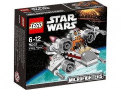
From the album: 2015 Star Wars sets
-
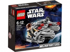
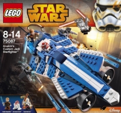
From the album: 2015 Star Wars sets
-
From the album: 2015 Star Wars sets
-
From the album: 2015 Star Wars sets