
BEAVeR
-
Posts
1,384 -
Joined
-
Last visited
Content Type
Profiles
Forums
Gallery
Everything posted by BEAVeR
-
That rule about not posting the creations somewhere else first is intended to prevent people from rehashing old builds. So don't get wind up in details: it's okay if you didn't post this creation already before this contest started. I hope that clears things up.
-
[MOC] Minifigure Scale Rebels Phantom with base
BEAVeR replied to goatman461's topic in LEGO Star Wars
Awesome creation, goatman461. You really managed to create an iconic scene, instead of just recreating one. It's amazing how it already seems that you have made the definitive Phantom. You immediately forget TLG's version. This one is just so much more beautiful... and big. Not only does it stand up fantastically against its source material, but also does it look like a very fine model from all sides. Great how you've also given the bottom a distinct look, completely in the character of the the ship. And you did great to give some more subtle textures, e.g. with those rail bricks. However the ship doesn't tell me it has been used quite a lot. I would have loved to see some more variation in color. this would have been a great occasion to get your yellowed and old grey bricks to give it some wear and tear. Also that splash of yellow on the 'cheek' of the model could have helped. And here and there some inset tiles to give it some more seams might have done it good as well. The more I look at it and compare it to the source material, the more I'm flabbergasted by how much of the ship you could incorporate (including a full interior!). However, the most important thing, the overall look and feel of the model might be a tiny bit off. The Phantom is already quite a chunky ship, and yours seem to exaggerate that even more to some extent. The 'cheekbones' on your version seem a tad to wide, but it's mostly the cockpit that does it, because it doesn't get less wide in the direction of the front. I don't think there exists a better solution than yours though, unless you would create a brick built one, but that might take a bit of the realism of your ship away. Well, experimenting is the message! My biggest advice for this model would be to smooth it all up though. You have a lot of edges where slopes meet, that shouldn't be there. It will require a serious effort to eliminate these small bumps, but if you can get rid of them, your build will look much more professional (because people don't immediately see what parts they're looking at, they stay interested and appreciate your skills even more), and your ship will look more authentic. Combine this with creating extra ridges and seams where appropriate, and you'll have an awesome model. But don't forget to present it properly then... It's pretty hard to appreciate it fully on its side, somehow. The base is really sweet. Somehow the running in circles idea seems wildly appropriate for the show. For some strange reason I exceedingly like those little pads supporting the base... The greebles make it more interesting to look at, although I have the feeling the negative spaces in between them are still too large. Sure, negative space tells a story of its own, but if you use it more sparsely, it will have more effect. you should use it to bring structure in the sea of greebles, dividing it in clusters. But it should still look efficient enough. The phoenix logo on top is just fabulous. The blockiness actually actually corresponds pretty well to the nature of graffiti, and the variation in color is a nice touch, although it only strengthens the colorlessness (in terms of monochrome variation) of the ship. All in all another superb build. I'm pretty sure your fellow LUG members will have a hard time winning that contest! Good luck! -
Ideally, of course, all bets should comply with the rules, so we're talking about an exception here. However, I understand that it's very hard to discuss the bets in group now so close to the deadline, therefore I'll accept posts with here and there an error, as long as it's somewhat clear to me how to post your bets according to the rules. I try to do this as well as possible, but please don't come complaining afterwards, as the errors are your responsibility.
-
The podrace is taking place very soon! You have untill 12:00 GMT (for reference, right now it's 20:05 GMT) to post your builds! If you still want to change the bets, you have to to it fast and take the people who've already posted into account: they can't switch places! So let the tension mount and the podrace (almost) begin!
-
Dear members of the Rebel Alliance, I'm sorry to announce the latest bet you placed is not compliant with the rules. In your previous ranking, you placed MontyPython above goatman461. Both have posted their builds before you placed your new bets, in which goatman461 comes above Monty Python. So two players that have already posted their build change places. This is against the rules. For now, I'll just place MontyPython above goatman461 while I take your other bets. It's up to you to decide where both players end up now, as long as players who've already posted don't swap places. So act quickly!
-
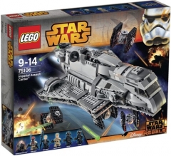
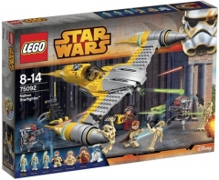
From the album: 2015 Star Wars sets
-
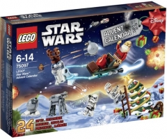
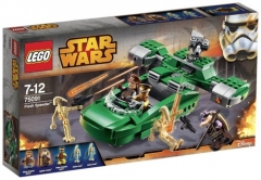
From the album: 2015 Star Wars sets
-
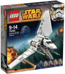
From the album: 2015 Star Wars sets
-
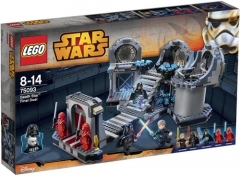
From the album: 2015 Star Wars sets
-
From the album: 2015 Star Wars sets
-
From the album: 2015 Star Wars sets
-
Updated the rankings. Dear members of the Rebel Alliance, I did not include Jakorin Swiftsword and Graham Gidman in your predictions, because they already posted their entries before you submitted your list. Therefor, they couldn't be added to your list. Your loosing valuable points here, so take care to coordinate your posting and betting! The Imperials changed their ranking a bit, but Jakorin Swiftsword and Graham Gidman didn't change positions in the ranking, so that's allowed.
-
Glad you like the feedback. I will attempt to clarify where you asked I agree, you can't show those dreadful studs! In the solution I suggested, you'd replicate the shape of the panels with a couple of stacked 1x2s and a 1x2 cheese grate slope (the one you mentioned), so that it looks right when you view it from the side. So it would be necessary to place it at it's side in the torso, preferably with an inset to make it subtle. This would be very difficult. It just occurred to me that instead of 2x2 tiles, you could use a traffic panel, like the octagonal one, or even the round one (you know, those half-plate thick pieces with a clip at the back). You're right about piece 61408. As for the v-shape. Have a good look at C-3PO's pelvis. In the center, right under the tubes of the waist, it bends down a little, creating a v-shape. You already recreated it with the 3x3 45 degree corner plates. The angle that creates is a bit too steep in my opinion. Furthermore, that v-shape returns several times as a layered effect across the pelvis, pointing to the crotch. It would be nice if you'd recreate that extra feature, and you could achieve that possible with a layer structure of different corner plates. How about a compromise: what would happen if you'd use battle droid arms for the fingers? They can be put closer together, so that you could include 5 fingers while having a slimmer hand. The segmented look would fit right into the creation as well. It really amazes me that the C-3PO took as long to build as the Sarlacc. It only shows how much dedication went into this project. I'm sorry to hear you won't be doing the Techlug contests, as they provided some very original topics. But I imagine you will build even better things when left entirely to your creativity. I'm looking forward to what you'll build next!
-
Unbelievable work, DanSto! I love how you recreated the iconic character on a reasonable scale without loosing any detail! The details stand out immedeately, like on the arms or around the neck, and you even managed to get some on the legs. What makes this model really stand out to me though, is the attention you paid to the shapes. It's very easy to miss the v-shaped hips, but you captured it. Same goes for the angled battery. And I'm astounded by the perfect parts usage for the shoulder pieces. Another nice feature is how you managed to round the face, and hitting the limits of the bricks, but using that layered texture to feature the rim around his head. Very clever compromise! The shapes on the torso are also a very nice addition. Also thanks for including the digital files. I enjoyed looking at the clever techniques you used, and still can't quite get over how those arms stay firmly attached... So far for the praise. I guess you like comments for improvements just as much! While most of the shapes are really nice, in other places I think there are improvements possible. Take the torso for example: you have a very pronounced straight horizontal rim. Maybe this could be replaced by a part with more of a curve to it, like a mudguard, to follow the shape of the disc more like in the original (I tried this and it looks quite nice, although it would seem you'd have to redo the entire torso to incorporate that piece). And I don't know whether it would be feasible to replace those square torso panels by inset ones with a slope contour to create more of a v-shape at the base of the neck. Talking of v-shapes, the one in the hip piece might be a little bit too pronounced. It could easily be replaced by wedge plates with a less steep angle. It might also be possible to add a second layer of plates with a different angle to create the layering effect on the original. A small change could be to replace the bows on his knees with cheese grates, to mimick the interesting hinges better. And while it's a nice feature that your model has ten fingers, it makes his hands look bigger and less delicate. I wonder if scrapping a finger would help the model more than cripple it. You loose accuracy, but it might start to look a bit better. Another possible tiny improbement could be to add a droid arm in between the two minifig hands on the neck. That way you can already create a faint v-shape, and the thicker dot in the middle will recreate yet another detail of the original. The head is by far the most difficult part, I reckon, and while it turned out as a nice model, there might be a better representation of C-3PO's face. I agree that the mouth is too wide. The solution you posted above is better, but I'm not too fond of the fact that the biggest parts of his cheeks are missing. The nose isn't quite there yet as well. It's pretty difficult to recreate such a tiny v-shape, but maybe the new shield part (15070) could be of help if you SNOTted it with the stud pointing downwards. Maybe the same part (or a similar one) could be used to create some eyebrows. I realize these parts would be extremely difficult to implement properly though, but I wouldn't be surprised if you somehow managed it! It might be a bit easier to include two studs on the side of the head to mimic his bolts. And maybe the bottom part of the rim surrounding the head that is curved could be straightened. You see that the lower half of C-3PO's head is angled, but straight when viewed from the front. So maybe an angle section would do the model good. You could benefit from it to include that extra protrusion that resembles an ear. I hope I didn't discourage you with that load of comments about things that could be better. But I imagine that someone with your building level wants to learn even more but can't find a proper challenge. And every challenge that distracts you from the REC is to my advantage . But seriously, tremendous job. It's great how you can make large scale dioramas, small vignettes, detailed vehicles and fine characters. I can't wait to see what's next, although I imagine it would be something to do with Kashyyyk. Anyway, keep on building and keep on learning. I won't miss a step in your 'career'.
-
Awesome creation! I'm sure not only kids will like it. You did a really good job staging those brute-looking beasts in such a delicate and classy environment, with very ornate pieces and an excellent choice of color (digging that sand green!). You added some nice texture with those creates, and I love the consistent use of those compound slopes. Setting the desk at an angle is yet another small element that makes this build so nice. I even like the way you tiled the floor, doing the borders with 2x2s and the middle part with the 1xn tiles. Very clever way to delimit your creation. It might be nice if there still would be some connection to what we know, just to make the creation look bigger. Right now, you have a big gap at the back, and although that arrow already helps to suggest there's more than meets the eye, it could have been made a little bit more substantial, e.g. with a gateway, some rocks... to give the scene even more contrast for people that aren't familiar with the source material. Also, you could add the light sources in more convenient places. Right now they just look a bit like placeholders because they don't serve any purpose, being so far away from where the light is actually needed. So try to position them near the desk, replacing that tiny candle. You could use the space to give us more goodies to look at, like a case with really old books, or a can for the bones, or a very comfortable Rancor seat... if you can even imagine what that looks like... but with the imagination and creativity you've already shown, I have no doubt the bricks are already clicking together in your head. Bravo for this excellent build and the incredible (implied!) story!
-
It's amazing how you can keep coming up with these awesome models. Your creativity, and your article in Hispabrick Magazine have helped me a lot in building the little alternative models I've build myself, most recently for the Bricklink MOC Design Contest (I should havee told you, but then I'd have no chance to win whatsoever ). So thank you for sharing your unparalleled experience in this unique field. As for your latest models: I really dig that polar bear, especially the head. And the cute tail as well. It's a pretty good animal considering it came from a vehicle set. However, there are some inconsistencies that take away from the organic look, obviously. So my advice would be to embrace that and turn it into a robot polar bear. The ide might be a bit over the top, but I can imagine it works well as a model, and would account for all the gaps and joints. The two vehicles both get the most out of the rather small set. I like the plain best because of it's creativity given the source material, and those rounded parts just work very well as tail wings. Not very fond of that propellor though. A single straight plate might be better, possibly attached with a 1x1 cone. And it would be cool to have angled wings as well, although I'm beginning to fear for the stability of the model then. So congratulations once more, and I'm very happy to see you're still making these beauties. If you want another challenge: try making a vehicle out of the furry creatures set. I got pretty far with a spaceshuttle idea, but got stuck. Maybe you can handle it? But no pressure whatsoever (after all, it's space ).
-
[MOC] Walking Chair by Bert.VR, on Flickr Introducing the walking chair, the most comfortable and prestigious way of getting from place A to place B! Have you always wanted to go outside, fill your lungs with fresh air and discover the world, but couldn't get yourself out of you oh so comfortable chair? The only solution: your chair needs legs. That simple idea will start a revolution, because it lead to our latest product. The Walking Chair - the next step in sitting. Providing a comfortable, adjustable and aesthetic chair, it suits all of your sitting needs. And with strong, maneuverable legs, easy but tight controls and all the storage space you'll ever need, it is ready to take you anywhere. Don't let anything stop you. Not the weather, for an umbrella is included. Not the terrain, for it's legs are tested for the hardest conditions. And especially not your laziness. You don't even have to walk on your way back from the store. You only have to get out of chair once, and that's now. [MOC] Walking Chair by Bert.VR, on Flickr Or maybe it's just my latest alternate model... An entry for the Bricklink vehicle alternate competition, I wanted to do something different and worked with a non-vehicle set: 31019 Forest Animals. No wheels, no windscreens, no wings... it brings your creativity out. My main goal was to make it a pleasing model, and I think I succeded by using the curved bricks to their maximum and keeping the colors reasonably separated. The details aren't absent, with some engine greebles, controls, and an umbrella. And please forgive my silliness with this presentation. But the model ended up looking classy enough to inspire this Nespresso-esque style of 'advertizing'. I hope you enjoy my model. If you do, and if you want to build it yourself, visit Rebrickable. They also have a lot of alternate models. And don't forget to check out what amazing models my fellow-contestants came up with for the Bricklink MOC competition! Do more with your sets!
-
Due to a heavy sandstorm, preparations for the podrace have been heavily delayed. In order to have a proper event with enough participants, the pod race organization has decided to postpone the race by two weeks. The deadline is now May 3rd.
-
As a reaction to what has been said in the feedback thread, we've decided to change the core rules. For players whose episode build makes it to the second stage of judging, the scored of the two rounds will still be added together, but they will be divided by 2.5 instead of 2. this makes the maximum amount of XP you can gain by participating in an episode equal to 20 instead of 25. We hope that this lessens the big gaps in XP, and makes it easier for new builders to climb to the top of the ranking. This will be so for this episode and every episode that follows.
-
[Software] LDD2PovRay
BEAVeR replied to Superkalle's topic in Digital LEGO: Tools, Techniques, and Projects
In order to be able to continue your render at a later time, just add the line "Continue_Trace=On" to the file (I dont remember whether it was the.pov or the .ini ... but I know its the shortest of the two files you need to add this line to) -
Post your general LEGO Star Wars questions here
BEAVeR replied to XimenaPaulina's topic in LEGO Star Wars
This website features some excellent detail shots of a lot of the iconic Star Wars models. The Nebulon B is in there too, in the bottom half of the page, but the engine sections isn't directly visible. Still, it might be a good source for other parts of your creation. I also own the complete saga on Blu-Ray, and in the extra's there's an entire gallery of detail shots and 360 views of a lot of the models. I think that's copyrighted though, as I can't find anything about it online. I hope this information helps you to build an awesome creation! -
Wow, that book looks really amazing! It looks great how you handle both the architecture and the LEGO side of things. One of my favorite architecture builders is *Olly*. His models are a bit big, but I got to see some of them in person, and that really was quite intense. I've built an Architecture MOC myself a while ago. In fact, an Architecture Tower Bridge was the first creation I posted here on Eurobricks. And by some coincidence, it is my first test subject for my new renders, so instead of the picture in that topic, I think this one might be a bit better: link to the picture with a higher resolution. Good luck and congratulations with the release of your book. I hope that it my reach many people, and make them happier and smarter.
-
I'd like to remind you that two individual players have to submit the same predictions for them to be included as the official bets for the faction. So now someone else from the Rebels has to copy WickNole's post above and post it, if WickNole is indeed communicating what the Rebels think as a whole. Only then will the first post be updated with the predictions. The predictions above are only about Imperial players. This maybe because of tactical reasons, but it doesn't hurt if I remind you that your final ranking can include Imperial and Rebel players in a single list.
-
I've set up a group PM for both factions, so that you can discuss your secrets plans there. We're still discussing other options, but now you can seriously begin planning for this episode. Don't wait too long to place those first bets! The PM was sent to the top players from both factions and the ones that expressed interest in participating here. If you were not added to the PM, but wish to participate in the conversation and planning for this episode, let us know in this thread, and you will be added as long as there are still places available. Let the scheming begin!
-
[SoNE Freebuild] Operation Outlaw - Part 1: Poker Face
BEAVeR replied to VK-318's topic in Nar Eurbrikka Archive
Ah, the Empire's most famous cowboy is back for what seems to be a terrific story! The build itself is quite... sterile. Still, it features a beautiful bar, and I like the variety in chairs, and the subtle lines in the green of the poker table give it some realistic texture. And it's fantastic that you include little details like the tips of the legs of the table. Your build clearly depicts a saloon, but doesn't really scream Star Wars to me. I think it's great that you try to show us different sides of the universe we haven't seen yet. But if you make it too similar to something we know from the real world, we forget that it's Star Wars and your creativity gets a bit lost. So I advice you to, if you build this unseen sides of the Star Wars universe, to keep it different from what we know from the real world as well. Maybe poker tables aren't covered in green cloth in that galaxy far, far away, and maybe there are entirely different classic patters on the floor, maybe with some rails for a rusty droid. That droid could be managing the tables as well. So instead of literally interpreting our real world, think back to what are the key elements, not visually, but conceptually, and try to translate them. I'll give the example of the poker table. We think of it as wide, green, and containing cards - exactly like you made it, recognizable. But what are the underlying concepts? It's a place for multiple players (not necessarily humans!) that try to make good fortune out of chance, by bluffing, gambling... How could that relate to the Star Wars universe? It could involve holo's etc... the more you disguise it, the more people will enjoy recognizing it. Also, this creation seems a bit empty because it doesn't go in the vertical dimension. A wall or a cabinet with who knows what would have been good, or maybe some lamps. that would really set the atmosphere more and give us that in-universe feeling I like so much. Because now your build isn't only quite sparse of bricks, it also doesn't have a lot of mood to it, because it is so open. The story, on the other hand, draws us in right away. Well done! Some people tend to make backstories long and complicated, but here it is really clear and clean, but opens up a lot of possibilities. You have an unique situation here, and I can't wait to see what's coming up. Just keep the interaction between the characters going, direct conversations can do a lot to liven your stories up. I'm already ready to get sucked in by your story!