
BEAVeR
-
Posts
1,384 -
Joined
-
Last visited
Content Type
Profiles
Forums
Gallery
Everything posted by BEAVeR
-
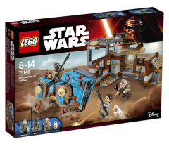
From the album: 2016 Star Wars Sets
-
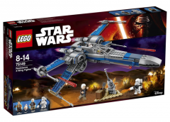
From the album: 2016 Star Wars Sets
-
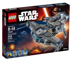
From the album: 2016 Star Wars Sets
-
Wow, great idea for a contest! I can't wait to see all of the original ideas and builds here, and have no doubt it will be many, considering that dazzling prize! Too bad I'm staff now that there's a contest I can participate in... I'm still wondering thoug: it's allowed to use custom decals, but how about parts that aren't technically customizable with decals in real life. I imagine some parts with complex shapes are hard to customize in real life, but here any part can be redecorated, right?
-
[MOC] Star Wars Battlefront - Battle on Sullust
BEAVeR replied to markus1984's topic in LEGO Star Wars
Glad to see you building Star Wars again, markus1984. Of course I could never forget how awesome your diorama's were, but I had forgotten how exited I got every time you posted a new creation. Thanks for reminding me of that feeling. I'd like to congratulate you on building a scene with lava and plenty of rocks, yet making it very clear this isn't Mustafar, without doing anything fancy with the architecture. You succeeded in it by giving the rocks many facets, avoiding sharp corners. You succeeded in it by keeping the lava monochrome red, rather than using yellows and shades of brown mixed in between. You succeeded in it by using the cold light grey. And you photographed everything in the perfect light, capturing the immense feeling of cold, even though you're at the edge of a stream of lava. Even though some bluish background would have been nice for an atmospheric effect, your build has enough on a clean presentation to evoke everything there is to feel about that location. Every time I see one of your creation, I'm impressed by how well you understand what makes a particular location that particular location, and manage to translate those observations in a beautiful creation. It might be that quality that makes you one of my all time favorite builders. In short, your creation rocks. Talking of rocks, I love the way how they have so much detail, yet don't distract from the scene. I do find it a bit strange you clearly have different styles of rocks merged together, which seems a bit artificial here. You see, on the left you have all of those short slopes in a zig-zag pattern. But on the right, you have a nearly uninterrupted formation of long, all vertical slopes. This visually makes for quite a big difference in texture, giving the impression we're looking at a different kind of rock formation. But there's no real feature that separates the two styles: it looks like they're intended to be one big piece of rock. So you have one big rock with two pretty different sides... that feels a bit unnatural to me. It might be better to give the rock a more uniform texture. Or what would be more interesting, you could keep the two different textures, but make it clear these are two separate entities. You could have some kind of separation between them, a kind of gorge maybe, or having the rocks all at an angle to imply a different layer, or give them some other color, or have a vein of who knows what running through it (although that wouldn't be too true to the source material, I guess). That would in any case be better than those few old grey slopes you have now, that don't really seem to have a reason to be there... What would also have been nice, would have been to integrate the type of rocks you realized with the plates better. Right now it's at the bottom, and stops quite suddenly. You could have built in some nice plateaus with that technique in the big rock wall, to break it up a bit. Still, your rocks are awesome, way better than a lot of rocks I've seen done in that style. I have no idea what makes yours so great, so maybe all of my suggestions aren't worth that much... Who doesn't love those rocks already? The architecture in this scene won't let itself be bullied out of the attention by the rocks though. When I first saw your bunker, I went like "wow, that's amazing! It's better than any rendition I've seen before!" But later I realized: "wait, hasn't markus already built an Imperial bunker before?" Then, I went to check your battle of Endor creation, and thought "You see! It's the same thing. What a pity he just recycled this design... O, wait a second, there are actually quite a few differences!" I love how you aren't completely satisfied with what you built before and decided to improve a creation many of us would consider the best thing they could possibly build. But you just wanted to do better, and you did! You found a marvelous way of using the tiles to make the outer corners really nice and clean, you improved the door design by making use of studs for texturing, and you even improved the greebly thingies on the roof of the bunker. It makes this bunker look more solid and more detailed at the same time, just the thing we like best. And having it at an angle, nicely tucked away in the rocks, makes for such a perfect setting, I like it better here than on the forest moon of Endor! Now that's how you reuse an existing design! I like how you put the upper platform at the same angle as the bunker, since it makes clear how the base is structured. The lower platform is really good as well. I've already mentioned how much I like how you used light grey for it. It's the perfect cold color for this occasion, especially for such a smooth surface. One small remark would be that the small touches of light grey beyond the clear border of it don't seem to make much sense, since rock isn't as loose as earth and therefore nicely stays behind its border. The hole that was shot in it looks incredible, although I have to confess I only discover it now. You could have moved the cannon a bit to give it some more focus, but that only applies because this is just a picture. What would have been really cool though, would have been to have the Rodian with the bazooka face the direction of the hole, to imply he created it. And making it clear the cannon is disabled, would answer the question why the Empire isn't using it to fight of the Rebels. Then the action in this scene would already feel a lot more alive. Without the need of flying laserbeams and smoke everywhere, the struggle would be clearer. Not that the scene isn't exciting already. I love how you have the Rebels storming that impenetrable looking base, the Imperials quickly reacting and taking the first cover they encounter, and the first people soaring in the air in an attempt to get a grip on the situation. You've perfectly captured that moment of excitement and confusion of a battle that just started and doesn't have a clear ending yet. Anything can happen at this point, especially with Boba Fett overlooking the fight and looking like he's doubting whether he will join this battle or simply observe it for his pleasure. I just want to know how things go on from here on out. Without telling me anything about the reason for this battle, without introducing me to any character and without a sweeping soundtrack and zooming effects, you've drawn me into this scene. I'm in the middle of the action, and I want to know how it continues. I want take part in this battle. That's what makes this one of the best representation of a game in LEGO. I'm dying to play this single level right away. Quick, what controls do I use? -
Converting LDRAW models to CAD assemblies
BEAVeR replied to EdmanZA's topic in Digital LEGO: Tools, Techniques, and Projects
This would also be my suggestion, since Blender has a wide range of export possibilities, especially if you include custom export scripts circulating on the internet as addons, so you have a big chane of finding the right thing. By the way, the importer perfectly imports parts structured like .mpd files, it's just that you can't select them in the file brower. I'll look into this problem... But simply renaming your file to a .ldr or .dat allows you to import it perfectly. -

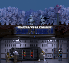
From the album: Shadows of Nar Eurbrikka
-
From the album: Shadows of Nar Eurbrikka
Text by MKJoshA -
Great job MontyPython: your creations are definitely improving! What I noticed immediately in this build, was the use of some odd angles, like the boiler thing and the wall, that instantly give your creation more character, visual interest and sophistication. The same goes for the dark blue panels, which have an acceptable color for an industrial environment but still pop, especially with that white border around them. Finally, the pillars that are embedded in the wall make for a detail that makes you envious you didn't thought about that, without looking like some superfluous attempt at adding details. Especially with that subtle ridge beneath them caused by the SNOTted tiles it has a lot of sober interest in that area, so well played! So you've assembled yourself quite a good amount of very decent bits and pieces in this creation, but in other areas it seems like your inspiration ran out. It's mostly the floor I'm talking about, with it's vast expanse of exposed studs. It's great you already tried to break it up by installing crates and bottles, without putting them in illogical places, but it's not enough. I'm not saying more boxes are the way to go though, as that will probably make your scene too cluttered. You could think of more subtle details, like markings, lights, or better even small ridges in logical places, maybe used as some kind of rail for a crane or something like that. I suggest you look at pictures of the hangars in the movies or even real hangars for inspiration: take your time to observe things, even if it's something as trivial as a floor. I've already mentioned you have a lot of potential with all your bits and pieces. You have a lot of great ideas going, but it's a bit strange you leave some ideas 'unfinished' as it seems. Take that white stripe next to the door, for example. It serves nice as a bit of contrast to make the dark blue pop even more. So color wise, it's a great addition, however, composition wise it goes wrong. That white line jumps at the viewer, but it connects to nothing else really, so the viewer keeps staring at that white line initially, making the rest of the scene fade... That while you could use it as quite the contrary, as a viewfinder. That could be achieved simply by continuing the white line to run across the top of the door, so that the door gets framed completely. It would make sense functionally as well, as it would allow people and ships to find the exit even in low light. Another way to make better use of that frame, would be to combine the contrast in color with a spatial contrast. The frame would pop even more if it'd literally pop from the wall by moving it a bit closer to the viewer. Again, it would make sense because an extra mechanism could be hidden in there or something like that. It would make the details more tangible and your creation less flat. Other examples would be the angled wall, that's a nice idea, but has no story to tell. Right now, I can't really tell if it's actually like that in the hangar or that you made it as a way to show a cutout. I'd prefer the first option, as it would make your creation look bigger and interesting. To achieve that look, you'd have to add something to tell us there's something behind it. Maybe the grey wall continues on the other side of the white wall, of maybe you have a tilted wall that lines up with the white one, or maybe you could give us a hint of a huge door behind the white one. It doesn't have to be big necessarily, but it would sure expand your creation greatly. A final example would be the beams, which are sadly see-through. It would be simple to add some bricks behind them (potentially with a few grills in there) or even better lights! Finally, a word about the composition. One of the reasons your good bits don't really connect in this one, is because it looks like they're standing in each other's way, and other areas look like they've been filled on an afterthought. So give everything space to breathe! Pull apart good bits that have nothing to do with each other, group bits that do. This scene could already look better if you had simply mirrored the back wall. Than the boiler wouldn't be in front of the door, and the pipe structure would connect perfectly to the boiler, connecting it more to the scene, because right now it stands loose, it doesn't seem to have any controls... and the door looses its purpose because it's opening is blocked for a significant part. Try to build up your scene organically instead of coming up with a number of good subbuilds and placing them together without much thought. Try really to design that hangar, building it as if you were an architect. Try to understand why things are as they are, in some way of thinking like: "So I want to build a hangar. What's the main thing it needs and that I want to show? A yes, a door. What is the function of this door? To allow things to enter and leave the hangar. What kind of things? Big things. So it should be big and unobstructed. etc. etc." Of course it's important to keep having fun building, but I find really designing and understanding things to be a fun part of it, especially as it tend to lead to better creations! Hopefully that gives you some ideas on how to make all of your goodies come together in a nice scene, because they deserve to be seen in a nice setting! Also, make sure the presentation is up to par. In general, flash photography is not a good idea because of the unnatural, harsh shadows. And choosing a lower viewing angle would bring the action closer and would immediately solve the need to do detailed floors . But what's more important: keep on coming up with these lovely ideas!
-
4090 - Motion Madness (A model) – Creator / Inventor 2003 - Unicycle Download MPD (OMR compliant) Known errors: None Built with LDCad 1.5 I've been working with the LDraw format for a while now, because I need it to render my models in Blender, but up until now I made all of my models in LDD and exported them with a much-tweaked conversion file. That already opened my eyes to the possibilities of the format, but it wasn't until it was announced that LDD would no longer be updated that I went actively looking to build directly in LDraw. I had dabbled around a bit with MLCad and LeoCAD, but in none of those I could work with the same ease and speed as LDD. However, LDCad allowed me to combine the best of both worlds, and I've been actively learning it for a while now. As test models to learn about the features like closing triangles, shaping rubber bands etc., this set from my childhood was the perfect place to start. Expect the other models from this wonderful kit.
-
Now that's a creation that hits you like a bomb ! Awesome work re-imagining this fighter. The first thing to notice, of course, is the single engine. It's very unusual and immediately gets you interested in the model: this is not a model you easily scroll past. I love how you don't just tell us why we only have one engine in such a weird configuration, but that you actually show it to us in a model, instantly upping the credibility of the vehicle despite it having such an exotic feature: nice job! First off, your eye is drawn to the single engine because of the asymmetry it introduces, and you instantly notice how big it is, so you easily understand this model is all about speed, which has the logical consequence you don't want to be wasting energy on firepower, and indeed: no extra turret. And then you see the weak spot, namely the engine itself: if that's crippled, you have nothing left. So you want to protect it. And moving it away from enemy fire seems like a good idea indeed, especially in a universe in which ships are know to sport rotating features. So you really guide us through the model, making us not just look at it, but question it and recognize its answers, giving you that great sense of satisfaction of understanding something. I just love that. You went pretty far with it, placing radiator fans in the right places (namely on the engine), emphasizing the sturdiness of the hinging mechanism and dedicating the only white bricks to a sort of safety notice near the engines: great stuff. It's the first model that makes me wonder what all those greebles are for, and you really deliver. So my only point of criticism is actually just to want more. You see, if you keep thinking about it, you realize having this asymmetrical propulsion will tend to put your craft in a spin, so you'll want something to counteract that. Therefore, it would have been lovely to have some small steering rockets to balance the ship. Also, it would have been such a nice touch if you had a control in the cockpit that looks like it could control the position of the engine, just in case the intelligent steering goes wrong. Maybe you included it, but I can't seem to make it out in the cockpit. All of those intelligent changes don't just add to the credibility of your creation, it also helps you to see it more as an improved version of the Y-wing, rather than the same one with an engine missing. However, that's only when you start thinking about it, and my first reaction was indeed one of bewilderment. So if you do something similar again in the future, you might want to consider changing something else significantly in the neighborhood of the 'shocking' change, to make the difference big enough. In this instance, beefing up the hinging section might have been a solution. Maybe having it rather big and completely round, potentially even without an arm bridging the gap between the hinge and the engine (so that the circular part touches it) would have been a solution here, with the added bonus that it allows the engine to be rotated 360 degrees (if only apparently), a feature this model sadly doesn't sport. Just little touches that might have helped it to have even more of a wow-effect at first sight. Finally, there are some detail that are just too good not to highlight in my opinion. The use of the turntable piece at the back of the engine is truly genius: I've never before seen it used like that. It might have been better to substitute the big dish at the end for it, as now I don't quite understand how this fighter propels itself, and because that detail is worth standing in the spotlight. Then there's your inventive incorporation of the tabs of the planet piece, something most people would consider a hindrance, as a feature. You use them to echo the four notches that are present on the original dome, so that's well done. And finally there's the ever so slightly tilted cockpit with plenty of details inside, with as only nitpick that the underside looks quite abrupt, and could have benefited from a smoother transition, especially as that would have completed the vertical symmetry of that area. So yes, what an awesome model. Unconventional at the beginning, but entirely convincing at the end. You really made my engineering heart beat faster with the lovely concept and attention to detail to reinforce it, reigniting that look that got me interested in Star Wars in the first place. Engineering hard hat of to you, sir!
-
Rebels hiding with the acquired supercomputer on Kuat
BEAVeR posted a gallery image in Members Gallery
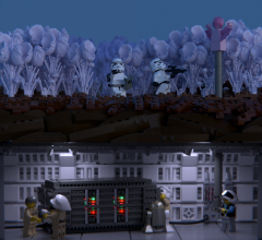
From the album: Shadows of Nar Eurbrikka
-
From the album: Shadows of Nar Eurbrikka
-
I have been busy with using Blender for renndering my models myself (example here), and have been playing a lot with the code of the LDR importer. Your tutorial is really helpful to show people what the possibilities are. However, I can point out some things that could be improved. - This will probably help you a lot: the reason your materials aren't optimal, is because the importer assigns them based on the rendering engine selected when importing. This is because the definition of the materials needs tobe done differently for the internal and for Cycles, a.o. because Cycles an do way more than internal. So right now, your rendering the internal materials with Cycles, which of course doesn't give the best results. So setting the rendering engine to Cycles before importing will already help. - Then the materials will still look off, because they haven't been gamma corrected. If you go to GIMP with your render, a simple gamma adjustment will correc the colors. This isn't the ideal method, so I will say more on this in a minute. - There is an easy way of positioning the camera. Just navigate to the view you want in the viewport, and press Ctrl + Alt + numpad 0. This is way more efficient. Sadly I didn't have time to watch through your entire video. I've said I've played a lot with the import script. I solved the color problem by putting a gamma cirrect node in front of the color input of each material, which drastically improves the color of the bricks. In fact, I've tweaked the materials a lot to make them more realistic. Among others, I also implemented the bevel shader, so that yourbricks look more realistic, just like the Mecabricks renders. I also implemented the option to have the LEGO logo on the studs (this will result in a lot more geometry though). And then there are some minor things, like setting the basic scale to something more reasonable etc. You can find my modified script together with instructions here. The code isn't really pretty (I'm just an amateur coder you know) and not fully tested, but you can give it a try. As for instancing, it can be done in Blender. Different objects can share the same object data. I've done a couple of basic tests, and it should work. That combined with a more efficient way to read out the files should result in a way more efficient importer. It's on my to do list for coding.
-
*insert Ode an die Freude here* Unbelievable the 1/209 chance of me winning my ideal prize came true. I feel sorry for those who weren't as lucky, but am incredibly happy with the prospect of receiving the Doctor Who minifigs and the dinosaurs. It's the perfect combination for a re-enactment of Dinosaurs on a Spaceship or Deep Breath, so it's a remarkably interesting combination . Thanks a ton for all of the work, CopMike. Also, thanks a lot to everyone for posting the often entertaining trees! A Merry Christmas to all of you.
-
Shadows of Nar Eurbrikka — Introduction and Discussion
BEAVeR replied to Brickdoctor's topic in Nar Eurbrikka Archive
Note that Valtias has to reach the ten posts threshold first to be able to participate in the PM. So Valtias, make some more replies across the forum until you get to 10, and then you will be able to use the Personel Messager service here on Eurobricks. Then you will be added to the secret Rebel group chat. Please don't go spamming topics just to get to your ten posts, but try to make some worthwhile comments. It isn't that much and you can take your time, since no critical tactics have to be discussed now. If you have any further questions, feel free to post them here or in the 'Redemption' thread here in Nar Eurbrikka. Welcome on board! -
"Merry Christmas ent a Happy New Year everyone!" There's nothing like a talking tree (sorry, ent) that does all of the greetings for you, and with such a nice voice. Just make sure he doesn't run away with all of your presents when left unattended. Thanks for organizing this raffle again, Copmike, and thanks to all of the participants for keeping me entertained . I had a lot of fun building this one, throwing in all kinds of wacky parts without once having to worry whether or not they exist in the used colors, just to get the shape as right as I could. I must say I'm surprised how well the club fits in! I had a blast rendering this model as well, playing with the lights and some streak and glow effects for extra punch, testing with my custom created starry backdrop. It did end up looking like he's taking a selfie though...
-
Brick Mania Antwerp: 14 & 15 november
BEAVeR replied to Tomsche's topic in LEGO Events and User Groups
I'll pay a visit on Saturday morning. Any tips for a first-time visitor? -
Your example is right, goatman461, but your definition could use a bit of refining. You can include as many non-sigfig characters you want, but those characters can't fulfill crucial roles in the story. For example, the commander and the pilot should definitely be actual players and not made-up characters. The whole purpose of this is to encourage you to coordinate the stories and have every player fulfilling a meaningful task within the story. Why would you assign an important task to a NPC while you have real people who can take it further into a nice build and story?
-
As for the group PM's, say it here if you want to join in and I'll add you to it. If you'd like to experiment with other tools, you could consider making a slack page or something similar. There are some persons that have left the previous group PM's. Know that we can't add you back in, so I suppose there's a way you can do it yourself...
-
[MOC] Star Wars Battlefront diorama by Rollokster
BEAVeR replied to Rollokster's topic in LEGO Star Wars
That is one epic diorama, Rollokster! Its presentation is rather unprecedented and makes sure your creation leaves a lasting impact. Because that AT-AT is just gorgeous, with the perfect combinations of parts to create especially the head and the legs. It's amazing how you seem to find that one combination everyone has somehow missed. It's a bit of a pity those Technic beams are so prominent on the inside of the legs... maybe you could use some Technic pins and tiles to make them look better, and you could thicken the joint so that the leg is equally thick in all places as it should be. That will give your walker a more solid and finished look. I'm not a big fan of the hollow studs on the feet as well. I know it's hard to replicate a perfectly smooth round surface, especially when you have to make a connection in there, but maybe you could figure a way out to fit a 4x4 dish in there, or tile some of the studs, or place a 4x4 donut plate on there to cover the hollow studs with solid ones, which might give a better effect. Finally, your base is a bit weird. I can come to terms with, and even greatly admire, the underground texture you've created, but it just seems your base is a bit too small. The back foot of the AT-AT hanging over the edge gives an unfinished impression. Also, you have thick black borders at some places, and very thin ones on other places. When it comes to borders, let me give you a tip: less is more. Often, it works good to have a very clean and abstract border (rectangle with possibly rounded edges), or to have no border at all, so your base has jagged edges in a natural way. That way, you could continue some of the rocks that were cut off quite abruptly now to let your diorama come to life more. But maybe it's better this way... if the scene got even more lifelike, it might just as well run away from my screen, screaming. Because that first shot is really intimidating with your perfect AT-ST. Keep up the amazing building and editing! -
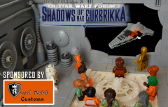
From the album: Shadows of Nar Eurbrikka
MOC by MKJoshA -
From the album: Shadows of Nar Eurbrikka
-
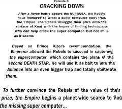
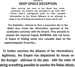
It seems the Empire wants our help even more than I had anticipated, even surpassing the endeavors of the desperate Rebellion. All the better... me contacting the Emperor will seem like a gift to him. It never mattered who would serve us best as part of our organization. I would be mad not to choose the side of the Empire for now and join the Alliance in their certain way to doom. Still, they've shown they can be quite capable, almost good enough to match the Empire. So just in case, I'll make sure they'll be grateful to me as well... No matter who wins this contest, I'll be the better of it. Great things are coming, gentlemen. The Results: You heard it from prince Xizor, so you know it's true: the Empire won this round. Besides being outnumbered by one entry (MstrOfPppts' entry got scored in the first round, but didn't have any further impact on the episode, just like MKJoshA in episode VIII), they made up for it with the quality of their builds to gain the upper hand. Congratulations on the excellent show, Imperials! The victory isn't complete, however. Because one Rebel agent surpassed them all. Congratulations WickNole with your awesome creation that makes you the best participant of this episode! Your now one of the nine builders who won a SoNE episode (that's right, every episode had a different winner!). goatman461 should also be congratulated with his first place among the Imperials, only 0,13 points away from defeating his Rebel adversary. You can both contact Brandon of RoyalBrickCustoms via PM to claim your prize: a pack of one-of-a-kind SoNE minifig cloth accessories! goatman461 was also chosen by RoyalBrickCustoms to receive the sponsor's choice award, which is a slightly different prize. Congratulations on incorporating the theme and catching the eye of our sponsor! Let's all say thanks to our generous sponsor! If you want a small taste of what it would be like to win one of the prizes, be sure to check out his Bricklink store to see what he has to offer! Finally, all Imperial players that participated in this episode (excluding MstrOfPppts) will have added to their tags in the Player Index. Those of them that want it visible on their profile, please state it here. Note that you can only have one SoNE/Community Build tag at a time. And now on to see what XP you earned in this episode! Rebel Alliance: (19 + 18 + 16 + 14 + 10 + 4 + 2 + 2) / 8 + 8 = 18,608 points Galactic Empire: (19 + 18 + 16 + 16 + 13 + 6 + 2) / 7 + 7 = 19,829 points 1......Gathering Intel (WickNole) - 19 XP 2......Hollow Men (goatman461) - 19 XP 3......Stuffed Men (LucasLaughing) - 18 XP 4......A Secret Meeting (Zaael) - 18 XP T5....The Calamity Star (MKJoshA) - 16 XP T5....The Unloading (Artizan) - 16 XP 7......A Quick Transaction (Commander Beltar) - 16 XP 8......Operation Dark Star (Lord Vladivus) - 14 XP 9......Tunnel Rat (Kodan Black) - 13 XP 10....Asteroid Annihilation (LegoPercyJ) - 10 XP 11....Detour (Lego Fett) - 6 XP 12....Smuggling Ltd. (MontyPython) - 4 XP T13. Frozen Mushrooms (Manx) - 2 XP T13. Dangerous Dealings (Tariq j) - 2 XP 15....Espionage (Alan1916) - 2 XP Out of competition: Suspicious Rodians (MstrOfPppts) - 8 XP
-

From the album: Shadows of Nar Eurbrikka