
Dorek
-
Posts
1,963 -
Joined
-
Last visited
Content Type
Profiles
Forums
Gallery
Everything posted by Dorek
-
Very interesting design. The original Scarox (officially labeled a Dune Crawler) resembled a Fikou in its own updated way, and it's actually quite cute. The new Scarox is cool, but it's definitely lacking in armor, and could use some streamlining. Also, on the original you had a (slightly small) abdomen (that's the right spider terminology, I think), which disappeared from the transformed version; in order to help with the spider appearance, it might help to add that back in somewhere.
-
Yeah, part of the reason the original Stormer could mix silver into his color scheme was the scout drones, which allowed for layering. Some of the gunmetal and silver armor pieces don't come across as well here (and also I miss the scout drones =P). The body is nicely constructed, though the torso narrows awfully fast. Good use of the Breakout chest plate in conjunction with the Hulk one, regardless. The tubes are a bit unnecessary, but they do add some nice aesthetics as well. I'd love to see you redo his sword, too.
-
Hence "interpretation", but yeah, I get it =P. As for the color scheme, I thought it worked, although now all I can see is a guy with silver pants.
-
The flick-fire setup is moveable? Sold. I was on the fence about Stormer, mostly because all of his poses were kinda dopey, and he hearkens back to the monkey arms of BIONICLE yore. Also Stormer XL was tops. But I just might splurge for this new incarnation.
-
Poor Aldous and his horrible football career. Cool MoC. You kept a lot of the set essences (such as the feet, which are really quite cool in their construction) but with your own flair. I can't quite tell if the assorted spikes on his launcher are supposed to be a hand interpretation, but they seem a bit random; the rest of the spikes are very well placed, and add some interesting visual style. The elbows also don't seem like they have much freedom of movement, but I can't entirely tell. The claw hand is also great, and I'm glad somebody else has been using that hose piece, which can actually be quite versatile if you use it right. The eyes effect is also cool, how did you accomplish that? I'd love to see him with a Skull Staff, by the way.
-
A nice "mech" interpretation of Breez. The colors are fairly well layered, though there's a few questionable spots (like the two silver pieces on the chest). The cladding sizes are sometimes a bit mismatched too, but it works toward the overall appearance, and that blade is neat.
-
Switch the countries if for whatever reason they don't show up on yours; LEGO has a bit of discrepancy here and there when it comes to localization, even though it should all come from the same place.
-
Overall, the MoC is very chaotic and jumbled. Multiple colors can work well under the constraints of the "Hero or Monster" theme, but it needs to have a defining purpose. Here, the assorted limb colors don't give any real sense of why they are that way, which is essential if you're going to include so many. It's also quite hard to see what's going on the with limbs, particularly the arms; they look as if they might have some cool construction, but they're at such odd angles I wonder if they can actually pose at all. Posing in general will definitely help the appeal of an MoC, rather than just standing them up. The weapons are probably the most interesting thing there, but as mentioned, the conflicting colors distract from the appearance. There's a certain sense of consistency, moreso than in the rest of it, but it's still very messy. Also, the brain just kind of slapped on the back isn't terribly exciting, but a lot of people have done that already. If I can suggest anything, it's try to find some visual color consistency. Even if you think you need to use lots of colors, use them in a way that isn't distracting, for instance, have the upper legs be white and the lower legs be orange, but with an equal amount on both sides.
-
I think he meant the summer ones, which don't appear to be on HF.com, at least not that I can find. Edit: Nevermind, they are in fact on the customer service website (which keeps glitching out on me, regardless).
-
Very impressive skeletal system you have, and it shows in the layering on the armor. The head is nifty, and obviously fits the theme you were going for, but with black as the only color scheme, some of the features get a bit lost, especially with using flash. It either needs some distinguishing elements to help guide the look, or perhaps to be taken against a white background without flash.
-
Very cool incorporation of the brain slug, I love his it's recessed into the armor and just watches out. I'd have made the crotchplate (how many times have I had to use that word since this contest began? Probably too many) yellow instead of gunmetal, it distracts from the otherwise great visual symmetry (or asymmetry, as it is) and color consistency. The tank arm is very cool, and even the Hero Core doesn't look too out of place, though I feel like this is one time the white core might not have gone amiss. The gun is very cool, and I love that (with a bit of tweaking) both of the new HF launcher pieces can be used. I'd love to see this design using parts from the summer line, mostly changing the color scheme to be the blue that his new incarnation uses... and maybe his new helmet, too.
-
Hero Factory Month - Index and Discussion
Dorek replied to Brickthing's topic in LEGO Action Figures
I meant more that because there's a choice of getting the signed or unsigned version, getting the signed version specifically to flip it in order to make a quick buck is obnoxiously capitalistic. I'd hope that someone who didn't actually appreciate it for the intended value would be kind enough to let the runner up take it (assuming, of course, that the runner-up actually would want it for that reason). -
Hero Factory Month - Index and Discussion
Dorek replied to Brickthing's topic in LEGO Action Figures
I suppose technically you could...? Seems a little mean-spirited, honestly. Some people would actually like to keep it for the collector's value (and not the money kind). -
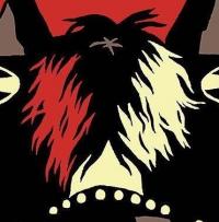
I feel like I should somehow recognize the inspiration, but I was never much into the Sly games, unfortunately. Regardless, a fun MoC design. We don't see too many brown things, and the color works. The ears, especially, are a neat design.
-
I'd say swap out the thigh joints for the lower arm type (the ones without the locked end joint) but I'm not sure how much you want to mod the set, and the joints don't come in red anyway, so it would look a bit different. Would make crossing her legs for posing much easier, though. Also, that clip for her handbag is hilariously great. Good usage.
-
All these things I haven't actually kept track of =P. Cool. Not particularly interested in them, but it's a fun feature for those who like it. Anyhow, lots of good entries seen so far, in all categories. Bums me out that I can't enter the other two, what with digital MoC's not being allowed, but there's been a lot of inspiring stuff.
-
Oooh, those. What are those anyway? What purpose do they serve?
-
So what's this "Hero Factory tag" now included with the prizes?
-
Very creative use of parts all around. The clawed foot is definitely a nice touch, and actually incorporating the brain into the arm (as opposed to slapping it on) works very well. The Arachnix drone head works very well too, quite morbid how it just shoves the other head out of the way. Seems a bit cluttered due to the size, I think; at a larger scale, some of those ideas might be expressed a bit better. Very quirky and creative regardless.
-
Torso is pretty awkward, all things considered. I like the brown and black color scheme, and the upper torso has got some good designs going on (red pin connectors notwithstanding), but the concave lower torso is just very bizarre looking. It would kill the hunchback vibe without it, but at the same time, it's hard to tell if hunchback was actually the intention, or just a byproduct of the design.
-
Very cool MoC, Aanch. The use of the armor piece as a face is ingenious, and the hand is very cool, and recalls the right set vibes. That's probably my favorite part about this entry, that it's probably got the most Hero Factory vibe out of any other entry. The normal hands also make very good use of the SP cladding, which is something I'd hoped they'd use again beyond the Hero Recon Team. The feet seem a tad bit awkward on the transformation, how stable are they? If I have anything else that I'd want from this MoC, it's that I'd love for him to have some kind of weapon, but that's hardly notable.
-
The weapon, especially, is very cool, although given that it's Quaza powered, you think it might be a bit more energy-looking. The same for the rest of her; some colored translucent elements would definitely have brought the whole thing together. The construction is very lanky, which fits the theme, but it seems like there's certain bits that hint towards a different theme altogether; the system vents, and especially the feet, have this mech look to them, which isn't exactly expressed anywhere else. The wings are also a bit too rigid; they pose well, but there isn't much actual movement to them. An interesting MoC, and very Hero-looking despite the extensive additional improvements.
-
Not particularly canon, but quite humorous. I love the funny entries we've seen. A nifty remake of Bruizer, fixing all of the glaring set issues, but keeping the look very close to the set. The only thing that sticks out is the legs, which are much too smooth and interrupt the motif, not to mention the color scheme.
-
Until the 30th of July, is what the ad says, at least for America. Don't forget, it should apply to S@H orders as well!
-
Some of that is compression, since their interactive magazine isn't particularly smooth.