
MstrOfPppts
-
Posts
1,560 -
Joined
-
Last visited
Content Type
Profiles
Forums
Gallery
Everything posted by MstrOfPppts
-
I think that the background in that particular image has a lot to do with that feel. A nice photoshop into the old styled island background would make quite a lot of difference. I still think I'd go without the baseplate and switch it for a sword. It's kind of a cheat since such a big baseplates would not be used in the set of a targeted price point. Besides it's plain and empty since you've ran out of parts to add something significant to it rather than just a crab or a bush ... Anyway I think that the brown plate looks even better than the black one. Also I must say that I do prefer the short ladder. It's something that was not in the original ship, but was built after using this part for a shelter. Therefor it makes no sense creating it too long but just long enough to reach it and climb to the balcony. Also when you look at the build after a while, when you're not too focused on your initial idea, you can spot little things where you can save a part or two. For example the 1x1 brown plate and arch holding the leaves could be replaced by this piece sparing a part and having the exact same effect though a little bit different aesthetics. Or maybe the leaves could be switched to the other end and the 1x1 stud from the rope could be used instead of the 1x1 plate ... Optimization is a fun thing (:
-

[ENTRY] Caribbean Brig - better known as the Ironram
MstrOfPppts replied to Stoertebricker's topic in Pirate MOCs
Nice ship, I like the color scheme, fits very nicely into the old era bluecoats. As in your other entry for an official set you're far too generous on the minifigures. I do prefer the back version to the right. Although the build is the same, I guess that only one tube looks a bit lower and does not give the elongated feel since the cabins on the ship were not really known for spacious interiors. So I'd definitely go with the version with just yellow. -
Definitely a major improvement from the first version! One aesthetical comment would be to heighten the chimney over the top leaves roof so that it doesn't smoke inside the shack.
-
Very different and therefor a very cool entry. Although I do agree with Mazin that it is a bit too dark and too military focused. For an official set there are also far too many minifigures included and we miss some good old pirates to play out some stories. Probably making a yellow and white design of the same thing wouldn't even look that militaristic and would fit the classic soldiers nicely - skipping a cannon or three (; But there are a lot of details to like all around this build. I really like the angled pier part and everything around and on it. The crane is very minimalistic yet looks fine and does it's job!
-
As I've said I am no ship expert, so I usually look at ships only aesthetically. I never was a fan of this slope technique for the ship hulls. Although probably more realistically representing the angle used in ship building, I think it produces many gaps or sharp edges that are hard to cover with LEGO pieces. Also trying to achieve the bowed shape of the body directly on the hull pieces, by offsetting the slopes, made quite a mess in my eyes. The color scheme is a bit dull though quite fitting for a pirate ship. Maybe I miss some more carving details around the cabin windows. But I do like the figurehead design, love the sails design, the red and black makes it even more menacing than the red and white. Also love the colorful minifig bandanas. Are the minifigures also interesting? Would like to se the full lineup!
-
Well all I can add here is that this entry is so funky it borders to the level of genius!
-
I agree that the hull makes it far too parts intensive to ever come even close to a real lego set - not counting the BL designer programe. And it misses some much desired minifigures! Otherwise it's a nice build, I like the little cannons to fit that many in the deck. And although you're keeping all of the colors from the original, this one somehow makes sense, probably for it's size and does not look too much like color vomit (: I would make a second thought about the tan though ...
-
Another nice little set! Though for being official it sure lacks the pole being connected to the build and I smell some illegal connections with those bars - the rules in the end are, to design a possible official set ... As for some more colorfulness I'd go with a red crab, a blue bandana and a different color of legs - maybe gray. And the pirate needs his sword (;
-
[ENTRY] 6281 Pirate's Perilous Pitfall Remake 2023
MstrOfPppts replied to Slegengr's topic in Pirate MOCs
Yes I know that the trap door was there in the original set, but the spikes underneath are a new addition. Cruel was meant more as for fun, I in particular like that detail. Yes I understand the bridge concern and it makes a lot of sense for I agree that the original was kind of funny in how it worked. Yet I'm used to seeing a hanging bridge and this one just takes much more space. I like the approach of another entry with a hanging bridge that can be pulled ashore by a rope rather than being lifted up. As for the liking of this set, I think that it all comes to the age and weather you owned this set or not. I believe it must have a significant value to someone owning it. But if you grew up with the older classic pirates and loved the aesthetics of those sets, nothing comes close to that. Besides this set was released to the very end of the original pirates theme and I think it is clear that they were slowly running out of ideas. It also upgraded the color scheme to include the few brown pieces from the western theme yet not enough pieces were produced to make al wood the same color. It is a bit of color mashup especially in the top right rocks part. And here I must admit that color wise your entry did a great improvement and is much more visually appealing! Ah yes, now I see that there are some modern faces, I just had a look at the first head, and I presumed all are from the same era. It's kind of hard to see the pupils in these small images. Although I don't recognize the head with the gray beard ... anyway, mixing styles is even worse than going completely with the inferior style in my eyes. Since there are so many digital builds, I'm really surprised no one took the time to create their own updated decals to go along with the updated set! Or did I miss someone? -
It's a lovely remake! Small and simple yet clearly resembles the original as is expected by a remake. Also like the updated minifigure. There is not much else that could be done, nor can I come up with a suggestion that would significantly improve the build of this remake. I must admit that I'd rather buy a version with some golden coins in there compared to the compass. The simplicity is also connected to the choice of a set and I think it will be very little details that will decide the mini build category in the end. Maybe it will even come to the choice of the set - there are many very good recreations as well as some fascinating originals. Good luck!
-
Glad the hut part worked out without the nasty colored pieces and without the middle pillar the throne room looks great! I only now noticed that the color in the side boat to the canoe is azure(?) and not ordinary blue. I guess this one is to similar to the water in the picture and blue would probably go together better since there's already blue in the islanders stickers! Great entry and nice photo editing, can't wait what more is to come!
-
[ENTRY] 6281 Pirate's Perilous Pitfall Remake 2023
MstrOfPppts replied to Slegengr's topic in Pirate MOCs
A nice remake of a classic set, that doesn't seem so popular among the fans. The original looks a bit rushed and this updated version really is an upgrade in regards to that. Much more visually appealing, the heightened structure makes much more sense than the original baseplate. Almost looks like an abandoned concrete pier or a wall from what used to be a fort. The play features are cool and the trap door with the spikes at the bottom are original. Can't remember seeing such cruelty in a LEGO set! (: I really like the roped fence and the fact that it is modular and can be split in the water, which is another original idea in my opinion. Though splitting the water is original, I think that the execution is a bit lacking. Works well for a MOC, but the waves are not something we would see in the LEGO set yet alone the one stud connections between the water plates. Probably such set would be a pain to move around. I think that the landmass should extend a bit further into the water to connect the water plates together without the use of the macaroni tiles. I'm also not too fond of the bridge, looks a bit too massive and bulky. As in most other entries I have to touch the brick built sail - a fabric one would be far superior! And another thing that needs an update are the minifigures. They use the very classic faces with simple dots for the eyes rather than updated versions which would fit your more modern approach and color scheme better. Overall a really nice design! -
[ENTRY] Rock Island Refuge (Now Finished)
MstrOfPppts replied to CaptainDarkNStormy's topic in Pirate MOCs
Looks great with the black, it misses the window though. And now the rocks that are part of the wall make sense and it's more visually appearing when the building is of different color. I agree the crane would look better in brown for the wooden parts, the joints can still remain in the original colors. Would go perfectly with the pier. -
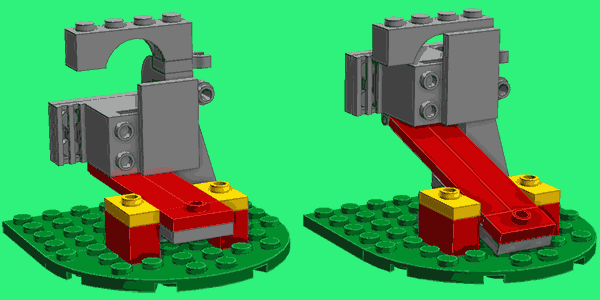
The great mechanism didn't let me rest, so I dug into some reverse engineering and here is what I came up with. The image with the support on one side removed ...
-
[ENTRY] - King Kahuka's Outrigger Boat (Mini Set)
MstrOfPppts replied to kritch's topic in Pirate MOCs
I think that LDD or a digital tool is your friend here, since you can change the colors quickly and make a direct comparison on screen. Since you only have a red tooth piece, I guess that adding a bit more red does not hurt. Original islanders had red canoes anyway. I quite like the color scheme to the right. I know that the bar with clip also comes in reddish brown since this year but it's hard to expect such a new part to be in common possession. I find the tooth front, although still far from perfect, better than the original. And the black spear is a nice touch of a different color. Maybe even the oar could be red?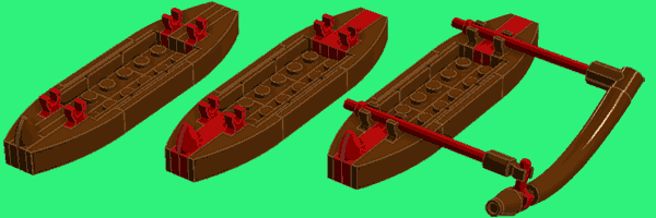
-
Just one word - Awesome! What a genius idea for the splendid play feature. I would also like to see a cut-through to reveal how this mechanism works in such a small space! The only thing that I find offensive is that the female islander is wearing a bra - the banana doesn't bother me that much! :)
-
Well I think it is quite obvious, the whole statue build slides left and right along the tiles on the floor revealing or concealing a hidden cave entrance behind it (:
-
Looks splendid as it is! If you have too much time, I'd rather suggest making an entry for the mini category rather than adding any mini builds to this entry. Sometimes less is more and you're already walking on a thin line between a MOC and what could eventually become a LEGO set. (: Therefore I would also remove the white tiles representing waves(?) to come closer to a passable set. I would prefer the hut to be without the middle pillar but I understand that might cause some stability issues. I really like the added bluish (teal?) color to the hut pillars, works quite nice! Only now with this extra color have I noticed that there are a bit too many in the hut part. Is the DBG and black part really necessary? The technic connector could be attached directly to a stud. The islanders boat is also great and all the rest looks awesome as from the beginning!
-
Wow, this mini category is getting out of control! Fabulous creation, great idea and overall design. Another of those such unique sets. Very detailed and very well designed. Love the idea of using the modified tile for the seat to be able to fit the peg leg! Speaking of which, it could be of a different color to represent a seat cushion and I do miss the back of the seat. Great work!
-
Small simple yet effective. Instantly recognizable as this was my first pirates set! Interesting to see that you imagined the grey pieces behind the chest as rocks, or at list that is how you depicted them in this remake. For being a straight brick I always thought of it as small part of a wall ... I think that too many pieces went into the base and as such I would suggest trying to create a hole in the middle to be able to fit in the chest. And also the minifigure needs an update, since you're using more of a modern color scheme.
-
What a great idea for a mini set. Love the aesthetics and the color scheme resembling the old Barracuda! I too think that the build would benefit from being placed on a 8x6 plate and make it black. As if it's the part of the ship and so that it could be placed on a tan baseplate when playing to achieve the current effect or it could be built into something bigger. Maybe use this at the top of the window to attach the ladder so it wont be sticking out that far. Great entry!
-
[CONTEST] Return of the Classic Pirates - Vote Counting
MstrOfPppts replied to Mister Phes's topic in LEGO Pirates
Well, we'll have to disagree then, that's fine. The question is what does the community gain from such users? Only you do - that's called selfishness. If it was my call I would have banned such users even for thinking about it, yet alone asking if it's OK?! No point in asking such a rhetorical question. I'd say first comes the commitment and the duties and after obeying and participation come the rights ... -
[ENTRY] Rock Island Refuge (Now Finished)
MstrOfPppts replied to CaptainDarkNStormy's topic in Pirate MOCs
The raft looks nice, I like the sail! I'd switch the black with either brown or dark tan also looked good in some other raft entries. -
[CONTEST] Return of the Classic Pirates - Vote Counting
MstrOfPppts replied to Mister Phes's topic in LEGO Pirates
A lurker of this competition in my opinion is someone who did not comment or strictly follow the contest and may be drawn here by the frontpage post to say his vote. In most eurobricks contests there was a rule that only members with 10 posts (I'd put that to 50) and registered before the contest started are eligible to vote. Not sure what the case is here? It's not that messy, there's been worse, trust me. (: Anyway why are you following these threads and reading them if you're only interested in builds and would not like to discuss rules? Besides we're just politely stating possibilities and not making a mess. At least not in my eyes. I've taken part in competitions where results were decided by almost less voters then there were entries, beaten by participants with more friends and what not. Therefor my habit is to try and vote if there's a competition going on. And in many cases, especially where the amount of entries is as big as it is here, I struggle to decide for top 3, or sometimes even less, and would rather not vote at all, which again is not the way to go. Therefore I just suggested more points to be available and make my choice a little easier. Usually the rules are written before or during the competition when it's hard to predict the amount of entries and sometimes adjustments are in place. As I've stated there are also other reasons but I'll manage even if in the end only one vote will be given. Well yes, not only would you be accused of, but that is exactly what you would be doing - cheating. That is why the eligible accounts rule mentioned above was present in most competitions around here. The results of the competition are supposed to be determined by the community surrounding the platform where the competition is organized. It's from users to users - us EB AFOLS. There is no point in calling in all your friends and relatives to vote, this is not AGT?! Voting should be decided by the dedicated community who knows what they are voting for and have the idea of why one build is better than the other regardless of who built it. Of course it's still a bit of a subjective matter, but that's why more relevant voters vote, the better the results will be. Yes, but do the votes of people who are too lazy to have a proper look at the entries and pick 5 really matter? Quality over quantity I'd say and besides more votes per person less of chance for potential draws I guess. But in case of a draw another vote between the drawn entries can be done and it's solved. Possibility of a draw can't be predicted and is possible in all scenarios, so it's nice to have a rule in advance to cover the case. -
[ENTRY] Rock Island Refuge (Now Finished)
MstrOfPppts replied to CaptainDarkNStormy's topic in Pirate MOCs
Well all I am trying to say is that the original had a distinct line between the land and the building that went from gray to black. A lot of gray parts already existed that could be used in the original to simulate continuation of rocks into the building. But that is not the case. In your build I find the rockwork too integrated into the building which also causes a more plain color scheme with too much gray. It doesn't matter if the building on top is an old fort or just a pirates wooden shacks built it's just some minor aesthetics in my eyes. Anyway continue with your build, I'm sure it will turn out amazing!