Gideon
-
Posts
3,534 -
Joined
-
Last visited
Content Type
Profiles
Forums
Gallery
Everything posted by Gideon
-
#3
-
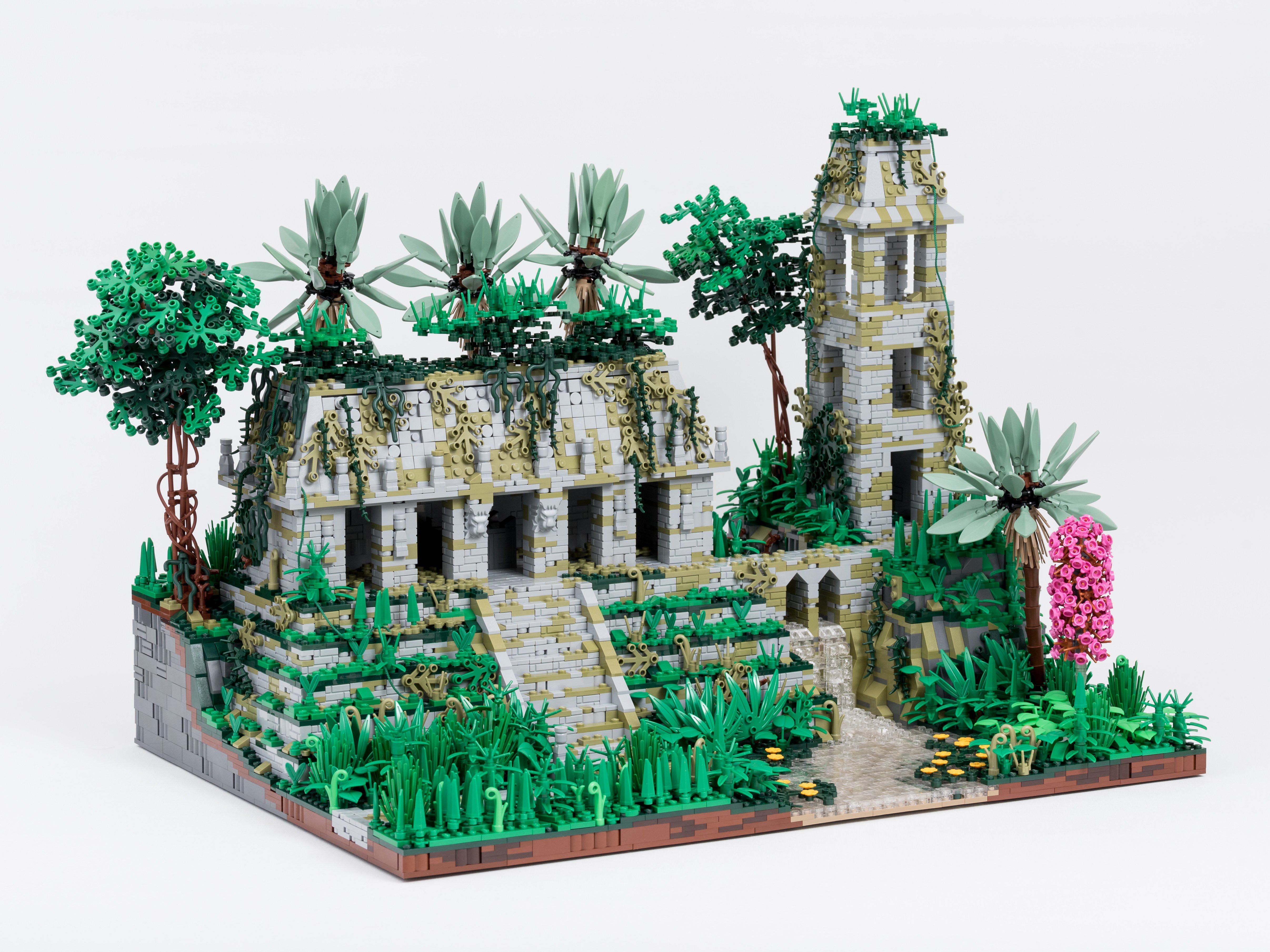
Great idea with friendly minotaurs, and the dialogue was funny! Regarding the build, my favorite part is the fountain. I had thought of doing a similar thingbin my big Barqa build but ran out of wall space...but this looks even better than what I had in mind The only nitpick here is that I find the double row of crenelations sloping in different directions a tad too busy.
-
Excellent build and presentation! So happy we get to see you building for GoH also now I agree with SJ however that the editing would have been even better with some of the blue light remaining on the Drow figs.
-
Very nice waterside build, I like how the town is protected from flooding by that small wall Is the water at the front a river or a lake/the sea? (I'm not familiar with where this town is located, sorry!)
-
 So many awesome figures already! I think I am going to stop looking at the entries for a while now however so I don't fill my mind completely with these figs and block my own creativity in creating 16 figs myself...
 -
Great set of figures and flawless photography!
-
Nice scene with a suitable feel of a busy port UoP +1.
-
I was clearly not looking hard enough UoP +1 because of the nice shape of the trunk then!
-
Very nice siege equipment, and great diorama overall! I especially like the ground close to the wall a lot Definitely UoP +1 for wall, siege and fortifications...but where is the tree?
-
Excellent build! The structure and trees look great (not least the fallen one) and I love the color palette as well :) And as usual, top notch photography.
-
Very nice design, especially the shape of the roof! Am I glimpsing a net that the tiles are attached to...? Good luck in the CCC!
-
Some excellent figs there and a lovely set in total! Wasn't me
-
Looking forward to seeing pictures from the event
-
Have fun and take lots of pictures!
-
Great idea for a contest! Looking forward to all the figure combos this will spawn
-
An instantly recognizeable dG build I especially like the quay area and the whole riverside along the wall, and the houses against the walls on both sides look great. I also like how the wall bends along the river and the "inside" corners are excellent. The "outside" corners however are a tad to gapped for my taste, I think that 1x2 cheese slopes offset by 5 plates each might have made a better joint, at least at some angles. (At a certain angle, wedge bricks/plates actually work to make both a smooth concave and convex corner, as I've tried here.)
-
The continued adventures of Atlas: visitin Barqa
Gideon replied to Hobbythom's topic in Guilds of Historica
Definitely UoP +1 for Anthropolgy: City Scene and also for one of the three roofing techniques as well. For the other two I think I want to see some more of the techniques however to indicate "mastery of roofing techniques". Please also post your claims in the UoP thread and when/if they are approved you should start a post in the UoP registrars thread and record the credits (with links to this thread). In that way it is super easy when you start to have lots of credits to know which ones you still need to claim or if you fulfill the requirements for a degree -
The continued adventures of Atlas: visitin Barqa
Gideon replied to Hobbythom's topic in Guilds of Historica
Welcome to Barqa! Very nice city street scenes, I like how the buildings can be removed to show the street from the side as well I also like the description of the Spice quarter. Have you thought about claiming any University of Petraea credits for the build? -
Excellent base, stones and minifig posing! This build certainly has an eerie atmosphere UoP +1 for the claims. Only nitpick is that a glimpse of the interior structure of the table is visible under the groove of the top tile.
-
Nice interior design and very clever composition! My favorite part is probably the chandelier, but the carpet looks great as well May have to borrow that door hinge design some time...
-
Falki Ridders, Mounted Guard for Falkidalr
Gideon replied to Slegengr's topic in Guilds of Historica
Nice figs overall, and I agree that those weapon designs are excellent! A photography nitpick however, at least on my screen the pics look a bit reddish, might it be that the white balance is a bit off? -
I agree. 5 is slightly better as I'm not sure if the shields are needed and adds a bit extra crowding, but even though the figs have the guild colors it's of course nice to show those explicitly in that way...so I guess either one works for me as well.
-
You are! Not saying that your older builds were bad, but seeing well-balanced and well-presented builds like this is a pleasure. I like to think that it is at least partly due to the spirit here at GoH of constructive feedback where builders who listen to that will improve at a fast pace
-
Taking pictures is not my hobby either, just a necessary thing to do to be able to show my builds to other people since I at most participate in one or two exhibitions a year You don't need to work with fancy lighting setups, extensive post processing or anything of the kind...but there are some factors which are good to keep in mind for the photography/presentation to not detract from the build. I would say that these are: Background: minimum a solid color without too noticeable angles/wrincles Lighting: sufficient lighting is usually achieved outdoors without direct sunligt = in the shade or on a cloudy day Sharpness: have the right parts of the build in focus. (overview shots = the whole build, detail shots = at least the part you want to emphasize) You seem to have nailed the second and third items on my list already
-
Farmer Maggot's Work Horse - AoM: Mill Phase I
Gideon replied to Slegengr's topic in Guilds of Historica
Excellent build overall and extremely nice roof design That pattern on the chair backs works very well as a somewhat messy thatching or something similar. The only tiny, tiny nitpick I can come up with to keep my intention of giving constructive criticism is that I'm not too fond of the design of the cart wheels.