thetang22
-
Posts
395 -
Joined
-
Last visited
Content Type
Profiles
Forums
Gallery
Everything posted by thetang22
-
I suppose that's kind of my question then...the rumored walking fortress isn't part of the spoiler list...so where is THAT rumor coming from?
-
There was talk of some sort of mobile castle/fortress for the theme. Was it suggested that it would be part of the first wave? Looking at the list of sets so far, I don't see it. Is it supposedly an incomplete list, or something that will come in a later wave, or possibly some exclusive?
-
Hopefully that's all the more jellybean they will look.
-
Can you please answer my question from the bottom of page 73? Edit - I'll just repost it here, for your convenience:
-
On Umaro? If so, isn't that the hair from the oldest dwarf from The Hobbit?
-
Very cool build. My only criticism is the size of the pics...they are too small to zoom in and really appreciate the effort and detail you put into this.
-
Good stuff. I've long wished there was a good way of making scale-accurate moogles and chocobos to go with Lego minifigs. I've never personally been a fan of blonde Terra. I like Amano's concept art too, but put in WAAAAAY more hours playing the game on SNES than I did looking at his art...so Terra will always have green hair in my opinion. Despite that detail, I like everything. Several of them are standouts, but Gogo is probably my favorite. It's the least expected I'd say.
-
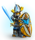
Regarding the characters being color coded- is it like Knights Kingdom 2 (the dreaded jelly bean Knights) in which the characters are primarily a flood of the color you mentioned....or is it balanced out with other colors on each of the figures too? Are all the colors rainbow-vibrant, or do we have some earthier tones on the figs for that balance? (grays, browns, navy, forest green, etc...maybe even gold/silver))
-
That's a lot of Lego skin....this theme isn't aimed at kids at ALL!
-
A lava boat?
-
Ugh....I know "soon" is a relative term...but still several weeks away doesn't feel soon, with the momentum this has picked up since the logo and set names appeared.
-
We've also had comments from people "in the know" who have said the logo is far more sci-fi than the actual theme is.
-
Perhaps it walks? Especially if we got Elves at some point for this theme in the next 3 years. Think to Warcraft 3....the Night Elves having their tree fortress that could uproot itself and walk to a new location.
-
Itaria - here is another point of reference to consider. You keep referencing 1 out of 4 being female as being a negative thing in this set....but you are referencing history as a whole, for your comparison. When we reference the entire lego castle history for a more proper comparison, we've got something like 2 (including this new one) out of probably hundreds of male knights and soldiers that have been released. Taking that into consideration, it is closer to the way you think it should be.
-
The last time we got a female knight was before most of the modern printing advancements, so I'll be interested to see the new interpretation.
-
Wait...so you are saying Lego shouldn't include a female knight because they weren't common, from a purely real-world historical reference point?
-
Knight Errant just means a "wandering knight". I'm a little confused why people would be offended by a female knight. While they weren't common in history/literature...they DID exist.
-
It's neat looking, but to be honest - the background is distracting.
-
I'll provide you with a similar example that didn't play out the way you suggest it should. Final Fantasy - it started out as a pseudo Dungeons and Dragons type experience - with a hint of steampunk/sci-fi mixed in. Final Fantasy 7 comes along with an anime style. You could argue that 7 brought more fans into the series, which would be a good thing...and then they'd go back to making games in the style/setting they used to (medieval), and everybody would be happy. That wasn't the case, however. When FF7 was a big success, Squaresoft (now SquareEnix) decided to continue making future Final Fantasy games in that anime style that 7 used, because 7 was a big hit....largely leaving the medieval roots in the dust. They haven't abandoned the medieval genre altogether, but most of their single player flagship titles for the past 15-20 years have been largely anime/modern themed, with medieval relegated to MMOs and small budget projects.
-
@Brickjagger - to get the pic to show, you need to edit your post and choose advanced options if you don't see all the extra editing options by default. Then, you'll see the icon of a white square with a tiny tree in it. That is the picture link button. You'll want to paste the location of the image in the pic button popup. To get the actual address of the picture, you'll need to right click on the image of the logo and click "View Image". The address is what you see at the top of the page after clicking View Image. Does that make sense? For instance, the location of the logo is: http://i.imgur.com/Q61GYii.png As a fellow designer, I'll field some of those concerns. - I can agree with your assessment about the afterthought of the scale between Knight and Nexo. They should have scaled it before adding the notches so the details were a comparable size. - Regarding the bevel - I'm not sure what your concern is with there being a bevel. There is a time and place for a bevel, and personally, I think it was called for this instance. - Drop Shadow - it's actually an "Outer Glow". It needed something...otherwise there wouldn't be nearly enough contrast between the logo and a white background.
-
Ironically, the genre isn't even completely clear just yet. It's been rumored to be Castle, Space, Steampunk, Action...or some mix between some or all of that stuff. Until we see more stuff, it's hard to definitively say what it will be at this point.
-
Are you referring to the big yellow background within the red inner border? If so, I'm not entirely sure that's intentional, or just a happy accident of using those stylistic notches. I believe the top of it is intentionally meant to look like a lego brick, but I'm not convinced the sides are intentionally supposed to be a tower shape. I wonder if the knights from this line will be anything like the "Sentinels" from Lego Universe. They were pretty sci-fi, by Castle standards: edit - LOL Umbra....talk about timing :) My thoughts immediately went to the same sort of styling!
-
That looks pretty sci-if inspired, not steam-punk. Lends more credibility to the He-Man knockoff.
-
A few considerations - we don't know that it will, in fact, be steampunk. It's rumored, but the latest info also suggests it will have a lot more sci-fi influence, which could be something else altogether. Until pics...who knows??? Also, some people just aren't into Steampunk. I like mild steampunk influences, but the more steampunk it gets, it usually loses my interest pretty quickly. Lastly - "Robo horses" could be either pretty cool, or REALLY tacky...depending on how Lego decides to go with it. They've blown it in the past with the KK2 jousting set trying to make non-traditional horses, so that doesn't inspire a lot of confidence. Also, a lot of the Ninjago and Chima vehicles aren't very "Castle-friendly"....and since some of the same designers from those themes are involved here, it has people worried a robo-horse will be more on the really tacky side, rather than pretty cool.
-
Or has some cybord implant of an eye to "help" him aim better... Also comes with a modern compound bow, rather than a traditional medieval bow (although an unusable accessory isn't the end of the world). Regarding Jestro, I've kinda assumed, if he's a bad-guy, there's a decent chance he'd be a skeleton jester...since that's a pretty traditional "fantasy" thing: It also sort of reminds me of Skeletor, if the He-Man influence has any merit to it.