def Posted February 25, 2010 I've decided to do some tutorials on how to do Photoshop Lego images. I am not a professional, but I've been using Photoshop on and off for years, and still follow up on new tools and techniques. Usually, I don't have much to do with it, but since I've been doing Eurobricks reviews, I've been practicing it more and more. In this thread, I'm going to do a few tutorials, and will index them in this post. If you want to do a tutorial, please do, but please give links to all the source pics, so others can follow along. Otherwise, I will not index it, since it's not a tutorial. If you try any tutorial, feel free to show us how it turned out, and ask any questions about how to improve your image. Or show us what you did with the techniques you've learned. One bit of advice, if you seriously want to use Photoshop, or any graphics software: Buy a tablet. I haven't used a mouse in over a decade, for drawing or anything else. Digi-pen technology is quite solid, and once you get used to it, mouses are anti-intuitive. They require your arm to move. Digi-pens move with your wrist, for the most part, and are much easier to use, control, and have 500 degrees of pressure, allowing you to control the 'flow' of your clicks. My tutorials are all relatively difficult with a single pressure mouse. I use a Wacom Intuos 3, which is apparently discontinued for number four. You don't need an Intuos, but I recommend putting the $100-150 out for that or one of the cheaper models, like the Bamboo. http://www.wacom.com/intuos/ It's not that much money considering how long they last. I've been using my current one for five years. That's about 10 cents a day. Anyway, happy Photoshopping! Tutorial index: Tutorial 1: Galaxy Commander moon scene Tutorial 2: Mono Jet on Mars Share this post Link to post Share on other sites
def Posted February 25, 2010 I want to go through the process I went through to make the title pic to my Galaxy Explorer review. It's an intermediate level tutorial, so you may use Photoshop tools that aren't so common, but I'll try to make it as clear as possible for beginners to follow along. If you've used it a fair amount, there should be no big surprises here. Here is the finished pic: To begin with, download the four original pics used here: Moon, Ship, Base, shipshadow. To start with, I prepared the main ship. It's what the pic is about, so I did this first. Open the ship.jpg pic. Double click the layer so it isn't the background, it will become 'layer 0' or whatever name you give. I used the lasso tool and just roughly went around the ship. Then, I went to select /inverse to select what I hadn't selected. I then deleted this selection, so just the ship is left in the pic. Next I select the green around the ship with the marquee tool. I usually use a white background, but this ship has so much white on it, that it would make this step a hassle. With some green selected, I go to select/similar to get the majority of that color. Of course, you'll get some colors you don't want, but that's okay. Notice, the tolerance is set to 40 (not circled, but in the second row from the top). This is the range of shades taken. "0" is only identical pixels, and the higher the number, the higher the range. Now, the first time, I deleted the stuff I didn't want, but this time, I'm coming close to the ship, so deleting is too dangerous. Instead, I create a layer mask, hiding selection. Layer masks cover what's visible, but leaves the picture intact. (Layer masks are one of the most important items in the Photoshop arsenal.) I create a new layer and fill it in with a color that will create contrast. Any color will do, as long as you can see clearly. The next step takes a little time. I close up to the image, and in the mask, using the brush on the mask, I manually either cover or show the ship. This is not the way to create masks for trees or hair, but for Lego, it only takes about 5-10 minutes. Save the pic! If you make a mistake, you'll want to come back to it. Anyway, now we can apply the layer mask. Right click the mask (the box to the right of the image in the layer). This is the image we'll be dropping into the pic. As we can see, I'm watching LOST season 6 as I make this It's pretty easy to multi-task if you have a nice big screen. Next, repeat this whole process with the base.jpg pic. Getting the whole of it cleaned it important, but if you leave a little white, no worries, you can clean it up later in the process. Having too much is better than too little. Now I start a new page. I made mine 1024x816 pixels. I don't know why I chose that size, but the moon pic is from the Internet, and has a lower resolution. (I just google-image searched "moon lunar" and this showed up. "moon surface" would have been cleverer, in retrospect.) Ultimately, this pic was being made for Eurobricks, so a high-res image wasn't needed. In the end, the pic I used was only 800 pixels wide. To this, copy-paste the moon.jpg pic. <SPOILER> Yes! Claire is back, not looking so cute either! <END SPOILER> I edit/transform the moon pic so that it fits the screen, but lower it, because I want lots of room for space. <Remember, hold shift during transform to maintain proportions, so you don't stretch your moonscape> Don't worry about that white space. Next, I create a new layer, and call it stars. Hopefully you can imagine what I'm going to do now. In the moon layer, select the sky, and the negative-white space. <shift-select adds areas> Switch to the stars layer, use the paint bucket tool to fill it up with black, then go to filter/noise. I used about 100%. This looks quite crazy, so filter/blur/gaussian blur it about .3 to .5. Then, with the stars layer selected, option-click new adjustment layer (bottom right-hand corner). This is very important. This layer will affect only the stars layer, and is always adjustable, whether you want more or less stars. In this new adjustment layer, slide the black towards the white, until you're comfortable with it. Next, again, with the stars layer selected, option-click new hue/saturation layer. I check colorize and slide the hue to the right until the stars get a nice little blue tint. It's looking great, except the pesky marks and moon guys. I quickly grab the clone stamp, and select a nice big soft brush, and then clone them out of existence. <option-click to choose the area to copy from, then click/drag to copy to> But the pic is missing something... It needs some Lego! Now for the fun stuff, we bring the ship in! And it's freaking massive! Again, quickly with the edit/transform (or command-t for short) I bring it into the size I want, and also rotate it a bit since the originals position isn't where I wanted it pointing. Now that the ship is in place, I want to do the lights. Because of the way I do the glow, I use a different layer for each color. I use the eye dropper tool to get a basic yellow, then lighten it to a color I like. I basically just color the yellow piece in. Then, I use a much whiter yellow, and color the center, to replicate a light. But it looks funny, so I put a Gaussian blur on it. One to two pixels should make it look good. Of course, you can do it until you're satisfied with it. Next, double click the layer to bring up the layer effects. You're going to add an outer glow to the pic. You mainly have to adjust the spread and the size. I set it at 7 and 21. Again, use your judgment as to what looks good in your opinion. Then repeat this for the green and red lights. Each need their own layer, their own effects. In this tutorial, I'm not going to do all the lights, but you'll have to in your pic. The ship should essentially be done now, but you might want to adjust the levels, either brighten or darken it until it feels right to you. I dropped the base pic in and resized it to look nice, but the angle/perspective of it was all wrong. So, rather than just transform it, I transform/distort it, allowing me to force perspective on the image. A lot of this will make it look funny, but a little bit can really help integrate two images together. Last, we need to create a shadow. First, open up the shipshadow.jpg pic. Basically, you're going to do the same to this as you did to the first pic, but because it's a shadow on the moon surface, you can be lazy and roughly get it, nobody will know the difference. In the end, I chopped off some of the wing, and it's all o-tay. Again, drop it in the pic, and transform it to a smaller size. I also vertically crunched it a bit too, since it's supposed to run off in the distance, it's not supposed to be in the proportion of the overhead shot. That pic, you want to adjust the levels on it, pull the lower white slider all the way to the left, so that the pic is pitch black. Then, Gaussian blur it two pixels or so, and in the layer menu, lower the opacity to 40% or so. It looks good, but it's not interacting with the picture well. I add a mask to that, and mask the shadow on the foreground minifig. He now stands out now. Finally, create one last layer for the lights' shadow. They need to appear on the ground, for realism's sake. I use the eyedropper to copy the color on the ship's light, and paint them roughly where they belong on the shadow. Then, Gaussian blur them, between 10 and 20 pixels, again, when it feels right. When you're done, you should have an image roughly the same as the one I made in the starting pic! Total time? Less than an hour. If any points of this review are unclear, I'll edit this post, so that it as useful as possible to as many people as possible. Try it and show us the results! Share this post Link to post Share on other sites
Rick Posted February 25, 2010 Thanks for sharing this very informative and detailed tutorial. Share this post Link to post Share on other sites
def Posted February 25, 2010 Thanks for sharing this very informative and detailed tutorial. There's more coming! But not this week, I should take a break, two reviews and a tutorial in 4 days Absolutely mental, I'm so tweaked out this week (exercise + coffee - alcohol = busy busy def) Share this post Link to post Share on other sites
Big Cam Posted February 25, 2010 I for one appreciate this, I'm a heavy PS user, but mainly just for editing RAW images from my camera, image manipulation has always been just out of my reach. Hpefully this will help me improve my reviews even more. BTW, this post can be absorbed if need be for future tutorial use. Share this post Link to post Share on other sites
def Posted February 25, 2010 BTW, this post can be absorbed if need be for future tutorial use. There's no worry about that, I plan to index them in the first post, so people can post all they like in this thread. Just to be clear, while anybody can post a tutorial in their own thread, I'd like to post them in this thread and reference them from the first post. Share this post Link to post Share on other sites
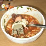
def Posted February 28, 2010 In a week or two, I'm going to do a tutorial on how to do a Mars scene, in this pic: But, in the meantime, if anyone wants to chat about Photoshopping, I'd love to, it's on my head a lot these days. I finished this today, which is a combination of photos of Lego I took, with a variety of effects, all done in Photoshop (except the word baloon, done in Illustrator). Share this post Link to post Share on other sites
NewRight Posted February 28, 2010 Great tutorial. I always find it hard to do the magic wand keyout. Maybe that's because I'm to cheap for the real photoshop and settle for GIMP. Share this post Link to post Share on other sites
Erdbeereis Posted March 2, 2010 Awesome tutorial Def. I'd love to be able to create lovely pictures like that. My backgrounds always are imperfect, like here. It always frustrates me to not get the results I want... How much of this is it necessary to have the full Photoshop? What version do you have? I did a trial for Elements a few weeks ago, but I still had a lot of trouble. Share this post Link to post Share on other sites
def Posted March 2, 2010 It always frustrates me to not get the results I want... How much of this is it necessary to have the full Photoshop? What version do you have? I did a trial for Elements a few weeks ago, but I still had a lot of trouble. I think full Photoshop is needed if you want to do graphic effects. Elements is more or less a colour editor, right? As I mentioned in the first post, there is a free 30-day download of Photoshop, so I recommend installing it at the start of a vacation, so you can push yourself on it. I started on Photoshop 4.0, and am now using CS4, and I keep needing to learn new techniques. I've been buying The other thing though, is that it's really hard to do tight graphics without a digi-pen. It's an investment (a cheap one is $100 or so) but it will pay off in the long run in all graphics stuff you do. As for your pic, it looks fine at that size. Once you drop it on a background, we can see how well it works. Lego tends to get a shiny white line around it, so I tend to edit it out, cutting out a little extra. I'm working on a technique to replace the colors and keep more of it intact, but so far no luck. But looking at the ninja pic, it doesn't seem like there is anything missing. Do you have a background in mind for your picture? The angle you shot is a little difficult, because it is a crane shot of sorts, and may be hard to find something that fits that perspective. You could try taking a shot from a Lego person's eye level. The background would be easy to improvise... Very easy Share this post Link to post Share on other sites
Erdbeereis Posted March 2, 2010 Actually, I usually just like a clean white background. That's really what I use the most for MOCs. It's just tough for me to get the white part to go perfectly up the the MOC, without it going into the MOC. If you look at most of my pictures, it's almost never perfect. Share this post Link to post Share on other sites
def Posted March 2, 2010 Actually, I usually just like a clean white background. That's really what I use the most for MOCs.It's just tough for me to get the white part to go perfectly up the the MOC, without it going into the MOC. If you look at most of my pictures, it's almost never perfect. Sorry, I meant drop a background in in Photoshop. In a pic like that, simply a nice sky, grass, and sea background would do nicely. I take my photos on white too, though a pic like that would be well served with a color to contrast with, since the building's white. Share this post Link to post Share on other sites
Erdbeereis Posted March 2, 2010 I knew what you meant. I am curious though, how would you just get a white background with your methods? Is it also a many step process like this is? I can manage to do it on my paint.net, but it always is a difficult process as the magic wand always leaves some of the backdrop behind, so I have to do the details by hand. Do you still want to use my MOC for the next tutorial? Thanks a lot for doing this awesome tutorial. Share this post Link to post Share on other sites
def Posted March 2, 2010 Sure, let's do it. You can stop it when it's white, and I'll keep going, because I have a new lovely cloud (and possibly water) technique I want to try out. Share this post Link to post Share on other sites
Erdbeereis Posted March 2, 2010 OK. I probably won't be able to make it a perfect white though, because like I said, I'm not an expert. Also, the photo was originally taken on a dark blue background, is that OK? EDIT: I just saw that I don't have a lower angle photo that you mentioned. The MOC has been taken apart for a while, so maybe you should stick with the mars pic, unless you want to do one of my new MOCs. Share this post Link to post Share on other sites
def Posted March 2, 2010 OK. I probably won't be able to make it a perfect white though, because like I said, I'm not an expert. Also, the photo was originally taken on a dark blue background, is that OK?EDIT: I just saw that I don't have a lower angle photo that you mentioned. The MOC has been taken apart for a while, so maybe you should stick with the mars pic, unless you want to do one of my new MOCs. That's fine, if you send me a link to a higher-res original version, I'll see what I can do with it. Let's use the shot before you worked on it, if you still have it. I'm not entirely keen to do the Mars shot again, since I made it a month ago, but I can do an alternate maybe, to keep things exciting for me if you don't have it. Share this post Link to post Share on other sites
Holodoc Posted March 2, 2010 I was looking at this topic when you started it, because I'm really interested in digital "remastering" of photos. I'm currently working with Paint Shop Pro Photo X3, just because I grew up with it, starting with PSP 4 . I had PS CS 3 installed, but if you're working with it, at some time you're forced to learn the key-shortcuts by heart instead of just klicking at icons you can place where you want them. That was the main fact that kept me from using PS. Now you have driven me back to put some more time in working with Paintshop again. The main problem now is the layer issue. I've never worked much with layers so far and this may be the reason I wasn't able to produce clean cut-outs, as you did with the layer masks. I will definitely look further into this. Thank you so much for this insight in PS! At the moment I'm working on a new uniform for my avatar. (First contact, here I come!) It was meant to be a first work to create a decal for my real minifig. I had a fine result in PSP, but then I realized it would have been better if it was scalable. Then I started over again in CorelDraw... Of course it would have been a lot easier if I had made a digital version of it, but with a real minifig you have more possibilities to create photos in upcoming MOCs. Share this post Link to post Share on other sites
def Posted March 2, 2010 At the moment I'm working on a new uniform for my avatar. (First contact, here I come!)It was meant to be a first work to create a decal for my real minifig. I had a fine result in PSP, but then I realized it would have been better if it was scalable. Then I started over again in CorelDraw... Of course it would have been a lot easier if I had made a digital version of it, but with a real minifig you have more possibilities to create photos in upcoming MOCs. I haven't used CorelDraw, but if it were me, I'd do a decal in Illustrator. It would be scalable, and you can turn it into a Smart Object in Photoshop/Illustrator. It's a takes a bit of time to explain it, but smart objects are really useful. Share this post Link to post Share on other sites
Erdbeereis Posted March 2, 2010 That's fine, if you send me a link to a higher-res original version, I'll see what I can do with it. Let's use the shot before you worked on it, if you still have it. I'm not entirely keen to do the Mars shot again, since I made it a month ago, but I can do an alternate maybe, to keep things exciting for me if you don't have it. Unfortunately, the only shots I still have unedited a super close-ups, which probably wouldn't work. I do however have abount 5 or 6 new MOCs in the works that will be done soon, and if you want to do one of those, the pictures will be completely unedited. When they're done I could PM you one of them. Share this post Link to post Share on other sites
def Posted March 14, 2010 For tutorial #2, we're going to practice a few things, namely, using curves, color matching, smoke (cloud) effects, and motion effects. The first two techniques are useful to any Photoshopper doing Lego pics, so hopefully they are useful to you too! I said I would do a Mars tutorial, but I decided to do a new pic using older techniques. The subject? Another member of the unloved Life on Mars series, set 7310 Mono Jet. It's pretty darn cool to begin with! Files Original Photo Mars Surface (optional)Edited Photo To begin with, I took some pictures from different angles. I knew I wanted a 'speed' shot, and those are best done at an angle coming at you, but this is a weird looking ship, so I settled on a diagonal angle shot. Then, as in the last pic, I searched the web for high res Mars surfaces. Not a great selection, but I found a decent pic. I realize not everyone has a digi-pen, so this time, I added the optional file so you can skip down to step 5 if you don't want to cut out the image. But it's always good practice since you have to do this every time you do a Lego pic. 1. First, start watching Chuck in the background You don't have to, but it's a good show, especially in season 3! I have a big screen, so it's easy to have a TV going in the background. Anyway, first, duplicate the original layer (lower right) by right clicking the Background layer. Last tutorial, I used the magic wand, but this time, I'm just going to use the lasso, since it's small. I make a layer mask (pic). 2. I use the lasso to draw around it, then I invert it (pic). I fill the mask in, then I zoom in and clean up the rest. This is laborious, and very hard with a mouse, but you can shave off a pixel at a time if you like. Since it's a mask, you can always come back to it if you made a mistake. 3. I create a curves layer with the adjustment layer in the lower right. Curves (basically) set the maximum light and dark of an image, and can really make your image 'pop'. With the curves layer selected, you'll see a window with three eyedroppers, a black, grey, and white one. The black is the absolute black, the white, absolute white, and grey, you guessed it, absolute grey. Select the black one and then touch the darkest part of the pic (I selected in the engine). Magically, the image should be much more vivid. The white level seems okay, but maybe you can touch it up with the white eye dropper. I did it, using the helmet, but there was little effect. 4. For the avid Lego photographer, we're going to use one of the most useful tools, the surface blur. This filter blurs only areas of a similar color, and is first used to cover pores on fashion models or cut noise down on night sky pics. For Lego, it cuts noise and purifies your image. I used a radius of 25 pixels and a threshold (degree of variation) of 10. Experiment with it. As you can see, the image is cleaner, but still very 'Lego' looking. 5. I saved that pic (and made a png for you!) and then applied everything, and copied it to the Mars pic. The Mars pic, I tilted, and embiggened it just a bit, so there were no white corners. I had to shrink down the Lego pic, and got it looking like this: Some of my edge editing wasn't perfect, so here and there, I shaved a bit off to make it look better. 6. The colors are really jarring, so we need to fix that. I want the Mono Jet to suit Mars atmosphere, so we use the Image/Adjust/Match Color. This is a fantastic way to quickly shift the tone of an image. In the Source menu, select your current pic (pic) and then select the Mars layer. With the fade at 0, it's way too red, but if you move it to 80-90, it'll start looking quite nice. Also, I'm now watching Cougar Town, a far better show than the name implies! 7. It's subtly better Now, we'll create a shadow, similar to the one in the last tutorial (so I won't go into detail here). I duplicate the layer, and call it 'shadow'. I open image/adjustment/levels (pic). In the output section, I shift the white to zero, making the image black. 8. I move it to the lower left, matching the shadow direction of the rocks. It doesn't quite reflect a true shadow, so I use a soft brush to delete what isn't needed (head and wheel) then Gaussian blur it, and lower the opacity, to maybe 50%. Again, your vibe on it is most important, and you can always adjust it again if you change your mind later. 9. I duplicate the Mars layer, and filter/blur/motion blur that new image. I had to do it a few times to get the placement and degree correct, but basically I used the vanishing point of the landscape as the center, the upper right. 10. I just want the area around the vehicle to be blurred, since that's how motion photography works. The stuff close by is blurred, the far away stuff okay (like looking out the window of a car). So, I create a quick mask (the bottom button on the left hand toolbar). With that selected, I do a radial gradient from the same vanishing point, and you should have a red pic like this: Unselect the quick mask, and then create a mask, layers/layer mask/reveal selected. This should make the blur fade into view as you leave the vanishing point, right? 11. This isn't a major step, but it looks nice and it's worth trying. I want to create smoke behind the vehicle. There's no one way to do this, but there are some principles to follow. First, make a new layer, and select a light grey/white color, and lower the opacity of the brush to about 30% and the flow to about 50%. I use a rough brush (windows/brushes/load-thick heavy brushes) because it has a little more texture. Then, doodle circles. Make it a little darker, and doodle inside, and darker again, and so on, until it's about as so (pic). After, I Gaussian blur it to soften it, and lower the opacity on the layer to about 80%, so it is partially see-through. Finally, I color match it to the Mars pic, as I did the Mono Jet pic. 12. As one nice dramatic detail, I create a new layer and box, and fill it in black. 13. I use filter/render/clouds to create clouds. I do it a few times to get clouds I like. 14. I take the box and edit/transform/perspective. I want the clouds to move off to the horizon, so I widen the top, and turn it to match the horizon line. After moving it to the upper right, I create a layer mask, and use a gradient to fade it in the horizon. I lower the opacity to blend it into the color of the sky. That's it, you're done! Not so difficult, and can be finished in an hour or so. Give it a try Share this post Link to post Share on other sites
drdavewatford Posted April 1, 2010 This is great - I can't wait to try these techniques, although I may need to invest in a graphics tablet first.... Photoshop seems to have such a bewildering array of options that it can be intimidating; nice to have someone walk me through the steps. Sorry if I missed it, but do you use Mac or PC ? I guess some of the menus are slightly different between the versions, so it'd be nice to know which version you're using. Thanks, D. Share this post Link to post Share on other sites
Holodoc Posted April 1, 2010 Sorry if I missed it, but do you use Mac or PC ? Look at the photo above. Upper left corner. See? Share this post Link to post Share on other sites
def Posted April 2, 2010 This is great - I can't wait to try these techniques, although I may need to invest in a graphics tablet first....Photoshop seems to have such a bewildering array of options that it can be intimidating; nice to have someone walk me through the steps. Sorry if I missed it, but do you use Mac or PC ? I guess some of the menus are slightly different between the versions, so it'd be nice to know which version you're using. As Holodoc offered, yeah, I'm on a Mac. In regards to Photoshop, I think they're pretty much the same. I use Macs because they have a better daily experience. Though I haven't used Windows post-Vista, which I've heard is becoming more and more Mac-like. Anyway, before the Mac-hating Walrus rears its head... I agree that Photoshop in its full form is intimidating. It was bewildering when I first used it 10 years ago or so, and I expect it's harder to jump into now that its been expanded on for a decade. Tutorials are the way to learn, rather than a textbook. It's how I learned (and learn), and the reason I started this thread. Please do invest in a graphics tablet. It will change your life if you enjoy digital art whatsoever. We're a long way from the computers Tom Cruise used in Minority Report, but Wacom's tablets seem to be a nice middle ground... and their graphics monitor is even scarier and futuristic, not to mention unaffordable. Let's get to work! Share this post Link to post Share on other sites