
Clone OPatra
-
Posts
9,107 -
Joined
-
Last visited
Content Type
Profiles
Forums
Gallery
Everything posted by Clone OPatra
-
Ah, thank you! I honestly had no idea I've noted that in my new title description. And the first posts are updated.
-
You know, I used to think that too, but now I'm not so sure. LEGO has shown that it has no problem creating sets based on PG-13 properties (Indiana Jones, PoP, PotC, Harry Potter), so I'm not sure if LotR really is too violent. Some of the Indiana Jones, Pirates, and Harry Potter films have a good deal of violence in them. The Hobbit will also be less violent than the trilogy. At this point, when it comes to licenses, anything is possible.
-
I've never been a fan of Batman in the comics, or even the character much himself. Granted, I haven't read a whole lot besides for some of the really early stuff, but the ideas behind his character are not something I find very compelling. I've seen all of the live-action films (including the one based on the TV series), and I think these are certainly better than the others. Of the older ones, the one I enjoyed the most was Batman Forever. For whatever reason, I found Batman the most compelling in this one, and Jim Carrey and Tommy Lee Jones did a good job as comic bad guys. On repeat viewings I really grew to like Batman Begins. I especially love Tom Wilkinson, who played Falcone, and all of other actors did great jobs too. Despite having multiple bad guys and a few different interconnected story lines, Begins doesn't feel too rambling to me, and all of it works. I can't say I felt the same way for The Dark Knight. The performances are still great, but the film felt much longer than it had to be. One of the biggest issues I had with it was the look of Gotham. In Begins, Gotham looks very gritty and at the same time unlike any real place on earth. Sure, it's more realistic looking than the Gotham in the older films, but it still felt like an entirely fictional place. In TDK, Gotham just looked like Chicago, which didn't work for me at all. I fear that I will have the same problems with TDKR that I did with TDK. Begins felt like one story despite multiple villains because Scarecrow, Falcone, and Ras were all somewhat connected, but the two villains in TDK were not, making the film drag on. Since I expect that Bane and Catwoman won't have much to do with each other, it's likely that this film will also have a very long running time because of the separate nemeses. And it seems that Gotham still looks like Chicago. These issues don't mean I'm not looking forward to seeing it, nor that I won't enjoy it. They're just my thoughts on the Batman franchise.
-
 No, that's a MOC.
 -
No hissy-fits necessary! - Thanks to info from JimButcher, I have learned that this comes from my own Podracer review. So, I have a feeling it might've been given to me by Rufus.
-
I disagree. Kids is a very broad description, and some themes are clearly aimed at younger children than others. Take the recommended age ranges for example. On a $20 Cars set the recommended age range is 5-12, while the recent Clone Battlepack was ages 6-12, and $25 SW sets are 7-12. I'm not suggesting one should take too much stock in LEGO's recommended age ranges, but there being a difference at all shows us that LEGO has a slightly different group of kids in mind.
-
Super review Rufus! I still cannot imagine laying out all of those pieces for such a big set, but I love seeing them. This set is very nice, and I certainly prefer the CW color scheme to the old one. It looks sleeker. The biggest thing that screams about to me about this set is the minifigure selection. Two new Jedi and two new Clones is beyond awesome. If only LEGO had started this trend last year; the Turbo Tank would've been less disappointing had it not only had two new figures (one of which was available in another set anyway). If I could afford to buy two big sets, I would seriously consider picking this one up. As it is, I'll just stick with your extremely detailed review.
-
You really know how to transform a basic box of bricks into a full blown, very entertaining review Rufus! It's great to get a look at this type of 'set,' which can't even be called underrepresented in reviews. It's not represented at all (kind of like Duplo). It's refreshing to see that LEGO still cares about basic bricks, and their own suggested builds are quite the nostalgia inducers. Just basic bricks can't be turned into the highly detailed MOCs that AFOLs tend to make, but the MOCs that come out of them still have charm, like you've shown. It's like some modern art: rudimentary and simplistic, which makes it charming.
-
LEGO Star Wars 2012 Pictures and Rumors
Clone OPatra replied to XimenaPaulina's topic in LEGO Star Wars
I don't know how much Wookieepedia is a trusted source for such things, but it says: So green is not an unusual color scheme. I don't think LEGO would make decisions about a clearly EpIII set based on what is going to be in the CW, though I could be wrong about that. -
Great review Masked. You nailed all of the opinions I have about this set too. I do not buy many Star Wars sets anymore, especially not on impulse, but this one I did. Even though it has less pieces than both $25 sets in this wave, it does feel worth the money. The ship itself is nicely designed and excellent for swooshing. Obviously the minifigures help justify the price, but that's how it always is with a set this size. I'm glad I picked this up.
-
LEGO Star Wars 2012 Pictures and Rumors
Clone OPatra replied to XimenaPaulina's topic in LEGO Star Wars
I don't think they will. Back when somebody gave us info on these rumors, that person said it would be green, I believe. Or did I just make that up? I don't think it matters what color is 'iconic' to LEGO when it comes to that ship. They've already released it in dark blue, which didn't see a lot of screen time. Dark green will be a nicer color than yellow anyway. I doubt any kid would actually think 'didn't Anakin pilot a yellow one of those?' It'll be cool looking regardless. -
REVIEW: 30080 Ninja Glider
Clone OPatra replied to WhiteFang's topic in LEGO Action and Adventure Themes
Very nice review Fangy! Those Ninjas don't know how to hold back in extravagance do they. My question is, where did they get all that gold? Personally, I don't find this set to be all that exciting. Besides for the gold scimitars, there isn't much that makes me want to get this. Compared to the old Ninja glider that you've shown, this one is certainly better, but compared to the old ones that use the large plastic wings this one is not as good. Those old ones might have been clunky, but they actually felt like something made from wood, bamboo, and rope, where as this one is utterly nonsensical. Nonsensical is what NinjaGo is all about, though. -
Review: 7419 Dragon Fortress
Clone OPatra replied to ZO6's topic in LEGO Action and Adventure Themes
It seems nearly everybody agrees with you too! Add me to that list!In fact, I would go so far to say that Orient Expedition as perhaps the all-around best theme of all time. Besides for the littlest sets, which didn't have much going for them, the rest of this (sub)theme was purely brilliant. The flagships of all three regions were great, this one being the very best. It's so odd that during a period of turmoil for a bunch of themes this beautiful set came out. This has to be the best ever use of that baseplate, and yes, perhaps even the best set of all time. There is nothing one can fault here (though I never liked the vehicle so much). I wish LEGO had released a full blown ancient China theme at the time, since they certainly knew what they were doing. I guess the one thing at fault, like you've said, is Pippin's new face. The original was so great, and much more mature looking than any of the other female faces LEGO had ever released. The new one just made her look stock, boring female figure. I really loved the new face for Johnny, though. The changes were subtle, but the added detail really spiced him up and gave him more character IMO. Still, I wonder why the main trio reverted to their original desert outfits for China when they had new ones for Himalayas and India. -
Hmm, all that mood swinging might not be healthy I've got to say that this time I was not deliberately trying to look at this set from today's perspective (besides for the comparison pic with the new Great Hall). It may not be apparent, but most of my opinions of the faults in this set stem from when I originally got it. Even then I found this set to be ugly and a bit boring. LEGO was capable of delivering very nice looking sets at the time (the Adventurers sets are good examples, and Ninja), but this one was not like that. My playability rating is not based solely on the amount of play features included. I agree with you that there a fair number of them, but most of them are exactly the same and pretty useless, to me. Trap doors and falling statues are exciting play features; hidden gems, not so much. We probably differ on these points, but I still thought it would be good to explain where I'm coming from. It's difficult to completely immerse oneself in the time period when a set was released for a review, but I can say that nearly all of my critiques are ones that I had when I first got the set. Besides, I'm no big fan of the newest Hogwarts either.
-
I think you've just inadvertently selected the wrong licensed themes to base your opinion on. Because of their source material, Cars, Toy Story and to some extent SpongeBob have some weirder types of pieces. I don't see many <insert that tiresome argument> pieces in SpongeBob myself though. The minifigures make use of different moulds for heads, but that's no different than Ewoks, Watto, Jar-Jar, in fact, many many alien races in Star Wars. All of the other themes besides for the ones you've mentioned, though, are absolutely on the same level as SW. Indiana Jones, Prince of Persia, the recent Harry Potter, and even Batman all had terrific designs with only the occasional large piece for a cockpit or something, no different from Star Wars. Perhaps these themes are hard to compare because they are either not vehicle based or do not have sci-fi vehicles, but they absolutely have the same quality as Star Wars, if not better in some cases.
-
All this Harry Potter set reviewing has got me in a perpetual Harry Potter set reviewing mood. Or maybe it's the other way around. Whatever. Anyway, the theme didn't start in 2010, you know. It started way back in 2001, with the flagship of that wave of course being… Set Title: Hogwarts Castle Set #: 4709 Theme: Harry Potter Film Connection(s): Harry Potter and the Sorcerer's (Philosopher's) Stone Pieces: 682 Minifigures: 9 Year of Release: 2001 Price at Release: $90 Buy it? Inventory? Bricklink Peeron Just browse the pictures? Flickr INTRODUCTION Ten years ago, the overarching Harry Potter mania was just testing out its legs. The first film was soon to come out, and it was remaining pretty true to the source material, so its success or failure would have a lot of effect on where the series would go. LEGO was also just starting to test out a new area of toys: Licensed properties. Star Wars had taken off just two years before, but since it had already been successful, adding another License probably didn't sound like a half-bad idea. How right LEGO was. Before long, this Hogwarts Castle had sold out like crazy; I had to wait several months before getting my hands on it, having to settle for the Hogwarts Express and some of the smaller sets in the meantime. The question is: why? Was it just the Harry Potter craze? Is this set truly something special? Let's find out… BOX My box dissapparated a long time ago. But it was big. And probably had a front flap like big boxes did back then. Yup, moving on. I have too many pictures already, I don't want to waste one on a box pic from the web. INSTRUCTIONS This is quite a meaty booklet, larger than a standard (what our European friends call 'A4' I believe) piece of paper. The picture is what must have been on the box as well, and it depicts the castle mysteriously surrounded by water. I seem to remember it being up on a hill in the film, without the ability to have rowboats go right past, but maybe that's just me. The picture actually doesn't make much sense, but it has that nice friendly feel characteristic of HP at the time. No conflict, just the characters happily lazing about. This being a large set with multiple modules, it actually had a form of numbered bags: bags with pictures on them, showing what the pieces inside constituted. Also, not all of the minifigures came in the first bag to be built, as you can see here. Though I grew up mostly pawing through huge amounts of unsorted LEGO when building a big set, since this one has these clearly divided sections I think the specific bags make a lot of sense. It's really when LEGO has you open a bag to build half a building, and then another bag to complete it that numbered bags are just silly. Another interesting feature of these instructions is the function illustrations. I will demonstrate the feature shown here later. As you can see, the build is not very complex and moves pretty slowly, making the booklet as thick as it is. Still, there are no piece callouts, so you get to have the old fashioned fun of scanning the images for the new pieces being added. Once the build is over, there are some pictures showing the crazy amounts of awesome fun that you can have with the set. That astronomy looks totally rad! There are also multiple sets of alternate instructions. Since this is a large set with a lot of wall pieces, there are a lot of neat Hogwarts-like things that one can build. I don't want to use up too many pictures showing them, so here's one and links to the others. That annoying screaming kid was probably not even born in 2001, so instead we get a full page ad for the first Harry Potter Creator game. Never played it, so I couldn't tell you about it, but it probably involved building Hogwarts and wasn't anything like the awesome Harry Potter: Years 1-4. MINIFIGURES This being the first big set of the Harry Potter line, it comes with all of the essential characters, actually all of the characters that LEGO made for the first wave, besides for Quirrel who only appeared in the $10 set. That was really smart of LEGO to do, since you can have all the fun around Hogwarts with all of the characters, without needing to buy any other sets! Perhaps from a business standpoint that isn't too smart, but it's great for the kiddies (and parents). Kids Now, I know I've said in my more recent reviews that I don't care much for these originals, but really I suppose they are alright, and I was glad to have them at the time. They are each a good and distinctive representation of their chracters, and LEGO did a terrific job designing new hairpieces for the trio. I still find Ron to look a bit too zany, but LEGO was going for a cartoony feel. The one thing that really is wrong is the color choices for the outfits. In Sorcerer's Stone, the kids wear dark grey sweaters and pants with black cloaks on top. Also, the Gryffindor shield is never on the sweater; it's on the cloak. I was disappointed then and still am now that LEGO decided to use their standard cape, which is not reminiscent of the movie costumes at all. In any case, they should've used dark grey here (not to mention when they did switch to dark grey, the costumes had actually switched to black). I felt like showing off those hairpieces, to show what a great job LEGO did on them. These figures just wouldn't have been the same with existing hairpieces. Now would also be a good time to mention Harry's violet cloak. I suppose it's supposed to represent his invisibility cloak, but really that doesn't make any sense. Sure, I like variation in my colors of capes, but he should've just had the black (and starry) one like everybody else. Yep, the capes have stars on one side. Why, you ask? Who the heck knows. Maybe it's supposed to be 'magical' or something. I'm sorry, but this too doesn't make a shred of sense. At least it's better than the extremely colorful HP sets (if you don't know what I'm referring too, maybe that's a good thing). Adults Staffing Hogwarts we have Dumbledore, Snape, and Hagrid, all choices that makes sense (what would Hogwarts be without Dumbledore?). Dumbledore is pretty cool looking dressed all in purple, not the most common of LEGO colors (though his costume looks more dark red most of the time in the film). What I especially like about Dumbledore is how LEGO designed a hair piece to fit the existing beard piece and that he was the first ever minifigure with the beard in grey. Snape, on the other hand, is really dumb. A glow-in-the-dark head? Why? Ok, I guess it's because Harry thinks he's all evil or something, but seriously it's a nonsensical choice. Lastly, the Hagrid figure does the job, while being a bit plain and having too-hollow eyes. Others The 'others' are Peeves and a suit of armor, that has the same head as Peeves. These are some of my favorite figures of the bunch. LEGO didn't even have to make Peeves, since he wasn't in the films, but using an old grey minifigure to represent a ghost was an awesome idea. The faint design on his torso just adds to his ghostly appearance. The knight, too, is just all around cool, especially because he's the only minifigure to ever feature that armor piece and visor in light grey. Monochromatic figures also have a neat look about them in general. Faces Revealed Here are the minifigures with parts normally covered, not that you would really want to uncover them. Dumbledore is the strangest of the bunch. His mouth is quite far away from his eyes for one, but what's with the revealed chest? I guess he likes to keep things breezy? It's a bit disturbing, just like Hagrid's blank eyes. With Accessories Here are the minifigures brandishing their figure-specific accessories. The most exciting is obviously the Gryffindor shield, and perhaps the light grey shortsword as well. The wands are typical, and I don't really understand why Harry has his broom included, but I suppose the Nimbus 2000 is a big deal in the movie/book. Do note that back then each character had to have their own wand color, though it doesn't make much sense for there to be a grey wand (more sense than trans blue, though). ACCESSORIES There aren't really a ton of decorative accessories, but there are enough. The printed tiles and books are nice and fit well into the theme, as does the stickered Dumbledore card from a Chocolate Frog. The keys and goblets work too, and more chrome anything is always nice. The rest, though, is odd. Besides for the Sorcerer's Stone itself, there's never much treasure in the HP series, so having a treasure chest (albeit in a cool and rare color for that piece) and gems seems kind of like the designers couldn't handle putting the name 'Castle' on a LEGO set without there being treasure in it. A magnifying glass fits in a little I suppose, and at least that is also in a cool and rare color, appearing in that color mostly in Belville sets. The books all have exquisite, unique prints that clearly show what subject material they may contain. These are so much more interesting than the plain brown books in the newest Hogwarts Castle, even if two of them are brightly colored. The black one, by the way, is exclusive to this set, and reminds me of the book in the Restricted Section that screams at Harry in the film. This set also contains a good haul of animal friends, though they all look somewhat blank without printing. Still, they play their part, and owls certainly do have a large part in the HP universe. BUILD Nope, I didn't take any build pictures. This set is so open that you can see everything without needing them, and there aren't a whole lot of interesting features of the build. No SNOT in this set. I will take you through the set in the order that it gets built in the instructions, though. HOGWARTS CASTLE - By Parts Ok, ready for the grand tour in build order? If you're not, you can find the buttons to take you back to the Licensed Forum or the Board Index up above this post somewhere. But don't do that; you should check out Hogwarts! Boat This being a Sorcerer's Stone set, LEGO had to throw in one of the boats that the first years take across the lake, not that I'm complaining. I've got nothing against rowboats, and it does fit for Year 1. The fire and holder works for the lights on the front of the boats as well. An odd feature of these instructions is that they have you place the minifigures on certain parts of the set as you go, without much good reason why. I guess the LEGO designers just really cared about which figures went with which part of the Castle, dammit! You have to put Draco and Hagrid in the boat, you brainless numskull of a child! Owlery Tower Topper Yeah, I didn't really know what to call this thing. It's basically just there to look nice, having no other purpose, but it does the whole 'looking nice' thing quite well. There isn't even a floor, since this goes over the owls on a component that you'll build later. I find it odd that this is actually built before the Boat Archway thing, since it would make more sense to build this right before the olwery that it tops and it would make sense for the Boat Archway to come right after the Boat. But oh well. The designers were spending too much time deciding which figure went with which section of the Castle. Boat Archway Hey, LEGO preemptively knew about the boathouse that the filmmakers would add in Deathly Hallows Part II! Or maybe not. For whatever reason, somebody decided to throw in this thing, which fits with the rest of the Castle but serves no purpose. Maybe they just wanted to throw in another turret piece and a BURP, 'cause everybody loves BURPS. At least they got to throw in a third printed wall piece, which only appeared in two sets. Yay, printed pieces! One advantage of those turret pieces is that they automatically provide space for a minifigure (or two, if they went there to make out). So maybe this thing serves a little purpose as another place to play. One thing the Boat Archway makes me think about is that, if this set were to come out today, LEGO would've stuck dark green cheese slopes all over the BURP. But is it really necessary? Probably not. Just for funzies, here's the boat going towards the archway. Oooh, so much fun! Ground Floor Time to move on to something a bit more substantial: the ground floor of the main tower. Take a good look at the exterior; I won't be returning to it for a while. One thing you immediately have to notice is… Hogwarts Castle looks pretty drafty. LEGO went the route of tons of wall pieces and arches, making it have more the appearance of walls than actual walls. To me it seems like a riff on the Fright Knight Castle, with the addition of the turrets from King Leo's. But let's not think about those monstrosities, shall we? I will say that I like the color scheme on this, and how it transitions from all grey on the right to grey and tan on the left. Overall, quite Hogwartsy feeling. Now onto the back. (Note: the stairs should be topped off by a red pieces, but I couldn't find it and substituted a bley one) As you can see, there's not a lot going on, but the bookshelf is a nice design, as is the fireplace. I suppose the bigger room is supposed to be the library, while the smaller room is anybody's guess. The table with the magnifying glass is almost too tall for figures, though, which is a bit of a problem. Due to the smaller room being hinged, the whole floor can either be closed up likes so… Or opened straight like so, which you would need to do to put it atop the Chamber of Secrets a year later. As you might have noticed, the owls go on top of the small room. The owlrey is one of the few things that has been featured in every Hogwarts, but don't ask me why. I guess somebody just has a thing for owls. The Owlery Tower Topper goes over these owls, but is not held on by any studs. It just sits there. There's really no problem with that, though you have to remember when you go to move the Castle. Ground Floor - Features Since every section has some sort of play-ish feature, I figured I should just show them off as I go. This Castle is full of things that can happen, though not all of them are so exciting. We'll see. Let's start with the more boring. The reason that table is so high is to accommodate this… little box. Um, I don't get it. Why is there a tiny little book tile in a little box under the table? I think I would've rather had a shorter table that went better with minifigures, sorry. Next, you can dump the books over. OMG that is so AWESOME! Or not. Did that happen in the movie? I don't think so. Maybe if the bookshelf was actually a secret door to the outside, that would've been cool, but just being a bookshelf that falls over and dumps its books isn't. Besides, setting those books back up on the shelf is a pain. Then there is of course the collapsible staircase, LEGO's way of creating the moving staircases from the books/films. The problem is that it doesn't change where it goes; it's just either a staircase or a column, but that's ok. It's a neat-looking thing and has a sense of magic about it, since you could unravel it as the minifigure walks up, or something. I like this one. Now to the most interesting feature. As you might've noticed, the small room is taken up with mostly a fireplace and a rubber band across the floor. If you didn't notice, here it is again. The rubber band goes from under the fireplace to the column across the way. That fireplace looks nice all by itself. The 2x2 part of the column turns, and, using just the awesome power of friction, makes the fireplace turn as well. Voila! The fireplace has turned all the way around to reveal… a treasure chest? Ok… As I said up by the accessories picture, it feels to me like this sort of feature belongs in one of LEGO's non-HP castles, but they stuck it in here because heck, it says 'Castle' in the set title. Sure, a clear treasure chest is neat, and the play feature is neat, but it doesn't fit. Not to mention it wasting the entire room. Just some chairs in front of the fireplace for a common room type feel would've been good to go. Main Tower Next comes the tower that goes on top of the ground floor that we just looked at. It's not too fancy, which is good, and it looks nice overall in a plain way. Those printed wall pieces have only ever come in two sets, so that's another perk, and it was the big roof piece's first ever time in a color other than 'glitter trans pink.' The color scheme on this part is perhaps a bit mish-mashed, with tan, light grey, dark grey, black, and some brown, but it's not too bad. At least it doesn't look bright and shiny. The back overview reveals the interior to be pretty spare, but that's not so bad. Though the detailing on the recent Hogwarts sets is better, they are far too cramped, whereas this tower has plenty of room for play, like the library room below. Some details don't quite add up, though, like the lovely portrait of the Fat Lady (which is not a sticker, though the 'Building the Magical World' book says it is). The instructions have you place the revolving door like this, which would seem to suggest that the Gryffindor common room is on the other side. But there's nothing at all on the other side, besides the staircase down to the library. So maybe it should be the other way around, since the knight has a Gryffindor sword? But that doesn't look like a common room, it looks like a hallway with a balcony. Creative license, I guess. The next level features a box with some things on it, I suppose potion bottles or something. LEGO really liked their potion bottles, they kept using them for ten years. This is actually a play feature, which I shall highlight a little later. The top floor is (what else) the astronomy room, and as such has a nice little telescope and a medium blue book to tell you what the heck you're looking at. I really like that stand for the book. Sure, it's simple, but it works so well. The instructions tell you to put the black owl on the outside. Now that you've built the Main Tower, you can compile the separate components so far to make the entire building. The stone pattern from below really matches up well with that on the tower, and it all comes together to create a huge, imposing building. This thing really is huge, which is a plus, because it makes you really feel like you got your money's worth (and huge models are always good just because they're huge) Main Tower - Features The main tower holds several play features (of course), ranking from mundane to ever-so-slightly interesting. The first one has to do with the awesome suit of armor in the 'hallway that may or may not be the Gryffindor common room.' There he is, a lovely monochromatic suit of armor, just chilling… But aha! Just like his later redesign in the new Hogwarts, he turns around! And it's… more treasure. By now we should've been expecting this, another play feature having to do with hidden treasure. Though, I must admit, I like it being hidden treasure better than it being hidden Tom Riddle's diary. Another play feature involves that chain that you might've noticed. The chain goes from that lever on the first floor up to the box on the second, and by pulling the lever… …it opens the box. Now, you might be thinking 'well that's useless,' but I have at least two reasons why it's not. For one, we got a brown chain, and I didn't have very many of those. Ok, that's not really a legitimate reason. The real reason is that it seems magical to me. Like somebody waived their wand and the box opened, and that's cool. Sure, it's just an opening box, but it feels like something that truly fits with Hogwarts and the whole magic thing. The slight downside is that you have to close the box manually, but oh well. In the box is a chrome key. Mmm… chrome. But what does it go to, you might ask? Uh, who knows. There aren't any doors in this set, so your guess is as good as mind, but by the number of missions in LEGO HP: Years 1-4 that involve finding a key, I'd say finding keys in Hogwarts is pretty imperative. And it's better than more treasure. The top floor has the nice feature of the roof not being held on by so many studs, so that it easily comes off for your Astronomy-viewing pleasure, or for reenacting other scenes. This makes the room much more playable than those cramped excuses for rooms in 4867 Hogwarts. Also, the medium blue book contains this tile thing. Dunno what the heck that is, but it's both printed and translucent, so who's complaining? Great Hall Since this was the first Hogwarts ever, LEGO of course had to include the Great Hall, one of the more prominently featured locations in the entire Castle. I did my research to try and see if this model actually looks accurate, since the source material is clearly there, and my general feeling is… sorta. The general shape is there, and the central turret, though it's bigger here than it should've been. The real problem is that this building is just kind of ugly. The BURP at the bottom, those laminated cardboard sheets at the top. It's too stark to my taste (and what exactly is with the bats?) I could compare it to the new one at this point, but I would probably be told (not so nicely) that that would be unfair, and how dare I compare two sets made ten years apart. That would just be wrong wrong wrong. But what do I care? It is a little surprising how much shorter the new one is, but it is clear which is the more beautiful. It isn't like the new one is colorful or even uses difficult techniques; it's just a prettier model. The designer did a good job trying to cram all of the necessary aspects of the Great Hall into a pretty small space, since it is quite narrow. The fireplace is a detail right out of the films, and it's done well despite using a BURP. The Hall is also nice and tall, like it should be, and the benches and teacher's chair are in the correct orientation with respect to the exterior, unlike in the new one. However, being so narrow does cause a bit of a problem. For one, there is only one student bench, so (since there are more Gryffindors included) Draco has nowhere to sit (or vice versa, if you really like). The other issue is Dumbledore's chair. the designer was really doing so well on the Castle, keeping it not brightly colored, but out of the blue he or she broke down and gave us this chair. Sure, purple is a nice color and all, but why? And why a 2x6 tile instead of 2x4, which wouldn't have stuck out? Besides, there's no room in the chair for a minifig to sit anyway since it's so small! What the heck? By contrast, up above is one of the best features of the lot: floating candles. LEGO has effectively used the clear pieces that's also employed in STAPs to pull off a floating flame effect, which is neat. It's also much better than the run-of-the-mill chandelier in the new Great Hall. Great Hall - Features No your eyes don't deceive you, there's actually a ruby inside the fire. Or it was just a box bewitched to look like fire? In other words: wtf? But fine, more hidden jewels, fine. (Did I mention 'fine?') Oho, so the useless, ill designed chair opens! That's the theme of this Castle, hidden stuff in indeterminable places. And as I mentioned before: what do these hidden keys even unlock? The large piece over the fireplace swings open to reveal Peeves, which actually is kind of nice. Peeves would hide above a fireplace, and hiding spots are cool in general, so this play feature is a (semi-rare) good one. The final feature lets you reenact the (horrendously stupid) change of decorations at the end of the first film and book, once Gryffindor actually wins the House Cup over Slytherin. The double printed drape is connected to clips and a rotating piece, so you can turn it around… …and voila! We give it back to Slytherin. I'm not sure how enticing the play feature is over and over again, but it works well and actually represents the film, so it's good. COMPLETE SET and CONCLUSION There it is, all of it. The buildings all match each other well, making the overall Castle have a singular look. Because of the baseplates, all of the wall pieces, and other assorted large pieces, the Castle is quite big, despite a piece count that isn't so high. I've always thought sets are mainly priced on the size of the completed model, not so much the piece count, and the size of this one doesn't disappoint for the price. Neither do the minifigures. So what does disappoint? Really, the way it looks. Like them or not, the old greys are ugly colors, and those coupled with tan, arbitrary smatterings of black, and the occasional bit of old brown do not make for a lovely color scheme. I'm not saying that Hogwarts should be pretty, it certainly shouldn't, but this Castle is a bit too ugly. I don't know how LEGO could've necessarily done better with the colors of the day, but dark tan does wonders for the new Hogwarts Castle and would've been a big help had it been in use back in 2001. The other disappointing aspect is the play features, taken as a whole. There are lots of them, which is good, but when it comes down to it most of them aren't all that fun nor do they have much to do with Hogwarts or the world of Harry Potter. The interior of the Castle has plenty of space for role play and the like, but it lacks enough detailing, besides for the play features which make little sense. As I mentioned above, some of the details that are there are poorly designed, like Dumbledore's chair in the Great Hall. Ultimately, this is a mediocre set, though, like almost any set, it has some good aspects. Though it's far uglier than the newest Hogwarts Castle, it's also physically much bigger, which can't be ignored. One of the main problems with the new one is that it's so cramped, whereas this one is quite spacious. I wish LEGO could've worked on a larger scale for the new one, since this one truly is imposing. RATINGS Minifigures: 8/10 - I'm only docking a little because Snape looks awful, and I think McGonagall should be in his place. Hagrid's face and Dumbledore's unsettling open shirt are also design flaws. Pieces: 7/10 - If you like wall panels, they're all in one place. Two BURPS was unnecessary, though, and it could've used more smaller bits for detail. Design: 5/10 - Yeah, it's big and Hogwarts-y, but it's also ugly ugly. Certain sections of the interior are also badly designed, and one room entirely wasted because of the revolving fireplace play feature. Playability: 7/10 - There is an undeniable abundance of play features, though not all of them are all that stunning or make sense. Still, this set is heavily play oriented, which is good. Price: 7/10 - It is big and imposing, and has all of the figures, but it's lackluster. I felt at the time and I feel now that $90 seems just a bit high for a set mostly composed of big-ish parts, with an ugly look. Less than 700 parts doesn't feel so good, even if a lot of them are substantially sized. Overall: 6.8/10 - I guess given its time and everything, this set doesn't fair too badly. A kid should be able to play with it, and a parent can say 'wow, that's nice a big (if horribly ugly) Castle, sweetie-pie.' It's a little bit more dull than s spaceship that you can swoosh around, but it's a solid playset and a job well enough done as the first ever Hogwarts Castle. At the same time, I wouldn't look to buy this now if you don't already own it. There's just nothing great enough about it to actually want it. For probably less money, buy the new one instead.
-
Recently I apparated into a LEGO store and spent more than $35 on 7962 Anakin's & Sebulba's Podracers. $90 in fact. Sorry wallet. But then I got unexpected free stuff! Woohoo! Yeah, I'm talking about… Set Title: The internet says ADU Jetpack (boooooring), but I'm calling it Dude with Large Jetpack Set #: 30141 Theme: Alien Conquest Subtheme: Free Unexpected Stuff Pieces: 19 Minifigures: 1 Year of Release: 2011 Price at Release: Um… would you want to buy it? Buy it? Inventory? Bricklink Peeron Just browse the pictures? Flickr INTRODUCTION For about a minute one time I thought I'd like to pick up an Alien Conquest set. Then that 60 seconds was over. All I really wanted was one of the new guns that came with the ADU guys. But oh well, I could live without it. The LEGO gods, on the other hand, thought differently. I just had to have one. Had to, no discussion. They forced it upon me. Hey, you can't beat free. But does that make it a good set, worth your while if you aren't able to get your hands on it for zero of whatever currency you use? Let's find out… BOX or, in this case, BAG The main packaging image is pleasing and does what it has to do. By the positioning of the figure in relation to the ominous tractor-beaming UFO in the background, it looks like our plucky not so hero is saying "Hahaha, I'm outta here motherf*****s." If he had a middle finger, he would be waving it big time at the world at large. But he doesn't. He only has two little clippy things on each hand, poor fella. Not to mention him holding two accessories. The back of the bag is just the 'made in' info and a big advertisement. Well, no, I lied, it's actually a tiny advertisement, but you get my point. Nice colors though. INSTRUCTIONS The instructions come folded into a tiny little square. They contain eight steps in all, not including assembling the minifigure. I feel like these instructions qould've been crammed onto an index card back in the day, but now all the kids have brain issues and can't read pictures if they aren't surrounded by a lot of dead space. One thing to not is that, unlike regular impulse sets, these instructions do not have each part's ID next to the part in the steps. Still, a set this tiny couldn't fill the space, so they gave us more tiny advertisements. It doesn't really make me want to buy the sets, though; I can barely see them anyway! EVERYTHING ELSE LAID OUT Ok, mark this moment: CloneyO actually gives you the parts assortment. This is something I absolutely do not like to waste my time doing, but it took a grand total of 13 seconds for this one, so I thought it would be ok. Surprisingly, this set contains a few nice parts. Blue pieces for SNOTting, a big 2x4 tile… nice! Not to mention the awesome jetpack piece. It might've come out in 1985, but it's still awesome! MINIFIGURE The highlight of the set is, clearly, the ADU Dude. For anybody familiar with Alien Conquest, this guy will seem pretty typical; he's got the head of the big helicopter pilot, with the regular ADU soldier body. Still, that shouldn't make him less exciting. He's got the color that was made just for him, top notch detailing, and the new gun. The one downside is the helmet. The area of the minifigure head that LEGO prints and the cutout in the helmet do not match up, making the soldier look kind of silly. It looked bad when it came out in Space Police, and it still does. Alone, it's a great helmet. Maybe the helmet is a good thing, though, since his happier face freaks me out. That chortle is way too intense; I'm worried he's going to break into my house at night and start doing naughty things while I sleep. The reverse side is much easier to deal with. For once, the expressions are not happy and scared, they're sadistic and 'eh?' Like you made a really bad pun and he's saying 'really dude, you just said that?' Or he's stoned. LARGE JETPACK Here's the part that the minifigure covers up. Yay, undersides of plates! What I wonder is why the orange cones are on top. Are they blasters, landing lights… what? But it's never good to over think things. The back is mostly covered by the big tile, which creates a nice armored effect. You can't shoot this guy in the back! LARGE JETPACK with MINIFIGURE Our stoned hero has strapped himself in and is ready to go! The wings look nice and aerodynamic, and stick out the right amount I'd say. Four-long was a good choice. Note how is mouth is completely hidden, though. Even in tiny sets, LEGO can add nice details. The grill on the bottom works so well as an exhaust/booster type thing, and it's only one piece! Good design there. The jetpack looks a tad too large from the side, but it's alright. The real issue is it's placement in relation to the minifigure's body; because the jetpack neck piece is used, the whole thing is low down. It wouldn't have looked as good from the front, but perhaps a simple neck bracket would've allowed for better placement. PLAY You can swoosh him. Huzzah. CONCLUSION This time, no ratings, just words. Overall, I'm quite satisfied because 1) I still semi-wanted an ADU minifigure/gun and 2) it was free. In addition, you get the jetpack neck accessory, which you can never have enough of. However, if you are unable to get this for free, should you try to get your hands on it? I would say no. Buy the cheapest normal Alien Conquest set, and you'll get an alien too. It'll probably come out to about the same price anyway. There's no reason to go out of your way to get your hands on this.
-
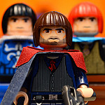
Over the course of the Star Wars line, there have appeared every so often a set too good to pass up. 8038 Battle of Endor. 8092 Luke's Landspeeder. The infamous 7666. At the time of the 2011 New York Toy Fair, it didn't seem like any fit that description for this year. But then one grew on me, big time. That's right, I'm talking about… Set Title: Anakin's & Sebulba's Podracers Set #: 7962 Theme: Star Wars Subtheme: Episode I: The Phantom Menace Pieces: 810 Minifigures: 5 Year of Release: 2011 Price at Release: USD 90, GBP 82, EUR 100, CAD 120 Buy it? Inventory? Bricklink Peeron LEGO Just browse the pictures? Flickr INTRODUCTION There's one thing, one minor thing, that's wrong with this set right off the bat: its name. Yes, the name precisely describes what's in the set, but it's also weighty, awkward, and all around unexciting. Clearly, LEGO doesn't mind using titles that are just a bit off to make things more exciting; look at the recent Battle of Naboo (Droid Carrier plus two Gungans), Battle for Geonosis (speeder and cannon), and 2009's Echo Base (trench, turret, Taun-Taun, and Snowtroopers). Wouldn't Mos Espa Podrace or Boonta Eve Classic be so much more exciting titles for this set? Yes, yes they would've been. But I'll get over it. (Note: on LEGO.com the name is listed as "Anakin Skywalker and Sebulba's Podracers, but I have used the name found on the box.) Some of you OT fanatics or CW-only lovers might be scratching your head as to why this set was as irresistible as those others I mentioned above. I'll tell you what caught my eye: for once, it wasn't the figures, but the two beautiful, and beautifully detailed, models. Not to mention large. It doesn't get much better than 810 pieces for $90 when it comes to Star Wars, and when a Star Wars set is beautiful, you know there's something special going on. At least that's how it seemed to me. Let's see how it stacks up once it's out of the box… BOX But before we can look at it out of the box, we've gotta look at the box. Thems the reviewing rules! All the Star Wars boxes have been getting a bit smaller, but this one is still plenty big (it's the same size as Battle of Alamut's box, in fact). The Cloudy Rex artwork is lovely as always, and the Podracers themselves look exciting. I do fear for the lives of Obi-Wan, Wald, and Watto, since they seem to be chilling smack in the middle of the race course. Obi-Wan is probably regretting leaving the Royal Starship for this. It's also humorous how LEGO has Watto hovering above the ground with some CG wingflapping, which the figure cannot do in reality. The back shows the Podracers in 'parked' position, though Sebulba doesn't feel like getting out of his. Everybody else seems to be going for a team huddle (Anakin to Obi-Wan: "Who the heck are you, and why are you brandishing a lightsaber in the middle of the Podrace?") There are also the boxes showing the very slim amount of play features, though this set is actually amazing for play. There are ads for the other biggest sets of the wave, because if you're going to buy one big one already, you might as well go big or go home. Overall, it's a pretty bland back, and the podracers seem crammed between the other pictures. Note that both here, on the top of the box, and in the minifigure lineup on the front Obi-Wan has his 'old Obi-Wan' torso instead of the new one. In the main artwork on the back and front he has the correct, new torso, so I really don't understand why this happened. I'm always surprised when errors like this make it all the way through to production. The photographer has also magically gotten Sebulba to stand up while being bent forward, something impossible in real life. It makes him appear shorter, which is probably what they wanted. INSTRUCTIONS The instructions are fairly large, and there is only one book. They easily could've split it into two, but there's no reason to and I'm happy they didn't. The booklet splitting thing confuses me. Something small to note is that here (and on both sides of the box) Obi-Wan's lightsaber hilt is upside down, though in both minifigure lineups it isn't. Clearly, the photos for each were taken at different times. Since I'm not giving you build pictures, I thought I'd show you this page, which breaks it down. The build is spread over five bags; basically a bag per engines and a bag per pod, though Sebulba's gets an extra one containing the large builds that form the 'x' shape. Inside that bag, bag 4, are two bags that are identical, I think. They seemed pretty identical. On the minifigures page is this diagram telling you not to put Sebulba's legs on wrong, which I guess they felt was an easy mistake. It's probably to keep you from later trying to put Sebulba in his pod, find he doesn't go in, and throw a hissy fit. This way, no hissy fits necesary. Some of the instructions pages feel pretty empty, but others like this one are satisfyingly full of steps. Only a handful of pages still have the Darth Vader mask on them. They should really retire that artwork by now and replace it with a Clone or something. The color differentiation in this book is quite bad. There is never a case of a part being in both dark grey and black, so it isn't really a problem, but those two colors appear extremely similar most of the time. I wonder why this issue seems to always be more prevalent in Star Wars than anything else. The parts list is quite long and fills this spread in the back. As you can see, the majority of the parts are grey or black, though there is a pleasing amount of orange to be had. You can't go wrong with 20 orange 2x3 plates! The back also contains the minifigure lineup from the front of the box and the inserts from the back, as well as ads for all the non-Special Edition summer sets. They even included this one, in case you wanted to go out and buy it again. There are also pages for joining the LEGO club, the third Star Wars videogame, and that thing on the back that we don't talk about. DSS Sometimes, the word dreaded in relation to a sticker sheet is quite justified. This is one of those times. Many of these stickers are nice and add good detail to the set, but there are just so many and only five are not annoying to apply. Another bad point is that all of these are the 'colored sticker' type, not the clear backing type. Some have good reason for that, but others would've looked much better had they had a clear back. MINIFIGURES LEGO has finally fully realized that people love new minifigures, and it's no secret that the company is piling them into sets with full force. This set comes with five brand new figures, though the box doesn't list Anakin as new (maybe because he also comes in the Naboo Fighter?). All of these minifigures are pretty awesome. Of course Obi-Wan doesn't make sense at the Podrace, but I'm happy to get him here. Five also seems like a fine number to me, probably because they are all new. One slight issue is scale; Sebulba is obviously way too huge, and Watto is a bit too big. Still, both figures are nicely designed to look like their characters, so I can't complain too much. It's also worth a chuckle that LEGO cares so much about giving us new figures that they've created Wald, who it's probably safe to say nobody cares about. But that doesn't make him unwelcome. Everybody has some back printing as well (expect Sebulba). I absolutely adore the new Jedi robes. They match the film so well, and look so crisp. Watto's new mould is also stunning in its level of detail and printing. It's just perfect. Sebulba and Watto deserve to be shown from the side as well. Watto looks so cutely grumpy, while Sebulba looks ugly and evil just like he's supposed to. The purple on him is some great detail. Both of these figures look so incredibly better than their original versions, besides for Watto getting the 'grey hands' treatment so many aliens are getting these days. Other things worth noting are Anakin's worn-looking helmet, which is much more fitting than just the aviator helmet… …and Anakin's crazy goggle face. Some say ridiculous, I say ridiculously awesome. Yes, it's a completely cartoon version of Anakin, but that's a good thing. Anakin in Episode I is only marginally less annoying than Anakin in Episode II, so the sort of print that makes me forget about his horrid characterization is a good one. Anakin and Obi-Wan also have alternate expressions: Obi-Wan can be angry while Anakin looks like he's attempting to be angry. This face for Obi-Wan is more reminiscent of the character than the happy reverse side, since Obi-Wan is mostly not a happy guy in Episode I. However, removing the hood reveals a problem: the color of the skin tone on the torso. Going by movie sources, that patch should be Obi-Wan's skin, but here it's completely the color of the darker minifigure skin tone introduced in Indiana Jones. The instructions show this part as being light flesh colored, so I assume it's just an error, but it's a pretty big one. Obi-Wan isn't too happy about wearing an orange shirt under his robes. Anakin I figured I might as well compare the two young Anakins that I have: the original and this one. (Though in the Podrace sets he had a light grey helmet with dark grey goggles) Both have the same basic details on the tunic, though those details are much better defined on the new one. Oddly enough, the old one's face reminds me more of the character, while the new one makes me chuckle again. But which do I like better? The new one. He's got the expression of a manga character. He could use some hair, though; it would've been nice if LEGO threw some in. Obi-Wan Despite overstated happiness, this Obi-Wan is much better than the original (and the last one, too). Why? He's finally got his own face; he doesn't have to share it with Luke any more! Although he still has to wear a hood. It may just be me, but I didn't notice him wearing a hood all that much in the movie. Why does LEGO think young Obi-Wan always has to wear a hood? Only once have they ever released him with some hair. This time it's also slightly a problem because his hood does not match the color of the cape, a problem that I don't think has ever occurred before. Obi-Wan does have one other thing to be angry about, which would be his eyebrow color. LEGO has gone and given him orange hair again (I added the orange hairpiece, since it matches the brows). Did he ever have orange hair in the films? Nope, it was brown. LEGO just doesn't get it. I do like how he looks next to his older counterpart. Quite a bit younger, I'd say. ACCESSORIES Without any gun-toting characters in this set, there are very few accessories. In fact, there's only one intended to be an accessory, but that doesn't mean we can't play around with the other ones. PODRACERS Having two very different models makes for an interesting build that seldom gets boring. The build is peppered by '2x's, which can get annoying, but overall it stays interesting. Now let's look at the completed pods! Anakin's Podracer First, a comparison with the film. Overall, the look and shape of both the engines and pod are captured very well. Obviously, the film engines are more unfinished looking, but it's very hard to pull off a similar effect in LEGO. The designer has put some effort into it, though, using grill tiles and a bit of brown. Not all aspects of the shape are perfect, but it is a very successful rendition of the film vehicle. This podracer is pleasingly long. The clear technic pieces really do well to make it look like the pod is flying because of the engines. Yes, it's not like they are invisible, but they create a slim profile and look much slicker than the clunky tan bases of old. The engines and pod even look good from the back (although excessive stickering is apparent here). These are the rare models that have no 'bad angles,' no underside to be left unfinished. Every view reveals some sort of detail. Even the front of Ani's pod looks good, trying to appear smooth with some SNOT attachment. They also gave us those small technic bits in yellow, though they also come in this set in grey. I don't care if it's true to the film or not; that's a nice touch. The only problem is the windshield being a bit too low, although only a little. From the top, you can get a better sense of the length of the model. It's also apparent that the engines are pretty massive, like they should be. The size and placing of the engines works quite well in relation to the pod. The real faults of Anakin's Podracer lie in the stickers. You might have noticed the blue detailing on the tips of the 'wings' or whatever you want to call the long yellow parts on the engines. You can see it here if you missed it. This detail does match the film, but the stickers are all so small, you have to sticker six of these, and since the stickers don't have a clear back the yellows do not quite match. It's plain annoying to sticker so many of the same thing, and crooked stickers look the worst. These really bugged me. Another set of stickers that many people might dislike are the large blue ones with engine intake details. Personally, I do not mind these. Sure, they don't blend in with the piece at all, but better to have them not try to blend in than to try and be slightly off. The detail of the intake looks cool, and it's nice to have so more color on the engines. The pod is really where the stickering goes wild. The one on the front, at least, works well and is easy enough to get right. That one is fine with me. It's the little ones that are killer. Why a sticker with dark grey backing on a light grey tile? And that 1x3 wedge piece is the worst; three stickers! I've never seen this many stickers on a single piece before. Once you've gotten them on fairly straight, then it's fine, but to do so is no easy task. This many tiny stickers is way too many in my opinion, and they add a level of frustration to the build. Sebulba's Podracer First I'll look at it along with a film frame, just like I did with Anakin's. The most noticeable problem is that the engines are too close together, but besides for this and the fact that the angle of the 'x' shape is a little off, the model does nab a lot of the details of the Plug-F Mammoth (a truly terrible name, if you ask me). Thanks to perspective, the engines appear to be fairly large. It's not just perspective, though; these things are pretty big. The PoP quarter dome piece works very nicely to make the wings flow together, although the color and size of it is not entirely accurate. The white stripe is also inaccurate since it is supposed to be diagonal, but that would've been hard to accomplish and a vertical stripe is better than none at all, like the old version. The stickers that continue the white stripe onto the black sloped parts would of course be better as printing, but they aren't too intrusive and look pretty nice. The main flaw of this podracer is that it uses the same size frame as Anakin's, which makes it seem very compressed. Though the engines and the pod are nicely designed (as I'll get into with some more close-ups), since the engines are so large they come very close the pod, which doesn't feel right at all. LEGO needed to use some more clear technic parts and longer flew tubing to extend the frame and push the pod back. This problem may be more apparent from the top, where it is very clear that the pod is not very far back from the engines. The split 'x' itself also strikes me as a tad small in comparison to the pod and even the large orange wheels used on the backs. There's a reason this podracer is called the 'Mammoth;' in the film it truly seemed gigantic. From the back you also get a sense that the engines are dangerously close, though they look very nice. You can take in all of the nice detailing work on the engine in this horribly discolored picture. They've really piled on a pleasing amount of greebling for such a confined space. I love the gold bars, telephone, and three cylinder pieces that remind me of exhaust vents. All of the stickers here are not too bad. To me, a good sticker is one that covers the entire surface of the piece, and both the stickers on the 2x2 round tiles and one large orange slope pieces do that. Both aren't too difficult to apply and add detail. Putting 4L bars in robot arms sixteen times is not my idea of fun, but the result is worth it. The rears of these engines look awesome. The pod is also nicely detailed and even has a little greebling of its own, in the form of the binoculars pieces. There is only one sticker here, and it's just a white stripe with a little design. Even though it's on an orange piece, it looks alright and also is easy enough to apply. This pod ends up looking more blocky than Anakin's, but it gets the shape right so I can't complain too much. The only real issues are that the windscreen is so low and that Sebulba's controls are very weird, but because of the make of the figure it couldn't be helped. Size Comparison After surveying a lot of internet images of the pods, I've come to the conclusion that the split 'x' on Sebulba's isn't necessarily too small, and if the his pod is too close to the engines, it's not by much. However, once it is placed next to Anakin's podracer it does feel a tad too small. I don't actually know if it is compared to the movie, since it's hard to tell, but I don't think Anakin's podracer should be longer. Other than that, Anakin's vehicle does look sufficiently weak compared to Sebulba's large, sturdy-looking machine. STANDS The stands are fairly basic, and are identical besides for a difference in color of the 1x1 round pieces (gold is Sebulba's and red is Anakin's, not that it matters). As you can sort of see in this picture, the pod's stand has a technic liftarm that easily slots into the stand. Each pod balances perfectly on a flat surface. PLAY FEATURES There is only one (or one, four times) play feature that is built in: the saws on Sebulba's pod. I don't think the placing of these is accurate, and I don't remember there being four of them, but I understand that LEGO had to show Sebulba's evil cheating ways somehow. It's still not a very exciting feature. The real play feature is not little detail; it's the pods themselves. The way they slot into their bases has been designed as a handle, so that picking them up is easy and swooshing them is a ton of fun. I can't recall any set as perfect as this for swooshing. Because of the bottom handles, you still get the entire view of each ship when you pick them up, and you can swoosh both at once, one in each hand. It truly does not get any better than this. But of course you might want to play with the other figures too. Time for some good old minifigure fun! CONCLUSION This set is not your typical big Star Wars set, not at all. While most sets are rife with flick-fire missiles, plagued by unfinished undersides, and often cumbersome to pick up, this one is designed with the very best play feature in mind: swooshing. And on top of that: one-handed swooshing. Besides for swooshing, this set makes a terrific display model. It's suitable to behold from any angle, and highly detailed to boot. Sebulba's podracer has its issues as I've illustrated, but on a shelf it still looks striking with its big engines and lovely color scheme. Anakin's pod, though more bare, also looks wonderful. The minifigures are also pretty good. They are not without faults, but overall they are a pleasing assortment that doesn't feel gratuitous. Since the focus of this set is clearly not the minifigures, they are a bonus that can't be faulted too much. It's not like they were thrown in just to drive up the price. RATINGS Minifigures: 8/10 - The little things do bug me, like Obi-Wan's eyebrow color and his very orange patch of skin. Watto's hands are also a minus. Apart from that, I like them. Pieces: 10/10 - Lots of orange? Clear technic? Trans-pink bars? There's so much good stuff here, and plenty of it. Design: 9/10 - One point is docked because of the issues with Sebulba's pod. Otherwise, gorgeous and sturdy. Playability: 10/10 - Maximum. It doesn't get better than duel-fisted swooshing. Price: 9/10 - It's not realistic to dock many points because of the price. $80 for this set would be awesome, but it's Star Wars, and the price per piece ratio is actually pretty good. There are tons of small parts, but you get impressive, highly playable models. $90 is right for that. Overall: 9.2/10 - This set is one worth picking up, even at full price. It has just a few design flaws, and the minifigures have just a few issues, but it won't feel like you're being skimped for your money. Unless you could really care less about podracers, this is a set worth getting.
-
Star Wars: The Clone Wars - Season 4 Discussion
Clone OPatra replied to XimenaPaulina's topic in Culture & Multimedia
More like "Canon… yeah, but this would be cooler." Watching the 'episode commentary' aka Filoni talking about whatever he feels like for approximately two minutes, I believe that Filoni is really well-versed in all of the EU canon, but he overlooks it. He knew Koth was supposed to be dead, he knew how Piell originally died, etc. but since Lucas doesn't care too much Filoni doesn't either. -
Love all the new ones. Skrytsson, all of those are extremely funny! I do agree that the first one should be worded a bit differently, but besides for that they are great. Oky, the amount of times that Obi-Wan has already faced off with Grevious in the show is extremely annoying. In RotS, it seemed like Grevious was a very elusive, extremely dangerous character (as he was made out to be in the original CW show as well). Like they always do, though, the CW writers riffed on the few scenes he had in RotS, making him fight and then run away time and time again. No wonder Obi-Wan didn't seem very intimidated in RotS after all his battles with Grevious!
-
CHEESE overload - I don't know who gave it to me (Rufus maybe?) but it's because I posted this discussion about LEGO's (possible excessive) use of cheese slopes. Why the all caps? That's anybody's guess.
-
I see everybody is pretty much of the same opinion, which frankly is what I expected. I myself don't dislike cheese, it's just that I don't find it necessary in many places. Certain models would look just as good to me with the cheese left off and not replaced with anything else at all. It is undeniably a great piece for MOCing and has a wide variety of uses, which is the best kind of piece possible. At first when the 1x2 cheese came out I also thought it was useless, but I've grown to like it. It greatly improves aesthetics when just two cheese side by side are needed (or more, probably, but I don't have any sets with that). Things look much sleeker with the combined piece.
-
I though Harry Potter died once, and then it came back. I thought Spongebob was certainly dead, but it wasn't. Everybody thought Batman was dead, and now it's (sort of) back. So all in all… who knows. Perhaps we will get a few more sets. There are certainly some more set-worthy things that LEGO could make, and probably would if they were making more sets. LEGO recognizes how much people like never-before-seen minifigures, and there are some more prominent characters that they have yet to make. All of this tells us nothing, really. There's no proof or evidence in either direction.
-
By now, it's safe to assume we are all familiar with this little guy: If not, you probably haven't bought a set in five years, or looked at any MOCs, or been on EB… we all know what is commonly termed the 'cheese slope.' Seldom used as cheese (though it has been), excessively used as a detail on everything from lava to rocks to plant life. Working on a review of an older set (circa 2001) recently got me thinking, though, about the cheese. This particular set had a BURP, plain and simple, but once I thought about it, I figured that today that BURP would have a few pieces of dark green cheese on it. The recent Pirates of the Caribbean line also got me questioning cheese; those sets have so much cheese and other small bits that despite their piece counts they come out as smallish (and to me, unimpressive) models. Captain's Cabin alone had 10. So my question is: does LEGO use the cheese slope too much? Does it add necessary detail, or is it used excessively, driving up piece counts and (perhaps) price? According to Bricklink, the number of sets containing the cheese slope has consistently risen each year since it was first introduced in 2004. Last year, some amount of cheese was included in a whopping 146 sets (though one must keep in mind that BL includes promotional sets, so not all of those are regular consumer items). I don't know how many total sets were released in 2010, but that sounds like a high percentage. Myself, I find that the use of cheese slopes could be cut back a bit. To add nice angling to a model like a spacecraft or car or train it is nice, but as a rock or lava or just a bit of greenery I think a cheese slope is unnecessary. What do you think? Answer the poll and leave your thoughts.
-
Excellent new ones Oky. The bucket really is a joke all by itself, but you've certainly made fun of it in style. Seriously, the single mold Aldar Beedo is far better than that eyesore.