
Dr_Chronos
-
Posts
263 -
Joined
-
Last visited
Content Type
Profiles
Forums
Gallery
Everything posted by Dr_Chronos
-
In terms of maximum depth these look to be about the same as the Inika, maybe a little more depending on how far the torso shell goes out. Speaking up the Ignika, these builds are actually pretty similar in terms of their purpose: more build options for humanoids. Not to mention they both use a single torso piece (I don't think I'll ever get around to liking it). These are far more customizable than the Ignika however, so I can't wait to see what sort of zany designs builders come up with.
-
Agree about K and M, that set is very unappealing in my eyes. Which is a shame because Kopaka '15 was probably my favorite Master. Of all the combos (excluding Umarak) I like Gali's and Lewa's the most. Gali gains an aquatic look as well as GUN SHOULDERS and Lewa gains insect wings and more color. Why not include Tahu? Well, even though he has the same combo as Lewa, his wings look hilariously tiny. I wouldn't say the new sets are gappy, because they are nicely filled in the back. They're just flat. They lack depth. Probably to accommodate the function. Not really a fan of that.
-
I'd be lying if I said I didn't want some. They just have that sort of derpy charm. Gali and Pohatu are my favorites. In other news, the Month of Earth scenery has been released. (Facebook wasn't working so I had to grab the image from somewhere else.) You know I think this might be the weakest scenery so far. That's not to say it's bad, I think it's quite good. Compared to the others it simply does not stand up as well. The rocky texture look is fantastic, but the randomly dispersed purple is what really kills it for me. If it was in pockets it might have looked better. I know it would have been hard to implement, but this diorama really needs some color. That Korgot is fantastic. I particularly like her.
-
New short released, "Champion of Chivalry": http://www.lego.com/en-us/videos/themes/nexoknights/champion-of-chivalry-7f986d0003a14dff90e99c25613fc6a3#?sp=138 Whoops. Wrong thread. I'm still getting used to this whole separate thread thing, apologies.
-
The article mentioned that they had received other 2016 sets, is it possible that a new NK set was sent to them?
-
Star Wars Constraction 2016 Discussion
Dr_Chronos replied to Logan McOwen's topic in LEGO Action Figures
Nice. So the sets use the 2015 gearbox with a new cover piece. There's even a new upper torso variant without the turntable. Loving these new sets, they're much more interesting than the first wave. Can't wait to pick em up. -
It's possible it might be a ratcheted connection like that of the EXO-Force limbs, but I would personally like it to be a regular pin connection.
-
I don't believe this was mentioned before, there's a new NK trailer on the website called "Knight is coming".
-
Star Wars Constraction 2016 Discussion
Dr_Chronos replied to Logan McOwen's topic in LEGO Action Figures
A Droideka would certainly be inpressive. In fact nearly every droid would be great. However a BB-8 would really blow my socks off. -
Indeed. Perhaps in the future we'll get some nice system integration. I'm glad that some parts this year offer system connection points like the creature head and Kopaka's mask, really opens it up to customization. Speaking of Star Wars I'm surprised that none of the Toa this year share any of the parts that SW introduced (save Ren's hilt). Particularly the leg armor which now looks like it will fit better with the Toa's increased height. Let's hope the new cloth piece will be used eventually. Eh, might as well give my overall 2016 thoughts. Individually the Toa are more or less on-par with their 2015 versions, but when combined they outshine them (except Kopaka IMO). Combination is a very taxing feature so I wouldn't worry too much about the sets that come ahead. As for the Technic integration, it could have been better. Some of the custom limbs need a little filling out. I'm a tad disappointed the new Technic shell isn't a marriage piece between CCBS and Texhnic, but I can't reall find fault with it because that was never it's purpose. It was brought in to make the combination feature work and open up connection points in the torso, and it succeeded. Last thing I'll say about it is that it looks underwhelming as limb cover, it might have looked better if there was an addon on it. In the end I'm hyped for 2016 and can't wait to see what comes next.
-
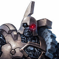
My biggest complaint for the current MoCo is the horns. They look flattened from the front, and it really hurts the silhouette. A fan by the name TheShadowMakuta actually edited the MoCo to look more like the animations.
-
POLL: Favorite Nexo Knight?
Dr_Chronos replied to BrickJagger's topic in LEGO Action and Adventure Themes
Macy. Not only does she look fantastic, but she breaks the princess stereotype. Her heavy weapon arsenal seals the deal. Although I will admit, Axl was a close second. -
In the MMvsSG designer video the designer talks a little bit about the MoCr. He mentions the runes on the "crown" are the source of the mask's power. This could just be an error or mistake. However it's interesting to note that if you count the Nuva Symbols as runes, all of the masks of 2016 have runes inscribed on them. Even the creatures have some. Could magic runes be the source or the "mythical link" of the mask's power? And while I don't believe the rules from G1 apply to G2, the Nuva Symbols were the source of the Toa's elemental power.
-
I do wonder why they chose to release this video so late. The possibility of it being filmed earlier yet unreleased until now makes the question even more baffling. While I appreciate that Mr. Ho has taken time out to film these inside looks, it's clear to see he's having a little trouble with the pronunciation of a few words. It might have been better if he were paired with another designer to talk about the set. The most valuable information I gleamed from this is that Grinder's Trans-Orange color scheme was chosen because it contrasts well Ekimu's Trans-Light Blue, and that the combiner model is Grinder's canon powerup form. The rest of the information could have been gained by simply observing the sets or watching reviews. In the future I would like more information about the development of the figures and why certain aspects were chosen. It's nice to see that Lego is interested in giving us an inside look and I can't wait to see more of what the designers have in store. Edit: After rewatching the video, I noticed that when he's talking about the MoCr he mentions the runes on the "crown" are the source of the masks power. This could just be an error. However it's interesting to note that if you count the Nuva Symbols as runes, all of the masks of 2016 have runes inscribed on them. Even the creatures have them! Could magic runes be the source or "mystical link" of the mask's power? And while I don't believe the rules from G1 apply to G2, the Nuva Symbols were the source of the Toa's elemental power.
-
I'm feeling that these sets are more or less on-par with their 2015 versions. I appreciate the inclusion of custom builds, but there are some areas where I feel it wasn't used to its full potential (Pohatu and Lewa's upper arms). The color distribution this year is.... lackluster at best. The clashing textures is another issue entirely, and one that gives me fears for the future of CCBS. I would be very disappointed if they continued this cluttered style (or rather lack of style). Probably the biggest issue for me is the huge loss of individuality in the Toa. What happened to Tahu's samurai inspiration? Or Onua's Dwarvish look? Pohatu's asymmetry, Gali's subtle femininity, or Kopaka's paladin bulk? The only one who continued his design quirk would be Lewa, and he suffers from the same problems that plague the rest of the sets.
-
Looking at the bike mode has given me hope in the horse set's redemption. Only con I can say about it is how comically low the seating is. I would welcome a civilian set in the summer wave, I can only imagine how they would pull it off!
-
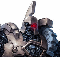
The biggest disappointment for me here is the Mask of Control. The horns are flatter so they appear less curved from the front, the forehead circle is larger and the crest is less prominent, the top of the mask is domed instead of angular, and the chin is squared off rather than pointed. In fact I would go to extreme and tone down the false beard. Another issue I have is the inclusion of a "mouth", why? No other mask in all of Bionicle has had a humanoid mouth. It pretty much ruins emotional projection and manages to look exteremly out of place. Hopefully the MoUP is good so I have no regrets in making it Makuta's main mask.
-
I was just about to post that. Anyway, I really like it. I hope it's not too hard to obtain.
-
The Ultimates have really surprised me. Trans-color armor, printed shields covers without TRNO, a bad-guy sheild base variant, and fantastic stands have really hyped me up. Favorites from greatest to least would be: Macy. As I said before, I have a thing for gals with heavy weapons. In addition to her oversized minigun and standard mace, she also comes with a golden flaming axe of justice. Bonus points added because unlike Clay and Aaron she sports the candy-color-coated look much better. Robin. He is my smol engineer. Giant wrench missile backpack may be a little cumbersome in real life, but it looks pretty good. I also really like the science vibe his stand gives. Is it just me, or does he look like a mini Duke Exeter? Lavaria: Probably the most creative design. Spider legs and bat wings are a really sp00ky combination. She just looks fantastic. Aaron. Spring cannon crossbow, and more stud guns for good measure. The only reason he's not higher up on the list is that he looks like a member of the Green Lantern Corp. Clay. Of all the knights, Clay pulls off the colored look the worst. His equipment is alright and his stand is boring. Beast Master. Looks under armored and his chain propeller pack looks even worse than Clay's. Weapons are weird and even inconsistent (Why a drill? Why a weird space-warp thing?). I doubt I'll even pick him up.
-
Here's the spread on imgur, courtesy of dannallcorn: http://m.imgur.com/a/BAF52
-
That's not much considering they usually release the art late. November should be the Month of Earth right?
-
While I'm all for silver masks, I fear it will imply the smaller Toa are "weaker" even more. *Unrealistic dream alert! Chrome masks anyone? In the future I mean.
-
This. This so much. I can't help but wonder how he would be priced since he's essentially a two pack. $25-30? seems a little pricy, perhaps that's why he was dropped. Still though, it would have been cool if the Brothers were a combiner model. In other news the mask maker challenge has come to an end. These are some pretty cool looking masks, I wonder if their designs will be released someday?
-
Shame. Not that I was expecting them to be silver, but it would have been nice for Non-Unity Kopaka be a little more consistent in his colors. Can you recall any other information? I'm particularly interested in the turntable parts (although I imagine they were obscured by the chest).
-
Nice! I did not expect him to be that tall. An update of sorts, I just realized that the neck is not a glatorian neck. It's actually a long bone. So I'm tweaking the design a bit.