

josykay
-
Posts
155 -
Joined
-
Last visited
Content Type
Profiles
Forums
Gallery
Everything posted by josykay
-
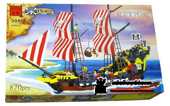
1. 6239 Cannon Battle vs. 70409 Shipwreck Defense IMO 70409 wins, since there are more parts, more weapons and minor details like the bottle and the campfire, and the shipwreck looks better than the ruin thingy. And i like the ship cannon better. However keep in mind 70409 is far more expensive! 2. 6241 Loot Island vs. 70411 Treasure Island And another point for the 2015 Pirates. The new set might not have a unique baseplate, but is overall much better built, more stable, and got IMO the better selection of minifigures. Sorry old man, but the pirate lady is just awesome. 3. 6242 Soldier's Fort & 6240 Kraken Attackin' vs. 70412 Soldiers Fort & 70410 Soldiers Outpost IMO it is a very close race. The 2009 fort got the better fort imo overall, has a nicer palm tree. In addition I kind of prefer the red kraken. However now if we got to parts, and minifigures the new fort and outpost are better: First of all look at the big flags. The old fort just had that foily plastic thingy. The new set contains a detailed fantastic large classical style flag! The red brick pieces are fare better than DSSs and the 2015 minifigures are awesome! I just love the Govenor and that lady. In addition we got that crab, and 2 lovely frogs. Oh and the pirates boat got a bench. So yeah... who wins? In the overall design 2009, in details 2015. IIMO 2009 edges 2015 a litte bit. 4. 6243 Brickbeard's Bounty vs. 70413 The Brick Bounty So which ship wins overall? Both have serious flaws. The BBB hat the worst riggings ever, which easily bend, look terrible, and the sales are unstable, nearly impossible to hold in position while playing. The ships hull is pretty dire, and let's face it those logs look terrible. You can not properly man the swivel guns and several sections of the ship are unstable. However it does have a fairly nice color sheme, pretty unusual for the regular pirates, brings back the lovely BSB style cannons. TBB on the other hand has a terrible cannon design, making it unable, to close the port holes. The stern castle is, for whatever reason half open, since one door is missing. The stern in general looks squeezed, and the overall color sheme is not that nice. The upper sails are very very small... IMO both vessels are pretty medicore. Not as spectacular as BSB or SES but pretty decent ships. If they only wouldn't look so similar. I think, it is a draw. 5. Chess 2009 vs. Chess 2015 2009 got a far better choice of figures, while 2015 got the better board. It depends on what you want to do. Do you only want the figures? 2009 wins. Do you want to have a nice Lego chess board? 2015 wins. I think it is a draw. Sorry but the rook, bishop and knights are terrible, and I just can not stand the soldiers hair variations. Tschakos or tricones would have been awesome! So the result is: 2x 2015 2x draw 1x 2009 However I am kind of an unfair bastard giving the 2009 bonus points. 2009 got impulse sets, while the current serie does not. Especially the Soldier's Arsenal, giving one of each Lego Pirates weapons is dearly missed. Oh and don't forget the Shipwreck Hideout! 2009 got 3 sets more (If you ignore the IFS). +1 points for 2009. In addition you can argue about the new bandana.... But regardless of the design, I miss the 2009 dark green bandana! Those things were simply amazing. The new red bandana looks ok. But white? I am no fan of that. So after giving bonus points I come to the conclusion: The new smaller sets are generally improved! The 2009 fort takes the cake, while the ships are equally good/ bad, depending of the point of view. The chess games draw. However 2009 series was larger... All in all both series are great, it is just a question for individual taste. There is no clear winner for me.
-
Indeed. I would love to see Lego designing a completely new vessel. What about a true shooner? Or a brigatine? The usual two masted BSB copy gets pretty boring, especially since none of them can compete against the original. I've got nothing against two masted vessels. But thanks to the colors they end op looking so similar. Hell at least a new color sheme would be great. The red/white striped sails got so boring...
-
Not that spectacular, but I kind of love that set. It is much better than the 2009 island, especially since it doesn't have that huge baseplate. The only thing I do not like is the Technik tree. I kind of liked the older plam better. The boat is pretty standard, sure. But there is nothing wrong about it. As for the stud shooter..., yeah I know that item is aimed for the younger audience, but is not that bad, compared to old shooting things... I would just wish, that the stud shooter's barrel would be a little bit longer. Then it would look like more like a light cannon/ swivel gun. As in the larger sets the minifigures are lovely. I really like that pirate lady! A nice new bluecoat and well, a standard pirate. Oh and of course the new alligator nothing you would not want.
-
I am still undecided. On the one hand it is a god damn Lego pirate ship, and I missed the PotCs and the Imperial Flagship (All are now quite expensive), which still saddens me. On the other hand, BB is a medicore set at best. It's overall design is not very good (Squeezed stern, cannons, half open cabin and so on) , and is pretty expensive. It costs 20 € more compared to the 2009 Bounty is very similar and offers only 50 parts more, while lacking the larger rear pieces of BBB and IFS (09). Having the BBB staying next to my BSB makes me realize how poor the BBB is compared to ships of the golden age, even if I don't consider the rigging... and BB is not really better. It is pretty expensive, but doesn't satisfy my desire for a amazing pirate vessel. I don't want to miss an opportunity, but it doesn't look like a good one.
-
To be fair, yeah I didn't see that half open sterncastle. That's terrible. It kind of ruins the design. As for the cannons, yeah, indeed, they are terrible. The question is, does, are those flaws enough, to make it worse than the BBBs shittyness at it's rigging? IMO no, but they are equally bad. They both have unforgivable flaws. Both ships have flaws ruining them. So after watching more reviews, I got to revoke my vote. IMO it's a draw.
-
Look what I just got - Report your latest Pirate LEGO acquisitions
josykay replied to V()()D()()'s topic in LEGO Pirates
A complete BSB (one of the pirate flags is damaged) at ebay. The price was pretty decent after all, since the the set was complete and I got a Harbor Sentry as well. 75 € sounds pretty nice for a complete set. Bricklinks BSB are ridiculously overpriced! -
Well, a little bit as aspected. Worse than the ships of the golden age (BSB and SES), but pretty decent. I dislike how empty the newer ships are. BSB had a deck, storage at the bow and the rear, and a fully armed cannon deck, making the ship looking much larger, much heavier. Oh, and with that widely open cannon deck the cannon design without wheels looks even more terrible. It just looks so cheap. What was wrong, about the cannons of old days? Even BBB used them. Not to mention the fact, that you can not close the portholes, making the entire cannon deck design even more shitty. You should have used turning "table" like on SES or wheels. Now after watching more and more photos I see so many flaws: The non working crane.... I really dislike the half open stern castle. It looks terrible. Was a second door to much to ask for?! It appears, that a ladder or stairway to the roof of the sterncastle is missing... In fact I think the entire rear section of the ship looks a little bit squeezed. IMO the bow is fairly ok (Although they could easily design at least a proper deck section in the front..). The mid section looks sadly too empty, while at the rear there wasn't enough room for proper building. An additional hull piece whould have been nice and would have given much more opportunity for building a deck section at the rear as well. It is a decent vessel. Better than BBB (Thanks to the rigging), but IMO nothing special. As expected BSB still rules the seas. However the minifigures are clearly a redeeming factor! I absolutely love those guys. The captain, as a modern version of Redbeard looks so awesome! The cook is lovely... and the Admiral with his wig looks absolutely fabulous!
-
The Brick Bounty wins. BBB has the better color sheme. I absolutely love that dark red! However, TBB has a much better design. So, yeah TBB takes the cake. BBB has to many unforgivable flaws. It is rather instable, so parts brake of frequently, she is missing an anchor... but the most important part: It's rigging is terrible. Sorry, but that lazy, instable, horrible design ruined the complete set. Thank god, other ships are designed much better!
-
The "New Dragon Knights" from Kingdoms (2010-2012)... The dark green looked amazing and they were the only castle faction, using dark pearl grey for their armor, which is sadly gone now during Castle II, replaced with regular black...
-
Thank you for that great review. I think it is a pretty decent castle. The classical drawbridge is awesome, we got really great minifigures and I have to admit, that I really love the options by adding elements of that Gateway set. But except the mentioned drawbridge the Kingdoms castle had an overall better design. I liked the Kingdoms colors more, it got the better layout (I don't like that central tower on the back and the corners without towers or other fortified positions)... and all those great flags seem to be on the wrong place! That central one at the gate house is ok, but the others are not. All in all it is not as good as the Kingdoms one, but still good. I have to admit, that I really dislike the crest... The colors are ok. There is nothing wrong about blue/ white. But that large lion head looks stupid. I disliked that crest when the royal knights came out, I disliked the crest during KK 1, and I dislike it now! But all in all the good guys are ok, the blue king is quite awesome! Speaking of that king, he maybe lacking of an armour, not the best idea, if his castle is besieged, but he got an awesome golden sword, which's colors don't fade. Great. I always hated that color issues about the older greater swords. Oh and the new kings weapons shape is pretty nice. Speaking of that king, is it just me, or is his crown really gold pearl? So It doesn't fade as well? Now let me talk about thebad guys: They look far more sinister compared to the Kingdoms counterparts. Their crest is, again just a overseized head of a creature, not as good as the Kingdom's dragon. The color scheme is pretty strong and the torso prints are lovely (And so is the knights breastplate). What I do not understand when looking at the entire serie is the color of the armor of the evil guys. Blizzard introduced that awesome dark pearl grey when introducing the Kingdom serie, and no they replaced them, giving the evil guys normal black equipment. Why? They even use weapons of that dark pearl gray color. Why not doing the same with armor? That dark pearl gray was so awesome.... Or did Lego considered it, not being dark enough for the bad guys? But still they are awesome. All in all I would give the set a 4/5, although it is close to 3/5. Lego could have done better.
-
After looking at the newest detailed pictures i am pretty shure, that this crossbow is a dark pearl grey one. It just looks more like the Dragon Knights axeblade.
-
@ GRogall: Thanks for posting that picures! I have to admit, neither Dragon Kights nor the good guys look that bad like i thought. In fact the torso of the Dragon Knights look very nice, even if i still do not really like the crest. The blue guys have really nice torsos too. But why there are still no dark pearl morning stars? Why are all the awesome looking dark pearl helmets gone? They just looked awesome and made the Kingdoms' Dragon Knights the faction wie loved. The bad guys look a little bit weird: We got some regular dark pearl weapons, some black pieces of armor and some light pearl weapons like the morning star. Speaking of light pearl weapons... the new light pear cross bow is awesome!!! But why does only the Gatehouse Raid contain that crossbow? I just don't get it. Why are crossbows in the castle set regular brown ones? I really really don't like the old "Dragon Masters"-torch design. It looks terrible. Why did Lego bring it back instead of using the orange plumes like they used for Pirates '09 and Kingdoms? In addition there is an other minor thing, i really don't like about that serie. Stickers?! Why are those small flages stickers instead of printed like all the years befor? Nobody likes stickers! They suck.... The Forest Ambush set is a really great armybuilder for both factions. We got 2 good and two bad soldiers, 5 weapons (including that new sword) and a dog! That's awesome. In Addition we get some minor parts, a chest and new coins. Nice set. The Gold Getaway contains less soldiers, but a (of course) new horse and a carriage. It looks a little bit overprized to mee. But still it is a decent set. But why is the hilt of the dragon knights axe brown instead of black like in Forest Ambush or the castle? It is really confusing why they use differrent colours for weapons of the same army.... The Gatehouse Raid reminds me of Kingdoms' prisom. However the gate is much higher so a mounted knight can cross the gate! It contains a mounted knight of the bad guys (with awesome horse barding) the earlier mentioned light pearl crossbow, a decent amount of minifigures and a heavy armored footman. Nice. But still i think, 30 Euro might be a little bit overprized. The building is surly not that great. But the minifigures are awesome. The Dragon Mountain contains a awesome dragon, an other footed knight, a really great warlock/ sorcerer/ wizard but that's all. There don't seem to be many additional weapons, the "mountain" itself does some kind of suck and again i am a little bit confused. Why does the Forestambush contain new gold colored coins, while Dragon Mountain contains usual pirate coins, which look entirely different? Now let me talk about the castle. Compared to the King's Castle of Kingdoms or several other classic lego castles that one looks a little bit disappointing. Of course it is still much better then KK1 and KK2 castles. But it looks a little bit childish. However the minifigures are really great again. It just is a real shame, that neither the king him self nor the Dragon Knights commaner owns a steed. Speeking of the king: That king sadly can not afford a suit of armor. However he seems to own a full golden colored crown and sword instead of that gold covored stuff of former kings- Great. So his sword and crown will allways be shiny and will never ever fade. Ahhh... i just realized: A classic brown spear? Are you searious? I just don't get it. Why don't you guys just stick to one color for each army? All in all i think the minifigures are great. No doubt. Even the bad guys are not that terrible. But the strucures are not that great. Seems to be a little bit like KK1. The serie it self sucked, but some minifigures like Leo's troopers looked great.
-
I edited it. *sorry* I must have been blind. I just saw the mounted knight, while the king hides at the top of his castles gatehouse like a coward.
-
Hm, great. Castle is back. But the design of the minifigures and colours are really disapointing. It's to close to the infamous Knights' Kingdom I series. All those blue, the lion's head crest... They should have continue the last series colours or at least the truely amazing looking crests. I think the golden lion wouln't look that bad at a blue-white flag/ shield. The crest is a step towards old times. Old times, we don't want to come back. Speaking of old, bad times: The bad guys are really bad again. Now the bad guys are black and red. So everybody sees them at´s the evil guys. The design of the new bad guys looks almost exactly like the antagonists of KK2... They even got those "Look at me, I am the Evil Guy"-helms. Tell me, if i am wrong, but are most helms of the evil guys just black instead of dark pearl? I just don't like the minifigures at all. Even the bad guys crest looks stupid. Sorry. The sets themself are nothing special. We got a castle, a carriage, some minor buildings and the (of course) smaller hideout of the evil guys. There is no outstanding set. Several sets ( 70402 The Gatehouse Raid; 70403 Dragon Mountain) seem to be a little bit overprized to me.
-
Nice captain. The red coat and golden gutlass are amazing. Who knows the release date? Btw: brickipedia sais, that serie 8 does not only contain this sweet captain. In addition there is a Conquistador! So be warned pirates! The spanish soldiers return!
-
Classic Pirates of course. PotC has some fantastic parts (Windows, "swordholders", hats, the clobe...) but there are to many named figures. I would like to have more normal soldiers/ pirates! Who needs n army of Jack Sparrow, erm Captain Jack Sparrow?
-
In my opinion AC is not bad. The minifigs are great and some sets like the truck are fantastic. I really love those "Brainslugs", you can attach to a humans head. They are nothing else but cute! IT is much better designed than most sets created between 1996 and the early years of the 21st century (But those space themes still are superior compared to themes like KK2 of the Lego Castle series). However it is clearly no "classic" space theme. There are no human ships,there is no space setting... It is just different.
-
Nice Castle. How did you build the towers roof? I would really like to see a little bit more of the Queen. Which parts did you usw for her dress? Sadly the torch makes it impossible to see more. Edit: Sorry for bad English. I am German.^^ Edit2: Sorry for Thread necromancing. But i did not see that topic before.
-
Do you know, that there are actually TWO BSB clones of Enlighten Company? The showed one is the cheaper one called "Pirate Adventure". There is an other ship, that is called "Black Pearl", that looks exactly like the BSB! Only differences are the polearms, the printed skull at the sails and the minifigs. It is really shocking to me how the "designers" copied BSB without shame! :
-
BSB and SES are two fantastic ships. But the BSB is a little better designed. First of all it is very obvious, that SES is a pirate ship. Not very clever, if you want to come close to an enemies ship for boarding. In Addition BSB is the only ship of Lego, that is fully armed. Every other set contains only half the cannons, the ship should have, so you have to switch the cannons. Sure, you can buy more cannons, but SES cannons do not have weels... thay are built on a turntable! BSB has some kind of deck! Even it is just 2 studs wide, it can used for puting walking/ fighting minifigs on it! SESs Deck is the cannondeck, so the sailors have to cross a wall, that is higher as an minifig. Not very good for bording a ship or to abandon it, if it is going down! However, the steering mechanism is very nice! As much as its working crane. But all in all I think, the BSB is a little bit superior. If BSB scored 10/10, SES scores 9,9/10! SES is a very nice ship and a "Must have" for every Pirate fan! Sadly after the SES, the pirate ships were not designed very well. RBR looks very strange because of the colored hull, the damaged sails and the stern castle... and the BB is just a low quality BSB copy with terrible yards!
-
How does the POTC theme fit into your world?
josykay replied to David Thomsen's topic in LEGO Pirates
I will get some of the sets. There are fantastic pieces like the clobe but also fantastic structure. I love Sets like QAR, Whitecap Bay and The London Escape (However, I am going to replace the PotC Minifigs)! Isla de la Muerta, Fountain of Youth and Captains Cabins are some sets I will buy as well, but only for getting some pieces like the clobe, ships in a bottle and the Captain Barbossa minifig. -
General Pirates of the Caribbean Theme Discussion Thread
josykay replied to Oswald the Rabbit's topic in LEGO Pirates
Aye, Blackbeard is a fantastic minifig. It is not Blackbeards beard, that is burning. He was some kind of mad and attached burning fuses to his hear or beard. Btw: I am suprised, that the Queen Anne´s Revenge set does not contain the Jolly Roger, that is attributed to Blackbeard. -
I never bought a keychain. But this torso is sometimes sold at ebay. So it seems, that the torso is somehow removeable.
-
I am talking about the torso of an old keychain: My link I know, they replaced only the bull crest, but i think, the brown, scaled armor fits very well to the Wolfpackcrest. It is a excellent torso for a Wolfpack commander (still fits to the original torsos) or for a complete group.
-
A more modern remake of Crusaders, Black Falcons, Blackknights and Forestmen would be very nice. The crests still fit to the modern kingdom crests. I think, it would not be very difficult to revamp the torsos by adding details like a belt, folds, chainmail and of course a printed back. Maybe like the revamped Wolfpack torso. Adding the new shiny weapons and armor is not a problem as well. We do not need new castles or stuff like that (even I would like to by a revamped Black Monarch´s Castle) Some battlepacks would be great. But sadly they won´t do that...