Oky
-
Posts
10,231 -
Joined
-
Last visited
Content Type
Profiles
Forums
Gallery
Everything posted by Oky
-
Seeing how bad the first part of the season finale of Star Wars: The Clone Wars was, I just had to make fun of it. However, the ideas for the following funnies come from Iceman792. First off, here's a general Star Wars rule: Never tell Lucas the odds! How Darth Maul ended up on a junk world after the Battle of Naboo: The reaction of Darth Maul fans to the new depiction of their hero:
-
Star Wars: The Clone Wars - Season 4 Discussion
Oky replied to XimenaPaulina's topic in Culture & Multimedia
From Wookieepedia, taken from this novel: Not this "will to live" hippie crap again! And seriously, he grabbed an air vent? Sure, I could do that right after I got cut in half. By the way, our review is up. I hope we didn't "obsess over details" too much this time. -
Yay! Combustion Man! I think you did quite well for your limited amount of bricks, although the statue could have indeed been better. Do you have the Series 6 Alien? If you replace his head with a regular gray minifig one, he makes for a good statue. Teo's glider is looking much better too. By the way, have you tried using the Series 5 Detective's head for Iroh? Seems like a perfect match to me!
-
Not bad, but there are a few things I need to point out here. First off, this is not the Lincoln Monument, it's the Lincoln Memorial as your reference image states. Secondly, this isn't architecture, it's just a sculpture. I suggest trying to build the rest of the temple in order to make this count as architecture. Also, it looks like Abe is piloting a podracer, so I think it would be better if you could find a way to attach his arms on top of the armrests. I am also not sure about the hair choice. Personally, I would prefer Count Dooku hair or generic male hair, but it's up to you. No offense, it's a good start, but far from being a worthy addition to the architecture line in my opinion.
-
It's funny. I never had much interest in Lego's Y-Wing sets for some reason, and I wasn't planning on getting this one either, but when I got it for my birthday, I couldn't pass it up. Why, you ask? The following review will tell you! Set Number: 9495 Name: Gold Leader's Y Wing Starfighter Theme: Star Wars Subtheme: Episode IV-VI Year of Release: 2012 Pieces: 458 Minifigs: 3 Price: $49.99 USD S@H description: Brickset Bricklink S@H Brickshelf One thing I noticed about the set description is that, as usual, there seems to be some confusion about the identity of the astromech in Gold Leader's Y-Wing. The S@H description calls him R5-A7, whereas the Brickset description calls him R2-A3. Both are wrong as there is no astromech with the name R5-A7 (this was probably a typo), and R2-A3 is a name Hasbro made up for Wedge Antilles' astromech. The correct name for this droid is the one that's on the box and on bricklink, R5-F7. There was a similar issue with the droid in previous Y-Wings who is mistakenly labeled as R5-D4 on bricklink. Also, what medal are they talking about? Leia doesn't have one on the box art, and there certainly isn't any included in the set or the inventory. And why would Dutch Vander get a medal anyway? He died during the Battle of Yavin. Silly S@H writers. Let's get started with the review. The Box The box is nice and big and features this year's white and blue design. Since this is an original trilogy set, Darth Maul looks very out of place in the top right corner there. I do like the background with the Yavin moon, although I find it strange that the laser fire seems to be coming from the planet. It looks like friendly fire! There is also one of those "hard to find" badges in one of the corners since this set is a TRU exclusive here in the States. Also note that there are some tiny faults on the model. Some of the pieces with clips that are used as greebling are not attached the way the instructions ask for, there are two studs missing, and the Technic pin on the top most pylon that holds the ring in the back is not completely stuck in. It's not the worst thing in the world, and I'm probably the only one who noticed it, but it tells us that the set for the photo shoot was put together somewhat sloppily. On the back there is a picture of the entire set, highlighting all the play features as usual. There are also some profile shots and scene recreations from the movie. The whole thing has a holo-display look to it. Very cool. On top of the box there is a line-up of the minifigs in their actual size. Interestingly, they call Dutch Vander simply "Gold Leader", which is OK I guess since he was never really named in the movie, I think. But then again, neither was R5-F7. Contents Inside the box you will find an instructions booklet, a small sticker sheet, and three large numbered bags. I can't put my finger on it, but there's something odd about the instructions booklet. It just looks kind of... empty. No choking hazard warnings, no booklet number, nothing. Oh well. Here's a random instructions page. The instructions are quite easy to read, thanks to the gray "scratched metal" texture in the background which is plain, but not too boring. The part call-outs are very unbalanced though. Sometimes they only ask for one or two pieces, and sometimes they ask for six. Some of the pages are haunted by Darth Maul's ghost. Again, he feels very out of place. Minifigs All three minifigs in this set are exclusive and pretty neat, but the inclusion of two of them is a bit strange. First up, we have Jon "Dutch" Vander, a.k.a. Gold Leader. This is the third version of this character, and while it has much more accurate detail on the torso and head than the previous versions, it is still slightly disappointing since this is basically just another Zev Senesca clone, but with a different helmet print. I think that's okay, though, since the helmet print is the only thing that really differentiates Dutch from his fellow rebel pilots. The only thing that bugs me a bit is that the print isn't quite as detailed as on previous versions. The use of white lines instead of yellow ones on the sides is more accurate, but the insignia at the front is just a black smudge whereas the old ones had detailed lines. But I'll get over it. Next, we have Ceremonial Princess Leia. As I said, it doesn't really make sense for her to appear in a set together with Dutch in that particular outfit, but that's not the strangest thing about her. Instead of a medal, she comes with a blaster! What kind of ceremony is she going to?? I guess being one of the most important members of the rebellion, she can't be too careful. And last, but not least, R5-F7. He is the first astromech with yellow printing and sports the great new R5 head. A little research shows us that this droid is not actually Dutch's astromech as the set would have you believe, but Lieutenant Lepira (Gold 4)'s. What is he doing in Dutch's Y-Wing? I hate to say it, but the generic red R2 unit that was in all the previous Y-Wings was actually more accurate to Dutch's astromech than this guy. Oh well, I guess TLG just wanted an excuse to give us a named character with the new R5 dome, and I appreciate that as this fig is pretty cool. Here's a reference image of Leia in her ceremonial gown. TLG did a pretty good job on her, but then again, there's not much that they could have done wrong. I do find the addition of a cape a bit strange, but it helps the fig to retain the look of a long flowing dress. Besides, who could pass up a white cape? The thing is, my white cape came bent inside its packaging! This is the first time this has happened to me. It's hard to see in this picture, but there is a fold going horizontally across the lower third of it. But I digress. The back printing on the rebel pilot torso and the R5 head are nice. Leia comes with the same double-sided head from the new Millenium Falcon, with an angry face on the other side. Why would ceremonial Leia have a blaster and an angry face? This is the only plausible scenario I can come up with: Leia completes the series of ceremonial minifigs, and she is the first (and probably last) to be featured in a regular set. Here she is alongside ceremonial Luke and Han Solo. Don't they look nifty together? The Build Bag 1 contains the minifigs and the parts for the midsection of the Y-Wing. Lots of gray here. You start out building the bomb compartment and the astromech seat. Pretty straight forward, except for a bit of SNOT. Then you add the flick fire missile launchers. You have to pay attention to get the greebling right. The second bag contains the parts for the cockpit. A much more colorful selection of parts here, but don't worry, none of the blue is visible in the end. The cockpit is built separately and later attached to the main body of the ship. This is the first time I have seen a SNOT slope being used as a backrest. Once it is attached, you build the canopy on to of it. Bag 3 contains the engines. Lots of white and gray cylinders and long Technic axles. Here is the ship with the main part of the engines built. This part was a bit repetitive since both engines are the same. Note the black octagon pieces which are later used to attach the pylons. This is the first time they used this technique. Lastly, you add the pylons in the back and the domes at the front. This was even more repetitive since there are eight identical pylons. Completed Set Here you can see everything in this set. The finished Y-Wing looks quite impressive, even without the stickers (which I want to save for MOCs). It looks just as good (if not even better) from the back! It looks very accurate right down to the greebling if you compare it with these reference images. Special thanks to my former fellow rebel blogger Fallenagel for providing me with them! May the force be with him, wherever he is. Here is the source: LINK In this front view you can see a bit of the detail inside the "mouth" of the Y-Wing. I like the use of flick-fire pieces as laser cannons. Also, note the domes on the engines here. This is the first minifig-scale Y-Wing with non-faceted domes (not counting the CW variant). Looking at it from the side, it looks nice and sleek. They even got the inverted slope on the nose right this time. The only thing that bothers me a bit is the unretractable landing gear below the cockpit, but at least it goes along well with the sleekness of the ship. Another thing you will notice here is that there is a bit of stress on the pylons towards the back. This is due to the new way they are attached to the engines (which I pointed out earlier) and is probably the reason why one of them wasn't fully attached on the box art. It's not too bad, but I think I like the way they were attached on the previous version better. Also, the engines themselves lack a bit of detail without the stickers, but I guess this is better than the blocky attempt at brick-built detail on the previous version. I am also not so fond of the fact that the engines are more white than gray since the ship looks mostly gray in the reference images. Again, the stickers would probably help to fix that, but I still think gray engines would look better. There is lots of nice detail in the back. They even used those T-pieces to indicate the steering plates on the rings in the back. This is much more authentic than those glowing orange disks that were used on the previous model. Also note that the ship has two landing gears in the back again this time around, so it doesn't rest on the engines. There is a lot to note in this top view. First of all, it's great to see that they finally got the paint job on the cockpit right. The greebling looks nice too, although I would have liked to see a bit more asymmetry. It's a bit hard to tell because of the turret (which doesn't swing around while swooshing, but is still easy to turn ), but the cockpit canopy still has the issue of having a 1x2 hole between its hinges, so it's not "airtight". Also, I really would appreciate it if they finally made a more accurate print for the windscreen (like they did with the stickers on the UCS model). The only real annoyance, however, are the Techinc axles that stick out of the back and are used to fire the missiles, but those can easily be removed. Aside from their whiteness, the engines actually look very good. I really like the use of the round brick with fins for the exhausts, and quite frankly, I don't know why they never used it before since it's an almost perfect representation of the exhausts on the "real" Y-Wing. I also like how they indicated that the cylinders in the back are meant to be rings by adding dark round tiles to them. Again, I don't know why they didn't do this on the previous models. I already mentioned the flick-fire missiles and the swiveling turret, so let's have a look at the other play features. The canopy can be easily opened and closed, although you do still have to turn the turret sideways in order to be able to open it. Dutch fits inside quite comfortably, even with his blaster. Then there is the bombing feature. The two included bombs can be loaded by dropping them into an opening in the center of the midsection. It makes reloading them easy, but I wish they would have added a hatch to the opening because this way the bombs tend to fall out if you swoosh the ship too much. Also note the astromech's neat head printing in this picture. The bombs can be dropped by pulling a trigger on the underside of the ship, without having to pull a pin at the back as on the previous version. This makes dropping them while swooshing much easier. Spare Parts Since this is a greeble-heavy set, there are bound to be lots of little left overs. And lo and behold, there are indeed several extra studs, Technic bits, and a cheese slope. Ratings Design: 5/5 - As far as minifig-scale Y-Wings go, this is as detailed and accurate as it gets. It's still not perfect of course, but then again no Lego set is. Its flaws are very minor, and it has several improvements over previous version, most notably the cockpit. Build: 4/5 - It's a pretty enjoyable build, although a bit repetitive toward the end. The detailing was challenging, but not overly so. Minifigs: 5/5 - Aside from the smudged insignia on Dutch's helmet, I don't think the figs in this set could have been done any better. Three minifigs isn't a lot for a set of this price range, but considering that Leia and R5-F7 don't even really fit into this set, it's actually a pretty good amount. Playability: 4/5 - Nothing out of the ordinary: Great swooshability, flick-fires, bombs, and a rotating turret. The improved bomb drop mechanism makes it slightly better though. Parts: 3/5 - There aren't any exclusive or special parts, but if you need a lot of gray and white and some yellow, this is a set for you. Price: 4/5 - At 458 pieces for $50, the price-to-piece ratio is not ideal, especially considering that the last Y-Wing sold for $40 with almost the same amount of parts, but it's still better than the 12 cents per piece ratio of the first Y-Wing set which had the same price and amount of minifigs as this one, but only had 410 pieces. Overall: 5/5 - The first Y-Wing set included Darth Vader's TIE Advanced, and the second one cost $10 less, so why should you get this one? Because it includes three excellent and exclusive minifigs and because it is the most detailed and accurate representation of this classic ship from ANH in this scale. It looks great and is fun to play with. Plus if you already have Luke and Han, you will need ceremonial Leia to complete the set. I can even recommend it to people who already have one of the old Y-Wings since you can just pretend that this is Gold 4's Y-Wing as it already has his droid in it. So, in short, it's not a Y-Wing, it's a Because-Wing! I hope that this review was entertaining and insightful to you. Hm... I can't help but feel that we forgot something, or someone...
-
If only it was his last battle. I'll allow this since you didn't post it as a MOC before and it looks nice (although I think you overdid it a little with the glow of the lamps). Do you have any other pics of the scene? Also, can we expect any more podracers from you?
-
This site has pretty good ones, but you can't deeplink them (they're too big anyway).
-
Thanks for the hi-res pics! The wait is getting more unbearable with every new pic I see! But why am I not surprised that there are still no Spidey pics? If it weren't for the initial press release, I'd seriously doubt the existence of that set by now.
-
The Penguin's Harry Potter minifigures..... )
Oky replied to The Penguin's topic in Minifig Customisation Workshop
Nice little update, Penguin. There is an official mushroom radar dish, which is what they used in the game I think, but I can understand if you didn't want to spend the $2 bricklink price for it. Also, the Red Cap's arms look light bley to me in that reference picture. Still, nice work. And Sirius came out very well too. I still wish they would have released that version of him. -
Okay here is the funny Arsenalfan98 wanted me to make: And here is a funny that the-bricking-builder asked me to do for him:
-
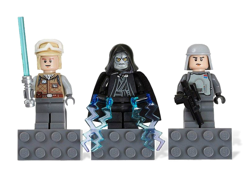
I believe we haven't had a good picture of this yet? Magnet Set: Luke Skywalker, Emperor Palpatine and General Veers
-
Star Wars: The Clone Wars - Season 4 Discussion
Oky replied to XimenaPaulina's topic in Culture & Multimedia
Fair enough. I think we can all agree that there are a few stupidities in Star Wars. I also agree that one shouldn't base one's opinion solely on such details, but they do take away from the experience. Note that I did give the episode a 3/5. Only one of the deducted points was for those illogicalities, the other was for the simple, unoriginal plot. I believe we covered most of the important and special things in the episode along with the details in our review (I tried to anyway), so I don't know you're complaining about. And isn't it partly the point of a review to give your view of something? If you just want to hear the bare facts (the way you wrote them) I suggest you go to StarWars.com or Wookieepedia. -
Oh, okay, thanks. I didn't know that. Well, she has it in the movie, so I don't know why the minifig doesn't have it.
-
I see. What's the big deal with that belt buckle anyway? Excuse my ignorance, but who cares what shape it is (besides you)? You do have a good point about HE's quiver. I wonder why they didn't include an actual one for him.
-
Star Wars: The Clone Wars - Season 4 Discussion
Oky replied to XimenaPaulina's topic in Culture & Multimedia
In the contrary: The harder he rules, the more he has to expect people to betray him. If he doesn't do that, then he's braver more foolish than I thought. Yes, that's indeed what you wrote, but what does this have to do with our review? And what's wrong with paying attention to detail? If you're not going to pay attention, what's the point in watching (and reviewing) at all? ...and yet you said it... Your conflicting insults aside, just because somebody disagrees with you doesn't give you the right to tell them what to do, especially based on an opinion based on a single episode. And it's really just that, his opinion. He never said the episode needed to be done differently, just that the way the story was executed could have been better. No need for such an attack. I for one agree with Peanuts for the most part. The Balugans (very creative species name again by the way, CW team) were indeed pretty stupid and could have been portrayed better. And I didn't even think about the ease of the bounty hunters' escape, that's a good point. I guess by that point I had already accepted the fact that the Balugans are complete morons and wasn't surprised. True, that would indeed be an interesting development. -
You misunderstand. I meant that it wouldn't make sense if they were rings. The studs are fine since you can imagine the glow coming from the center of them. Perhaps, but they don't have a hole in the center.
-
They always looked like studs to me and I don't know why anyone ever thought they are or should be. They are representing the glow that comes from the palm of his hand, so why would they be around his hand.
-
Am I the only one who likes the aliens? I think their printing is pretty neat, and I love the gold and purple color scheme (pearl gold minifig heads!). Besides, they're the bad guys, they're supposed to look ugly.
-
The banner is nice, but it does feel a bit dated. I think it needs some of the modern figs, like a SP3 commando and an AQ alien, and some color in the background. Since the forum is getting more attention, does this mean we'll have the long overdue Sci-fi contest? Also, will you be completing the MOC index?
-
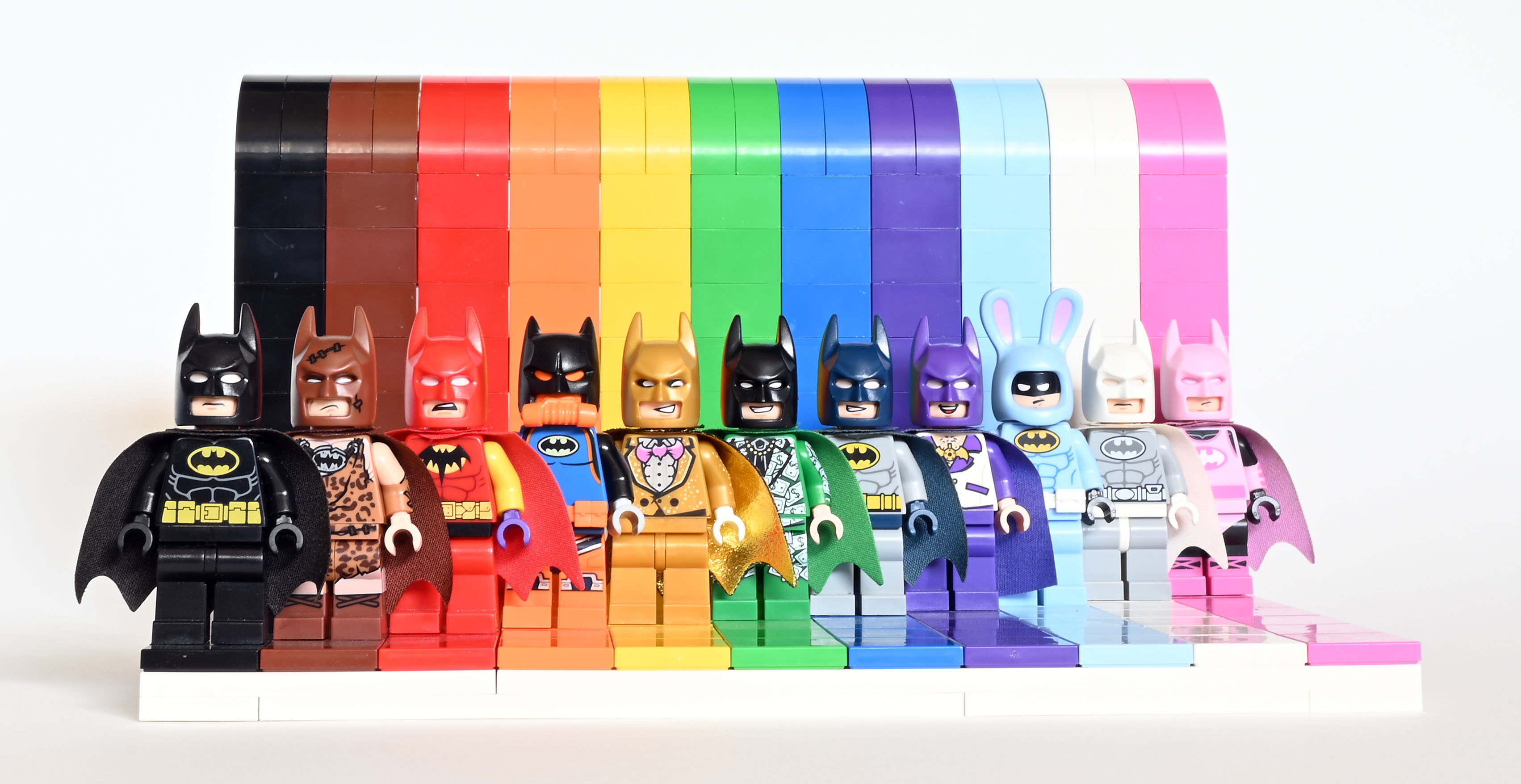
Thanks for those pics. Iron Man doesn't look so bad when looking from the front, but still not as good as with a printed minifig head. Tony's face underneath looks good, although I'm curious to see how the other side of his head looks. I gotta agree that Loki's and Widow's faces are disappointing as they look like Bruce Wayne / Hermione clones. Oh well, I'm still very satisfied overall and can't wait to "collect them all"! But still no Spidey?! That Webhead sure is elusive... Hehe. While I doubt that it will be Rainbow Batman, I agree that there is no Mr. Freeze's chance in hell that it will be anything but some version of Batman. Personally, I would love a battle damaged Batman with a torn suit and possibly blood on his mouth, but I guess there's no way that would ever happen either. My bet is on a TDK® variant.
-
It looks like a tile to me, but the underside of it seems to be turned toward the camera, so we can't see what's printed on it. Perhaps a calculator?
-
Argh! I really gotta visit other sites than EB. Where did you hear about it? Is there any news on when it's supposed to premiere? Yes, I think it's the thickness and angularity that make it so inaccurate. It would be good if you had two of those big round pieces that you used for the zip-line platform on the freedom fighter camp in tan, as well as some smaller ones for the back. Or you could just cheat like you did on Aangs glider and use paper instead. Also, it would be good if you had a few of Aang's staff piece to use for the supports and "ribs". Oh, and you should definitely draw some "ribs" on Aang's glider too.
-
You're kidding, right?
-
You sure have, and I hope you never stop! Your MOCs are the only thing (except for reruns and occasional news) that keep my hunger for all things Avatar satisfied until Korra finally comes out! Man, if only the theme would have continued long enough for them to release an official freedom fighter’s camp playset! Your MOC gives us a good idea of what it might have looked like! I like Aang's and Katara's gliders, but I'm not really happy with Teo's. The wheelchair part looks good, but the color and shape of the wings just don't feel right. I'm guessing you're running out of parts again, so I'm not sure how you could fix that.
-
Thanks, everyone. Sure. Shoot me a PM with your idea and I'll see what I can do.