
Frank Brick Wright
-
Posts
364 -
Joined
-
Last visited
Content Type
Profiles
Forums
Gallery
Everything posted by Frank Brick Wright
-

Tournament of Retribution III - Voting Results
Frank Brick Wright replied to Admiral Croissant's topic in Pirate MOCs
Congrats to all who passed! I'm glad those extra-participants are included, it would be unfair to rule them out. -
I wonder… This is perhaps because there is no difference between a carrack and a "nao" I wonder why they call these ships "naos" because in fact the portuguese word is nau, with an u. The word carrack comes, etymologically speaking, from the greek. The portuguese word comes from the prefix nau, which is associated with NAUtical issues, as in English They are the same, so don't worry about that. Building one of these vessels is tough because there are few pictures and no plans from this time. They were usually VERY rounded (and I really mean, very), with a gigantic sheer and an overall rounded hull-shape. This is looking good so far, I'm looking forward to see the progress in this WIP!
-
Absolutely unbelievable! I am missing the words… The way she is built, with so much elegance, and the stern… I never thought it possible to put so much detail in a stern built on a prefab hull… But it is! And what a stern! The pumps, lamps and details are also unmissable! Now I also see where all the dragon wings from BL have gone They are so beautiful as an ornament! I have thinking (actually before I saw this) in making a ship with removable sections. I wonder how strong she has to be in structural terms to support that. Have you had to rearrange the structure you used in the Achille to make it strong enough for the side hinges? And how practical are those removable sections, i.e. are they easily removable? Perhaps it has escaped you, but here The jib boom is a bit bent, I've also found it hard to stretch the ropes enough but without benting the yards. This is possibly my favourite prefab ship to the date
-
[MOC] USS Poseidon - Minifig Scale First Rate Ship of the Line
Frank Brick Wright replied to shiplover's topic in Pirate MOCs
I'm specially impressed by the crazyness and the size of this project! It is looking tremendous already However, a few issues come to my mind. In the first place the gunports are not to scale. Check here, the gunports should be almost of the size of windows and they are way too small. Besides this and the wrong number of gunports (which has already been adressed), the bowsprit is also too thick, here. I haven't measured it but I'd say you should have something like 3 studs wide, and not 4 (though IMO 3 studs is even too much, but it is needed because there are no half-stud pieces). Also 150 guns is larger than anything ever built in real life, and even for a forth-decker those 10 extra guns make a difference. I'm looking forward for any updates, this has an enormous potential! -
2013 LEGO Pirates rumors and discussion.
Frank Brick Wright replied to just2good's topic in LEGO Pirates
Thumbs up for this! :thumbup: -
Tournament of Retribution III - Bluecoats voting
Frank Brick Wright replied to Admiral Croissant's topic in Pirate MOCs
2. Sebeus I 1 point 11. Brick Brick 2 points 7 Esurient 1 point 1. Yawgmoth 1 point -
Tournament of Retribution III - Redcoats voting
Frank Brick Wright replied to Admiral Croissant's topic in Pirate MOCs
9 Purpearljellybob 2 points 4. Duck 1 point 3. Dr Spock 1 point 1. Blackar 1 point -
This is looking terrific! It has an amazing classical felling to it The gatehouse is specially well-built. My only suggestion so far would be to add a bit more of detail in the rock work, such as plants and so, but you are probably planning to deal with that later
-
RvB: Commander Red Hat goes to the cinema
Frank Brick Wright replied to Admiral Croissant's topic in Pirate MOCs
A good laugh And now it is time to get more jars!! I hope you aren't stoping the collection now, it already looks impressive (not that killing redcoats is very impressive, but you know) -
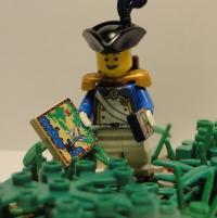
ToR III, Round II — Pirate School
Frank Brick Wright replied to Frank Brick Wright's topic in Pirate MOCs
I actually like the comic the way it is, I don't see the purpose of having more blood in it I actually thought more about the pirates serving us bluecoats than a coop… Though that was probably left ambiguous. My idea here is a school that teaches pirates how to kill redcoats and also good manners towards us bluecoats, the kings of the world I was absolutely not expecting this! Thanks for the blog though -
Now this isn't a "classic" comic I really like the disarranged looks overall because it helps to the idea of a lot of motion, there's always happening a lot of different things in your entries But it is funny and pretty good, considering it came from a redcoat…
-
That's because you are in England which has the best timezone in the world! Wait, isn't Portugal in the same timezone too? No one follows the Greenwich time anymore… EB uses the CET (Central-European-Time) which is the most used in the countries in UE… (for some reason the site is called EURObricks )
-
This is a good entry! (Isn't that pirate ship a new one? I don't think I have seen it before!) I specially like the moment when Din's Fire pops up in all her grandeur with the guns drawn! The photography is perfect
-
Acknowledgments: that fantastic headrails photo is of course from the great Vesta and the best pirate ship ever (IMO) is obviously from the Dutchman! Thank you guys, AC and Sebeus, for your photos, this entry would not be the same without them! C&C very welcome, as always!
-
Nice job! It really is funny! A very nice story AND layout!
-
My first thoughts too In the reference pic you are using and that I posted somewhere in an older post you can confirm that. For a ship of this size even 2x2 in the bowsprit is even too much (probably) so your extended thickness/length looks off. Another slight issue for me is that the yards look way too bent. That's quite visible in the first picture but mostly here: I don't quite like the 1x1 rounds because of the benting but they do look good! If you add extra-weight (like sails and so) to bent yards that may look off, though it might also be easily solvable with rigging. Also the headrails, even after all that pain, still look a bit unfinished This all being said, I really really like her! She has such a sweet lines and a terrific colourscheme! The amazing degree of detail/dedication you went for this project are noticeable at the first look! The working rudder, the stunsails, the interior, all that adds up! Keep up the excellent work!
-
RvB TOR III The Blue Team -Now with improved version
Frank Brick Wright replied to Admiral Croissant's topic in Pirate MOCs
Wowsers! This is great! I love it -
Unless it is Z. closing this round then I guess it will be closed in Netherlands, at least all the team leaders are from there
-
Can somebody make a potc HMS providence?
Frank Brick Wright replied to captain gabe's topic in LEGO Pirates
Possibly the best "build", so to speak, of this model IMO is not on this forums: http://www.mocpages.com/moc.php/278472 The detail is amazing and, even if it is LDD, I'm sure you'll be inspired anyways. -
TORIII Entry Round 2: The Pirates of Penzance
Frank Brick Wright replied to Sir E Fullner's topic in Pirate MOCs
I really like the concept of your comic but… Let me put this in this way. I find your idea tremendously original and a very good one. I like operas but I didn't knew this one -- however it was clear that there was a rhythm and a music underlying the text because it is very well-written. However, despite this fact, in technical terms, the comic looks pretty unfinished, mostly because there aren't any balloons and the text seems threw-in, with different font sizes and balloon formats… I think this is a good entry overall and I like it, because the photography is clear and the text superb! But again, it is just a pity for me that you haven't gave it a more comic-like look. -
This is a rather good-looking ship, I'm especially found of the colourscheme and of course of the custom work, great rigging and sails. I must say the sails appeared to me to be real cloth and not paper, their color/texture strikes me as very accurate!
-
I'm not sure wether this is just a mis-spelling or not but it is tremendously funny! Bluecoats try to despirately get food! Funny story, although it isn't quite true
-
For me at least it is ok! After all this is all for fun, so what matters if this isn't exactly a comic? Moreover the video is incredibly well-made, and it humiliates the redcoats! Great great job!
-
And I thought my comic had already too much text! This certainly is a nice comic! The story is funny and well written, I like its unique style, it a different concept of comic from the others we have seen here and that is original and good! The letters size, however, is a bit too small which makes the reading hard, moreover different sizes of letters don't help a lot, I had to increase/decrease my browser zoom a couple of times to be able to read it all
-
ToR III Official Entry I — Metamorphosis
Frank Brick Wright replied to Frank Brick Wright's topic in Pirate MOCs
My apologies to the staff for creating such problems. My intention was not to take advantage of gaps in the rules. The truth here is that I do not have any islander nor any minifig which could be adapted, moreover my Lego budget at the moment is 0. Then I had this idea that since redcoats are so primitive/dumb they could easily be taken as islanders/turn into islanders. Since it fitted in the rules I saw no problem, but it clearly generated a lot of discussion. Unfair? I don't think so -- even if I am not imparcial in this case. I must say I hadn't quite understood what efulner's entry had to do with islanders when I finished reading it, whilst my entry has a clear point: redcoats turn into islanders. You can say that there aren't any islander figs and that is true; but the main theme of the sotry is nevertheless their turning into islanders. I have to agree with your first critic, the first photo was a night-shoot and moreover its on black-and-white, thus the created effect is odd. Your other remarks, however, seem all off to me. Chaotic? Lack of organization? Boxes thrown in? But that was more or less my idea when I made it! I'm glad I succeeded. I don't know whether or not you are a great fan of bd -- I am. This is not a classic comic. On of my great inspirations was The Sandman by Neil Gaiman (a true masterpiece). My idea here, for the story, was a bunch of redcoats which ask red-hat/bandana for a story, their story. While he tells his story, images pop in, like memories, whilst the narrator voice keeps sounding in the back. Thus the "thrown in" boxes! The panels are misaligned for some reason, also, it is part of the aesthetic principles I was following, indeed not classic ones Again, this tournament is all for fun, so let's have it! Let's not ruin it for details or exhaustive discussion of the rules.