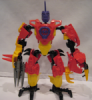
cylex7 Posted January 31, 2013 http://upload.bricks...ry.cgi?f=509943 Matthew Sharpe is the leader of the Zeta team! Strong, quick-witted, and a good leader, he'd go out of his way to help a civilian in need. Armed with a Crusher Claw and a laser-sighted Saw Gun, he's a worthy match for any foe! - $10 Born from an experiment gone wrong, this dragon is a worthy match to all heroes that stand in its way. Armed with sharp claws, wicked talons, clawed wings, and a spiked tail, this beast can strike fear into the cores of Heroes with merely a roar! - $30 Please comment, review, criticize, and most of all... Enjoy! Share this post Link to post Share on other sites
howie28 Posted January 31, 2013 I quite like the hero. The colours are basic but they go together well. The dragon has a jarring colour scheme but still looks nice. It would be better with more uniform colours. They all look good though. Share this post Link to post Share on other sites
bacem Posted January 31, 2013 the hero is cool. the color scheme are good and i like the way you use Bulk 3.0's helmet as shoulder armor. the dragon is interesting too. the way you use those armor as wings are cool, but don't you think the tail is too long? BTW, i noticed that you put a price for both of them. did you plan to sell them? Share this post Link to post Share on other sites
DraikNova Posted January 31, 2013 The dragon needs it's colors reorganized, but it's nice. The hero is pretty good though. Share this post Link to post Share on other sites
cylex7 Posted January 31, 2013 No, The prices just go along with the cheesey descriptions... Thanks for the replies! I had gotten reverse replies (color scheme was good, tail should be longer) so I'll wait until a general consensus before changing anything... Share this post Link to post Share on other sites
VBBN Posted February 2, 2013 The Hero looks decent enough, bringing in a nice colorscheme and a few techniques I like(particularly the wolf head as shoulder armor, always a fan of that) His legs are my main complaint, which due to the long armor pieces, they seem too simple for the figure, which from the waist up as a more broken-up complicated look. The dragon...Has some good points. I don't mind the long tail, and I like the design of the legs and claws well enough. His torso is okay, but I think the real issue here is those wings. When I looked at the first picture, I just thought they were some kind of cool looking armor of the sort, but to be wings they are way too small. Most dragons wings are multiple times the size of their actual mass in order to properly lift them, for example; While yes, it may just be a dragon-inspired villain, I think that if you want to give him dragon features like wings, they should be more properly sized. The color scheme doesn't seem to bad to me, maybe try to replace the gray with black to bring the colors more in tune would be a welcome change but other than that it's a decent start. Share this post Link to post Share on other sites
MakutaDreadscythe Posted February 2, 2013 I'd have to disagree. These need quite a bit of improvement. The hero looks good from the waist up, and his right arm's pretty innovative considering, but he looks so top heavy and his legs are too basic, not to mention his arms are longer than his legs (I never did like the Savage Planet proportions). The dragon...well, the heads interesting and I see where you're going with this, but his hands seem a little overkill with the extra fingers and his colour scheme is...jarring. Oh, and those wings are rather puny as well. The end of the tail's pretty cool though, as are his feet. Share this post Link to post Share on other sites