

CardinalBricks
-
Posts
323 -
Joined
-
Last visited
Content Type
Profiles
Forums
Gallery
Everything posted by CardinalBricks
-
Unpopular Opinions about LEGO
CardinalBricks replied to Lego David's topic in General LEGO Discussion
A couple of specific ones related to some recent modulars: The use of garage door elements for the bakery window in Assembly Square has to be the worst part usage in any modular set. I get what they were going for, but the amount of lines is too harsh and it gives a "barred-up storefront" look, which, in the setting of a lively town square, palpably de-livens it. The set has some redeeming qualities but this aspect (probably to an unreasonable degree) ruins it for me. I admire the ambition it took to design the Boutique Hotel, as they were working with some challenging geometry. But I think the angles got too unwieldy, resulting in a pretty shabby build overall. I'm sure tying the middle section to one side and having it converge with the other side, rather than making the middle section completely centered, was their attempt to minimize gaps and simplify the geometry, but to me it came out looking confusing and quite straining on the eye. I'm particularly thinking about the curved windows on the second level, which, from certain angles, don't appear to match up with the door frames on the first and third levels, even though they technically do. -
[MOC] Naboo N-1 starfighter & Razor Crest (Midi-Scale)
CardinalBricks replied to a topic in LEGO Star Wars
Well, that's one of the most incredible Naboo fighter MOCs I've seen. Great use of the relatively new 3x3 cylinder! I was thinking of updating mine to utilize that piece as well. Even though it's midiscale, according to my calculations, a 28cm long Lego N-1 would be exactly minifig scale too. They are really small ships in-universe. I'll bet it would look great next to minifig scale sets like the ucs falcon, at-at, and some of the x-wings! You're a wizard with those angles on the razor crest too, wow. -
It’s always delightful seeing what others do with the interior of this set. I love what you did with the table legs, the coffee table build, and the SNOTed bed sheets. The dark red floor really compliments the interior too. Thanks for sharing!
-
This is my ranking, using the popular "tier" method: The originals just really do it for me. Parisian restaurant and detective's office are pretty prefect too.
-
So I found this while searching for modular MOCs in the Town forum for inspiration. This is just spectacular. I'm designing a yellow half-modular right now, and I can tell you it's not easy to make that color look good, and you knocked it out of the park. Also cannot get over how amazing that looks in between the bookshop and townhouse! Who needs a whole modular layout when you have that?
-
Thanks so much for sharing! You have a lot of really good ideas. I particularly like the brown cabinet build in CC and the compartments next to the refrigerator in GG. The laundry area looks great too. And yes, I can tell that you like tiles Thanks guys
-
Thank you!
-
My Lego project this year has been parting together the first three sets from the modular building series. I used parts from my own collection in combination with bricklink orders, and while there are a few part substitutions for cost reasons, I wanted to keep things as faithful to the originals as possible. Some of the notable changes are: CC) old style 1x2x3 panels with solid studs and 2x2 jumpers for most of the light bley turntables; MS) old style white hoses for balconies (I think these look a bit nicer too) and basic 1x4x3 windows instead of train windows; GG) the sand green walls redesigned to avoid 1x8s. My custom interiors use only parts that were accessible in 2007/08 to keep a consistent style going. It was also a really fun challenge. I hope you like seeing what I came up with. Cafe Corner After parting together the Cafe Corner, it has undoubtedly become one of my favorites of the modular building series. The warm colors on the upper floors are handsome and thoughtfully blocked out, and the dark blue on the ground floor is a fantastic idea. It being a hotel and cafe is also very inviting imagery, and I was inspired to turn it into a European-style hostel with a ground floor cafe and bakery. The ground floor cafe and bakery has a few seats and tables as well as plenty of open space for customers to stand. It's all a bit kitschy, especially the floor design I chose, but also pretty in-keeping with design sensibilities from this era of Lego in my opinion. I put the kitchen area in front of the set's blue wall to keep things visually sectioned-off. The coffee machine was a build I had a lot of fun coming up with. There is also a key on the wall, which is meant to represent keys to the door of the stairwell leading up to the hostel— I figure this counter is the one-stop-shop for everything in the building. The first floor of the hostel features three bunk-beds with storage drawers underneath for each guest, a bathroom, and some stained glass, which continues the old-world feel of the brown interior and lattice windows. The upper floor has more comfortable accommodations with three larger beds, a desk and chair and a dresser. Market Street I was really, really surprised how much I ended up loving Market Street. This set is typically found at the bottom of people's rankings of the modular buildings, but it's safely near the top of mine. Sure, it's a hair more than half a modular; but it was priced accordingly, and who doesn't like a little height variation in their layout? Besides, the open-air market space would be a terrific addition to any urban area. The ability to configure the square floors in different directions is a bit unnecessary for display, sure, but it's undeniably in the spirit of Lego. And medium blue, gosh, what a pretty color. I decided to make mine into a science museum with its medium of engagement being its library. This is a museum you could spend all day at, combing through their collection of books on the scientific topic and deepen your understanding. Much of my inspiration here came from a place I visited in Amsterdam called "embassy of the free mind". The guy in the blazer is the owner of the museum and has immense passion for the topic, demonstrated by the piles and piles of books scattered everywhere. To him, though, it's organized chaos. I tried something different with the technic bookshelf, I think it turned out pretty cool! The second floor features walls of infographics, important objects on display, and general outlines of the topic. Inside the clear case is a sextant element; maybe this is some sort of astronomy museum? I made the absolute most of the available space on the third floor to place several columns of bookshelves, a plant, and a statue of a foundational scientist in the field. The outdoor area under the awning is kept the same from the original set—a fantastic place to pass the time and read! Lastly, here's what I've done with the market space and the back side. I guess we know where the plant in the 2x2 yellow cylinder out front is grown! Green Grocer Green Grocer is a fantastic, inventive modular building and fits beautifully with the previous two. Many of the window and door elements we take for granted today were released in 2008 with this set and the Town Plan. But in my opinion the sand green groove bricks, creating a powerhouse of detail, are this set's real showstopper. It's a shame they're not more readily available. I've kept the ground floor the same from the original model. That tile design—so charming! I made the rest of the building into a spacious two-story apartment. The rug and the grandfather clock have been moved to this floor from the upper floor where they were placed in the original set, I think they give the space a lot of character. The chairs are a variation of a design I came up with for my Hobbiton MOC a long time ago, and they work well here I think, the upside down grey turntable playing nicely off the grey floor. I'm also quite proud of the sink, which I got to fit almost perfectly in the bay window, and the SNOT refrigerator using mailboxes and brackets partially locked into the wall and partially acting as storage shelves. Upstairs is a bedroom with a reading nook and a full bathroom. The bed frame is a somewhat complex build featuring hammers, continuing the set's motif of using that piece for detail. I made no changes to the rooftop patio on the original set, it's perfect as is! Thanks for looking at what I had to share! Let me know what you think
-
Ahhh, duh. You gotta believe me when I say I really spent a lot of time trying to word this post properly, but even I'm susceptible to general American ignorance of world geography
-
Many fans have voiced their complaints that the landmasses on the Lego Ideas Globe 21332 have not met their expectations. While I don't fall into this camp as passionately as some do—because accurately representing Earth using Lego at this scale is a tall order for anyone—there were definitely some areas I wanted to tweak once I got my set. After getting tired of my original Pangaea globe, funny as that was, here's a modification of the landmasses that fits my personal sensibilities. I'll start by showing my revamped Europe as, in my opinion, it's the region that needed the most work. It looks extremely simple, but I think it works well. The curve of the globe sets the 2x2 plate next to the Iberian peninsula at a slight angle, which is perfect. You may also spot a technique that I utilized quite a bit in my modifications here, which is to let plates bleed onto adjacent "pizza slices" and use the quarter tile to give it room. Greece and the Aegean Sea are present, which were just about absent on the original model. I also made sure include a proper Caspian sea, as Lego seemed to represent this using only the gaps in the plating. The U.K. is in quite an unfortunate location relative to available studs, so my solution was to merge northern England and Ireland into a single 1x2 tile and angle it down, which came out okay. This is the same situation for Jutland, which should probably be about 1 stud east. Next, here's what I've done with Asia. Essentially, I've added more land and extended the continent further south. By doing this, I was able to achieve greater detail, including Lake Baikal (quarter round tile ~ 9 o'clock of first image), the Kara sea (way up north by the white tile), and a suggestion of the Lena river (where wedge plate is not mirrored). I also better captured the shape of Vietnam, Hainan, and the gulf area (~7 o'clock first image). The continent extending south ultimately meant less room to work with when drawing Indonesia, as seen in the image below. Still, this looks more accurate to satellite maps in my opinion, and I was still able to get the larger islands including Samatra, Java, Kalimantan, the Philippines, and Papua/Papua New Guinea. I kept Australia, Africa, and South America basically the same, but there are a few very minor tweaks. Lastly, here is North America, which I've also changed up quite a bit. The main issue I wanted to fix were the large amount of gaps, which I did by shifting the entire continent 1 stud west. This resulted in some weirdness with Central America as I kept South America the same, but I think it was well worth it. I'm most proud of the Hudson Bay, the Great Lake suggestion, and the Gulf of Mexico which came out much less rectangular looking. Anyway, that's it! P.S. you can make this version yourself if you own the globe, as I only rearranged the pieces included in the set! (and made use of spare ones!)
-
Absolutely! As others have no doubt pointed out, the globe set is an incredibly versatile thing.
-
Not sure why I decided to do this, but as I was building the new globe set I had the idea to leave all the green/tan pieces off and make a Pangaea globe with the parts. This is the result. I left the ship attached, so as to build the landmass on the opposite side of the interior counterweight tires. Still, they are no match for the sheer density of plates and tiles on one half, so the globe does not spin amazingly well. Lastly, a look into my process. Nothing fancy, just a screenshot and basic markups using the ruler tool in camera roll on my iPad. The X represents the point exactly opposite the ship. Hope you enjoyed this bit of random fun! I will make the original model eventually... but there's something so funny to me about a Pangaea globe.
-
Made some more album thingys recently! 37. Rilo Kiley- The Execution Of All Things 38. Broadcast- Tender Buttons (the vinyl copy has a red stripe along the left side, adding a nice splash of color) 39. Adrianne Lenker- Songs (kind of ended up being a blend of the album cover and this picture of her) 40. Illuminati Hotties- Let Me Do One More 41. (finally!) The Beach Boys- Pet Sounds Here are all 40 that I've made since 2017! I tried out something new this time by organizing them by color. Besides a small plant on the right, they take up an entire 4 foot shelf now! Thanks everyone for checking out new iterations of this project!
-
Thank you! Totally agree about the side, it is a little rough looking
-
Thank you! Very good use of technical terminology too, I'm not quite there yet lol
-
Hey! After completing my X-wing and Y-wing MOCs, this was third of the iconic Rebel fleet trio I wanted to design. It came together in about 2 weeks and didn't go through too many revisions. Of all my Star Wars spacecraft MOCs, this is probably the in-universe model that I'm the most irreverent of. I think because of that, I subconsciously approached this project not with the goal of a making a particularly aesthetic (or even necessarily hyper-accurate) model, but more as a kind of breeding ground to stimulate my imagination and experiment with strange building techniques. So, I view this as the most artful model of the bunch but probably not the prettiest to look at. And I like it because of that; a craft that I easily could have designed for the sole reason of it fitting with the others now feels like a personal expression and demonstrates my more raw sensibilities as a builder. I'm curious how you guys feel about it! The way the front of the interceptor slopes downward is very peculiar and I tried to approximate the gradualness of it by doing 2 series of bar-clip connections for the dark red platforms, and 2 more for the white edges. Inevitably, that creates some gaps, but I don't think they're too bad. Unlike my other models, this one does not have an internal structure. The closest thing to one would probably be one of these bad boys, which the whole front sloping apparatus is attached to and also connects to the pilot seat. Structural stability has not been a huge issue though, since the display stand rests on the back of the model which is reasonably built-up. The dark red section behind the cockpit hugs the windscreen very close in the actual model, so I thought having a small gap was better than having the parts extending outward from it. I think the underside really demonstrates how haphazardly this thing was designed I couldn't fit much in the cockpit, but at least it's monochromatic and there's a couple of control sticks. Lastly, an aerial view. Hope you enjoyed looking at my custom A-wing. Let me know what you think!
-
Well, it's about that time of year where I dump pictures of my new MOCs before getting back to my life as a student. In all seriousness, I'm really excited to present my Y-wing MOC. Ever since I designed my X-Wing last year, I knew I wanted to make a Y-wing and an A-wing to accompany it. Of all the minifigure-scale Star Wars spacecraft I've designed, this model is the biggest but also the most straightforward design-wise. I found myself having very little difficulty in the build process, everything fell together very well. Don't you love when that happens? My favorite part of this ship is probably the oblong section just behind the astromech. I love the shaping of this part on the actual model, especially the cylindrical eyelets poking out diagonally, and I think I've done a good job replicating it here. I never sacrifice structural stability for detail when it comes to the undersides of my spacecraft. Maybe I could have tried a little harder here, but I think it looks reasonably presentable. Not much going on with the interior either, just enough space for a minifigure and as many control panels as I could fit! While we're here, the hull was most definitely the most challenging part of the build. It's not quite as curved as the actual model is, but since we're using Lego bricks, I opted for a straight and smooth approach over something that would have turned out angular but ultimately jagged. Lastly, here is an (admittedly crooked) aerial view of the ship. From here it's pretty evident that the copper flex-tubing I bought (in new condition) resembles reddish brown more than it does the newer elven swords in copper, which is disappointing. I like the slight sheen it gives off, but I'm not sure that makes it worth it. Hope you enjoyed looking at my Y-wing! If anyone knows where I can find other minifigure-scale Y-wing MOCs besides Jerac's, leave a comment because I've been trying to find some for a while!
-
Nah, these don't have any relation to if I own the record on vinyl-- I actually just started getting into vinyl this year. Yes, it is truly a superior sound haha.
-
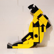
On 9/6/2020, it would seem that BrickRally217 did not have a grasp on the concept of Lego elements loosening over time, nor on his innate perfectionism. A year later, he would, in fact, fix it. Indeed, after a little while having this thing on display, the ball joints gave and the wings started to sag. So, this summer I returned to the task of solving a problem I had only previously scratched the surface of. As a builder whose strength has always lied in capturing artistic detail over things like functionality or physics, it was quite a nightmare indeed. If you'll have me, I'm going to go through my process (if nothing else to get it off my chest, lol). My first thought was "how do I improve the friction on technic pins?" My solution was absurdly simple; just put bars through them and bend the bars slightly, somehow. After a some fiddling around, I was able to accomplish this illegally; as seen below, the technic pins do not fit into the red liftarms without being slightly stressed. Still, I was okay with it, since this solution actually worked for a while, and it didn't use rubber bands, which I was vehemently against. It wasn't ideal, but it worked and it was creative. That was, until it didn't, and the parts started to loosen in much the same way the ball joints did previously. Great, I thought, I'll have to rack my brain about the functionality of gears now, since I can't rely on precarious solutions anymore. My only experience with using gears in my MOC making was when I made my Starkiller Base Forest a while back, where I had a feature where the ground split open. Still, that was a larger MOC which gave me lots of space to work with, and even so, it still only worked about half the time. Still intent on using the 3x3 cylinders for the engines and not revert to anything 4x4, this is what I came up for my next attempt. (re blue plate: Gotta love repurposing your broken Lego in places where it doesn't matter, huh? ) It's really quite similar to what I had done previously, only this time with gears running along the liftarms such that the wings will balance each other out, and the use of t-shaped liftarms to provide extra support toward the bottom. That wasn't so hard, was it? After redesigning the wings to accommodate a single-stud connection (the white bits), I attached them and... well, they were just too heavy for the mechanism I designed and the small gears. That was one sad-looking, droopy X-wing I had on my hands. After this, I took some time off from this project and made a Y-wing MOC and an A-wing MOC, both of which I'm very proud of and I'd love it if you checked them out. Coming back to this, though, I decided I'd get out of my own way and see how other X-wing MOCers did theirs. I came upon this thread from cehnot, and I saw how they used a simple gearbox, with the gears on the sides being attached to the extensions which attach the wings. I couldn't tell based on the picture how their mechanism worked beyond that, but that fundamental idea was all I needed. I came up with this as my final solution, using technic double-pins attached to the side gear, and the weight of each wing balancing out. I simply attached plates onto the technic beams and started building a new wing design! (and I gave up on the 3x3 cylinders as you can see, lol) To avoid the alternating-technic-beam problem, I simply included a mock-up 1x3 beam on the opposite side to match; easy enough. So, how did the final model turn out? In my opinion, pretty spectacular. I'm not sure if it's the best minifigure-scale X-wing MOC out there, but I would venture to say it's definitely one of the better ones. Some other changes I made were 1. a color change from my original dark red to regular red, I think it looks a lot sharper, 2. painted a stipe across a tile next to the 1x4 "red five" tile to make it the "red six". Thanks for looking! I hope you enjoyed seeing the completed model and/or got something out of my ramblings, lol.
-
I'm pleased to revive this thread once again to showcase some new music dioramas! 31. Nick Cave and the Bad Seeds- Murder Ballads 32. Lana Del Rey- Norman F#%&*!@ Rockwell! 33. Ween- The Mollusk 34. Big Star- #1 Record I really wanted to use my glow-in-the-dark bars from my fairground mixer to make the star. The problem is they are 4L which creates quite an oblong shape when the constraints are only 7 bricks tall. Still, I think it turned out great! 35. The Cure- Disintegration (I really had no choice but to use glow-in-the-dark pieces here, did I? ) 36. Angel Olsen- Burn Your Fire For No Witness 29. (Redux) Talk Talk- Laughing Stock I redesigned the tree to make it appear more circular, as well as eliminating many of the original animals attached, which originally made it look too cluttered in my opinion. This is probably my favorite album cover of all time so I had to do it justice! Lastly, I wanted to show an admittedly grainy image of my current display of this project, right above my vinyl turntable. Here's to building a whole room full of these eventually, ha.
-
No I haven't heard of that group but it's really awesome thanks for sharing!
-
Thank you!
-
Thanks Retro. The Talk Talk one was pretty hard and I actually might revisit it and improve it more in the future because I don't think I'm that happy with how it came out. I want to find a better way to replicate the circular shape and still make it look like a tree. Maybe attaching the animals should be a secondary consideration.
-
[MOC] Eta-2 Actis-Class Interceptor
CardinalBricks replied to CardinalBricks's topic in LEGO Star Wars
Thank you! I too was surprised how well the windscreen came out. It's all about carefully pre-bending those 3mm hoses. -
Almost a year later, here I am with 5 more dioramas to show. My Lego free time was mostly spent making Star Wars models this year, and it was great to get back to this project last month. Sorry about the Dutch angle shots lol. 26. The Internet- Ego Death 27. Fiona Apple- Fetch the Bolt Cutters 28. Red House Painters- Roller Coaster 29. Talk Talk- Laughing Stock 30. Vashti Bunyan- Just Another Diamond Day