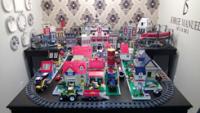
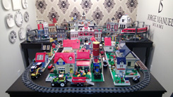
Why is LEGO going backwards on their designs????? What a huge disappointment. So many beautiful fan made Mocs that go unnoticed. These truly heightened the modular line with their use of creativity, color combining bricks, and use of innovative ideas. The Travel agency and post office has to be one of best Mocs I’ve seen out there, including those from the Lego line. @lego needs to keep pressing the envelope of creativity rather than seeing how many ways to cut corners to make larger profits. Literally the new Garage modular is half a baseplate of design!
To start off, we see more of the baseplate than of the actual modular. All the spaces are so small inside the building you can barely enjoy the details. The color palette of the bricks makes it look like the bottom half came from a different building to the one it has on top. No special features with their mini figures (a regurgitation of older mini figures just recycled into this one) and the tow truck is something we’ve seen many times before. The architectural elements are so elementary looking that what it lacks in design it also lacks in detail. The veterinarian office is a great idea, but instead of building on that, it takes backstage to the design. And the stickers that actually hide behind other elements like the element in the center of the garage roof doesn’t seem thought out. Perhaps they were trying to be creative with the inverted corner modular, but honestly the set is disappointing. If you compare the cafe corner (one of the oldest modulars) to this one you would think that the garage modular came first assuming that modulars get better and better with time.