-
Posts
376 -
Joined
-
Last visited
Content Type
Profiles
Forums
Gallery
Everything posted by ED-209
-
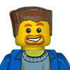
Well to be honest I don't know, I've never used water slide decals. I've seen videos of people doing it on YouTube, and it looks fairly straight forward. I also understand that you get quite a decent result from them. Even though they're lower quality I've always simply used stickers like these: http://www.officeworks.com.au/retail/products/Office-Supplies/Labelling/Printer-Labels/Mailing-Labels/Inkjet-Printer-Labels/AV936020 I just wait until I have a full page of images ready, and print out a whole sheet of them. You can probably fit about 160 on one A4 page! This is what the end result looks like with stickers (just the torsos, the faces are standard parts.) In your hands you can tell it's a sticker and the finish is a little matte, but over all it's pretty decent. Here are a couple of my previous figs:
-
Robbing from the rich; the Forestmen return!
ED-209 replied to ED-209's topic in Minifig Customisation Workshop
Thanks guys! Ah, that's a good idea. The Dark Forest was during my dark ages, so I must admit I'd not even thought of that! Here are some darker themed styles, let me know if there's anything specific you'd like to see! -
Thanks! I wanted to use some of the same elements used in the Hulk face, just to tie it together. I'm not really sure how much it looks like Ruffalo though! Well, maybe his chin... Thank you, although I must admit I've never done water slide decals - I've only ever used sticker paper. The results look better on torsos than heads, as the edge of the torso helps to hide the edge of the sticker. But it's certainly very easy to do! No, he looks sea-sick! It's not 100% clear to me which colour they're using for the promotional figure, so I figured I'd just do a couple of simple recolours to give people some options if they wish to use the images. If you had a prefered colour I'd be happy to do one for you? I've also just edited the original post to include Grey Hulk and Red Hulk versions too!
-

Robbing from the rich; the Forestmen return!
ED-209 replied to ED-209's topic in Minifig Customisation Workshop
Cool, thanks! The updated classic is exactly what I was aiming for! -
Lego's decision to portray the Hulk as a jumbo figure has caused some debate, some people like him while others would have preferred a standard minifigure. I waver between the two but tend to lean towards a minifig myself. So I was pleasantly surprised to discover that TLG will be producing a version of the Hulk in minifig form as an exclusive: http://www.eurobricks.com/forum/index.php?showtopic=68094&st=0 The downside to this is that the Lego website's postage to Australia is preposterously and inexplicably expensive, and that there may not be enough figures to meet demand. (Maybe? Who knows.) So with this all in mind, I set about reproducing some decals. I figured I'd make both regular green and sand green colours, as well as both dark purple pants (as the figure has) and dark tan (like the film): And just for fun, I went on to make a design for Mark Ruffalo's Bruce Banner. Keeping the trouser stitching from the Hulk figure, and adding a second face for when he begins to lose his temper! Any feedback is most welcome! EDIT: A friend of mine suggested Grey Hulk and Red Hulk versions, so I thought - why not?! EDIT: I've now got more Hulks than I know what to do with! Now in bright green with dark purple and dark tan trousers, and a mysterious Blue Hulk that I wasn't previously aware of; AKA the Incredible Smurf! Cheers!
-

Robbing from the rich; the Forestmen return!
ED-209 posted a topic in Minifig Customisation Workshop
A few weeks ago I'd made a tutorial topic about designing torso images in Illustrator, and reproduced the Collectable Minifig forestman as an example. At the time, I'd made a few alternative colours/designs with the intention of posting them in a separate thread rather than in the tutorial. I had a total facepalm moment when I realised only now that I'd forgotten to ever post them! So anyway, here are the modern-styled forestmen (the first one being a straight-up repro of the official one): Will Scarlet, is that you?! I made sure to include black, blue and red variations as these were the colours used in the original line: http://www.bricklink.com/catalogList.asp?catType=M&catID=288 And here's the link to the tutorial in case anyone's interested in how I made them: http://www.eurobricks.com/forum/index.php?showtopic=67532 As always, any feedback, suggestions or requests are most welcome! -
Ah, fantastic! I'll always have a soft spot in my heart for the Black Falcons, and this is instantly recognisable as an update of the original set. Very nicely done indeed. I prefer the overhang in the eaves you introduced in the newer version... and is that a Leprechaun's pot that you've put the plant in?
-
Gorgeous! The upper floor is already starting to take on a lovely German gingerbreadish look to it!
-

REVIEW: 8831 LEGO Collectable Minifigures Series 7
ED-209 replied to WhiteFang's topic in Special LEGO Themes
Wow, the series just keeps getting better and better! Neptune's great, so's the black knight, the piper is fantastic, and by Odin's beard - I love the Valkyrie!! -
Thanks everyone, glad you all like it him! That's true, he does wear a sheepskin coat in the film, but not all the time: And I figured that I'd go with a fabric coat when I make mine, rather than incorporate it into the torso image. But to each his own, I've edited the original post to include a design with the coat for those who prefer it that way.
-

The Wolfpack Renegades strike again!
ED-209 replied to ED-209's topic in Minifig Customisation Workshop
I sure can! I've edited the first post to include them all redone as fleshies. -
Although Lego gave us a Batman based on Christian Bale's costume in The Dark Knight (and the Tumbler), they never did movie versions of the Joker or Two-Face. I'm assuming they won't be doing a version of Bane based on Tom Hardy's look in The Dark Knight Rises, so I thought I'd take a shot at it. Here's the result: Any feedback or criticism is most welcome! EDIT: Bane with coat:
-
Well they're both arrogant loveable jerks who appear to be drunk a lot of the time!
-
Hi everyone, I've been posting some prints for custom minifig stickers/decals recently, and several people have asked how I make my images. I use Adobe Illustrator and I thought I'd make a tutorial detailing the process. Firstly, Illustrator is a professional grade product, so it's packed full of features that can get a bit overwhelming at first. I will really only be focusing on the tools and methods I use in making minifig decals, but it's quite easy to get very clean and precise results with a little practice. It's also worth noting that Illustrator is quite expensive! They used to release free trial versions - you may want to look into sourcing one before you commit to any purchases. Additionally, there's no "right" or "wrong" way to go about drawing the images, this is merely a guide to the way I personally do it. Just quickly, you can hold the space bar to turn on the drag tool. Space + control for the zoom in tool, and space + control + alt for the zoom out. I find this the quickest way to move in and around the images. OK, let's get started! PART 1: Setting up the guides. 1. Open Illustrator and create a new blank document (ctrl+N). I just use a standard A4 page, as that's the size I'll be printing. Set the resolution to 300dpi and the colour mode to CMYK. 2. Now because we're drawing something very small, we need to be very precise about our measurements. Press ctrl+R to toggle the display of rulers across the top and left side of the page. If you've defaulted to inches, you'll need to go to "Edit > Preferences > Units & Display Performance" and change the general units to millimetres. 3. Click and hold on the ruler at the top of the page, and drag down to drop a horizontal guide. Just drop it somewhere near the top. Do the same with the vertical ruler. These guides will form the edges of our torso design. 4. Now zoom in to the position where the two guides intersect. Zoom in all the way, so the magnifier cursor no longer has a "+" sign in it! Place your cursor in the little white square where the two rulers meet, and click and drag to the precise point where the two guides intersect. This will reassign the "zero point" of both horizontal and vertical rulers. If you don't get it quite right, just repeat until you do. 5. Zooming out to a more comfortable level, we're now going to drag out another horizontal guide, and another vertical guide. Only this time we're going to position them exactly. A minifig is 15.44mm wide at the waist, and 12.77mm high (excluding the neck post), so our new guides need to reflect that. I personally like to use 16mm and 13mm, as the overlap is minuscule, but gives a little wiggle room when applying the decals/stickers. PART 2: Base image. 6. Now comes the fun part! I'm going to reproduce the forestman design from series 1 of the Collectable Minifigure range. So I find an image online and copy it, then paste it into Illustrator. This is the result: 7. Way too big of course, but that's fine. We zoom out until we can see the edges of the image. Click on the image object to highlight it, then click and drag on one of the corners to resize it. Hold shift to constrain the proportions. 8. You'll need to do this a few times to get the position just right, but we're aiming for the printed surface of the figure to line up with our guides. If the image you're using isn't exactly straight, hover the mouse cursor around the corners of the image until it turns into a curved arrow. Click and hold to rotate. Here's the end result: 9. Now go to the layer window (F7 to bring it up). Create a new layer above our old one, and lock the old one so we can't accidentally select or change it. 10. Ensuring you've got layer 2 selected, zoom in and drag a new vertical guide to the 8mm mark - this will prove invaluable when drawing anything symmetrical! 11. Most objects drawn in Illustrator have two colours assigned to them, a "stroke" which is the colour of the linework, and a "fill" which is the colour inside the lines. At the bottom of the vertical tool bar are the current colours you have for both fill and stroke. Fill is the upper left, stroke the lower right. Click to select fill, click to select the "none" option beneath it. Then double-click the stroke to both select it and bring up a colour palate. I use a bright blue or pink to start with, just so I can easily keep track of it. Now select the pen tool (P) and we're ready to draw. PART 3: Drawing lines. 12. OK, now we start drawing some lines. Zoom in a bit if you need to, and click on the guide intersection at the bottom left corner. Then move up the line of the torso, just 0.75mm short of the top. Click and hold here, to drag some handles out from the point. A line between two points with no handles will be perfectly straight, but a point with handles will cause the line to form curves. You'll want to make sure the bottom handle is in line with the line, and the upper handle reaches nearly to the top guide. Now move across the guide to the 13.1mm mark, and click and drag here to create another point with handles of the same size, but this time running across the horizontal guide. (Hold shift here if you need to constrain.) Your results should look much like this: 13. Use the selection tool (V), and our linework is now an object. The object will appear to be already selected, but it's actually only the last point which is selected here. Make sure to click somewhere else to deselect the object, then click on it again to select. If we were using the other arrow tool, the "direct selection tool" (A), we would be highlighting only the individual points. 14. Now select the reflect tool (O). Position the cursor directly on top of the 8mm guide, hold alt, and click. A new dialogue box will pop up, allowing us to indicate the precise details we wish. Select vertical, and hit copy. We should now have two identical line objects. If you only have one line with a crazy loop at the top, you've probably accidentally reflected the point rather than the object as a whole. Just ctrl+Z to undo, and repeat step 13. 15. OK, now we're going to fuse these two objects together. Use the direct selection tool (A), and highlight the bottom point of the left object, then hold shift to select the same point on the right object. You can also achieve the same result by drawing a box around both points, as long as you don't draw it high enough to accidentally select any of the other points. Either way, you can now press ctrl+J to join the two points. Then go select the top two points, and join them too. You should see this: 16. At this point, I'd recommend adjusting the thickness of the object's stroke. Use the stroke window (ctrl+F10), and change the stroke weight from 1 point to 0.5 of a point. 17. Go to the layer window again, and create a new layer and lock layer 2 that we've just finished working on. PART 4: The details. 18. Now comes the point where our projects will probably diverge. If you're replicating another design, you'll obviously be drawing those elements. But either way, use the pen tool like before to draw lines, dragging to create handles when you need curves. You can use the rectangle (M) and ellipse tools (L) when need be, and the same scaling, reflecting and rotating tools we used earlier. Use the direct selection tool (A) to adjust the position of the points and handles so they're just right. I usually use several different layers to keep elements separate, and to help keep foreground elements separate from background ones. You can also use "object > arrange" to move objects forward and backwards in relation to each other, but only within layers. You can also press ctrl+G and ctrl+shift+G to group and ungroup objects for convenience. 19. Once you've started drawing elements, you can colour them in. Most outlines on Lego designs are in black, and you can use the CMYK values from Peeron's colour chart to match the object elements: http://www.peeron.com/inv/colors For instance, the forestman's sleeves are tan so I'll colour the collar to match. So I select the two objects that form the collar, and use the colour window (F6) to enter 14,21,47,0. Then I'll repeat the process with the dark green section, with the values 100,58,100,33. The belt buckles aren't meant to match any other part of the figure, so I'll feel free to use whatever colours I like here, just trying to find a brassy look that feels right. The belts I'll match with reddish brown, as his quiver and bow came in that colour: PART 5: Cropping. 20. The final step I take is to create a crop mask; a white box with a hole in it the exact shape of the torso. This means that any overhanging objects (the belts and collars here) are masked to look nice and presentable. Create a new layer on top of all the others and draw a large white box in it. The box needs to be large enough to obscure all your other objects (with the exception of the image we used to trace.) Now hide this layer and unlock layer 2. Highlight the blue outline we made earlier on, and holding shift and alt, I press the left arrow key. This duplicates the object as it moves it. The original outline I can now fill with green and stroke to "none", and the new object I will move to the masking layer. 21. To move a selected object between layers, first highlight it then go look at your layers window. There will be a little coloured square in the layer, off to the right. This represents the selected objects in the layer. Simply drag it up to the masking layer. 22. Hide layer 2, and unhide the mask layer. Select the torso shape and hold shift then press the right arrow key. This will move the object back to the exact same location as before, but keep it on the current layer. Press ctrl+shift+] to ensure that the torso shape is in front of the white box. 23. Now hold shift and click the white box so both it and the torso shape are selected at the same time. Bring up the pathfinder window with ctrl+shift+F9. Hold alt and click on the second "shape mode". This will subtract the shape of the object in front (the torso shape), from the shape of the object behind (the box). Think of it as using a cookie cutter, and the dough left behind once the cookie shape has been removed is what we see here. You may find that you need to reassign the fill colour of the new shape, and set its stroke back to none. 24. The only thing left to do now is to export the finished product. Go to "view > guides > hide guides", or alternatively press ctrl+; to do the same. Then delete layer 1, as we no longer need it. Then go to "file > export" to save it in your preferred file format. Don't forget that a bitmap is uncompressed, and I'd recommend saving a copy in a lossless format to preserve the quality. I up the resolution to 600dpi in the export stage. And now we can do a bunch of recolours very easily! And it's very easy to add your own flavour to things, think of other elements to add/remove. For medieval characters, think about adding pouches, potions or daggers to their belts, or a talisman around the neck. If it's a peasant perhaps add patches where their clothes have been mended, or splotches of mud. Or blood? Add creases where you want to indicate folds in the fabric. Mix and match between your characters, lots of the elements in my designs I reuse on others. Just copy them across, rotate/resize/recolour as needed. That's it, we're all done! That actually took a lot longer than I realised it would, but I hope it's been interesting and been valuable for anyone interested, and most of all fun! If there are any questions, or any points I haven't covered in enough detail please let me know and I will do what I can to make things clearer.
-

Praiter Yed's Sci-Fi Classics
ED-209 replied to Praiter Yed's topic in Minifig Customisation Workshop
Haha, that's the perfect hair for Logan! Excellent work as usual, and Snake Plissken is great as well. Where did you get Logan's Sandman pistol? -

Praiter Yed's Sci-Fi Classics
ED-209 replied to Praiter Yed's topic in Minifig Customisation Workshop
LOL, oh that's awesome! The first time I saw Westworld was on TV when I was a kid, go Lego Yul Brynner! -
Done and done, plus a few more colour variations on your description. Added the images as an edit to the first post of the tread. Hope you enjoy them!
-

The Penguin's Harry Potter minifigures..... )
ED-209 replied to The Penguin's topic in Minifig Customisation Workshop
Wow! I love Sirius, you've done an excellent job there! -
Very nicely done indeed!
-

The Wolfpack Renegades strike again!
ED-209 replied to ED-209's topic in Minifig Customisation Workshop
Edited the first post to include a collection of shields, we can't leave the poor Wolfpack defenceless! I'd totally go bananas over any of the classic castle factions redone as Collectable Minifigs!! -
Added some new torsos and shields to the first post. Sure, I'd be happy to. But you mean only black and white, you wouldn't want any blue in it at all?
-
Thank you everyone for the kind words! That's exactly what it is, just folded up into its briefcase form!
-

The Wolfpack Renegades strike again!
ED-209 replied to ED-209's topic in Minifig Customisation Workshop
Good ideas! I'll have to work on some female ones too. EDIT: moved the newer images to the first post. Oh no no, not at all! The more the merrier I say! -
Thanks, I always get a buzz when I actually get them on the figs! I like the higher buckle more, but I explained in a bit more detail in your thread. Me too! But if Lego were really clever, they'd do a modern version as one of the Collectable Minifigures!! Now that would be a real army builder fig! OK, I am very interested in this! I looked into it myself a while back but I couldn't find a decent price. You can certainly print them for your own use, PM me to discuss in further detail - I can adjust things to suit the print process if need be. Thank you indeed, although I'd still love to see an official one from Lego!
-
Thank you, but actually I've just been really busy with work! I did apply some of the elf stickers, here's one of my elven scouts (the fig on the right is the unchanged official one):
