
TFGuy89
-
Posts
103 -
Joined
-
Last visited
Content Type
Profiles
Forums
Gallery
Everything posted by TFGuy89
-
I think I will focus more on the creatures next year. They look fun and I think they represent something different. I will probably also get Umarak, since I'm a sucker for big figures and I want the Mask of Control. As for the Toa, I think Kopaka and Melum will be my first choice. I want to see more of Gali, but I'll probably get her. Maybe Tahu. As for the rest, I'll have a clearer look before deciding.
-
Saw this on tumblr and I absolutely love it. Good work!
-
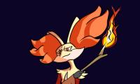
This is one of my favourite designs in recent times. I can't imagine how to even begin designing Pokemon in LEGO, and you did an outstanding job! Honestly there is simply no better way, at least that I can think of, to capture Swampert's look. Do you plan to do anymore?
-
Oh yes, Aanchir has mentioned this as a problem too. But when you bring up his similarity with Ackar, I think I kind of like him better. He really does look like Ackar.
-
Oh yes, there's no doubt about that. Like you said, we're just honing in on and analysing one aspect that may or may not be important in terms of sales.
-
I don't doubt that there are certain aesthetic elements that appeal more strongly to people than others, often at a subconscious level. Symmetry, for example, is often accepted as something visually pleasing as compared to asymmetry, as research shows that human eyes gravitate and linger on bilateral symmetrical designs. At the same time, I feel it's extraordinarily difficult to say how combinations of visual elements interest different people. Certain elements may work well in isolation, but together may not form an aesthetically pleasing picture for everyone. I think the difficulty is in achieving a consensus on what is beautiful. Even in terms of symmetry, excessive symmetry can be seen as boring and unimpressive. And very often asymmetry works too, if used properly. For example, I appreciate 2015 Pohatu's asymmetrical arms as they form part of a unique visual identity that separates him from the symmetrical Toa. I think that though there are universals in terms of design (not everything is relative and subject to taste), a significant portion of design elements remains subjective. Tastes differ based on what the viewer is looking for in a design. You for example, dislike Darth Vader's gappy torso, while I find it very visually pleasing. I think the gaps in his torso hint at his nature as a constructible figure and separates him from say, a Hot Toys or a Sideshow figure. Yet, the shapes come together to form gestalt closure, which to me is an example of good design. Make no mistake, I believe the realm of design is important, and research needs to be done to be able to identify what is aesthetically popular. At the same time, I'm really not sure it's easy to discover that without some form of market research. I suppose we can keep our fingers crossed that LEGO is doing all the research in the right focus groups. Meanwhile, we can continue to debate whether we think the designs work. I really do hope so! Not just for the future of Bionicle but for constraction as a whole. There really is nothing like it on the market.
-
I think that's the question we all try to answer, but honestly have no idea about. I do worry about how Bionicle is perceived by kids. Of course, there is nothing to say that it isn't successful, but I keep hoping Bionicle G2 will be a special line that kids will treasure for years to come.
-
Loving the creatures. I know where I'd be spending most of my money. The Toa are pretty nice too. I'd love to see them more up close, but as they are they're pretty sweet. I don't know if I prefer them to the wave 1 Toa that I've come to love so dearly (although I already prefer Kopaka), but they look like good figures in their own right. At the very least I'd want the Kopaka set, he looks awesome! Umarak looks like a nice, intimidating villain. Admittedly, the lower leg looks a bit strange from the side, but I don't think that's too big a deal when the rest of him looks so nice. I think the lower legs look better from the front than the side.
-

Star Wars Constraction 2016 Discussion
TFGuy89 replied to Logan McOwen's topic in LEGO Action Figures
Aanchir's article pretty much nailed it. To add another point, even before the Disney takeover, The Clone Wars was not EU per se. It was T-Canon, which occupies a higher level of canonicity than the rest of the EU, which was C-canon. That's why they could mess and contradict the EU as they wished. There are numerous examples of them doing it, such as the depiction of the Mandalorians, the pushing forward of Anakin's knighthood, and the deaths of certain characters. The Clone Wars had the authority to do so because it was effectively George's vision, and as such is more canon than anything except the movies. In the new Disney Canon, there are no levels of canonicity and most things Disney are canon. As Aanchir has pointed out, The Clone Wars is considered canon and is official material that Disney can use. -
Oh, in that case, I think they're both excellent, to the point I can't really decide. Grievous is large and imposing, and a really impressive figure simply by scale. When you spread out his arms with his lightsabers he looks fantastic. Vader on the other hand keeps a more commanding, intimidating look. He's a powerful, dangerous presence on the shelf. It really depends on which look you like better (I have them both fighting each other now). But if I was forced to choose one, I'd say Grievous is more impressive simply due to his size and his eye-catching design. He'll catch the eyes of visitors better.
-
Do you mean literally stand, as in how stable they are on the shelf? Vader's very stable, and since he's an upright figure, his centre of gravity is very easy to figure out, much like any conventional toy. Plus, he has those friction joints on his hips and his feet, so his legs will be quite stable. Grievous is a little bit harder purely due to his chicken-leg design. Once you figure out a pose, he's very stable, but figuring it out is the hard part. It requires playing around with the feet and posing the legs to make sure he's planted solid on a surface. All I know is that he's the only one of the two I've had fall down at least once.
-
One thing I've found is that tucking his cape under his round shoulder armour/pauldrons allows it to spread out with his arms. It's a nice look, as one of the issues the figure has is that his cape tends to fold backwards.
-
Star Wars Constraction 2016 Discussion
TFGuy89 replied to Logan McOwen's topic in LEGO Action Figures
My impression is that Phasma uses the same Stormtrooper armour except with a cape and platinum colours. -
Vader is jaw-dropping. While I was building him, I found it hard to believe this was a store bought set, it uses advanced techniques the likes of which you'll see on MOCs. I have never constructed a CCBS set this complex and it was a joy to build. He looks great and imposing, just as you would expect Vader to look on the shelf. It's just amazing how well they've captured his look. I'm extremely impressed! Of course, he's not perfect. There are some minor articulation problems in how his belt restricts the forward movement of his legs. His cape could also be a little bit bigger. But overall, Vader is just about what I want in a Vader figure, and more! He's definitely my favourite CCBS set of the year.
-
I could see that happening. That's not entirely a bad thing, it seems that these Star Wars figures have caught more attention than (at least I) expected. Perhaps by getting people into CCBS through the Star Wars figures, they could find themselves getting into Bionicle too. I started CCBS collecting with the Chima Ultrabuilds. I got a bit addicted to the CCBS system, so I ended up getting into Hero Factory, too.
-
I thought you guys might find this new promo by LEGO interesting:
-
Obi-Wan looks terrific, and they managed to capture the human look without venturing too far into the uncanny valley. It's a little disappointing that his price is so high. Over here, he is the same price as Mask Maker v Skull Grinder at $40AUD, and I don't think it's a fair price for what you get. Especially considering Grievous is just $10AUD more. Still I'm keeping my eye on him, and will get him if a right discount comes along. I would really love one of him; Obi-Wan has always been one of my favourite Star Wars characters and this is a pretty well done representation.
-
I was quite impressed with this clip episode. Normally these are a chore to get through, but I welcomed the brief recap, and it was structured in a way to not be tedious. I supposed having the 1:30 time limit helps to keep things concise. The result is an episode as entertaining as any other.
-
I think the use of Gali's mask for the torso armour is pretty ingenious, as is the use of the two shoulder pauldrons. I especially like the use of spikes to add even more curves to the body, it reminds me of a similar attempt used on Transformers Animated Blackarachnia. I think you could improve the look by somehow masking Gali's eyes and mouth, though honestly I wouldn't begin to know how to go about that. As of now, her face does stand out, even if the overall shape is good.
-
I like those combo modes! It's a good incentive to get all of them.
-
I would not mind a Jar-Jar to use as a generic Gungan head. But in all honesty I'd prefer a generic Gungan warrior, or Captain Tarpals. Anyway, both seem unlikely to happen, sadly.
-
Yes to this! If they're making an all-new Toa team for Bionicle, it's the perfect chance to make the gender ratio a little bit more even. Even having 2 out of 6 be female characters is not a bad start. This applies to Star Wars too, I hope we get someone like Ahsoka Tano.
-
Whoa, whoa, whoa, this is amazing! It shows just how powerful CCBS can be with imagination. Truly an impressive design, I am astounded!
-
I think he looks great. He kind of reminds me of the Pokemon Groudon, but in green. :D I'm most impressed y your head construction, that's always a sight to see if done well.
-
I love it! Female body shapes are difficult to get in the best of times, and your idea is unique and interesting. I think you did a great job!