
Brickdoctor
-
Posts
22,772 -
Joined
-
Last visited
Content Type
Profiles
Forums
Gallery
Everything posted by Brickdoctor
-
Nah, they need more chamfered edges. They definitely do. I remember back in '07 I read somewhere an article about the Indiana Jones sets, and the designer(s) mentioned that Indy was a lot harder to design sets for compared to Star Wars because so many of the iconic scenes and set possibilities were focused around locations and individuals rather than around vehicles. It doesn't really surprise me; it's a lot easier to sell a set and make it look complete* if it's a vehicle rather than a location, and I'm sure kids (and many of us AFOLs...) have a lot more fun swooshing with the vehicles.*By which I mean, if you want a vehicular set at a certain price point, you simply select a vehicle that you think will sell well at the right size, build it, test it, etc. But if you want to do a location, you have to figure out how big you have to make the set to make the location recognizable, and you have to figure out where are good places to cut the location off, and you have to figure out what elements of the location are essential to the look, and you have to figure out how to disguise fun (read: launching, shooting, or throwing) play features...
-
You do see Luke playing with the studio model at the beginning of the oil bath scene, and in the same scene, the half-completed full-sized skyhopper can be seen in the right garage, just behind and to the right of Threepio.You're still right in that most people won't remember it. Nevertheless, as long as it includes Luke, the original hero that every kid knows, it should still have some appeal. Kids like getting all the heroes, and parents like smaller sets that include the minifigs the kids want.
-
"By the way, I believe the anagram works out to be, 'Leave me alone,' if we do have to solve it." OoC: Yes, I cheated and used an anagram solver. I've had one bookmarked ever since Quest 7.
-

Shadows of Nar Eurbrikka — Introduction and Discussion
Brickdoctor replied to Brickdoctor's topic in Nar Eurbrikka Archive
Done and done. -
OoC: It doesn't matter in this case because of the higher Level you chose, but for future reference, it doesn't make sense to say that an enemy is 'Immune to Scary' — Scary is a positive effect that I have, not a negative effect inflicted on the enemy. You make an enemy immune to the effects of the Dread Hat by setting the Level higher than half of mine, as you also did here. Unless you meant 'Immune to Afraid,' which is an unrelated effect with different consequences, in which case, my bad. "Your plan makes sense, Master Vandagant. I can easily Counterstrike the Elite Lancer until he dies." I attack Dream Lancer A from the Back Row with my Darksteel Crossbow.
-
Shadows of Nar Eurbrikka — Introduction and Discussion
Brickdoctor replied to Brickdoctor's topic in Nar Eurbrikka Archive
Yes, I did; I just used a generic avatar because I couldn't find a 100x100 version. I've updated the image.Remember, guys, if you can't find yourself in the index, use a Ctrl/Cmd+F search on the page first to make sure you didn't skim past your entry. -
Shadows of Nar Eurbrikka — Introduction and Discussion
Brickdoctor replied to Brickdoctor's topic in Nar Eurbrikka Archive
You were already added to the index with the generic avatar on the 13th. -
Shadows of Nar Eurbrikka — Introduction and Discussion
Brickdoctor replied to Brickdoctor's topic in Nar Eurbrikka Archive
Welcome! Fixed! -
"I don't really have any preference as far as our next stop is concerned, other than avoiding the keep, of course."
-
Fingers crossed that this doesn't turn into the series with the surviving glove of Darth Vader*. *Not to mention the whalers, the three-eyed son of Palpatine, the order of Dark Side prophets, Lando's holographic amusement park, and more! (Do not read. Cannot stress this enough. )
-
"Excellent work, Master Barkley." "Master Vandagant, I suggest we continue to investigate this area." Using my Magnifying Glass, I inspect the treasure chest for traps. If I find no traps, I will open the treasure chest.
-
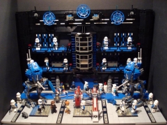
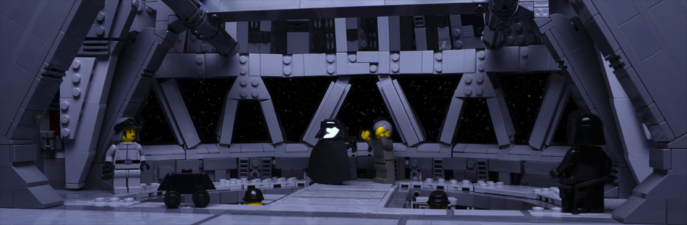
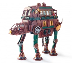
From the album: Star Wars MOC Index
-

From the album: Star Wars MOC Index
-
From the album: Star Wars MOC Index
-
My weak sauce Imperial Tie/In Tie Interceptor
Brickdoctor replied to huskysizeguy99's topic in LEGO Star Wars
If you haven't already, check out our flickr tutorial. In a nutshell, the problem lies in the fact that EB posts are formatted with BBCode, not with HTML. (I think you copied it from one of the sharing options on flickr; they have an option to copy the code for BBCode in addition to HTML.) So instead of, <img src="https://farm4.staticflickr.com/3879/14930711812_43b031e606.jpg" /> You need to use, [img=https://farm4.staticflickr.com/3879/14930711812_43b031e606.jpg] I've taken the liberty of editing a picture into your first post. -
Also refers to certain species of jellyfish. (This was actually what I first assumed the title referred to; I didn't know about the plant. )
-
"Master Vandagant, make sure to favor Humanoids." Before we go, I look around to see if there is a safe place for the party to Rest.
-
I don't think you can pin it down to a strict rule on how many lines to use — I do think your example looks pretty good. More detail isn't automatically bad in my view; it's rather a matter of knowing when to stop because you've already sufficiently captured the look of the character in a (disproportionate and slightly cartoonish) way that looks like it fits in with LEGO. Some designs do require more lines and printing on more surfaces; some don't.
-
I like the first one. It looks more futuristic, a logical evolution of the Stormie helmet. Maybe a little more smoothed out than I'd like, but it looks pretty good. The second one...I think it's way too clean. I can see where they're going with it, drawing upon the shape of the Snowie helmet, but it just doesn't look like Star Wars to me. Especially that eye slit.
-
Biggs Darklighter is the minifig exclusive to 7140; Wedge is also exclusive to an X-wing, but to 6212.
-
Shadows of Nar Eurbrikka — Introduction and Discussion
Brickdoctor replied to Brickdoctor's topic in Nar Eurbrikka Archive
You could use that as your character's nickname and 'lego3364' as your trooper's ID or something: 'L3G0-3364 "Terra Nonin"', for example. Added! Added! -
TLG calls it 'Light Stone Grey' (which has lead to plenty of confusion in LDD owing to the fact that what we usually call 'light grey/bley' is actually labeled 'Medium Stone Grey'), and as I understand it, it's a specialized color that was used for Mindstorms sets.Ultimately, I think you have to remember that we're not the primary target audience, that TLG targets these sets towards kids first, and that if you go out and ask kids (and any casual Star Wars fan parents) what color an X-wing is, most of them are probably going to answer, 'white.' Quite the opposite; he's giving you some of the benefit of the doubt by saying that perhaps you didn't intend to sound as impolite as you were perceived due to a language barrier.
-
I could've sworn there was a big existing discussion from a year or so ago about this, but I can't find it... Anyways, I'm in the camp that generally prefers the yellow minifigs and simpler designs. My preference is for my LEGO minifigs to look like LEGO minifigs, and I think the older face designs do a better job of blending Star Wars with a LEGO-ish charm. As an aside, 'high quality print' doesn't mean 'complex print;' 'high quality print' refers to a print that doesn't rub off or fade or something like that. Therefore, a simple print can still be high quality, and I personally prefer the design aesthetic of the simpler designs. Which is not to say I don't like any of the recent minifigs, because there are many cases, especially with minifig arm and leg printing, when I do like the newer prints, but I usually end up combining bits and pieces from both the older and the newer minifigs to get what I consider to be the best of both worlds. Didn't you hear? TLG snuck a prototype of Episode VII Old Luke into the set.
-
I attack Dream Knight B from the Back Row with my Darksteel Crossbow.
-
Correct. Also applicable to rolls of Damage and the Damage portions of rolls of Special Damage.