
noname
-
Posts
150 -
Joined
-
Last visited
Content Type
Profiles
Forums
Gallery
Everything posted by noname
-
Eurobricks Collectable LEGO Minifigures Series 2 Building Contest
noname replied to WhiteFang's topic in Special LEGO Themes
You're welcome. Rock monster there would make more sense (because of the crystals) but you could also put carrots and a bunny... And a lot of nice trans red tiles... Muhahahahaw! -
Eurobricks Collectable LEGO Minifigures Series 2 Building Contest
noname replied to WhiteFang's topic in Special LEGO Themes
Oh, now I get it. If you want that more people will understand it, edit your original post. (I don't know if you saw it, but I've commented on your category B entry too.) -
Eurobricks Collectable LEGO Minifigures Series 2 Building Contest
noname replied to WhiteFang's topic in Special LEGO Themes
I'll give more advices and comments to the other newer entry-posters: Category A ThatGuyWithTheBricks- Nice build and play-feature, it makes the vignette look like a part of adventures set. I think that you should put dark grey (or random mixture of dark grey and dark bley) for the primary color, and light grey/bley for the secondary color, but only for the walls. The tiles should remain the same, but with a bit more dark grey. (The color change for the walls is optional, it's really similar to the existing color scheme, I offered it out of curiosity, but the color change for the tiles is more important to me). Also, a bit of dark green would be great. Can you take a picture/video from the side? Ewok- The landscaping is great now. I like the river, the mushroom and the tree (to sum up, I like it). CorneliusMurdock- Good color scheme, nice minifigs. lisqr- I like the way you did the fence, the stars and the sun. If the black thing is supposed to be a shadow, so why is the head there? Shadows are in 2D, not in 3D. The SNOT decorations are a great idea, much better than tiles. Darkblane- Good idea! The closet, the chair and the pole (I think it has it's own name, but I don't remember) are really good. Erynion- The build is good, and I like your vignette, but I think that a 8x8 limit made difficult for you- with a 10x10 vignette (which you couldn't have built due to the rules) you could have made a white exterior and a dark grey interior to the cave. (which would look much better) Jippon- The decorations on the top of the wall are great, and so is the "wanted" sign, but there are too many colors in the wall- when building a wall, you should decide what colors you want (one primary, one secondary) and in every second layer of bricks, put a random 1x1 of your secondary color. The circular column in the corner is nice. more coming soon... Morellos- Nice and simple vignette, good color scheme. Category B CorneliusMurdock- Very original idea! The evil wizard's furniture and his "dark magic items" are really great, and so is the throne. Putting tiles on the top of the walls and on the floor would make your vignette even better.(By the way, you can make drawers by SNOT-connecting "jumper plates". (If you don't understand, I'll PM links) lisqr- A great combination of jungle-landscaping with neat sci-fi building. I like the cave (it looks really realistic) and the greebles. The crash-area is also great. -
When you bump such year-old topics, at least write something different than "cool set" or "I like it". Just read this tutorial: "How to Write an Effective Post" by Eurobricks member Blackicep8ntball. (I don't want to offend you, so don't be offended- I just want you to know that it's really annoying.) EDIT: I posted it here by accident, I meant to send it to legowill1 by PM (I did it now), and by posting it here I accidentally bumped the topic too.
-
Both LEGO and Playmoblil are suitable for children (and many children like both), but only LEGO is good for AFOLs and TFOLs. Same in Israel, and in every toy store. (Because LEGO sets cost double the price in Israel)
-
Eurobricks Collectable LEGO Minifigures Series 2 Building Contest
noname replied to WhiteFang's topic in Special LEGO Themes
I'll comment on your entry later today. Oh, and I want some feedback on my entry too (category A) -
I thought that translations will help me understand it, but the thing that helped me was the link to the original posters. These are really nice posters (the LEGO ones).
-
Well, we got a little off-topic here. Cleaning issues go into the "LEGO General Discussion and News" forum, not into the "LEGO Action Themes" forum, and this is a MOC-topic, not a "should I clean-my pieces and how"-topic.
-
LEGO Collectable Minifigures Series 3 discussion
noname replied to Klaus-Dieter's topic in Special LEGO Themes
I wonder how didn't I notice that before... By the way, sumo is Japanese too. The Super Wrestler, the Karate Master, the "Sumo Wrestler", the Ninja, and the "Samurai" are a bit hard to categorize, but the subthemes idea is clever. Maybe the "male singer" is a journalist? I mean, what clothes did he wear? I also don't think that the yellow-outfit guy is a sumo wrestler, because they wear these weird underpants. Maybe they put the trophy and the rattles for replacement until the real item will be produced, and the real items will show us the minifigs' purpose. -
Closed/concluded questions and answers
noname replied to sologuy369's topic in Forum Information and Help
OK, thanks. -
Can you give us translations to English?
-
Well, "The Chronicles of Narnia" theme would be really great.
-
You know, self-promoting is not allowed on Eurobricks. (And I think this topic counts as self-promoting)
-
Closed/concluded questions and answers
noname replied to sologuy369's topic in Forum Information and Help
When I replied to a topic, I clicked the little smiley icon to open the emoticon menu. Then, I clicked "Show All" (to see them all) and saw that the "thumbup" symbol ( ) appears twice: below the "thumbdown" symbol ( ) and above the "pir-tongue" symbol ( ). Did I already mention it's little, tiny, puny, unimportant problem? -
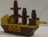
I agree with KielDaMan- that's exactly what I felt while building an all-orange carriage On-topic (and without self-promoting): The design of the ship is neat, although it looks fragile (but agile) I like the engines, the weapons and the yellow-fangs-thingies. And as for TheWarden's comment: I think you should put white pieces instead of the 3 yellow pieces (between the white pieces)- it would make a nice racing stripe. (Maybe make the turret white as well) A yellow Classic-Space minifig would fit here. Good job, Flare!
-
"Weird Al" Yankovic- Virus Alert http://www.youtube.com/watch?v=0pLHWKqNJgA&ob=av3e
-
I'd really want to see some Dragon-Kingdom sets- so far, they're really outnumbered...
-
Eurobricks Collectable LEGO Minifigures Series 2 Building Contest
noname replied to WhiteFang's topic in Special LEGO Themes
Category B comments: The_Customizer- The idea is nice, but the wave is bit unrealistic, try a bit of slopes. You should replace the trans-blue columns with another color, it looks a bit confusing. Try to put there a bit of big and small tan plates to make a bit of sand hills, or even a small sandcastle. Dan Church- I like the wall decorations, the televisions (I think they are) and the tiled floor. Keep up the good work! Optimus- Good work! You've combined two different themes, each of them could be be a stand-alone MOC. The only flaw in your MOC is the lanscaping above, which is a bit dull. Putting there he light grey pieces is an odd choice, I would go for all-tan landscaping. Plissken- An interesting idea, and a nice build. I like the curtains, the crowd and the weapons you've attached on the sides. Yatkuu- Your vignette/bignette is very nice, except for the "pentagram"- which is not a pentagram, but a "Star of David" It's a Jewish symbol- your use of the Star of David as a dark-witch-ritual symbol may offend a lot of people (including me). -
Eurobricks Collectable LEGO Minifigures Series 2 Building Contest
noname replied to WhiteFang's topic in Special LEGO Themes
It looks great now! -
Eurobricks Collectable LEGO Minifigures Series 2 Building Contest
noname replied to WhiteFang's topic in Special LEGO Themes
Well, I have some advices and comments to give too: Category A: Fires-storm- Your vignette is good, but I think that you should add a bit of gold and gems to the vignette, or maybe a spider and a spiderweb. Yoshi648- The broken fire hydrant is great, but add a mudguard to the front of the car (if you have another one). GeneralTalon- I think there's no need to change the gray-colors, bu maybe make it less random- dark bley on the bottom and dark grey on the top (or vice versa). ceroknight- The gym equipment looks great, but if you can, try to stick to one color and no holes in the walls (yellow would be good). If you can, try to make the floor tiled. Dan Church- Nice vignette. I like the landscaping and the chair! cralegoboy- The idea is great, but try to make brown or dark brown tiles, and an old, grey (not bley) dampened wall. (And maybe a spiderweb). Two 1x1 red plates would work better as shoes, because then you'll be able to change to position of the legs. Duke- I like the vignette, and unlike ThatGuyWithTheBricks, I have no complain about the snakes and the DUPLO block. Try to build a bit more colorful floor on the inside, and maybe some minifigs. absolutelylez- I think that the 1x1 transparent parts should be arranged in 2x2 squares of the same color, and not that random. The disco ball looks great. Rufus- Good work with the landscaping- you made it look realistic. The studs looks like small "hills" of snow, and the tiles looks like a ski-course, but I agree with ThatGuyWithTheBricks, it is a bit too steep, but don't change it. Cusm- I like your idea. Do you have more dark tan plates? If you do, you can try some landscaping. Diidy- Great vignette. I like the little accessories you've put there (the table lamp, the suitcase...). The chair and the cage are really neat, but it seems that this explorer has a little pest problems . Ewok- The cactus and the skull are good, but the landscaping is a bit dull. Thor Lund- I didn't see the movie, but I was told about this scene. Good idea! If you can make homogeneous tiling, try some landscaping (look at Dan Church's entry, for example) Ritz Brick- Take another picture, this time with proper a proper light. The blue pieces looks like they are dark blue, and the white looks like tan . The_Customizer- Nice idea and story, but make the walls and the columns with normal bricks, not with holed bricks. Lt. de Martinet, Good vignette, and this time a decent, gentle slope. The tree looks a bit out of place, try the classic evergreen tree. Profound Whatever- Great vignette. I have no advices to give... Plissken- Good idea, but why did you put grill tiles instead of tiles? Yatkuu- Great and realistic vignette. The colors of the bricks or seems good, but next time take the pictures with more light. Optimus- I really like your idea. It looks great, especially the time machine. Category B coming soon. -
Dr_Legoman kindly sent me his modification with instructions. Unfortunately, I didn't have some parts, so I improvised. I can see now that I didn't push the parts properly, so ignore that. The lever-weapons are supposed to be more "upwards", but they lost their friction with the years.
-
Thanks!
-
I have tried to add some things to the shuttle, and here are the results: But some modifications were not so good...
-
I think I used soap and water, but I don't remember. (It was a long time ago) Well, I'll try to clean one part, and if it'll work, I'll clean larger bunches of pieces every time. Maybe it oxidized because the window and the door were closed all day... I'll dry it with a towel and a hairdryer this time... As for the blockiness, it could be less blocky if I would remove the airlock chamber. Thanks everyone! (for looking and commenting)