
Clone OPatra
-
Posts
9,107 -
Joined
-
Last visited
Content Type
Profiles
Forums
Gallery
Everything posted by Clone OPatra
-
Thanks for this lovely review! This set is just so quaint, and it's an area of Town that LEGO hasn't explored for a long time. The simple style of detailing in these older sets is so wonderful. High detail today is ok too, but it doesn't have the same 'quiet' feel that this set evokes. The bed especially is so simple, but so great.
-
Thanks for this lovely review! Old MISB sets are fun, no matter how small. This seems like the Paradisa equivalent of 6009 Black Knight to me. One minifigure, and her mode of transportation. Personally, even though 6009 has such a smaller piece count, it's much more exciting because of the horse and that it's a knight. To somebody more town oriented, this set could be just fine. Still, the boat does seem rather uninspired and lack any flair whatsoever. This set could've really been helped by a few accessories. I'm not sure what exactly, but accessories always make up for the lack of anything else in tiny sets.
-
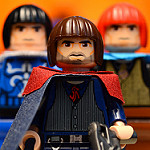
I recall an interview with some LEGO person in which he was asked if there would be any female characters coming soon. I believe he said that yes, in the next wave of LotR sets, there would be some. So… could Eowyn be coming up? LEGO Harry Potter Years 1-4 did have some designs reminiscent of not-yet-released minifigures, if I remember correctly.
-
Innuendo Sleuth - Because I make innuendos and I do it through the back door. RA Anniversary group photographer IC - I take those group Teacher Sigfig pictures!
-

LEGO Star Wars 2013 Pictures and Rumors
Clone OPatra replied to Erdbeereis's topic in LEGO Star Wars
That was from an earlier rumor before Hulk_Smash's details and the Celebration IV confirmation. It's two Clones and Krell. One of the clones could be a pilot; that would be logical. -
The new (piss-poor) Spider-Man set made me want to go back and look at some of the older stuff. I only have one Spider-Man 1 set, though that might be all you need. It's… Set Name: The Origins Set #: 4851 Theme: Spider-Man and Studios (sort of) Pieces: 212 Minifigures: 6 Year of Release: 2003 Price at Release: USD 30, GBP 25 Buy it? Inventory? Bricklink Peeron Brickset Browse the pictures? Flickr set INTRODUCTION The sets for the first Spider-Man movie were a strange wave. In 2002, around when the film was released, LEGO put out two sets that you could get along with an expansion pack to basically make the scene where Green Goblin attacks his former fellow board-members on a balcony. Then, in 2003, they released three sets that seemed more tied to the film. Maybe these were released to test the waters and pave the way for the Spider-Man 2 wave in 2004? It's possible. I'm not sure Spider-Man as a film series really lends itself that well to LEGO sets, but at the same time I can't help feeling LEGO boggled the license. They especially didn't put enough creative juices into the sets for the first film, as a whole. But now for 4851 (which may or may need actually be called Spider-Man and Green Goblin - The Origins). I picked it up for cheap a while after the release, but I'll try to judge it on being a $30 set. Even if the whole wave was weak, is this set enough to have some fun and re-enact your favorite film scenes? Let's find out! INSTRUCTIONS It's rare that LEGO throws two unrelated scenes into a single set (actually, I'm not sure if it's happened another time), and you can see that it doesn't make for easy artwork. They rearranged the scenes from how the instructions tell you to build them so that you can see them better, but you've still got two scenes atop each other and Spidey zooming out from… nowhere. The Spidey graphic in the corner is freaky. It's like 'Surprise! Yeeaaaaaa!' This is a weird-looking set. I always like to laugh at bad minifigure graphics. LEGO must've been testing this new thing called 'computer software' and it wasn't working to the company's advantage. These look particularly demented. The build goes rather slowly. It being after 2000, kids were already getting stupider at a rapid rate (until the Krusty Krab). The background is an exterior picture of a building because that's a total Spider-Man thing. You hear Spider-Man, you think building facade. A page in the back displays the fun features. Actually, it shows you that a sign goes up and down and that something spins in the Lab C35 part. Totally fun, right? The set is still built differently than the instructions… To win back in 2003, you didn't have to put up with a screaming kid. Those were the good old days. The back features the few other Spider-Man 1 sets, besides for the Studios set with its expansion pack. They don't look so bad, it's just that… that's it. That's all the sets for Spider-Man 1 (plus this one, of course). MINIFIGURES I'm always so surprised how quickly we get to the good stuff in a review! So much for saving the best for last. Six minifigures in a $30 is terrific, hands down. As minifigure parts go, these guys really have a lot to offer. The scientist is hugely exclusive; the torso and old grey hair are exclusive to this set, while the face comes in just one other. I always thought LEGO was trying to update the classic smiley, but then forgot or gave up. Both kids' torsos are exclusive to this set, as is the flat-top hair in dark orange that Norman Osborn has here. The orange Hermione hair came only in two Spidey sets. Green Goblin and Spider-Man are fantastically detailed figure, but I'll talk more about them in a moment. Let's start with the best and work our way down. Unfortunately, Green Goblin's lovely gold helmet printing has mostly worn off, and he's developed cracks all over. Maybe LEGO hadn't gotten down the bright green formula quite yet. Ahh, but what a lovely color it is! GG was the first figure to ever have bright green arms and green hands, making him especially cool at the time. More importantly, just note how well-detailed these guys are. Spidey has muscle detailing, GG has blue highlights to make his armor look 3D-ish, not to mention all the other small details. These are above and beyond 2003… in fact, I'd say they'd fit right in with today's minifigures. More delicious printing on the back. I'm a little confused why we're seeing lats on GG, since his armor is thick and armor-y, but whatever. Still looks great. It's also interesting how they made the GG helmet backless; they did it so it works well on the figure, so no complaints with that. The helmet only looks a little bit silly from the side. No problem with the moulding, but it seems like he's rather chinless. The thin helmet doesn't work perfectly with fat minifigure torsos from this angle. Peter Parker is also a perfectly ok minifigure. His torso was designed just for this set, as was MJ's, and both look nice and high-school-ish. Dark blue was also a nice choice of pants color, since it connotes jeans. But, the heads. Peter's head doesn't fit Tobey McGuire perfectly, but it does have a Peter look, what with the big glasses and slightly dopey smile. MJ just uses the head of the Studios actress, though, which is bad. The head itself is fine, but it doesn't look like MJ in the film at all, and she looks too made up. This seems more like 'stock read-head girl #27' than MJ. Norman Osborn has the same head problem. He just has the stoic male actor Studios face. Why couldn't LEGO design a new Norman head? This head doesn't remind me of him at all, and the dark orange hair also makes no sense. The way they got the head design on the GG figure is nice, though, but the actual face design is poor. Why the heck is he so happy under that Goblin mask anyway? Plus, the hair does not work with the reverse actor face. Not at all. And that's another thing - maybe MJ would need to scream like that, but Norman Osborn would never have that expression. One final thing about Norman Osborn is that the plain yellow torso looks silly. I suppose LEGO hadn't worked up to printing abs yet, but my my would he look better with some ripped musculature. The scientist figure is great though (while not seeming like the scientist in the film scene in the slightest). ACCESSORIES There aren't a whole lot of accessories here. The one that makes the most sense is the camera, since Peter would be nothing without that. The magnifying glass makes sense once it's in the set, but the mug, as we'll see, is an oddity. I like clear mugs and all, don't get me wrong, but it doesn't exactly fit. SPIDERS There are a crap-load of spiders in this set. When I say a crap-load, I mean a crap-load. They are all different colors too, which is pretty awesome. Trans-red is the rarest, coming in only 4 sets, but blue and orange are also not extremely common. PRINTED PARTS While there are a few stickers in the set, there are also a nice bunch of printed parts. Duplicates are not shown; there are three keyboards and two slope computers. The coolest ones are certainly the double-helix and green juice with monitor 2x2 tiles. There's really no reason why these even have to be printed, but they are, so that's cool. The green stuff one also comes in Tusken Raider Encounter in blue. The keypad is a pretty useful piece as well. The worst ones are the computers. Yes, computers are neat, but why the error message graphic? It could just be a couple windows, but anyhow, it doesn't work very well for an average computer display. LAB C35 - Overview I figured I'd already talked about the build in the instructions section, so it's time to dive right in. At an overall glance, this scene looks pretty nice. It's reminiscent of the movie scene enough: you've got the part that Norman goes into behind glass, the console showing the green stuff going in, another computer… not too shabby. The LAB C35 sticker is a STAMP, but really, did you need those three 6-long tan bricks? I didn't think so. The big trans-clear panel is exclusive here in that color, this is its only appearance in a non-4+ set, and it looks terrific. The design of the inclosure is quite pleasing. Being up on little stilts gives it an industrial science vibe, and the panel gives it a great shape from the front. The tall window piece on the side is also quite nice; these particular colors on it only come in one other set. You can also see how much empty floor-space there is. The baseplate (in its only appearance in light grey after 1990) provides plenty of play room, just like I like it. Science facilities shouldn't be cluttered anyway. The inside of the inclosure is taken up completely with the play feature switcheroo mechanism. And by mechanism I mean you turn it around, but I'll get to that later. The nice thing is that there's a lot of space in there if you wanted to MOD it into something, but LEGO wasted it a bit. On the other side of the lab is the well-done entrance to the inclosure. The door, like so many parts already, is also not uber common, and I applaud LEGO for actually providing steps and an entrance into something. Clap clap clap. That was my applause. LAB C35 - Features I took some shmancy close-ups and a play demonstration pictures. You saw everything already, but hey, it's my job to live up to my namesake and give you way more pictures than would be actually necessary. Our scientist buddy demonstrates how to use the computer console. This is a lovely detail with a modern flat-screen design, and it looks great atop the stilt piece. So few pieces come together to form such a nice little thing. The other console is also wonderful. I love those door pieces for whatever reason, and they only come in three sets in light grey. The levers and little green and red lights are excellent, and kudos to LEGO for making the levers somewhat reachable for the minifigure. You might be wondering what's inside the cabinet, and the answer is a whole lot of nothing. LEGO provided space in there so that there could be something, so that's nice. But it would be nicer with something in there. The inclosure entrance is also nice, as I already said. Very realistic too, and true to the movie. The scientist punches in a code before going in and getting strangled, if you remember. And now, drumroll, the playfeature. You can turn around the thing inside to turn Norman Osborn into the Green Goblin. Wait… what? He spins around and is magically in the Green Goblin suit? You don't say… That's pretty lame. A cool play feature would've been for the front of the thing to explode, so that you could reenact Norman smashing the scientist through the glass and killing him. Or maybe a mechanism to load Norman into the place on a bed that then stands up, true to the film. This spinny thing you do get is lame-o. MUSEUM LAB - Overview Apparently, in the movie this is actually a genetics lab or something. Maybe they say that in the film, but it always looked like some kind of science museum to me, so I'm going to go on calling it a museum. Whine all you like and see how much I care. Aka not at all. So here we go. This thing looks pretty nice. There's a big display screen with spider-facts like there was in the movie, and some cool details all around making this scene feel very much like it did in the film. The spider-web around back is a bit ridiculous. I like the piece, don't get me wrong, but somebody really should've called maintenance to get rid of that thing. It's not like it's up on the ceiling; it hangs so low, a minifigure can't even get under it. The pillars are quite nice, though, and give off a 'high ceiling' vibe without there being a ceiling. You're not supposed to look at this setup from certain angles. There's nothing behind the computer console, although underneath the desk makes a nice hiding spot. I'm confused by the black tile; it seems like it's almost just there to guide you during the build. I like tiles, though, so who's complaining. MUSEUM LAB - Features Just like last time, more pictures of stuff you already saw! The table thing is kind of weird. The table itself is great; the designer picked nice elements and a good color for the legs. What's on the table is a little more suspicious. Maybe that spider is dead, but still, it's right there out in the open. Also, what is the helix tile supposed to represent? A handout? A computer screen? I'm confused. The spider case is superb. I freaking love trans-panels; back when I used to haphazardly MOC I used to use these things. There didn't actually need to be hinges on both sides, but I love hinges too, so I'll take it. They certainly don't hurt the model. The sticker is pretty nice too, and spices up the stand for the case. The computer station is nice. Museums do have spots where you can read info or do interactive things on computers, so this is a nice touch. What is weirder is the mug sitting there (I know I left it off in a few pics earlier, but the instructions do tell you to put it there). Even if this is a research lab, it's still some kind of exhibit, so why did somebody leave their coffee mug sitting about? It's just odd. Here's the play feature of this part in one handy composite pic. The blue spider is on a hinge so you can make it come down and bite Peter while he's trying to be a voyeur and snap pics of MJ. That's actually pretty neat. Yeah, it doesn't hold a finger to flick firing missiles, but it's a pretty cool way to simulate a spider coming down from the ceiling. Albeit a gargantuan trans-blue spider. Also, I'd just like to take this space to say how the way Peter gets bitten is SO much more interesting and believable in the original Spider-Man film, as opposed to Amazing Spider-Man wherein he just stupidly walks into a room full of what he knows to be radioactive spiders and then STUFFS HIS HAND INTO THEM (sort of). Gosh that movie sucks on nearly every level. What happens when Petey gets bitten is a full-costumed Spider-Man pops out. I mean, if Norman Osborn spins around and appears in GG armor, why not, right? Or maybe you're supposed to hide Spidey behind the computer desk. So that's what that space is for! (Can you spot the mistake I made, for which I retook a whole bunch of my pictures? I left it in this one.) WHOLE SET and CONCLUSION Bam. So there it is: the whole shebang. It does in fact include the hinge tile so that you can attach the scenes. Individually, the scenes are pretty nice, especially as a display piece. They work best on display because they really aren't too functional. It's an odd idea for a set in the first place; showing how the hero and villain got their powers. I'm not sure there's another example of a LEGO set depicting two separate scenes, although I suppose a few Star Wars sets end up being a ship parked next to a scene (X-Wing with Yoda's Hut, Eta-2 with Mustafar droid/platform). It's strange to say, but I feel like this set is best for adults or at least people older than LEGO's target kid age-range. Why? A few reasons. It's a nice display piece, as I said, so all your comic-book nerd friends can go 'oh hey, I remember those scenes in the movie, cool man!' Then there are all the pieces that are in pretty rare colors, which turns out to be quite a few. Lastly, you get all of the Spidey minifigures that you need: Green Goblin and Spidey of course, but also Peter and MJ (although she sucks as film MJ). Plus the scientist is a wonderful figure. So LEGO failed somewhat at making a set that kids could really enjoy as is. If the kid is a Spidey fan already, then I guess it's ok, but they could've made a much better play feature out of the Oscorp lab part. It seems LEGO accidentally created a set that might appeal more to the older set; it's certainly the 2003 version of well-detailed (aka no cheese slopes, but who needs em). But maybe I don't give kids enough credit. I feel like kids would still like this set because they get Spidey and Green Goblin, but 30 bucks is a lot just for that and a somewhat boring set. 30 Bucks for a plethora of nice figures, plus a pleasant display piece or lots of excellent parts, though, is just fine. RATINGS Minifigures: 9/10 - That might seem high, but here's the rationale: Spidey and GG are totally awesome, the scientist is really useful, and the rest have some good parts. Even if MJ and Norman are bad compared to film material, they are still useful minifigures to some extent, so I only docked a little. Parts: 10/10 - There are so many parts in rare or exclusive colors in this set, it's great. Also, the printed pieces! Build: 10/10 - The build is fun and always changing, since this set has a lot of different things going on. Design: 9/10 - I docked just a little because the LAB C35 part could have a better feature. Otherwise, this set looks great and has tons of perfect details. Price: 9/10 - Gut instinct would say that this set is a wee bit over-priced at 30 smackers. But if you stop and think, there are six (different) minifigures who are, by the way, everyone LEGO made for the first film. There are also so many cool parts, and a few large ones. So, really, 30 is fine. Playability: 6.5/10 - This is pretty low, and it will bring down the overall somewhat, but that has to be done. For kids, play-wise, I'm not sure this set is so great. The lab could've had an awesome feature but has a lame one instead, and it's all about roleplay here. There's nothing to even swoosh. At least you get Spidey and GG to create your own adventurous battles. Overall: 8.9/10 - It's only brought down by the playability and a few other little things, and it seems right. This set is really pretty strange, and there aren't many like it. That said, it's still pretty neat, and it seems a little ahead of its time in that adults might like it more than kids. Not that LEGO releases adult geared sets that are only 30 dollars now (besides maybe LotR), but you get the point. I really enjoyed looking at this set, and I hope you enjoyed it too. If you've read my other reviews, you'll noticed that I never conclude with some statement like this. I'm saying it now because it's true specifically in this case. 2003 was a weird time for LEGO; themes were either amazing (Orient Expedition, Studios Monsters, Bioncle [the Mask of Light tie-ins were very cool]), god-awful (designer with motion stuff, sports, technic hockey players??), or mis-handled like Spider-Man. LEGO was getting started with detailed sets, but it took them quite a while to really figure it out. I'd love to know what people think of this one!
-
That was great! Your animation was so wonderfully smooth, and the ending was hilarious!
-
LEGO Star Wars 2013 Pictures and Rumors
Clone OPatra replied to Erdbeereis's topic in LEGO Star Wars
The Yoda differences seem way too subtle for them to make a new mould. Just look at Obi-Wan. His costume has actually been different for two seasons, and LEGO still used the exact same Obi-Wan figure in the Mando Fighter. I'm really not too sure we'd see a new CW Yoda. -
Star Wars: The Clone Wars - Season 5 Discussion
Clone OPatra replied to LEGOman273's topic in Culture & Multimedia
That clip looked horribly stupid for two reasons: 1. As said, the ground CIS units did nothing at all. That wasn't a fierce battle; that was an easy mow-down of Seperatist machines. The gunships, on the other hand, were shown to be powerful, but… 2. The gunship RIGHT IN FRONT of Ahsoka and co. couldn't hit them! What!? I know main characters don't just die in gunfire, so don't put a freaking gunship right in front of them! It's actually shown to be five feet away and still missing! Also, when did Pandora from Avatar become a planet in the SW universe? Those creatures sure were reminiscent of Pandora. -
Lego Superheroes 2013 Rumours & Discussion
Clone OPatra replied to CorneliusMurdock's topic in LEGO Licensed
I don't think you have that much of a case, honestly. Here's a list of big moulds recently that have only been used once so far, and likely won't be used again for a while: Wampa, upcoming Rancor, Moria Troll, Triceratops. The Taun-Taun wasn't used a second time until two years later. I could agree that we'll see the Hulk again eventually, but it could be quite a while. -
Back in 2001, LEGO launched a second little license called Harry Potter. It so happened that the main villain, who also happened to be the coolest looking minifigure in the entire wave, came in a small set! LEGO actually did something nice for the people! Or made a poor business decision… Anyways, who could resist: Set Name: The Final Challenge Set #:4702 Theme: Harry Potter (and the Sorcerer's Stone - yup, I'm from the US) Pieces: 60 Minifigures: 2 Year of Release: 2001 Price at Release: USD 10, GBP 9 Buy it? Inventory? Bricklink Peeron Brickset Just browse the pictures? Flickr set INTRODUCTION Frankly, I was surprised that LEGO would throw Quirrell into such an unimposing-looking ten dollar set. The key part is the ten dollars. Back in 2001 I figured that if you wanted the coolest figures, you'd have to shell out the $$$. That's how LEGO seems to play it most of the time, although I suppose back then and today there are occasions when they put awesome minifigures in small sets. You see how much I've been talking about a single minifigure? Three whole sentences worth; quite a lot, I know. But do you know what that means? That means this set hinges almost entirely on a single minifigure. This set is either worthy or not worthy based on him. I hope he's up to the challenge. The final challenge. Geddit? Eh heh. BOX Usually, when I no longer possess a box I just skip this section. But I realized that there's a once in a lifetime difference between the boxart and the instructions picture, so we had better look at the box (courtesy of Brickipedia). The main art with the set is pretty lull. This is the final showdown, the climactic moments of the film, and Harry is just chilling there looking at the magic revolving door, while Quirrell seems to be waving his hand in greeting while passing by. Although it seems Quirrell is about to trip over the giant cobweb any second. Then you've got the live-action Harry picture with his smug expression: this doesn't match the scene it portrays? Deal with it. INSTRUCTIONS Let's play a little game of spot the difference, since I said this picture is different than the one on the box. Hey, there it is! Harry is a freaking giant!! Seems like Quirrell doesn't stand a chance. All that happened was that the art designer took the Harry mf graphic and, and… blew it up! But why? Is Harry much closer to the camera? What's going on!? (Also of note: the dimensions of this booklet are huge, especially for a $10 set) The steps are easy enough to follow, especially because there are so few pieces to begin with. There are only sixteen steps. Color distinction, as you can see, is quite good. It makes me wonder how dark grey and black got to look so similar years later. Even LEGO knows that there isn't much going on with the set itself, and it's all about the figures. I know because there are no pictures of the figures interacting with the set; it's just Quirrell trying to kick Harry and then falling over (my favorite part of the film BTW) and then Quirrell revealing the tenant on the back of his head. As expected, there are some alternate build ideas. The first involves Harry and Quirrel having a friendly competition, launching rocks into a basket made out of the roof of the building. That's pretty creative, but dumb. I'm not sure launching rocks with the cobweb piece is even possible in reality. The second alternate model makes a little more sense, since it could pass as Astronomy class or whatever they call it at Hogwarts. But can't you just hear Harry saying 'blimey, I can't see a darned thing out of this telescope, there's a diamond blocking it up!' Maybe not the most useful design. The back is just a calm ad for the Harry Potter creator game. The graphics look great MINIFIGURES Alright, moment of truth! Is Quirrell worth it, or lame? Thank goodness Quirrell is pretty awesome. I'm fairly certain there had never been purple minifigures before the HP line, and it's a lovely color. I'm not exactly sure what source material LEGO used to produce these first sets, since both Quirrell and Harry look very little like their counterparts in the film. Quirrell isn't supposed to wear all purple, but it looks lovely. I'm not sure what the rumples on the torso represent, but it's still a nice print. Not much to see from the back. I remember thinking how cool the turban piece is when I got it, though it doesn't look much like Quirrell's film turban. It's proved a useful piece for LEGO too, as they've continued to use it ever since. Quirrell's face doesn't have a huge amount of detail (and the mouth has faded, unfortunately), but it has a nice timid look as Quirrell should. His mouth is just a little bit intensely defined. Simpler might have been better. As you may know, Quirrell has the first ever double-sided head! What a revolution he started. The Voldemort head looks nothing like Voldy in the movie, but it has a good Voldemort look that draws directly from the description in the book. The only downside is that LEGO decided to use the same design for Goblet of Fire, which was terrible, but here it looks very nice. Harry has the typical, nonsensical starry cape. I pretty much hate the Harry figure. The face has nutty eyebrows and a mouth that looks like a toad. Light grey has always been a boring color, and it doesn't look great for the torso and legs. The problem is really the face, though; if that was better, Harry would be ok. ACCESSORIES There are very few accessories, but that's understandable. Harry has his way-huge brown stick, er, wand, and there is a diamond masquerading as the Sorcerer's Stone. But, as you can see, Harry and Quirrell are suspicious. ANIMALS The HP designers have always loved their animals. The owl could have some printing (as was amended for the final waves), as right now it looks a bit like a statue. The bat might actually be a statue, as we'll see in the set. The spider is quite mysterious, being translucent and orange. Not a very healthy spider color. THE BUILDING Here is the lovely main structure of the set. It combines all of my most favorite colors ever: dark grey, light grey, black, and tan. Do you here the sarcasm bells ringing? Because I'm definitely ringing them. Seriously, the original Hogwarts sets were an ugly bag. Yes, Hogwarts is a dark and dingy castle, but for goodness sake, it doesn't have to be that way in the LEGO sets. This color scheme is beyond drab. (I'll talk about the cool sticker later, don't worry) It's not that it doesn't have a Hogwarts feel. With the big arches and high ceiling, this definitely does feel like the interior to a castle. It just doesn't make for a fun or popping LEGO set. It seems like the bat is actually supposed to be a statue, which is a bit strange. It's not only in this set either; bat statues were a common theme in these HP sets. Another oddity is the roof. It's not a terrible piece as large pieces go, but of course this model is really inside a castle and wouldn't have that roof. I guess the roof is there so that you can stick this next to your 4709 Hogwarts Castle and it will look like part of the building. I also have to wonder what the spider-web is there for. Spider webs on the wall I understand. Spider webs on the floor, not so much. I don't even associate spiders and spider webs with Harry Potter all that much, although of course they play a big part in book 2 (and 6, to a point). It really just seems tacked on and in the way. THE STORY I thought I should re-enact the scene that this set comes from as a sort of way to show off the play features and fun you could have with the set. I have tried to stay as close to the source material as possible, as you'll be able to tell. 'Harry stared into the Mirror. His reflection stared back, just the little kid with messy black hair and big glasses. But wait! A faint outline of the Sorcerer's Stone appeared next to him! No, Harry thought, that must just be a fault of the lenticular sticker, and it should probably be my visage there with no stone.' 'All of a sudden, the camera panned around Harry's shoulders! The image in the mirror immediately changed! Now Harry could see a sort of half-way image of himself holding the Sorcerer's Stone in his hand!' 'The mirror then swung around and revealed the gleaming red ruby that passed for the Sorcerer's Stone. A lover of shiny plastic objects, Harry grabbed it without a second's thought. But just then, Quirrell appeared out of nowhere and a wild chase ensued! Get back here! Quirrell cried.' 'But Harry would not give it back. Let me see the boy, a shrill voice said. No, master, you are not strong enough! Quirrell replied with trepidation. Nonsense, said the voice. So Quirrell removed his turban at one go, it being a solid piece of plastic and all, and Voldemort's unusual visage glared down at Harry. Harry scar burned painfully, and he fell back.' 'Then Harry fainted. He was only 11 after all. Later on, in the infirmary, Dumbledore made some vague remarks about coming back just in time.' WHOLE SET and CONCLUSION As sets go, I can't say I love this one. The building is drab and dull. There isn't much one can do with it. The sticker is a pretty neat idea, and it works well enough, so that's a highlight. There's only so much time you can spend looking at a cool sticker, though. But, as I sort of illustrated, they give you the right trappings to roleplay the scene from the book/film. This one is really all about the Quirrell figure, and Quirrell is great. The original Harry is pretty bad, but oh well, since Quirrell is great. If this set was around now, and for 10 dollars, I'd say it's worth it just for Quirrell. Did I mention how he is great? But it's not around now, so really you should just buy the Quirrell figure if you want him. RATINGS Minifigures: 7/10 - Quirrell is great. I tried to not dock too many points because of the stupid Harry because of Quirrell. Pieces: 6/10 - Not very exciting, not all that many. Design: 5/10 - It's ugly. The spiderweb is out of place. That's that. Price: 10/10 - I can't complain with $10, even if the model is a bit ugly. Quirrell Playability: 6/10 - They give you the right stuff, so that's something, but there still isn't so much to do with it. Overall: 6.8/10 - That's not great by my standards. That's actually kind of lousy. Because, let's face it, this set is ugly. So, as I said, just concentrate on Quirrell.
-
I disagree with the new one having a lot more detail. The old versions also have abs and musculature printed on, they are just a very light color. The new one instead has thick black muscle printing. It's more visible, but a lot less subtle. It works since this is based off of a cartoon, and LEGO is going for a cartoony look. It's also in line with Wolverine's crazy muscles also defined in black. The old Spider-Man figures are equally detailed, I would say.
-
Maybe it's just me, but this set still looks incredibly ugly and dull to me. The medium blue pieces are nice, but overall it's still very drab. It also seems like a throwback to a slightly earlier time design-wise, and not in a good way. The car is the worst offender - it's absolutely ridiculous, looks lumpy and cobbled together. I know some people find Deadpool's helicopter a bit ugly or blocky too, but that definitely does not feel like a design that you would've seen around '02 or '04, whereas this car completely does. The lab doesn't seem that much better, especially noting the feature-less tower that's made out of big pieces and just there to hang Spidey from. I realize that I might sound a tiny bit hypocritical, since I often find sets these days to be overly detailed and have too many fiddly bits, but there's a difference between a solid design that doesn't need the extra cheese slopes and a boring or ludicrous design like we have here. The designer of the Funhouse really nailed it, IMO, whereas the designer of this set… not so much to my taste.
-
All of these original line Harry Potter sets are so dark and dingy. I talked about it in my Castle review, and I can't help feeling it here too. I guess it does bring Hogwarts to mind, because, as portrayed in the films, Hogwarts is not a bright place, but it still makes for some drab sets. I wonder if they went off of the books a little bit for this set, since the flute is something that didn't come into play in the film. Also, why is Hermione shooting water anyway? She casts a sunlight spell. Ah, I guess it's blue flames, which are somewhat like sunlight. But it still looks like water. Maybe trans-yellow would have been a better (not to mention unique) color. Thanks for showcasing this!
-
Review: 9494 Anakin's Jedi Interceptor
Clone OPatra replied to Masked Builder's topic in LEGO Star Wars
Thanks for the in-depth look, Masked! I'm still a bit on the fence myself about this set. Obi-Wan and Anakin look great, as does the fighter, but it still doesn't feel like $40 to me. Maybe there will be a sale before long. -
Single Pane LEGO Licensed Theme Funnies
Clone OPatra replied to Gregorovich's topic in LEGO Licensed
Great stuff Penguin! The Umbrella one really made me chuckle! -
Lego Superheroes 2013 Rumours & Discussion
Clone OPatra replied to CorneliusMurdock's topic in LEGO Licensed
Robominer, don't read that much into it. They just misread the email into thinking he was suggesting Iron Man 3 sets, or he happened to get a rare customer service person who just pastes in a standard response without being cohesive, like many of the other customer service people are. Of course they weren't going to come out and say that there will or won't be Iron Man 3 sets. The person just used the wrong response. The person should've used the 'we can't tell you about future releases' response that I've seen before. -
LEGO Star Wars 2013 Pictures and Rumors
Clone OPatra replied to Erdbeereis's topic in LEGO Star Wars
I really don't think they'd just use the Garmadon piece. That piece works well for a whacky action theme, but it looks very silly and nothing like Krell. It's even moulded with ridges, which wouldn't work for Krell at all. I would expect an entirely new piece. -
The Spongebob Theme is like that bug on the wall; you see it and freak out and whap it lightly, and it falls to the ground. You go: 'is it dead?' And just then it starts buzzing and you run out of the room screaming like a little child. But I'll tell you this, kids: it's never dead. So step back to what we could call the larva stage of that bug, and look at the original: Set Name: Krusty Krab Set #:3825 Theme: Spongebob Squarepants Pieces: 295 Minifigures: 3 (plus a cylinder) Year of Release: 2006 Price at Release: 20 USD, 20 GBP Buy it? Inventory? Bricklink Brickset Peeron Just browse the pictures? Flickr set INTRODUCTION Hold up, did I get that price right? And piece count? Let me just say: whoa. One of CloneyO's great stupid decisions was to not get either Avatar set. I'll admit, I'd never heard of Avatar when it came out, and the sets did kind of suck. Spongebob I had heard of and watched, though, so I thought I might as well check one set out. I never bought another one, but I think that's more to do with not having unlimited resources than it has to do with this set. Let's see… INSTRUCTIONS Like Monsieur L'eponge's pants, the instructions are rather square. The theme-specific artwork is very loud, but that's a perfect fit for Mr. Pants and the old Nickelodean splash logo. What's not so hot is the cg graphics of the set, which are rather poorly done. Renders were really not up to snuff back in 06, so I'm not sure what LEGO was going for with this idea. I would've liked to see a picture that at least looked real. Things go under the sea for the inside, which fits quite well. The instructions have no part callouts, and can actually be difficult to follow at times. There's a lot of looking around to see what happened in each step. That's what I grew up with, though, so I like it that way. One of the kids on the back is screaming, but at least he's sedate about it. And he doesn't want you to win anything, he's just so enthralled by LEGO's killer website. He probably just pulled up that page so that the photographer wouldn't catch him at something a little more devious. PARTS There's a good mix of things in this set: some medium blue, a nice amount of brown, the baseplate of course, and some green for the dumpster. But no picture. Sorry. MINIFIGURES This Krusty Krab comes with exactly the figures necessary to run it, plus Plankton. LEGO had to throw him in because of the mandatory 'must have conflict' clause that they sign with themselves annually. But I'm not complaining, at least none of the Krusty Krab staffers are left out. The first thing you'll notice is that Mr. Krabs' mouth is folded over. I touched it one time, and whoopsie. I heard you also shouldn't touch Dobby's eyes, so it's clearly a problem that wasn't only around on soft heads in '06. It's sad, but oh well. Anyway, Krabs and Spongebob look pretty cool. Both of the special heads are spot-on, and Krabs' torso is cute in its simpleness. It looks like a print from an earlier time. Both Krabs and Squidward have caught the dreaded grey-hand disease, which is annoying. There is really very little going on from the back, besides for a little crabby texture and an unsightly indent on Krabs' head mould. Nowadays we'd get some back detailing, but I don't think these figures need it. I pretty much avoided talking about Plankton and Squidward on the last two pictures for a reason: they're damn ugly/wrong. Let's take an up-close look. Squidward's problem is his head. I guess LEGO figured they'd maxed out on their special-head quota with Spongebob, Patrick, and Mr. Krabs, so they said 'what the heck, we'll just do Squidward as a regular head.' Guys, it doesn't work like that. You could complain about no special leg mould too, but for me it's all about the head. It looks like a blow-up balloon with Squidward design. Then Plankton. He's a cylinder. I guess you can use your imagination… but it's still a cylinder. That dumb Squidward head makes me want to make a Frankenstein monster out of him. Like so: ACCESSORIES This is actually a somewhat arbitrary selection, since I forgot the condiment bottles/fire extinquishers. Anyway, there aren't a lot of true accessories in this set, but cups and rubbish bins and brooms are always nice, so who's complaining. The barrel is also not uber common, though it gets around. The stickered tile really does say Krabby Patty Recipe. It's a wee bit hard to see with the naked eye, but it's there. BUILD There are only 20 steps to the main building, but as I said a bunch happens in each step and you get no help with it, so it takes a while. I'll just point out a few things, and you can find a few more pictures in the Flickr set. Back in the old days, instructions would give you a birds-eye view and clearly show you where the initial parts go on a baseplate. They didn't do that any more by this time, so it's more difficult to tell where things go, as here. Also on display here is the sparse usage of cheese (can you spot them?). I thought you might like to see how LEGO builds a burger, I mean, Krabby Patty. Well here it is folks. By no means realistic, but quite cute in its jumbo-ness: It's also interesting that the last step doesn't have you put everything together. It's just the end of building itself, no minifigures or anything. The very next thing is the parts list. STICKERS There are numerous stickers in this set. They are mostly signs and decorations like that, so I'm really fine with them. Here's the whole sheet courtesy of Bricklink: However, I learned the hard way that these non-see-through stickers can really start to peel and crack if you leave them out a long time. I've tried to keep them intact with some scotch tape. It's unsightly, but it's better than there being half of a sticker. COMPLETED SET - By Parts Yeah, I know I just showed you the build for the main event, but it was a tease. The littler things come first in the instructions, and I must follow the golden rule: never deviate from the instructions. Let's look at dumpsters. The Dumpster Don't ask me why LEGO decided to include a dumpster. I do recall one factoring into a few episodes, and its a nice bit of scenery to be sure, but I'll admit it's not super necessary. In terms of dumpsters, though, they really nailed it. Just look how dumpster-ish it is. Pretty darn dumpster-ish I'd say. I appreciate that it's green, since green is a cool color. The colors on this thing are very nice, and I love the use of flags for the lid. Since the top is flaps you can open them together or one at a time, depending on how much trash you need to throw in. What excellent playability! Wow! I even took a picture of it from the back! The Cash Register/Kitchen Thing Now we move on to something a bit more exciting. On the show, the cash register area is a little boat. Behind that is a window to the kitchen so that Squidward can yell at Spongebob. LEGO took these details and combined them into this single little kiosk. It's both silly and cool that LEGO smashed these things together. Having this little area is great for roleplaying (plus adding a play feature which I'll show later), so it's nice, even if a little whacky. The broom is a great added accessory, even if it hangs where the door to the kitchen should be. Around back is some lovely detailing with the bar and that black sticker. I'm not sure what the sticker represents, but it feels kitcheny nonetheless and can be easily used in kitchen MOCs since it's on a 2-high brick. I'm less fond of the cash register sticker, which looks odd being blue on black and has started to peel over time. The other side is similar to the first, but without the hanging broom. No need for symmetry. The Restaurant Right off the bat, LEGO did a good job nailing some general things. They got the shape of the restaurant and the brown color. They got the big clam sign and enter sign. They even tried to have the string of flags, although they did only four out of five and they don't look very strung-up. The chimney is a little far to the side, but aesthetically it looks fine. Overall, from this view it's a pleasing model. Viewed straight-on, it still looks good besides for the gaps that are apparent underneath the roof and the gaping holes where windows should be. You never really view a model this straight-on, though, so the roof gaps aren't much of a problem. I'll address the gaping holes later. On this side you can see the lovely sea-weed that LEGO added for extra under-the-sea decor, plus the trash can for which they actually give you extra colored studs to simulate trash. Why it's out here and not by the kitchen is anybody's guess, but there's a lot of baseplate space and they need to fill it with something. That little protrusion with blue out of the building is the back of Mr. Krabs' safe, which is pretty odd sticking out like that. There is very little to see on the other side of the building. I'll mention here that I'm not a fan of the 1x4 black plate underneath the roof. Black really doesn't look good with tan and brown there. They should've just gone with brown instead. The interior is both spacious and barren. The oddest quirk of the model is that the building stops before the back of the baseplate. We're used to imaging back halves of buildings with open backs; less so imaging buildings continuing onto empty space left behind them in the set. The set is so quirky anyway that I guess it doesn't matter, but the fact that the building just stops is still supremely odd. There are lots of details in here which you can start to see for yourselves, but I'll take you on a full guided tour in the next section. The Restaurant - Guided Tour I've enlisted the help of numerous minifigures that don't come in this set to illustrate some points. You can probably tell which ones they are, unless you forgot which minifigures actually do come in the set. Let's start outside and work our way in. First, I really like the doors. Both left and right only come in five total sets in light bley. They're quite stylish. But who needs doors when you can bust out of the restaurant multiple other ways! Really, the big holes are ok. I can imagine windows. But at the same time, like so many other things in this set, it's so weird that you have to imagine the windows. They couldn't have used some clear panels here? Perhaps they didn't want to fill up the windows because they also didn't want to fill up the gaps under the roof. That way, the gaps under the roof seem fine and normal because they fit with the other gaps. These gaps are somewhat ugly. But they do provide another escape route! On the left side of the restaurant is Mr. Krabs' safe. Just sitting there. Out in the open. I guess it had to be included because you're supposed to roleplay Plankton trying to steal the Krabby Patty recipe. It's still strange that it's just right there and that it juts out of the building. Mr. Krabs is clever, though. He actually keeps the recipe under the little side table. I don't think this is particularly true to any episode, but there have been a ton of episodes, so I don't really know. It seems to harken back to an earlier LEGO time when they just loved hiding things under hinged things. Seriously, that used to happen all the time. Maybe it still does. True to the show, LEGO used barrels for stools. However, that puts the people on the stools ridiculously high up. It must be very hard for the waiters, especially if they have short legs. Also, LEGO got the tables all wrong, since they are supposed to look like ship steering wheels. I don't mind the yellow plate, though, since it's a nice piece. Squeezed into the corner is a little condiment area, serving mayo and ketchup. It's hard to get your fingers in there because it's so close to the table, but I appreciate the added detail/props. Alternatively, fire extinguishers. Note that both tables sit a little bit low compared to the minifigures. Minifigures have strange proportions anyway, but it's like the food is at the level of their feet, which isn't too good. PLAY FEATURES I suppose the hidden recipe is also a play feature, but it doesn't involve high flying ACTION!!! So let's look at the action features. Let's start with the dumpster. Yes, the instructions actually demonstrate launching a Krabby Patty from the dumpster. Why you would do that is, well, a mystery. But they tell you to do it, so it's a play feature. Launching a Krabby Patty is boring, though, so I'll launch Squidward! It works well. Making more sense, the grill has a launching function as well so that you can flip burgers. The front of the instructions show burgers being launched as projectiles, so maybe that's why they are so large. They are actually bombs. The feature is quite simple: you put something on the red plate and push down on the lever. But let's launch Spongebob instead! This feature also does its job well. CONCLUSION 3825 Krusty Krab is very… odd. It looks good from the outside, and has a tolerable amount of details on the inside, a couple nice play features, and plenty of pieces. Actually a ton of pieces, especially considering the $20 price tag. LEGO nailed a lot of the details, and then went and did some crazy things like the huge holes in the building, the safe that's just sitting there, the building that doesn't extend to the back of the baseplate. The little kitchen/cash register kiosk is odd too. About the minifigures, two are decent, while Squidward is god awful and Plankton is half a joke. What can be said to sum it up? I think what can be said is this: this set was part of the line's debut, and it certainly set a tone that has been continued ever since and completely sets Spongebob apart. The sets aren't <insert that tiresome argument>, they're just… strange. The show itself is completely whacky, and on the show buildings look different on the outside than they do when you see them on the inside. So does it really matter that the building doesn't go all the way back or that the safe is just chilling there? No, not so much. RATINGS Parts: 10/10 - Soo many for the price. And in some good colors. So I'm going with full marks. Build: 8/10 - It's a little challenging since there's nothing helping you, but I don't mind that. I supposed it can be a bit frustrating, though. Design: 6.5/10 - The odd sort of design is what they were going for, as evidenced by the whole line, but there are so many weird things. Minifigures: 6/10 - Two good, Squidward is awful, and I shouldn't really count Plankton. Price: 10/10 - For this amount of parts and a sizable building, you can't beat it. Playbility: 8.5/10 - There are some working play features, but flipping things gets a little old. Just the thought of playing with the Plankton cylinder is hard on the brain. Overall: 8.2/10 - That's solid but not stellar. You just have to realize that Spongebob sets are weird. That's what LEGO is going for, I suppose because it fits with the show. Some may not like it, but I find it interesting. Not my favorite, but interesting. Learn how to make reviews like this! Join the Reviewers' Academy!
-
Of the previous Batman films, I actually liked the Val Kilmer one the most. I thought the bad guys were fun in that one, and Bruce Wayne just seemed a little more interesting. Tim Burton certainly had a strong vision, but I hated it. It's been a while since I watched them, so I might have a different opinion now, but his vision was utter camp that made everything - sets, vehicles - look like it was made out of thin cardboard or plastic. Really not my style. I saw the Dark Knight Rises for the second time, and I enjoyed it more, as some thing that I thought were plot holes were actually explained briefly here and there. That's still a problem that Nolan packs too much into dialogue, but at least he did think of most things. Still not satisfied with his choice of plot, but at least I've discovered that he made it make sense.
-
I'm not egocentric, and I wasn't taking your post to be directly addressing me. I just don't agree with your use of the term 'selling out' because, as I said, that's not what's going on. Maybe that's petty, but it's not egocentric.
-
I said nothing about selling out. Selling out would imply that the studio wants him to do it in order to capitalize and make more money, which isn't at all the case. What I think he's doing is very self-centered to his own creative whims, and might not very well serve the material, but that's not selling out.
-
But my question is - so what? The amount of the public that actually knows about that stuff, I should think, is quite minimal. He's making a Hobbit movie, so make a Hobbit movie, and not a Hobbit plus all the other stuff I can't do in a different movie movie. For the big-time Lord of the Rings fans out there, yes, I can see how they might be very excited. But from a storytelling viewpoint, it just seems like an indulgent idea fueled more by Jackson's desire to make as much LotR stuff as he can than by a desire to make a good movie or two with a succinct story
-
Yes, so they adapted the books and added things to explain what was going on, but that's not the same as what he's doing here. What he's doing here is taking one pretty simple story, and injecting it with a whole bunch of other stuff that Tolkien wrote. The trilogy (the original trilogy, I guess) does cut back and forth between different stories going on concurrently, but the Hobbit, the book, didn't do that. It seems like self-indulgence on the part of Peter Jackson to stretch the Hobbit's story over three films, cutting between that story and that other stuff going on both of his own design and found in Tolkien's extra writings.
-
I agree with you 100% Remus_Lupin, I just didn't feel like posting about it myself. I sometimes have trouble writing such thoughts in a concise, eloquent way.