

MakutaDreadscythe
-
Posts
482 -
Joined
-
Last visited
Content Type
Profiles
Forums
Gallery
Everything posted by MakutaDreadscythe
-
I'm starting to sense a pattern with these reviews and opinions in the sense that all the sets suffer from LOSS syndrome where the gimmick takes precedence over everything. I think the idea of two sets combining to form something greater is really nifty, but it also results in more generic masks, flatter torsos, strange proportions and generally feeling like mandatory DLC for optimal appearance. And that torso shell has to go. I can get over it but I don't want it after this year, it screws with the aesthetic too much. Waist swivel though? I'll take that over a gearbox. The torso has potential definitely as the shoulders of the normal torso can be a bit restricting, but this doesn't show it off well at all, especially Lewa's awful awful shoulder articulation, but we'll get to that when we get to that.
-
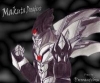
Sold. This is a must-buy for sure. It's really all I could ask of a villain set. Really. And those antlers bro. Man. King of antlers.
-
For some reason I find it amusing that the best set of the wave has the least new pieces, lacking the torso shell, the crystal add-on and that energy sword thingy. I guess the two-tone torso makes all the difference. I like the printing on the uniters but holy moly that piston detailing is beyond excessive.
-
Have to say seeing a HQ image of the torso shell it has grown on me a bit...provided the printing is used to good effect, which it isn't on Tahu.
-
So, new Tahu pics. I can see the new torso piece in all it's detail at last aaaaaand it's literally te most megabloks thing ever. I'm serious, these torso shells look horrendous. Not even G1 had this absurd ugly detailing. And we're back to one piece torsos again. I cannot fathom why this is, it ruins the usability of the piece and makes colour balance an utter pain. Just look at Tahu and Pohatu.
-
Hmmm, this brings up a good experiment to try. Perhaps replace some of the gold/trans orange with red or the new 4m dark azure shells from Gali? Sounds crazy but it might just work.
-
I think one of the problems of the wave is the crystal add-on. Yeah it's nice for adding multiple colours to a shell but as it's used now it feels shoe-horned in and it overpowers some sets, notably Tahu, Kopaka and Pohatu. It doesn't help that it has a bizarre texture mix.
-
Thoughts on the whole regarding these debated and general thoughts on the wave. I think the best word to describe the wave is "potential". For how much we've bashed the strange silver tops of the masks, I can't help but feel they express the upgrade approach better than the Nuva masks which IMO looked awkwardly organic. Some masks fare better than others but it's not a total dealbreaker. Kopaka and Melum is a decent concept, though Melum feels like a slightly downgraded Terak, despite the differing functions. Kopaka's physique is improved, having thinner upper arms, however the colour balancing is a bit off having only two gold pieces on the thighs, and the upper arms look a bit raw. Still, at least he has a sword now. Lewa has made a name for himself as a star set, and for good reason. Of all the toa he melds technic and CCBS the best without it looking forced. His weapons sorta remind me of Breez' tonfa from 2.0, but they spin. I almost imagine him doing a sort of Yoshimitsu-esque helicopter with them. His mask also looks improved IMO. Gali is somewhat mixed. I love the inclusion of orange and the asymetry. It really makes the set pop colour wise. However the upper legs are too long/lower legs too short, and the mask still bugs me somewhat. Another point I neglected to mention is that she is one of the few sets to retain the hinged elbows, alongside Onua's one arm. Pohatu is very mixed for various reasons. His upper arms are a mess and the inclusion of yet more trans-neon green is a misstep IMO, I feel he would have benefited from less trans and more of his 2015 orange shells. Definitely requires mods to work. On the plus side his weapon is a lot cooler and justifies the new waist gimmick. Oh yeah, waist articulation. Neat! Onua...tricky. He's a bit taller and retains his bulkiness to a degree. I actually like the change, makes him seem more wise and less like a brute, though I can't fathom why one of his arms is hinged and the other isn't. Also those feet straight up don't work. Don't even try it. Tahu is the "hot" topic of late [pun intended] due to his overuse of textured shells and gold. I feel mixed to both. I'm not a fan of the lack of pure red, having only 3 pieces in red, less still with the gold mask, and the textures...could be better. I can live with the crystal pieces and the piston legs considering the chestpiece, skull shoulders is pushing it and the arms, hmmm. Not sure. Swords are cool though I must admit, and I like the mask a lot. Umarak is a much needed villain to kick off the wave, and boy he delivers. Something about his mask, those antlers, the bow, the colour scheme with the dashes of dark red, this guy has character! A must buy, and not just for the sake of having a villain [cough, LOSS]. The other beasts are hit and miss. I like Akida's shark physique and the twin cannon, I like Ketar's function and colours. Uxar and Ikir are sorta the same, and Terak is kinda there I guess. All that's left are the reviews.
-
I must agree that Kopaka and Melum is very disappointing in regards to value. You get more from buying a Toa and a Creature seperate in the form of a trap, which sort of defeats the point of a 2-pack. The reason people dislike Melum as compared to Terak is that from aesthetics he is made different by way of subtraction.
-
I hope it is ratcheted in someway, the lack of friction would be a real shame.
-
It probably allows for more potent light-piping too, that's something that frustrated me from 2015 personally, though mask design also plays a big part (cough, Tahu 15's cold dead stare).
-
Looking at the back the technic integration makes a lot more sense. Most of the toa look pretty good, gonna have to be the opposite and say I really like Tahu, reminds me of his Nuva form who I have a soft spot for. Pohatu's upper arms look better but still a mess, and those colours...man. Gonna have to cannibalise a protector maybe to balance it out.
-
Like I said I feel these sets leave a great foundation for customisation and I like that they're trying to mix CCBS and technic, however like Fire Lord from 2011 the execution leaves something to be desired, especially Pohatu and Kopaka's upper arms, though Lewa seems to have some more going for it. Wait and see.
-
The new images definitely improve the image of the sets, including Gali's swimming cap mask along with the others, very much getting a Nuva vibe from the masks. I think they leave a great foundation to mod into spectacular designs, and the gear function seems very exciting.
-
Not a fan of the upper arm technic thing we got going. Pohatu is a mess, both in colour scheme and his upper arms, good lord.
-
Not sure how to feel, current perspective suggests a torso that's too large for the limbs. We'll have to see when they come out.
-
It probably is torso swivel considering the weapons. It'd allow for more complex upper torsos like Tahu 15's without impeding the function. It's also make 2-handed weapons more viable for MOCing.
-
Don't know how to feel, the smaller toa seem to be lacking upper arms and I don't know what they're thinking with Lewa's legs.
-
Someone brought it up earlier but I'm starting to notice gears at the lower torso on most of the toa, so it's safe to say the gear function may be similar to Evo XL in that they move at the waist, which I welcome. Gear functions are awesome but one thing that bugged me was that you were limited in shoulder construction so as to not ruin the function, Tahu had it worst with his wingblades clashing with his shoulders.
-
I've been wondering what's bothering me about the set and at first I thought it was the cape, but after more examination I feel the chest is the biggest problem, it's incohesive and too wide, especially at the shoulders. They're almost as exaggerated as Bionicle proportions. I feel a thinner, more CCBS build would have been of great benefit.
-
Not sure if anyone has suggested this on the topic of feet, but the bars give me an idea. How about a two piece foot? Like, sort of like the beast feet, but the bars are straight, and attach to another piece that fits to give them toe articulation. Similar aesthetic but maybe more squared off as to match the animation design?
-
What was the worst construction set?
MakutaDreadscythe replied to Bigger Fish's topic in LEGO Action Figures
Just gonna go ahead and say Gavla. All the limbs are 90 degrees, weapons are too big, looks like garbage no matter how you pose it. Only redeeming quality is the mask, even then it's very specific. -
The boomerangs should have had a ratchet joint instead. I'd say it might lessen the usability but it's situational enough as it is, and they aren't fun to use at all due to their floppy nature.
-
I think I'm the only one who likes having multiple metallic colours in sets if done right. Kopaka, yeah, that silver chest does bother me seeing as it's the only silver armour on the set. Gali on the other hand also has only one silver armour shell, but this is balanced by the shoulder add-ons and hands being silver. Really as long as it doesn't dominate the colour scheme *cough* 2008 *cough* then it's alright with me.
-
I dunno, a second wave of villains isn't implausible. They could be going a Ninjago route in keeping the same team, though how they would do this seems up for debate.