
Doddsino
-
Posts
159 -
Joined
-
Last visited
Content Type
Profiles
Forums
Gallery
Everything posted by Doddsino
-
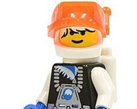
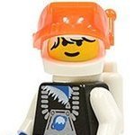
Wow, how did I overlook this happening? Honestly, they're all pretty ugly. It's remarkable that they can bring back the classic Space figures just simply changing the uniform colors and is treated positively. But then they take the sub-Space themes and they have to 'add personality ' or make drastic changes to their style. Ice Planet is my favorite space series, and the visor was a big part of that. I haven't studied too closely, but I would have preferred simply giving them a new torso, maybe add some paint to the helmet, but keep the basic proportions the same. The Flying Saucer head figure looks like his head is under a glass pastry bowl. Make that figure! Make Pastry Head Bowl Man! I kind of like the M-Tron figure, but it's still missing that classic charm. The Incognito Alien might work in another wave. Seems weird to say that an alien would fit in with a bunch of other random figures. The "Current" astronaut is okay, but just seems like something they could release in an actual set. The Blacktron figure is especially hideous. I have no idea what they were going for there. Here's a chance to play into their 'sinister' background, but mutates? What? I just want to burn it. Quite honestly, the rest of the figures are so bland that they fall under the typical skippable figures I would've not bought anyways (ogres, princesses, sports figures).
-
I didn't like it. I don't hate it. In fact I was loving at first, but the more I looked at it, the more I found things that just didn't sit well. Some of it is it just looks too busy, I would have preferred less pieces for what you get overall, especially the fact you need to build that enormous base. I'm all for larger, expensive sets with lots of pieces, but I do want SOME simplicity to it. If I want to add some flavor to it, that's my prerogative as the owner of a set. That's not so much the case with this set, but the mention of the cramped quarters reminds me of other sets that feel the need to have all this flair to bring the set to life, when it otherwise cramps things.
-
Shooting and Non-Shooting Cannons...What you Have!?
Doddsino replied to VintageLegoEra's topic in LEGO Pirates
None of mine ever shot. I wasn't even aware that there were shooting ones until I was an adult. Didn't matter either way, I preferred my pirates to slice each other to pieces with their cutlasses. Their heads would dangle hang from the hull of the Skull's Eye Schooner as a warning, not to cross the wrathful Captain Roger Moore Redbeard...and his custom monkey with four hook hands. -
Lego Icons 10332 Medieval Town Square Discussion Thread
Doddsino replied to BrickJagger's topic in LEGO Historic Themes
Been a while since I posted, and still no pics on this? I have like $40 in Lego Rewards expiring in February as well, which absolutely stinks given the release date of this. -
[COR-FB] Harbor Defense Sloop, Wullham
Doddsino replied to evancelt's topic in Brethren of the Brick Seas
Really looks good, although I'd prefer the standard rigging for it. -
Using the epaulettes for teeth is absolutely brilliant.
-
Indiana Jones 2023 - Rumors & Discussion
Doddsino replied to Pulp Detective's topic in LEGO Licensed
If only the same could have been said about the films themselves. Maybe 20 years down the road, they'll discover some old unreleased Lego sets in the trunk of a vehicle in Roswell, NM. -
The color scheme doesn't bother me, I just would prefer it being a music venue instead of specifically a jazz club, but it still works and I'll probably pick it up. I just wish the top 2 floors were balconies instead of what they are. Lego town tends to have an issue with seating.
-
Yeah, the Boutique Hotel in and of itself is okay, I just have no interest in purchasing it since it doesn't really fit with the rest of the sets.
-
My top 5 sets predate the Assembly Square. While the newer sets look nice, I can tell you I'm not a fan of the Boutique Hotel whatsoever. I prefer an element of simplicity in the design and it's an eyesore for me when placed amongst the rest of the modulars.
-
As far as other horror themes minifigures, maybe tributes to these haunting personalities; Phantom of the Opera Invisible Man Hunchback of Notre Dame Metaluna Mutant Cryptkeeper Evil Ventriloquist Headless Horseman (not Scooby Doo) Elvira The Undertaker Vincent Price
-
Green Grocer It's elegant without going overboard. The Detective's Office and Cafe Corner are both high up there too. I'd probably even put the little laundromat up there too if it wasn't attached to an ugly bank.
-
Man, I really did that rockface. Looks like it was smoothed down due to the ocean's tide. Really a nice touch.
-
Any chance we could see a re-release of Barracuda Bay?
Doddsino replied to canuckster's topic in LEGO Pirates
I think Skull's Eye Schooner is a little too close to the Black Sea Barracuda. I do like the idea of the Armada though. -
Quite the couple Necro posts! Lol Honestly, the modulars were the reason I got back into Lego after about a decade of nothing. One thing that ALWAYS bothered me as a kid was Town and how the buildings were never fully functioning...always felt like a stage play rather than an interactive playing field. So when they started putting them out in 2006, I was on board. Admittedly, I haven't bought the last two, and I probably won't get any more unless they actually put stuff that I actually like. So here's my list from worst to best. 16. Palace Cinema; honestly I think this is an ugly set. I bought it at a time when I was buying all of them, and I never even bothered to open it. It stands out among the other buildings in the worst way and the interior is just cheap looking. This is a case where I would have preferred to pay additional and gotten a better presentation. But the thing I'd prefer is if the buildings were in the modest look. I don't want it to look like the Chinese Theater. 15. Grand Emporium; this is a case where I would have preferred if they stuck to one theme for a store. Make it a toy store. Make it a clothing store. Make it a kitchenware store. Don't combine them and present it like it's a going out of business place. I would have even preferred it if the top floor was a break room or executive office for employees. 14. City Hall; Big square building that is rather uninteresting to look at. Oh and a couple is getting married...I guess that's Lego telling us don't to hold out breath for a church. To add insult to injury, this is the set that had like 5 pieces break on me due to the cheap red brown dye. I still need to get those replaced. I like the elevator though. 13. Police Station; I'm putting this here due to the fact that I own it but haven't put it together yet because I don't have the space at the moment. It looks nice overall though. 12. Corner Garage; I can't really say it's an amazing set, but there's little things I do like about it overall. I just wish it had a couple gas pumps instead of just one. Maybe put an actual mini mart in the side. 11. Brick Bank; While the interior is nice, I think the color scheme on the outside is just a little dull overall. The saving grace of this set though is the laundromat. I love LOVE LOVE that little building, and would love LOVE LOVE if Lego did more little buildings like this. Seriously, I set up this set at one point in a way that would most show off the laundromat, at the expense of the bank. 10. Downtown Diner; Here's the deal...this is a great looking set. Unfortunately, it stands out like a sore thumb amongst the other sets when placed together. This is also a set that I would have been okay with if it was half the size especially if you cut out the gimmick of the recording studio and whatnot. 09. Parisian Restaurant; suffers slightly from the same problem I have with the Downtown Diner, but truthfully it still at least fits the town for the most part. The set has been unbuilt and put away for now, and I couldn't tell you what the second and third floors are for the life of me, which should tell you how middle of the road forgettable it is. 08. Assembly Square; While I didn't need another coffee shop, at least I could make Starbucks jokes about having two coffee shops in close proximity to each other. What I like about this set is there's a lot of 'random' shops that probably wouldn't sell well on their own, and that's okay. I also like the off center display of everything. The fountain is a little much, but overall I still like this one. 07. Pet Shop; Simple and effective...I just like the basic structure of this for what it is. 06. Bookshop; Basically the same that I could say for the Pet Shop. I like the birch tree, but it's annoying that the leaves are out of season when placed next to everything else. I really like the color scheme in this set. 05. Market Street; I know it's technically not a modular, but it kind of is too. Admittedly very plain, it really sits well against a couple other buildings, especially the earlier models. Sometimes simple helps sell the overall theme that you're going for. Oh and I like the sky blue walls. It could use some interiors as well. 04. Fire Brigade; Other than the stupid flag, this set is gorgeous. I really like the bell and little things such as the fireman's pole. Again, not overtly extravagant, but simple just is my preferred vision of the town. 03. Cafe Corner; the one that I fell in love with...and quite honestly...I could still easily name this as my favorite and if there was one set I could keep out of all of them, this would probably be the one. The lack of interiors is super disappointing, but it has enough flair without being over the top vomit like other sets to just be its own special thing. I doubt if any other modular was released first that I would have been invested the same way I was with this one. 02. Detective's Office; Just a great set, I love that little outside staircase, the disjoined building as a whole and the color scheme. It probably helps that I like film noirs that the detective's office in particular is just a perfect little picture without being too over the top. Again, I really like when Lego throw like 3 or 4 little themes together in one set, as opposed to one major theme. 01. Green Grocer; If Cafe Corner needed a buddy, it was this guy! Oh and Market Street would be on the other side. Seriously, maybe it was just the color, but I knew I was going to have to get this the moment I saw it. I knew that Cafe Corner wasn't going to be a one off and I was setting myself up for a once a year big spend from Lego. But I was pleasantly surprised by the interior and just the little details that Lego could have easily skipped on. It also maintains that simple look that I enjoy while being a compliment to the rest of the town, which is what every set should strive to be; not the attention getter, but the staple simplicity that gives the town character.
-
Any chance we could see a re-release of Barracuda Bay?
Doddsino replied to canuckster's topic in LEGO Pirates
The Red Beard Runner would be ideal for this. Hopefully with less foliage than Barracuda Bay though. -
The more I look at this, the more I really like it. A lot of subtle details that you would see in a real church.
-
[MOC] The Skull Island - Remake of 70411: Treasure Island
Doddsino replied to zinnn's topic in Pirate MOCs
You have a skull island and there's no monkey present?! In all seriousness, I really like that dock, especially with the hidden treasure spot. Really cool. -
I mean...yeah? They haven't done regular smileys for 25 years, I would hope that any company would rebound regardless of what direction they would take over that course of time. I think at the end of the day, I prefer a compromise of both eras, since there was plenty of stuff to not like about stuff from the 70's, 80's and early 90's...but the build aspect was mostly good during that time.
-
Again, I stated that as an opinion. The bigger point was that Lego was putting out some of its worst ideas as we both agree they were doing. This was just an addition to the bad things they were already doing. Was it the cause of bad sales? No. But I doubt it helped. In my case at the time, it certainly was another bad blow to what I already saw as a mediocre product, and to this day I don't own any sets from that era. And again, not unanimous, but I've met other people who questioned some of these choices at the time as well. So again, it was Lego taking drastic action in many forms which in my case (and others presumably), they isolated their loyal base a little too much on multiple fronts. So it's less about how it hurt them at the time, and more about how it didn't help them whatsoever.
-
I think you missed my original point about having the obnoxious facial expressions on today's figures. There's plenty you can do with the smiley figures without giving them a permanent scowl, scream or off center smirk. That to me isn't "realistic". And the argument I made about today's kids wasn't regarding how what I had was better than them, because that isn't true. What I did say was that needing to have an emoting face limits what you can do with that face. I can't see the counterargument especially when it seems that most of the anti-smiley folks are upset they're smiling. I think I'd be more upset if I bought a set and the figure was making some stupid face.
-
Minifigures certainly *did* play a huge part if you ask any older Lego collectors as it opened up an entire new direction of building. Lego tried multiple different figure concepts that never caught on. With minifigures, that changed the entire focus of the branding. As far as your second point, and again this is opinion...but the period when they were getting away from smileys, namely the late 90's to early 2000's, Lego was putting out some of its worst product. Sure there was Star Wars, but almost everything else from this period was not very good. Bionicle really saved Lego when they were at their blandest. I can understand not using the classic smileys on licensed franchises, but I don't think it makes a lick of difference with anything that Lego conceptionally creates themselves.
-
And when minifigures were finally released, Lego became far more popular.
-
Mallow is a tough character to get down in general due to his lack of middle, usually most illustrations I've seen of him have him either as too elongated or too squishy. Paper Mario would be an interesting concept to do, but I wonder if it would make more sense to keep the characters as more two-dimensional, while building a 3D world around them?
-
I didn't say anything about an absence minifigures, I said excessive amounts. And again, I even stated they're probably not going to knock down the price, so if it allows for other items to be added, then great. You're taking my criticism too far on the faces. I'm not saying wipe away and and all things identifying a character or a place, but don't attach a specific emotion to it in order to assume a child needs one. Kids played with Space or Castle for years without the need for anything other than a traditional smiley. Kids bought the sets for the themes, and created their stories around the sets. No kid bought a set because they could now act out a story because there's a screaming face. Kids' imaginations work better than that.