
ReplicaOfLife
-
Content Count
705 -
Joined
-
Last visited
Posts posted by ReplicaOfLife
-
-
On 11/19/2023 at 2:02 PM, GregD said:Just realised there is a new colour - warm tan/medium tan, was a skin tone for minidoll heads and is now in Brickheadz set 40616. Maybe a future modular colour in the next few years!?
Oh, cool, thanks for the heads-up. Will need to get some of those parts.
-
Took some time to let it sink in, but I have to say: Not very excited about this.
On the plus side, it's big enough to be somewhat credible as a museum. Like that it takes up most of the baseplate. And finally, we get a building without unnecessary small pseudo-buildings attached to it again! It's been a while...
But on the other hand, I find the design of it a bit lacking. Again. Just as with the Jazz Club, most building techniques seem to be rather straight-forward, the proportions feel just a tad off and the exterior design - while checking most of the classic museum boxes - looks a bit unimaginative to me. Regarding proportions, I feel that the roof should be higher. Both the dome and the smaller roofs over the wings to the far left and right seem too small for the overall building size.
Design-wise, the cornices beneath the roof look rather bland, as does the detailing around the windows. Also, the capitals of the big white columns feel too small - ionic style capitals usually protrude to the left and right, here they sit pretty much in line with the column itself.
And the interior seems mostly empty, with relatively few and mostly smaller exhibits dotted around in a lot of empty space. And most of the upper floor literally is empty space where the huge openings to the ground floor are. The one for the dino skeleton makes sense, obviously, but overall it still feels way too empty. It's missing at least two or three more sizable, imaginative exhibit builds there to give the place some more life.So, certainly no Day 1 purchase for me. Might wait to pick up a used one for cheap once the excitement dies down.
-
Wow, those facades really capture the vibe of a traditional english street perfectly. Love it.
-
Nice work on your first modular!
Some very nice part usage, especially that bowser shell in the tower. I wasn't even aware of that piece, but it fits perfectly where you used it! Also great work on the interior detail, especially the apartments are very nice!
I'd also look into making the ground floor a bit higher. In Lego's modulars, it's usually about 11-12 bricks high. Also - and this may look worse on the pictures than in reality - the dark colors in the the roof area (with the dark red cornices and black roof) drown out the details and create too much negative space, if that makes sense. I'd go for some additional contrasting color there, or maybe a different color for the roof altogether.
-
15 hours ago, Gremer2 said:Hi guys, sorry to bump an old thread. I unfortunately had to sell my Brick Bank earlier this year due to financial struggles but I'm in a better spot now and I'm wanting to BrickLink it. Are there any part substitutions to make it cheaper? I saw the printed pieces can go for $25+ a piece.
99% of the set consists of parts that are fairly easy to source.
Apart from the five printed windows, which will set you back around 115€ or more, the most expensive pieces are
- the Tile, Modified 2 x 3 Pantagonal (22385) in sand-blue - it's exclusive to this set. But you could just replace the sand-blue color on the bank floor with any other color of your choice
- the Minifigure, Utensil Key, Ornamented with 1 Stud (19118) in lbg, also exclusive to the set. As it is fairly prominent to the exterior, it's hard to replace, especially since the other colors it exists in aren't exactly fitting for the purpose (like lavender or lime
 )
)
- the chrome gold pack of coins and ingot (97053) is also very rare, but you can easily replace the coins with any other coins you might have, and e.g. a pearl gold ingot
- finally the 2x4 tile with the printed cheque is expensive aswell, but I think it's neglectable for the set overall
The minifigs themselves are mostly made up of common pieces, so you should be able to get them rather easily.
I went through the process of piecing it together earlier this year, when I finally decided to build that set. I actually did have it still MISB
 , but after seeing the prices it goes for nowadays and then going through my inventory, I figured it would be way more sensible financially to sell that copy and get the missing pieces for my own build.
But I did have quite the head start, as I had over 2/3rds of all the pieces in my collection, and especially since I had bought extras of the bank windows and keys back when the set was on the market. So I only had to spend somewhere around 100-120€ on pieces. I replaced the hexagonal tiles (and subsequently the other sand-blue tiles on the floor) with sand green, and I'm missing the cheque. Otherwise, it's complete. -
Classic smiley all the way.
-
On 10/8/2023 at 12:21 PM, jonwil said:A building with a large amount of sand yellow (aka dark tan) as the primary color would be great and would certainly fit with the style of any number of museum buildings around the world.
Also remember that modulars don't normally get new molds (the double bass in the jazz club was an exception because it wasn't technically a "new mold" since it was created already for canceled Vidiyo product)
Afaik, that policy has been abandoned for some time. I think there was an interview with Jamie Berard some time back where he said that, while that strict limitation had been true for the first few years, by now the modulars have such a standing that they could also get new moulds/pieces. The Jazz Club also had that new piece that fits under the 1x2x6 arch in the pizza oven, for example.
Though, from the outside it's propably hard to tell what set an element really was designed for, as usually a new element gets used in many sets upon release.
-
On 2/18/2023 at 9:26 AM, jonahtron said:Don't know if this interview with Jamie was missed from last month but it has a whole load of photos of Anderson's WIP Jazz club designs. Whilst I do wish we'd gotten a huge sax sign, I think the final version of the JC was the best iteration. I love the facade of the yellow building in some of his sketches, and am glad he didn't go with sand green.
https://brickarchitect.com/2023/interview-backstage-tour-of-10312-jazz-club-with-jamie-berard/
Thanks for that link, would've missed it.
Sad to see that I prefer almost all of the early design sketches they shared to the final design.
Also interesting to see Jamie say "When you go to a half base plate it gets fairly tight for adult hands " with regards to 16-wide buildings, seeing as they have no problem at all creating even tighter spaces within the small buildings or even just facades they tend to tack on to the 32-wide modulars nowadays. Like the donut shop in the PS, Art Gallery in the Hotel, pretty much everything in the Detective's Office, or the Pizza-shop-half of the Jazz Club...
-
23 hours ago, Kalahari134 said:Looking at your recolour, I'm left wondering why Lego thought that dark orange (or whatever surrounds those first floor windows is) was ever a good idea. Matching the yellow used on the rest of the building makes so much more sense.
Propably because surrounding the windows with a darker color creates an additional illusion of depth, which makes the facade look more lively.
On the other hand, keeping it all in one color diffuses the real depth of the facade (created by setting the windows one stud back from the facade) and makes it look more flat than it actually is.
-
Phew.
Positive: It has some decent depth to it, the side walls look really clean. Seems like there's some nice snot work going on on the upper floors of the jazz club. Some nice interior details on the upper floors.
But:
I really don't like the overall look of it. Especially the upper floors of the jazz club look very random. The rooftop decoration looks downright terrible, imho. The dark red and that azure blue (whichever one it is) are clashing hard visually. The pizzeria has laughably little interior space (notice how they removed all of the front wlals to get that inside pic).Might entirely skip this one. Definitely the least visually appealing one for me to date.
-
21 hours ago, 24nolf said:Piece count is a meaningless data point and should be banned from discussions. Lego modulars have suffered from extreme shrinkflation in recent years.
For example: The Bookshop has 2504 pieces and is missing roughly 30% of the build including the books. The Grand Emporium has 2182 prices and is a full build with roughly 40% more plastic than The Bookshop. Most of the recent modulars were clearly cut down after being designed and suffer from obvious omissions. The Bookshop is an extreme example but The Police Station and Hotel both suffer from this as well. The amount of plastic, while not a perfect data point is at least helpful. Pretending that "piece count" is a valuable metric is like comparing revenue numbers from 20 years apart (inflation makes the comparison a joke).
Yep.
For a company that's famous for making plastic bricks, they sure are very scrimpy when it comes to putting actual decent-sized bricks in the boxes they want more and more money for. Sure, we'll get dozens if not hundreds of 1x1 greebly bits, but compared to the really old modulars, all the last ones were very poor in terms of how many actual, decent-sized bricks were in there. Buildings keep getting thinner and lower.
Very bad direction they've been taking.
For 230€, I'd want something the size of Green Grocer with the level of detail of the Parisian Restaurant. Which easily could be done with 3000 pieces. Instead, I'll propably get a building sized somewhere between the Book Shop and the Downtown Diner with maybe 8-10 studs in depth, whose interior walls (if existent...) won't even reach the ceiling.
-
On 7/2/2022 at 8:00 AM, LEGO Train 12 Volts said:Tthis modular palace is absolutely professional!

In my opinion the quality is superior to the Lego sets: I notice all your efforts!

I particularly like the staircase with the transparent steps, it's very elegant

Thank you, very glad you like it this much


-
On 6/20/2022 at 6:12 PM, Withacee said:Lovely!
The interior details are brilliant, and I really like the ground floor and the top floor façade.
The bright light orange works very well here.
I wonder if it would look even better without the second floor, which, on the outside, is a repeat of the first floor.
Keep clicking those bricks together!Thanks
In my experience, at 32 studs width three floor builds only work if the building is either flat-roofed (so you still get two full upper floors), if the floors are very tall, or if the modular is designed with at least two different facades. On more uniform buildings, like I usually do, removing one of the middle floor makes the buildings look weird, because they will feel too small for their width.
In other words, you usually want your buildings to be a bit higher than they are wide.
Which, I think, is another reason (besides saving on parts & volume) why Lego usually either does multiple facades or doesn't use the entire baseplate on straight modulars nowadays. Green Grocer was the only regular (non municipal) modular they ever did that was designed as a single, 32 studs wide building, and just look at how tall those upper floors are compared to almost all other modulars.
-
That's rather awesome. Makes me wonder if I should retrieve my island pieces from the box I put them in and build something worthwhile with them aswell.
But: How did a post from 2020 end up on the frontpage in 2022? I mean, I'm glad it did because otherwise I wopuldn't have seen it, but....
-
4 hours ago, Merlo said:Yeah, there's definitely something to this. Although I'm not sure if a see-through roof panel would be beneficial for the back crew of a spaceship or just introduce a structural vulnerability.
That argument also works against the original Galaxy Explorer, which had a big see-through roof panel aswell. Only that back then they used a trans-yellow 4x10 plate instead of a windscreen, propably because they didn't have big windscreens yet.
And you really shouldn't get started on structural vulnerability regarding Classic Space ships
. Pretty much all of them had giant windows or even giant holes all around their fuselage, all of which would be rather impractical in an actual spacecraft.
-
Gorgeous set.
Love the shape & building techniques, and am I dreaming or does it look like all the decorated pieces are actually printed? The awful sticker sheet was one of the main letdowns on Benny's SSS.
Only detail I don't like about 10497 is the back wing - looks too bulgy and plain just using those two big ramp pieces. Will most likely mod that on my copy. And of course, the unnecessary colors on the inside
 - though at least they limited themselves to the clasic Lego colors that were around back in the 70ies & 80ies. Which is a nice touch in a way, but I'd still prefer they'd use only the colors actually needed... but that goes for literally all sets they make nowadays.
Oh yeah, and I demand we get an identical version numbered 10928 in Europe!
-
That looks absolitely marvelous
-
On 6/5/2022 at 11:11 AM, GeoBrick said:Beautiful façade ornamentation, well-furnished interior, and a novel roof technique. What more can one ask of a Modular?
The almost-symmetry on the front with a protrusion streetwards on both ends makes it a real winner.But my favorite part is the terrace wall and entrance stones. Its simple yet convenes elegance.
Thank you :)
I intentionally didn't make it fully symmetric - I've done so many symmetrical builds already
On 6/8/2022 at 6:56 AM, Ravelino said:Ooh ah BLO Modular, this BLO's me away(yes, silly pun intended)! It might be a bit over like someone said earlier, indeed maybe a pastel would be better but hey! I've seen worse colour choices from official sets so who gives?
I pretty much agree with everyone here. I really like the staircase, and would love to see the improved version you have in mind. The roofing and the terrace are very lovable as well. Wonder why'd you call it The Golden Frog though when one really has to search for those buggers (found 'em though no worries ), maybe a couple more like over the main entrance would be nice though I'd get why you would be hesitant.
All in all: Very nice job

The name Golden Frog came about by sheer coincidence - when I designed it, I just thought about 'some sort of restaurant'. The frogs already were there, but I had originally planned with dark blueish grey ones as a direct nod to Café Corner. Then I noticed that I didn't have enough grey ones, but did have the golden ones. And since it's pretty common for restaurants to be called "The Golden [some thing or other]" around here, that gave me the name for it.
On 6/9/2022 at 12:17 PM, JakeS said:Amazing! I love the roof, and the bright colors :)
Thank you :)
-
-
Thank you all for your kind words! Much appreciated
And also thanks for the frontpage showcase! Much appreciated!
22 hours ago, Redhead1982 said:This is a truly beautiful model. The bright color of the facade stands out really nicely - obviously lots of fresh paint on it. It might be a bold choice to build with bright light orange, but the color combo looks great with white and grey. The roof is probably my favourite part, and you created a great pattern for the roof tiles. The interior is very interesting too. The glass stairs are very neat, but the fencing to it feels a bit bulky. It's a shame there's not enough parts in trans-clear as it would fit as a fence much better than the black slopes. But given the availability of the parts, the spiral shaping is spot on.
I'm really not sure how the roof is built, but I am speculating you fixed the parts (jumpers and bricks) to some supports in the back.
I get what you mean about the staircase hand rail looking a bit bulky. It's actually quite low though, when you look at how high it compared to each step. But as I was reading your reply and looked at it again, I actually got an idea for a technique to create a similar effect that would be less bold. I'll definitely re-use this, and that way it won't look the same
On 5/29/2022 at 5:00 PM, jus1973 said:This is a fab looking build. Some lovely details including that spiral staircase. I might have to borrow some of those ideas if that’s ok? I’m trying to work out the roof. Sideways SNOT?
No, I don't mind at all - if my work inspires others, that''s great! I'd appreciate a shout-out, though, especially if you go very close to what I did.
Regarding the roof: Yes, SNOT is involved, and of course there's some supporting structure in the back. But propably less than you'd think - each roof section is one interconnected assembly, and the supports are just attached at two points to that assembly
-

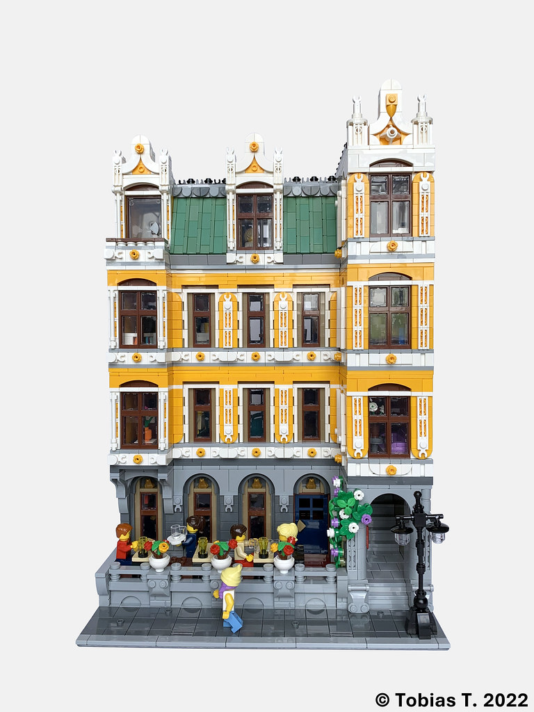
"The Golden Frog" Restaurant (Restaurant "Zum Goldenen Frosch")Alost two years after my last MOC it's finally time to reveal my latest work. This is a modular building with a restaurant - "The Golden Frog" (or "Zum Goldenen Frosch" in german) on the ground floor. The second floor houses a psychotherapists office, and the top two floors feature an apartment.
Summary:
Parts: 5650 (excluding minifigs)
Design: designed in stud.io from May to June 2021 and from December 2021 until March 2022 (got hard stuck with the design last summer and worked on other projects for a while).Highlights include the roof, where I tried to mimic the typical look of a copper plate roof as found on many older european buildings, the facade featuring lots of snot work, and the glass spiral staircase leading from third to the fourth floor. As usual, the model also has full interior.
The color scheme using bright light orange might not be everyone's cup of tea, but I really like the color, so there you are
As usual, head over to flickr for even more pictures: https://flic.kr/s/aHBqjzRQmw
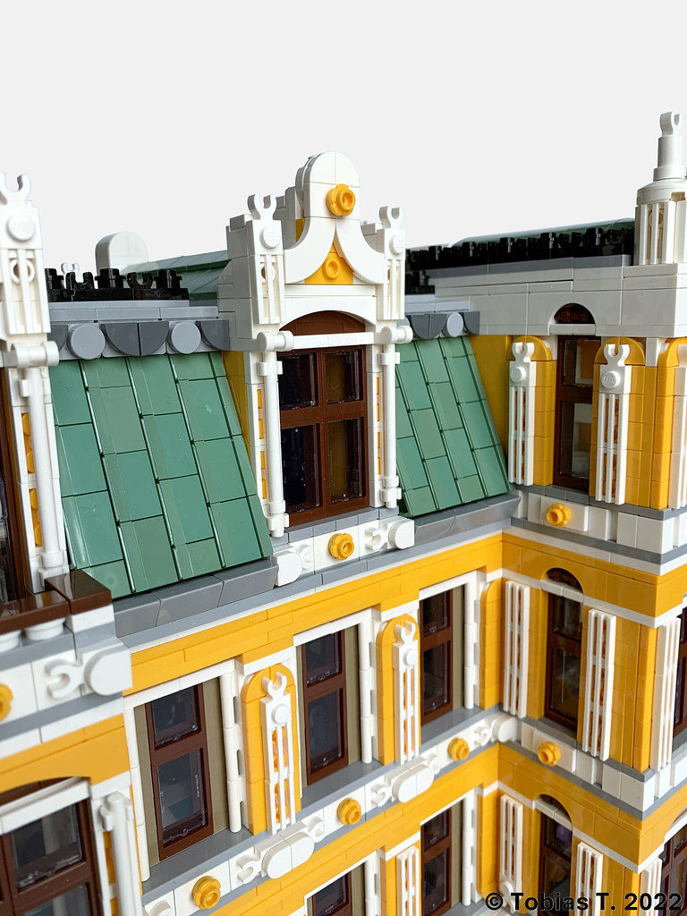
The copper plate roof. I'll leave it to you to figure out how it is built - I'll just say that all pieces are firmly connected.

The restaurant's namesake is featured above the windows and door on the ground floor.

Interior of the restaurant.
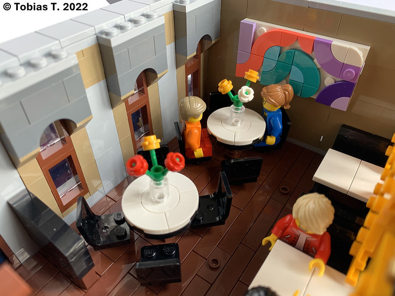
The restaurant also features a piece by a local modern artist. It's cryptically titled "Entrails of a Star Destroyer".
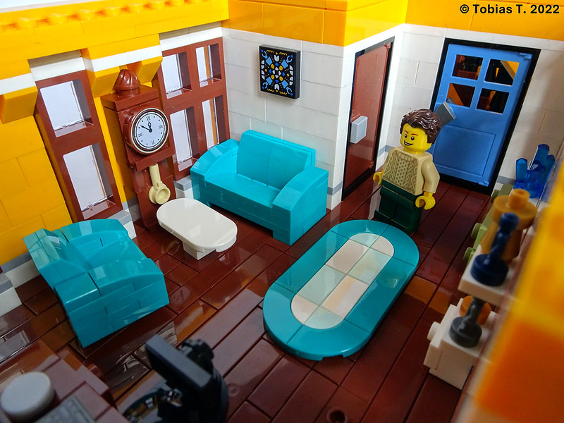
On the second floor, a psychotherapist has his office.
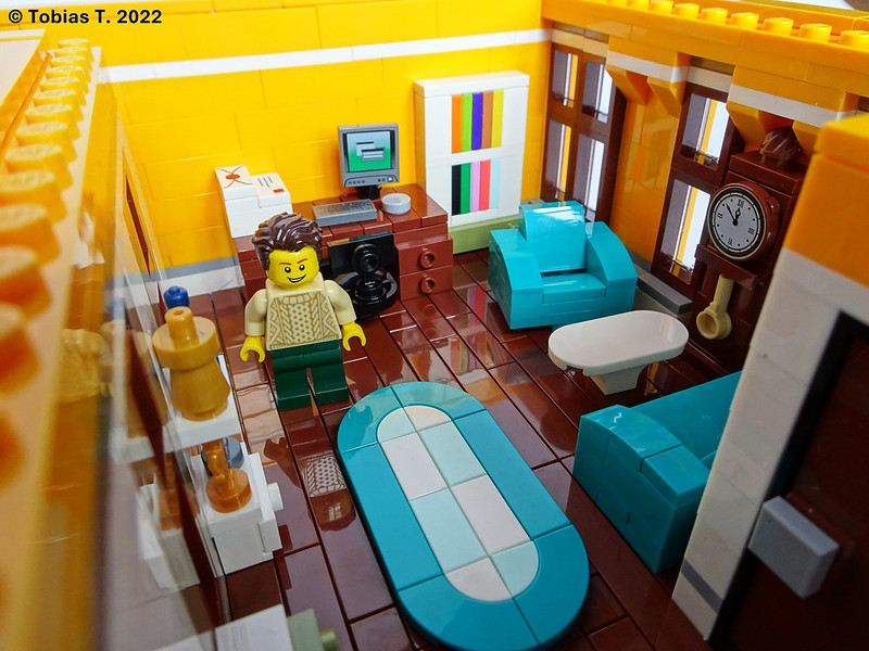
Many of his patients find the loud ticking of the grandfather clock to be distracting. He enjoys analyzing their reactions to it.
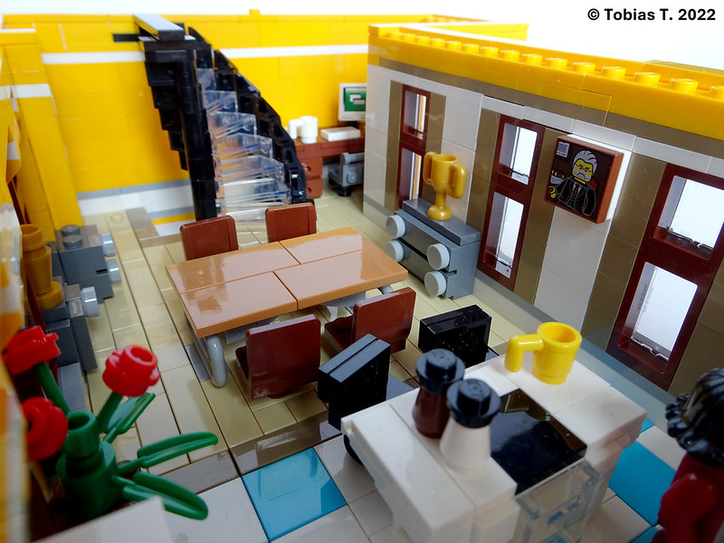
The third floor is the first of a two floor apartment. This floor has a kitchen, eating area and home-office working space.

The luxurious kitchen has a big fridge and a kitchen island with further seating.
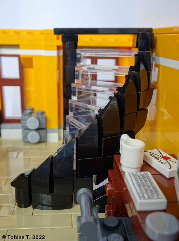
The glass spiral staircase leads up to the final floor. It is built using panels. Curved slopes with cut-out create the nice organic shape of the banister.

The top floor is less spacious then the ones below. It features the bedroom, couch and TV area and the bathroom.
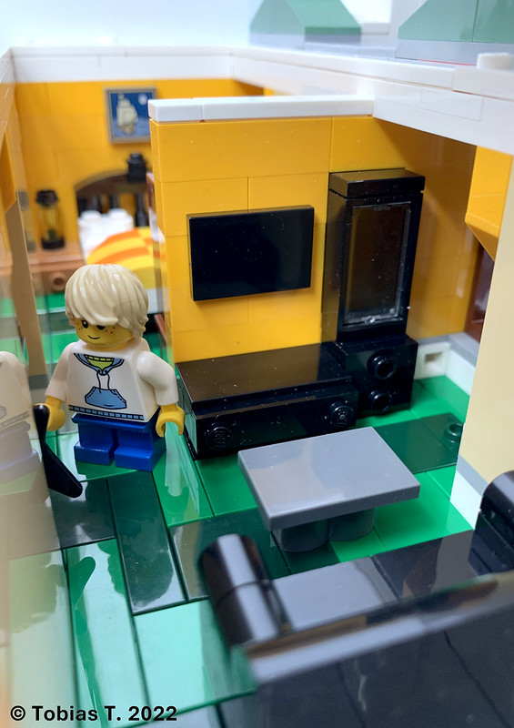

The bathroom features a big, open shower (with a coloured glass wall preventing spray down the staircase), toilet and wash basin.
I hope you enjoyed my MOC - looking forward to any feedback, constructive criticism or praise you have to offer
More pics on flickr: https://flic.kr/s/aHBqjzRQmw
Tobias
-
Very impressive, a truly grand hotel. Love the highvattention to detail throughout and the well structured facade!
-
On 4/5/2022 at 4:37 PM, Withacee said:Problem with Palace Cinema is that the ground floor is not tiled (for whatever reason). So the red base plate is the actual floor of the lobby.
Other than that, I agree. And the sticker sheet is indeed an issue.True.
Though you can propably tile the entire floor with red tiles (2x2 tiles in red are just a few cents each) and buy a new baseplate in whatever color for less than the red baseplate goes for
-
Cool building! Love the interior, it all feels very warm and cozy.
Making a 'true' modular (with repeatable floors) always is a bit harder than just building them floor by floor, but it's oddly satisfying, even if the possibility is never exploited.
42179 Planet Earth and Moon in Orbit
in LEGO Technic, Mindstorms, Model Team and Scale Modeling
Posted
Reminds me a lot of the MOC by JKBrickworks:
https://jkbrickworks.com/earth-moon-and-sun-orrery/