

Qahne
-
Posts
37 -
Joined
-
Last visited
Content Type
Profiles
Forums
Gallery
Everything posted by Qahne
-

Brickshelf is shutting down. Let's try to save it.
Qahne replied to Trekkie99's topic in General LEGO Discussion
Would you be interested in sharing your method once it's been tested a bit ? Possibly we could crowdsource some kind of backup of notable galleries on the site. Personally, MisaQ and Nabii's stuff stands out as worthy off the top of my head, there's dozens and dozens more. It was such an amazing site, I remember spending hours as a kid staring at everything, trying to copy models and learning techniques, it's such a brilliant archive of the evolution of the online Lego community. RIP to Kevin and to Brickshelf. -
Custom LDD bricks and fixes
Qahne replied to Equilibrium's topic in Digital LEGO: Tools, Techniques, and Projects
as far as I understand, the only issue with making dual-moulded parts decorable is having the correct UV mapping. I haven't delved into the standard sized legs so maybe there's an issue that's unique to them. -
Custom LDD bricks and fixes
Qahne replied to Equilibrium's topic in Digital LEGO: Tools, Techniques, and Projects
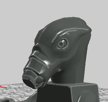
Made a pair of short legs that are dual-moulded half and half (which we don't have yet in LDD). Part number 37679 (via the Mecabricks database, but geometry data is all from existing LDD parts). Feet are decorable. Link Much less useful, but I also made the classic 2003 Geonosian head, based on the model from Lego Star Wars III: The Clone Wars. Has custom collision and correct part number (44376). Link I have a few more custom parts I've made but I'm not sure how useful or desired they are (decorable arches, but they've only been decorated 30 years ago and the decoration texture I made isn't the highest standard maybe, etc). Thanks for all your work!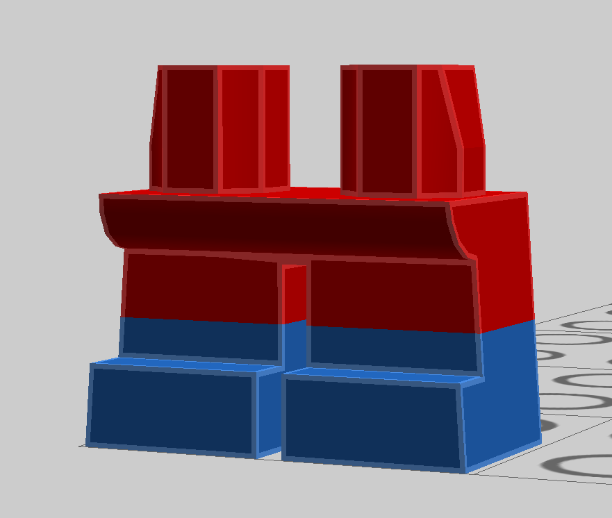
-
Custom LDD bricks and fixes
Qahne replied to Equilibrium's topic in Digital LEGO: Tools, Techniques, and Projects
Would it be possible to make arches 3307 and 3308 decorable? I'll create and share the textures for these two (one used in Dragon Masters, one in Orient Expedition) if you can make the model decorable Edit: The fork of Brick Studio (Brick Editor) actually works on my PC so I've managed to do it myself! Let me know if you want the resources to add to the official release -
Custom LDD bricks and fixes
Qahne replied to Equilibrium's topic in Digital LEGO: Tools, Techniques, and Projects
Would it be possible to add part 44511 - Onion Dome? Thanks! -
Custom LDD bricks and fixes
Qahne replied to Equilibrium's topic in Digital LEGO: Tools, Techniques, and Projects
yep, this was it! thanks so much! -
Custom LDD bricks and fixes
Qahne replied to Equilibrium's topic in Digital LEGO: Tools, Techniques, and Projects
Thanks so much for adding in the classic space crater baseplate I requested! I'm having an issue with the new colours not showing up in the colour selector, even though I replaced all the relevant XML files with the new ones. Is there something else I'm missing or some version issue? I'm on the final LDD version. -
Custom LDD bricks and fixes
Qahne replied to Equilibrium's topic in Digital LEGO: Tools, Techniques, and Projects
In anticipation of the new Galaxy Explorer, would it be possible to add the old crater baseplate from Ldraw? -
Custom LDD bricks and fixes
Qahne replied to Equilibrium's topic in Digital LEGO: Tools, Techniques, and Projects
Hi, would it be possible to add parts 41880 (classic Yoda head) and 44511 (onion dome) please? -
Custom LDD bricks and fixes
Qahne replied to Equilibrium's topic in Digital LEGO: Tools, Techniques, and Projects
I'm wondering if it would be possible to make the standard cape piece dual coloured, ie, one colour for outside and one for inside, or is it too complex a piece to separate like that? There are texture files for deco for some of the capes that are unused, so maybe TLG planned it and gave up. Also, the Rodian head (part 47545) is decorable by default, but there's no textures for it. I made the original 2004 texture years ago using the textures from Lego Star Wars The Video Game as a base, I'm not sure it's up to the quality standards set here, but it shows the UV mapping if anyone wants to improve on it or add additional textures. SurfaceID is 1. ,
-
Custom LDD bricks and fixes
Qahne replied to Equilibrium's topic in Digital LEGO: Tools, Techniques, and Projects
I haven't noticed any other parts that have discontinuous vertex normals, but if there are specific parts you want fixed in a similar way, let me know and I'll get it done :) -
Custom LDD bricks and fixes
Qahne replied to Equilibrium's topic in Digital LEGO: Tools, Techniques, and Projects
I'm unable to get Brick Studio to work on my PC so this is the best help I can provide unfortunately :( -
Custom LDD bricks and fixes
Qahne replied to Equilibrium's topic in Digital LEGO: Tools, Techniques, and Projects
I'm not very skilled with Blender, but I did a quick fix with another modeling program I'm more familiar with. Not sure how to convert it to .g or if it's useful to you but here it is as a simple .obj file. http://www.simfileshare.net/download/2827642/ -
Custom LDD bricks and fixes
Qahne replied to Equilibrium's topic in Digital LEGO: Tools, Techniques, and Projects
I've noticed there's an issue with the mesh for part "67887" , the pig head piece - the vertex normals for the .G and the .G1 part don't match and it leaves a very visible discontinuity between the head and the square around the eyes, could this be fixed? Thanks! -
Custom LDD bricks and fixes
Qahne replied to Equilibrium's topic in Digital LEGO: Tools, Techniques, and Projects
This is incredible, I can't believe how many parts have been done already, not only new but going back into the old parts bin too. Could I please request 2917, 2918 and u609? Thanks so much! -
Modular Building Sets - Rumours and Discussion
Qahne replied to The Jersey Brick Guy's topic in LEGO Town
The classic Main Street had a car dealership, it could definitely be done for a modular. I can almost imagine the curves it would have... -
Modular Building Sets - Rumours and Discussion
Qahne replied to The Jersey Brick Guy's topic in LEGO Town
Great! I always found it weird that they retired it, there hasn't been a similar shade since. The absence of teal really shows in the Simpsons sets, hopefully we'll get some plates and tiles in the future to redo the floors there. -
Modular Building Sets - Rumours and Discussion
Qahne replied to The Jersey Brick Guy's topic in LEGO Town
I really hope another Miami-inspired building is next, to complement DD. I think the time is right for another hotel, personally, but if they're going with a more classic, early 20th century look, something we haven't seen before like a school or a grand old post office would be welcome. Have we ever actually gotten an official school set? As long as it's not another eatery, I'm fine with it. As to the colour on this one, has it been confirmed that it's the same Dark Teal as the old '90s colour, or are we just assuming that it is? Many of the recent colour additions are slightly brighter shades of previously discontinued colours. -
Modular Building Sets - Rumours and Discussion
Qahne replied to The Jersey Brick Guy's topic in LEGO Town
That's a very good point, I just hope they keep the classic faces in production on some line somewhere, it would be a shame to let it be consigned to history. I began getting the impression that the modulars' audience had shifted from just AFOLs to a broader one when DO was released, and I think that's a great thing. I'm very happy that people are buying these for their kids, and that LEGO's other lines are not the simple stacking they used to be. I would definitely say that LEGO has improved overall in the past decade, but there have been a few missteps here and there where they are trying to be more like a normal toy company and fit in with what kids want, which I understand, but I always liked how they stood out and weren't afraid to be different. After the near-bankruptcy they are probably more cautious about that sort of thing and are paranoid about being seen as not cool and see a need to change with the times, but looking at Playmobil and how little they have changed to appeal to a modern audience, despite growing sales, I think it's not as necessary as TLG thinks. -
Modular Building Sets - Rumours and Discussion
Qahne replied to The Jersey Brick Guy's topic in LEGO Town
I prefer the timeless, more stylised LEGO look over the detailed caricatures they do now. History has shown that simpler styles age the best, both in art and in other areas of design. The classic minifig is 40 and it's still a design icon; I believe many of the modern designs or the spinoffs like the mini-doll will be dated in the future. The fact that they've redone their philosophy on minifig design so many times in the past 15 years compared to simply adding parts on to the classic face as the 35 years before (a beard, a moustache, an eyepatch, glasses, etc) is a reflection of a more transient design direction that really goes against the whole appeal of LEGO being a simple, timeless toy to me. -
Modular Building Sets - Rumours and Discussion
Qahne replied to The Jersey Brick Guy's topic in LEGO Town
I disagree that Ninjago City is "Main Street USA" material. Main Street is about the mythical perfect small American town, with neat and tidy storefronts in turn-of-the-century buildings. Disneyland's famous section is the closest thing I can think of to LEGO's modulars, it's like a series of plastic Norman Rockwell paintings. Ninjago City is too exotic for anything of that nature, it's more akin to Blade Runner's LA if anything. -
Modular Building Sets - Rumours and Discussion
Qahne replied to The Jersey Brick Guy's topic in LEGO Town
I actually think it would look more congruous if the tan section were pale pink, personally. Also, now that I think about it, wasn't there a better Cadillac model in LEGO City Undercover? Looking at this one from a distance it looks a little fat. And true, we can change things as we like, but it doesn't mean we should have to. LEGO started including interior details because we complained about CC being empty, and they listened and now detailed interiors are a hallmark of the line. Changing it for no reason isn't a good thing IMO. Surprises can be either good or bad, and when you have a line of products that all share similar features, and you abandon them without a reason, that's a bad surprise I think. If they want a different route, fine, I understand, but don't treat it as being the same as before. If they had a CMF line that was all simple classic figures, people would be mad because they know what a CMF line is and they have certain expectations, and I understand that, even though I prefer the classic look personally. I don't think it's hard to understand why some people aren't happy about this big change. As to blending, these are all designed to be put together in a big layout, I personally think it's important that they manage to look good sat next to each other. In real cities this is often a consideration they have, and the colours here a bit too bright and plastic-y to fit next to the others. It would be better if it were a corner building so we could gradually see the colour get brighter on the edge and blend into more muted tones where it has to connect to the other buildings. -
Modular Building Sets - Rumours and Discussion
Qahne replied to The Jersey Brick Guy's topic in LEGO Town
True, PR had a more European facade, but it used muted colours and a similar complex look that helped it blend. I don't see how Pet Shop is European, always reminded me of Sesame Street really. I would be fine with this if the diner were just on the bottom, but that big streamline tower in bright teal and white really doesn't blend with the upper floors well. They should have gone all in with a Miami style, or just done a normal building with a 50s diner below, this feels like a weird compromise. I'd actually really enjoy a series of Miami inspired buildings, but this is being marketed as a continuation of the classic modulars, and I just don't see that. I do, however, really like the return of teal, my favorite brick color, so I have some praise -
Modular Building Sets - Rumours and Discussion
Qahne replied to The Jersey Brick Guy's topic in LEGO Town
The modulars almost all have a similar architectural language, except for Palace Cinema, they all look like parts of a generic Main Street USA. This is a big stylistic departure, and I can't see it meshing with my current street. And just like PC, it looks a little...flat. It's not what I expected after AS, it looks a little simplified compared to previous ones. If I do get it, it will probably be on its own. -
Modular Building Sets - Rumours and Discussion
Qahne replied to The Jersey Brick Guy's topic in LEGO Town
The bright colours are definitely...different. It looks okay, but it doesn't look like a modular to me. Am I alone in missing the classic face in this line? I always felt it was one of the factors that made it seem more mature. The newer faces and the awful car make it feel more like a mini-modular that''s been scaled up than part of the actual adult line to me.