-
Posts
278 -
Joined
-
Last visited
Content Type
Profiles
Forums
Gallery
Everything posted by sonicstarlight
-
Huge thanks to you guys for the support! It really means a lot to see you rallying for the MOC Expert cause. I decided to cave in and throw my hat into the CUUSOO ring - feel free to vote for this creation here! I don't expect to spam this link a lot so I can't imagine this getting more than a few hundred hits, but I figured there is no harm giving those interested a way to express it. Feel free to share it in any venue you deem worthwhile.
-
Wow, again too many comments to get everyone! Thank you all for the great feedback! Will do. We don't get a lot of volunteers to take the Rockefeller Center window, so it will probably be sometime in the spring. I could try - send me a private message if there is something specific rather than posting in this topic. This is the first time I have ever been able to say that my building almost looks better in photographs than in real life - in low light, it honestly loses a lot of detail. I invested in a better camera since my last creation, which made a huge difference, and tried to get some better light on the building. Photographing a white building on a white background is a delicate process, and I'm by no means an expert. Thank you! I wondered how people got those little tags in their profile and would be honored to get one! I'll admit I don't know how the Taj Mahal domes were done, but if you want to build your own, here is a link to instructions. I had to make some modifications, mostly to the internal structure, which is totally different in order to connect it to the base. I gave a shout out to the creator of that on flickr, although this basic technique has been used in a lot of builds over the years. The dome is actually a lot more stable than the octagonal base it is sitting on. Great points. You also brought up a real reason that most of my buildings would be inappropriate for production - most draw heavily from existing sets. This is essentially Gringotts on steroids, and there is a lot of overlap between this and the Town Hall. My theater is also a long shot, as LEGO put an art deco movie theater in the Town Plan set, which again is what I used as inspiration. It is a bit of a double-edged sword - I want my buildings to blend seamlessly with the official sets, which seems to get a lot of support, but the best way to do that is use other official sets as a starting point therefore making them redundant to what has already been released. I agree that coordination is the key to CUUSOO's success, and like the idea of reaching out to the Ambassadors. I don't want to seem negative to the site, as it is actually a brilliant idea and encouraging to see that it has already resulted in action - I just don't know that it is a good fit for myself personally.
-
This is really lovely! That arched entry is so simple but completely convincing. Good luck on the contest!
-
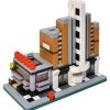
Thanks to everyone for their feedback - there are already too many responses to reply to everyone, but know that I really appreciate all your comments! Also, huge congrats to whomever made me the resident "Sneeze-proof floor specialist" on the forums - I honestly cracked up when I saw that. Several cups from the pick-a-brick walls, two Diagon Alley sets, and hundreds of dollars on Bricklink. No clue on the final piece count, but I wouldn't be surprised if it was in the 6,000-7,000 range because of all the parts needed for the interiors (the hexagonal floor alone was well over 400 pieces). The exteriors are actually not overly complicated, but have a lot of area to cover. I hope you aren't implying that I spent a lot of time before a judge in my life, and therefore know the ins and outs of a courthouse interior. Kidding aside, that octagonal part of the cupola used a lot of techniques that look an absolute wreck on the inside - I actually used tweezers and a chopstick to hold everything in place while assembling, which I'm sure isn't something Lego would condone in an official set. Speaking of... As others have said, the piece count and price point would make this as it stands now the most expensive set in their inventory. I've also had requests to put my diner and theater, another huge set albeit with a much lower piece count up. As someone who has helped with Marshall_Banana's CUUSOO effort with his Western Town, both by voting and blogging it on Brick Town Talk, I have the feeling that it won't even make it to that insanely high 10,000 vote mark, or at least not for years. Not to take away anything the Minecraft people have done, but if that is the only kinds of things that will ultimately result from this program, I'm not sure it is a worthy venue for custom modulars. That said, while I was waiting for my last Bricklink orders to arrive I decided to have a little fun and made version of my diner and theater in the Mini Modular standard - I still need to order the proper bricks to finish it. Maybe I could make and release digital models of mini versions of the buildings I've done to at least give people a chance to make some of my creations at a price point that is more reasonable.
-
I agree that the Town Hall is the odd man out in that layout, but I don't think size alone is the issue. There is something about the level of detailing that just feels... off, in a way, which isn't to say that there aren't some really great things going on with the Town Hall, just that it feels simplified compared to the rest. The fact it is so tall makes you feel it should be the most detailed, the most iconic, and frankly it isn't. I'm a huge fan of them mixing up the sizes a bit, but perhaps their tallest entry would have been better served by something else. Still like the Town Hall a lot more than the Pet Shop, though.
-
B-OM-13D Hello all! This MOC has been a very long time in the making! I started planning this build when I was still finishing up my townhouses based on the other buildings from the Diagon Alley set, well before it was announced that the next official modular would be a Town Hall. It underwent several major changes along the way - I had originally planned to have it only be 32-studs wide and actually had almost the entire exterior built before I decided the proportions were all wrong and redid it as a 64-stud wide creation. It was also to be 3 stories when it was the smaller footprint, and had things like holding cells and a jury box, but I decided it didn't need to be a criminal court and I think everything worked out for the best. When I learned that the Town Hall would be launching this year, I was very scared at first that my build would look too much like it - thankfully once the pictures came out, I saw they are indeed very different. Without further ado, here it is. The building is based on a bunch of courthouses throughout the United States, but not one more than any other. I did draw some inspiration from Borough Hall in Brooklyn, where I live, so the name is an homage to that. On the roof are two large skylights - one over the courtroom and one over the judge's chambers. A detail of the pediment. I am normally an advocate of the separation of church and state, but Moses was just too perfect of a fit not to use. I thought the handcuffs made pretty good scales of justice, and I like the duality of the whole concept. A perspective view of the front. The back is not my greatest work, but it's functional. I originally planned to do a flat roof, so once I decided to make it pitched I ran into a little issue with the overhang. Time to go inside. Here is the ground floor. I was tired of doing square patterns, so I decided to make some hexagons for the main lobby. I originally had something more elaborate and far less stable - after sneezing and seeing the pattern go everywhere, I went with something a little more sturdy. The elevators are loose in the shafts and have ceilings that can be removed to reveal tiled floors, but they don't move through any mechanism nor do the doors open. On the left is a large conference room. The two smaller rooms in that wing are a bathroom and a payphone - truly a relic of a forgotten time before cell phones took over. On the right are offices for the clerks, court reporters, and the like. I'm actually pretty proud of that copier - I need to take a better picture of it. There is also a little homage to Mike Judge in here (it didn't even occur to me how appropriate his name was until I just typed that ) Moving now to the second floor. The balcony around the atrium is a bit tight, but I really wanted it to be a double-height space. On the left is the courtroom. Since there is no jury box, this would handle things like small claims or family disputes. On the right is the judge's chambers. She has a bunch of little statues and trinkets to make the space her own. The stairs connect down to the offices below, which, when coupled with the fact that I have two elevators, makes my build much more code compliant than the Town Hall. The third floor is really more of a mechanical floor for the elevators and a way to let more light down into the atrium - those balconies are not accessible to the general public. Since this building is so wide, I didn't want it to be too tall. Here it is next to the Fire Brigade and Pet Shop to show that the two wings are actually shorter than typical modulars. And finally, here it is with my first MOC, the Modular Market Village... ... and my most popular MOC, the Galaxy Diner and Empire Theater. Thank you so much for looking. Comments and questions are always appreciated! Edit: Forgot to mention there are more photos on my flickr account. Edit 2: For those who prefer Brickshelf, the folder is now live - click here to go to it. I kept the images pretty high resolution when I uploaded. Edit 3: For those who expressed interest, here you go - click here to vote for this creation on CUUSOO. Edit 4: For those who are also fans of my diner and theater as seen in the last photo, you're in luck - click here to vote for that creation on CUUSOO. Edit 5: A few more details of the interiors added below. Here are the elevator cabs - the ceilings are removable but the doors normally aren't. Those doors are the only thing that holds the elevators in place. Here are some shots of the ground floor offices, courtroom, and judge's chambers. And finally, a shot of some of the smaller details, a few (like the phone) not very visible in the other photos.
-
Really impressive stuff! Each building would be stunning if it was by itself, but the way the whole group goes together is nothing short of remarkable. The all have their own identity, too, which is great to see despite having such a similar palette.
-

My new modular - Bakery and Sushi Shop!
sonicstarlight replied to AwesomeTaylor's topic in LEGO Town
Strange combination (I hope whoever makes the food deliveries doesn't mix up his orders by accident) but I like the buildings overall. I don't think I will ever warm up to pink as a viable building color, but you have used it as well as I've seen. Nice interiors, too. -
As always, I gained a greater appreciation of the model when I watched the video. It still has a few awkward things about it (the interiors especially), but I'll definitely be first in line on release day!
-
Nice first modular. I'm usually not a fan of yellow, but I actually like this one - the grey and black elements really even everything out. The interiors are great, too. Can't wait to see the Greek Revival one you are working on - one of my favorite architectural styles.
-
Congrats to all, especially Dix! You had my vote - a much deserved win. The runners-up are all fantastic as well.
-
Really great building. I was toying with the idea of doing a corner antique shop, but never took it further than just thinking about it. The second floor windows are easily my favorite element - I might need to do something similar in the future.
-
Perfect mini interpretation! Clever use of parts as well. I hope you continue with the series!
-
Truly inspiring, inside and out! I've seen a few LEGO factories before, but none with an interior as nice as that. I really like the exterior as well, and actually think the tan works well with the overall composition. Blogged on Brick Town Talk
-

WW Category 2: 1908 Wild West Town
sonicstarlight replied to marshal_banana's topic in LEGO Historic Themes
I was a huge fan when I first saw this, and am absolutely willing to help out in this worthy CUUSOO cause! I've blogged this (again) on Brick Town Talk -
I'm staying away from the whole subject matter controversy and will just focus on the architecture, which is very well done. The exterior plays well with the official sets and for me has the right level of detailing. The interiors are great - I like that each room has a theme but again doesn't go over the top with them. While not the most glamorous thing in the world, that toilet stuck me as being one of the better ones I've seen.
-
I'm normally not huge on vignettes, at least the smaller ones, but I really enjoyed this one. There is a lot going on despite the restrained palette, and I think the use of colors really helps bring it all together. The seating is actually quite clever, too.
-
I think this is the first time I have ever been blown away by a garage! Excellence work, both inside and out. The sign is very clever in the way you used two colors of blue, and the brick-built door looks great too.
-
Great interpretation of the old Town Hall. I was also thrilled to see you put in full interiors, something I never saw pictures of with Jamie's model. Really well done.
-
Excellent translation to the mini modular scale! I am actually tempted to do this with some of my modulars since I picked up the official set.
-
4. Dix - 3 6. Darkblane - 1 10. Priovit70 - 1
-

Corner Shop & Apartments - Modular Building
sonicstarlight replied to brickcitydepot's topic in LEGO Town
I love it! The level of detailing is superb, and the interiors are very clean and well considered. I also give you tons of credit for making instructions for all your builds - surely a daunting task. Blogged on Brick Town Talk! -
For flickr, use the BBCode instead of the HTML on the boards.
-
Nice modulars! The interiors to both are great - I don't think I have ever seen so many functions successfully crammed into 16 wides before. The interior of the comic book store is my personal favorite. For the exteriors, I'm mixed. The butcher is very nicely detailed, and the overall look it great. The skate shop comes off as a bit awkward in comparison. I can't really put my finger on it, but I think it is something about the wall to window ratio that just doesn't quite do it for me. Oh, and I am betting you saw the mosaic in eilonwy77's photostream on flickr - she is the undisputed master of the cheese slope.
-
This is really nice - a little Cafe Corner meets Grand Emporium with the massing, but definitely unique! I for one like the sign, especially because it looks more recent than the rest of the building. Few businesses stay in operation for 100+ years, so the fact that a limo company took over the lease for someone else at one point in time adds a layer of authenticity in a way. I'll echo what someone else here said - my only critique is than medium blue stripe on the second floor. It might work better if it were thinner, line the dark tan pinstripe on the GE, but honestly that is a minor nick pick on what is a truly impressive build.
