
CabooseBM
-
Content Count
592 -
Joined
-
Last visited
Posts posted by CabooseBM
-
-
19 hours ago, Tazakk said:It reeks of "nobody wanted this, but it's some weird contractual obligation. let's get this over with and pretend it never existed"
An understandable reaction to Journey to One, I'd think.
-
I dunno, it seems pretty competent for what it is. The arms are pretty inspired, simple but with some shape to them. And hey, Mixel joints make everything better.
-
I got a third Microfighters AT-AT, because it is ridiculously great.
-
I'm sad I missed the giant scarab set, personally.
-
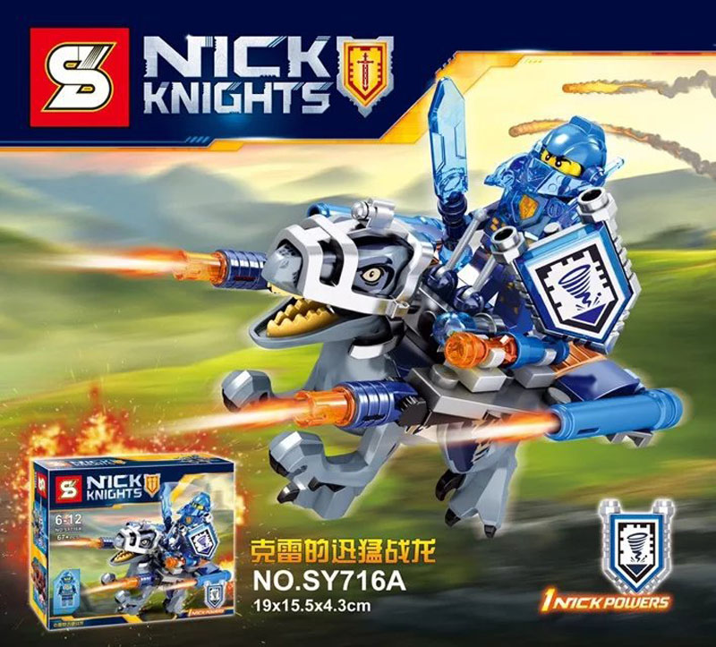
I dunno if I like the big jet much, but everything else is at the lofty heights I expect from Nexo Knights sets. The villain sets are as ridiculous and inventive as I'd hoped, and I like the other two Knights vehicles. The bricks with arms are hilarious mooks, too.
The action sets are neat in concept, but feel awfully same-y in overall design. On the other hand, this is basically what I was hoping the Ultimate sets would be, and hopefully the torso parts are versatile enough to allow customization.
-
Weird, I consider the geared waist torsos to be one of the most intrusive and annoying gear functions I've ever seen implemented. It's one of the many many reasons the Uniters ended up so bad.
-
Speaking of, why does this thing have legs and not treads? =P
But seriously, this set does a good job of capturing that 2001 Rahi spirit. It could use a little beefing up around the body, and maybe a longer tail?
-
I'd love to see 20$ versions of starfighters like the X-Wing and TIE Fighter, while perhaps not scale accurate, I think you'd be able to effectively get the look down. They would also be affordably massable, which is something you just can't do with current TIE sets. Which, I might add, I'm pretty sure is a crime.
I could see the X-Wing, the TIE Fighter, the Naboo Starfighter, and the TIE Advanced given this treatment, as well as ships that have already seen the $20 pricepoint recently, like the A-Wing or Vulture Droid.
(Speaking of Vulture Droids, a highly articulated transformable version would be the bees knees. Easily my favorite starfighter design in the franchise.)
-
...Dark gray shells... <3
And droid friend!
-
Blech, I just cannot agree. They just look so off with actual Lego parts.
-
-More Knights in different colours
-More structures
-Weapons/armour packs
-Something resembling this:

Oh wow, something like that might actually get me to buy one of those stupid lumpasaurs, but hopefully we could get something brick built instead.
On that note, I'd love Chima-Beast style sets, or even little mech suits. Anything small and loaded with Mixel joints, really.
Oh, and lady foot soldiers in a small set would be nice too.
-
Davy Jones style sea monster crew! =V
-
I... I think I need to lie down for a bit, think about my life.
-
But, but..! Bionicle is supposed to be doooooooomed!!!
-
I picked up Storm Beast and man this guy is a lot nicer in person than in photographs. I love the function, and it has a lot of creepy personality.
MUCH better than any given Uniter, that's for sure.
-
Nothing here suggests it'll be any more palatable than the last time I tried this. Pass.
-
So was anyone able to make it through Journey to One or will it's ending be forever lost in a bland fog of low effort cartoon?
-
So you're saying that W16 is the worst just because it wasn't as good as W15? Well, that's... interesting. I thought that being the worst dependend on how bad the wave was, not because on any comparison.
Oh no, it's still bad on its own, but before I softened on the Summer 16 sets they seemed more or less equally bad, so the Winter ones lose out by the additional factor of being crappy updates.
Save for Umarak the Hunter, who actually lives up to his hype, surprisingly.
-
It's a shame these Summer sets are hit so hard with the budget stick, nut the creative functions and nice color schemes definitely make up for it. They're pretty good and make for a good successor to the Skull Villains.
-
Winter 2016 by far. Summer 2016 didn't have a prior wave to fail to live up to in every way.
I hope that doesn't change by next year, but at least the bar's been set pretty low.
-
The Mechromancer is a pretty novel villain concept, and takes up the mantle of 'undead faction' perfectly in the context of Nexo Knights. Good work Takanuinuva!
Do you mind if I have a go at the concept?
-
Man, the Boxor was one hell of a set. =)
-
Ekimu would be 9000% more appealing if he didn't have that gigantic, greebled, single use waste of plastic they call a torso shell.
-
It's true, Bionicle characters are not humans and their proportions do not have to be humanoid. However, that doesn't mean proportional changes are utterly meaningless. Making the shoulders or hips wider or narrower, making the arms or legs longer or shorter... these things change how people see the characters. A character with unrealistically wide shoulders will typically look powerful and burly, while a character with unrealistically narrow shoulders will typically look slight and delicate. A character with unrealistically long arms will often look somewhat cartoonish and ungainly, like an orangutan. Sometimes you might want those things, other times you might not. So the fact that Bionicle proportions don't need to look realistic doesn't mean that the WAYS they're unrealistic shouldn't matter to people. Some people are just more bothered by unrealistically long arms than by unrealistically large hands or feet, and that doesn't somehow make them hypocrites.I think this paragraph does a fantastic job of summing up why people complained about G1 Toa sets since about 2006. Sure, they don't have to be humanoid but none of them looked like they were intended to be that way. Very few G1 sets looked like they had a character design in mind and often didn't tell you much about the characters. 2015 Toa were so fantastic because they were designed from the ground up as characters. Onua is BIG and STRONG. Kopaka is ARMORED and STOIC. Lewa is LANKY and AGILE. Tahu is HEROIC and POWERFUL. Gali is SMOOTH and a GIRL.
Well, okay, that last one isn't as great an example, but that comes with the territory of having only one girl character. This is also why Pohatu seems so bland at first glance. His design doesn't immediately say something about him, so despite being a cool figure he isn't held in high regard. Emphasizing his asymmetry would have done wonders for his design, and he'd really come off as ROUGH and WORN like his character.
In addition, it is this utter lack of thoughtful character design that ultimately brings down the 2016 Toa.
LEGO Nexo Knights 2017 Discussion
in LEGO Action and Adventure Themes
Posted
Pffft, you say that like Dimensions is anything more than License Bait.