
BEAVeR
-
Content Count
1383 -
Joined
-
Last visited
Everything posted by BEAVeR
-
"Ladies and gentlemen, please take your seats. The play the children of our elementary school have worked so hard for, is about to begin. And curtain!" [MOC] Tonight on Stage: Castle under Siege! by Bert Van Raemdonck, on Flickr "Once upon a time, in a faraway kingdom, there was a princess ruling over a beautiful country. She was so kind that everyone loved her. Everyone apart from the evil wizard nextdoor, that is. Ages of obsessing over magic had made him bitter and he couldn't take hearing the laughter coming from the castle anymore. So after brooding for only a moment, with his dark magic he summoned an enraged ancient dragon and set out to take over the castle and lock away the princess... Luckily, when the wizard and his dragon arrive at the castle gate, the princess' bravest knight is waiting there to - ... Uhm, it appears our brave knight is nowhere to be found... Excuse us for that, ladies and gentlemen, our children spent so much time working on the set that they didn't get to go through a full rehearsal. But - aha - I see that the princess is taking matters into her own hands! She seems to have realized that one thing is true about dragons that's true about all of us: they get in a much better mood once they have a filled stomach! So with one of her famous home-made cookies and her general kindness, she manages to appease the dragon. So everybody ended up living happily ever after after all! Including the wizard, because the next morning he found a box of fresh cookies on his doorstep, courtesy of the princess!" [MOC] Tonight on Stage: Castle under Siege! ... behind the scenes by Bert Van Raemdonck, on Flickr Thanks for indulging me in this build that's quite different from what I'm used to! I was pushed out of my comfort zone thanks to a contest on instagram where the assignment was to build a castle in a week's time. Knowing how I build, there was no way I would be able to finish a castle I was happy with in that amount of time, I got the idea of just building the facade of the castle, thinking I could get away with it if I framed it as a stage set build of cardboard, wood, crates and pallets with visible supports and ladders at the backside. Turns out it worked, as the jury selected my build as the winner! This really is the first time I did a castle build and I enjoyed it a lot. I love the fact that I can bring some architecture into it but that I can exaggerate the shapes, proportions and details to make it look fun. I started from the masonry pattern on the walls which you don't end up seeing much of in the end. The technique actually was pretty simple even though it requires puzzling some pieces together. Every row of bricks is basically a stack of 1x1 plates, 1x1 bricks with side stud(s) and 1x1 plates with clip light. A row of tiles is attached to the side studs of the SNOT bricks. At the back side, the 1x1 plates with clip light attach to each other in a column of 1x1 plates and 1x1 round tiles with pin. I meant it to give texture to the wall in the same way painting a stage set would and am glad I was able to pull it off. If you're interested in more details, feel free to check out the digital .io file. From there, it was playing around with the building blocks I had to create a fun castle. In the end, a friend suggested to add a dragon and that's when the story took shape. Considering the time I didn't go for an epic dragon build (maybe one day?) but instead for a cutesy dragon custom puppeteerd by two people. for how quickly it came together, I love how much character it has! Thanks for having a look! Maybe not the kind of castle you were expecting to see today, but I hope it makes you smile! ___________________ Find the digital file here
-
I knew somebody else must think of those hardhat pieces as robot eyes ! But I don't think anybody but you would look at those flex track pieces and see a decorative element! Really a stroke of brilliance to use them to get the most out of a cramped area. I love the fact that you don't use it as just another mechanical detail, but as something that really tells part of the story. Reading about this meltdown and radiation I immediately visualized things melting and bending, and that part with all of those curved features that look like they once were straight is perfect for that! Add to that the color palette, and I can really see the heat coming from your creation. Maybe a cool thought would be to also add some transparent pieces or darker pieces to suggest parts of the surroundings that are damp by steam or something like that (and would be a nice link to how those crustaceans might survive...)? Anyway, thanks for the great scene and for putting the flex track pieces in the 'to be used ina future MOC' category in my head!
-
Wow, I love how these guys look! You've managed to keep them at a small scale so those helmets fit right in while still making it look very detailed and coherent. At this scale, every brick matters and you manage to get the very most out of every brick to make it look like a real suit of armor with a lot of Star Wars flair. What I'm impressed most by, is how you realized the angle at the knees. Structurally, it might not be very complicated, but the placement of the hinge is exactly right so that for example those binoculars slide along the 2x2 round tile perfectly and that at the front you get a gap that is just the right size for being perceived as a detail rather than a fluke of the build. In general, it really looks like the armor consists out of a lot of different pieces, but that they all are held together securely. And that from every angle... The best way I can describe this build is as it being really 'tight'. Nifty! I would love to see these in some kind of diorama, for example in an urban setting doing some crowd control. Or maybe finally giving those Ewoks a worthy opponent!
-
Very nice! I love the fact that you use the micro scale to your advantage to create a really "big" and dynamic chase scene with those buildings and great posing of the speeders! I also had a look at your previous version of this MOC and the changes your made especially to Zam Wesell's speeder are such a leap forward. By swapping the large wedge-slope bricks with a stack of wedge plates and tiles, you slimmed down the speeder and made it look a lot faster. Another advantage is that you could balance the colors better so it looks like a killer paintjob. Maybe you could make it even more aggressive by using those 1x2 bows with 45° cut to get sharp points, but I'm not sure those would blend as well with the rest of the body. Another thing you could do is to make the slope of the prongs less extreme so they remain thinner for longer (by using for example 1x2 wedge plates). You could even use a corner tile with cut corner to get the side window shape closer to the original. As for Anakin's speeder, those cuarter circle tiles are a sharp looking improvement! I wonder if you could also use similar tiles (or maybe the stadium tile variety or those tooth plates) to emulate the two bumps behind the passenger's heads. That might help making the passenger compartment itself look relatively bigger. Oh, and one more thought! I wonder if you couldn't find something with even more texture for the front cylinders of the speeder. A part that popped into my mind was the printed head of the IG-11 minifig... Anyway, great micro's for in a fascinatingly big micro lay-out! I'm guessing these are a lot of fun to zoom around!
-
If certain stories are to be believed, you should forget about Gagarin as world's first astronaut altogether. He was a couple of hundreds of years too late, you know, because that's when Wan Hu took to the skies. Wan Hu had no Vostok rocket at his disposal, but he could get his hand on dozens of small Chinese firework rockets. He tied them all to a platform with a chair and let his servants light all the fuses at once. A couple of tense moments later, he had disappeared in a huge explosion of fire, smoke and noise. He was never seen again. [MOC] Wan Hu, World's First Astronaut by Bert Van Raemdonck, on Flickr Obviously this story isn't true and it isn't even an ancient Chinese folk tale - it's a lot more recent than you would think - but Wan Hu's attempt at spaceflight is a fun story that sparks my imagination. And the visual of a man with his gaze fixed on the sky blasting off with a big explosion, while he's just relaxing in his lazy chair really speaks to me.That's why I chose to depict Wan Hu and his makeshift spaceship for a local contest with as theme: "build the spaceship of your dreams". I loved the challenge of having almost no reference to work off - you'd be surprised how little comes up in an image search - so I could let my imagination run free in the design of the launch vehicle and of its rider. Since Wan Hu is a fictional character and not really a part of Chinese folklore anyway, I did not feel too obliged to follow historically accurate images and just made something up based on some images of Chinese philosophers I found. Once I figured out that crowbars make for a really nice moustache, the head came together really quickly although it has studs going in all directions. The body was a joy to put together and get all those nice curves in without having to do too much puzzling with the chair kindly hiding some scafolding. The chair itself is heavily based on the one I was sitting on while designing it! One thing about the contest is that it only ran for one week and I only found out about it three days in, so this was probably the quickest build I ever put together. I did finish just in time, but the last parts I put together were really rushed so they were not up to par with the rest of the creation. So now, a couple of months later, I want back to touch some things up. For the figure, all I changed was its backside so it looks decent from all angles. I did completely rebuild the platform with the rockets and their exhaust though. This process took a lot longer than the initial five days because of all of the weird angles for the rockets and the smoke, trying to make it dynamic while eliminating all of the gaps. The mess of clips, bars and ball joints is just out of sight but I did manage to keep it somewhat reasonable on the inside. For my standards, that is! My main goal was to convey a sense of energy, power and speed. A couple of Wan Hu's strands of hair are blowing in the wind and he's holding on for his dear life to keep everything in place. The ropes are barely keeping the rockets in check and some of the floorboards have given way because of the huge impact of the explosion. Combine that with some dramatic framing and lighting and the exhaust smoke in which I tried to capture both the initial jet of smoke with the billowing once it hits the ground, and I hope I achieved my goal! So I hope you felt the excitement in the build! Thank you for stopping by! Any feedback is appreciated, but anyway I hope you have a great day in which the stars seem closer than ever!
-
Thank you all for your amazing feedback! It feels great to be a bit more involved in the community here again. Not sure if more pictures will give more clarity, but you can have a look at the digital models (both for studio and LDraw) here. Then you'll spot all my dirty secrets I tried to hide in the pictures , but as a bonus you can also see the first version I made in the io file. The main idea of the exhaust/support is that it's a sandwich of plates on their sides. In between this sandwich, there's a bunch of clips and ball joint plates as attachment for those claw, bar and ball pieces to connect the domes. At the top, there's a whole bunch of socket plates with axle/ball joint parts in them, to which ultimately the technic axles are connected. The idea is that some of them slot into the bases of some of the rockets and while the others just serve as support without actually connecting, but just by serving as a resting point. That's the idea, but to be honest this is really a pain to build digitally where you tediously need to angle all the joint manually and nothing self aligns. So I gave up after finishing one of the smoke plumes and just mirrored it to the other side . But I think the idea is solid enough. I've seen some builds balancing on more precarious supports...
-
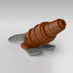
Yes, the trade-offs are never-ending! The only solution I still see to get rid of the stud would be to use those amphitheater tiles (24246) to cap things off nicely. But you would have to give up that stud representing the end of the cannons. Unless you use part 4590, but that could be a bit too deep and I'm not sure how well it would line up. Anyway, thanks for indulging me thusfar!
-
Totally understandable that you already thought of all the things I suggested . I really like your update, especially with how the canons now flow so nicely into the back of the ship! If you would flip the direction those 1x2 plates with rounded ends are facing and connect them to the clip light using a 1x1 round tile with bar, you would loose the gradual connection, but it would allow you to use a tile instead of the antistud we see now and it would get rid of the extra studs visible in the back. Not sure if it would really be an improvement. Finally, have you considered using a 1x2 ingot tile instead of a regular flat tile to cover the cockpit? It gives some nice shaping on the sides (although you will end up with a bit of a lip at the front of the cockpit. And as a bonus, the moulding of those parts is such that they have some rectangular dimples which almost exactly match the roof window of the cockpit, so you wouldn't even need custom stickers then. And I will remember that posing stand technique! That Bionicle eye element makes for a really great foot too. Evokes ice and speed to me, perfect for this model!
-
Hehe, building these micro scale vehicles really is a lot of thinking about every single piece, right? To my feeling no. 4 looks the most "right". You call it chiby, but if you look at it, so is the original model I would say. I also really like that rounded 1x2 plate behind the cockpit that beefs it up a bit. A couple of years ago, I was also trying to work something out with those small Technic wing panels, have they have that cut angle which matches the nose shape of the snowspeeder. It didn't work out for the scale I was going for (just a bit smaller than you here), but maybe it's a part you might be interested in checking out to, just to give you some more options . As for the back, maybe it is possible to take two of those 1x1 round plates with bar, put those bars in a couple of studs, turn them out and use some 1x1 round plates to crate the grill effect. I have my doubts the geometry would work out, but the advantage would be that you would have some studs on the side to attach some cheese slopes to fill up the space between the grill and the wings. And as a final thought, can you shift those 1x1 plates with clip light one stud forward and do the wing attachment using a 1x2 plate with technic pin hole? That would create a really nice gradient in radius to replicate the cannons more. Plenty of ideas to go to version 12 and beyond But even if none of it would work out, the versions you have look amazing already and would give wonderful life to any diorama!
-
[MOC] MINIs from Clone Wars - 10 models incl. NEW Turtle Tanker from Brothers arc
BEAVeR replied to obijon's topic in LEGO Star Wars
I love these! I've always had a soft spot for micro builds and yours do a wonderful job of scratching my itch! Some micro builds really revolve around some kind of crazy parts usage that makes you think "that's really cool!" but quite often they are just a gimmick and the actual shaping of the vehicles are very approximate. Not so with your tiny vessels that very cleanly capture the essence of their larger counterparts. You really make it look easy and at no point was I under the impression of "he had to make that compromise because it's a micro build". No, everything fits together wonderfully and you paid attention to every possible angle of your builds. For example I really like how neatly the wing of the Twilight folds fits so snugly when it is folded and how that plate with handle comes from an angle you don't expect. Or how the cheese slopes on the Trident perfectly follow the contour of the bottom cone. Or how you took the effort to create that continuous blue stripe accross the center of the Hyena, no matter how much more difficult it makes the structural challenges. And of course how you captured the gentle slope of the fuselage of the Y-wing, a technique you would normally only see in UCS scale models but that you managed to get down to this small scale. Very nice stuff! Your builds also work very inspirational. When watching them, I immediately had some thoughts to just maybe improve them a bit more... - For the Twilight, maybe you could use a 1x2 plate with the handle on the long side and with two supports in the middle instead of the 1x2 plate with door rail. Those supports would mimick the kind of fins you see in the "mouth" of the reference vehicle. - Also for the Twilight, you could replace the 1x1 cheese slope with a 1x1 tile and instead place the cheese slope one brick more towards the front of the ship. That would replicate the shape of the ship more accurately, I think. - For the Trident, it could be cool to use one of these 1x1 tiles with Arkenstone print as a cockpit, or one of those now 1x1 round jewel tiles from Dots to make it look more mechanical than organic. - For the Y-wing, you could use these 1x2 curved slopes with 45 degree cut on the rear fuselage to suggest the diagonal shaping and coloring in that part, tying in nicely with the head of the ship. Also, any particular reason you used that grey grill tile? It doesn't appear on the source model, but I agree that it does give some more interest to your model. - For the Hyena, that could maybe be the perfect opportunity to use the new macaroni tiles to smooth everything off. The body is two plates thick in some places already, so it would make it more uniform. Maybe some extra toughts to add to the great number of awesome decisions you already made to create these gems. Keep'em coming, please! -
Sweet creation, it definitely screams Kenner (and even a bit of Gerry Anderson!) to me. It seems a bit too wide for that cockpit bubble, but I really like that rim with the beveled edge that gives a nice clean shape. Also the presentation is quite effective with the shades of brown perfectly blending together. I like the jagged edge at the front, but it's a bit jarring that this isn't continue at the side, where you have a perfectly straight edge on the base. Still, it looks great and I have no doubt it fits in perfectly on your shelf! I would love to see some more pictures, so let me help you with uploading pictures. First of all, you should know that for an image to be displayed here, the picture should be hosted somewhere. The post you make doesn't automatically contain the image data within itself like an image you paste in a Word document. Instead, it stores a link to an image and retrieves the image from that link when the page is loaded. So you should upload your picture somewhere. Right now, it seems like you uploaded your picture here on Eurobricks. You can do that, but Eurobricks is not a dedicated image hosting website as you have noticed, with those restrictions on file sizes and all. So best thing is to create an account on a dedicated image hosting site. you could try Flickr which has a thriving Lego community in its own right, Instagram which seems to be growing more popular with AFOLs these days or something like Bricksafe, which is just a place to store Lego images and nothing more. And there are of course more sites you could use, but if you want more dedicated advice, you should ask that in the general discussion forum and not here. Anyway, whichever platform you decide on, if you've uploaded a picture there you should get a link to the image somewhere and then you can just paste it in your post and it should turn into an image (if that doesn't work,try the "insert other media" button at the bottom of your post window and paste the link (the actual image URL, not the page URL displayed in your browser bar) there. I hope this helps and that it enables you to start sharing more of your sweet creations!
-
Quite simply, this kind of construction was what I was referring to as a minimal modification to your original design. Other types of robot/skeleton arms work well too. Since you are just using the pin hole of those Technic bricks, you could just as well replace them with ordinary 1x1 bricks with stud on the side. Using a headlight brick can even bring the grey bows closer to the center without colliding with the central ring. And the extra studs that come available then might be used to attach something to to fill in the gaps between the legs to make the bottom half feel more like a sphere again, but I'm not sure whether such a thing can be done. Anyway, I hope it is clear now and that it might be of some help to you. Rebuilding part of your creation also made me appreciate some new things like how you managed to attach the spheres on both halves. Good stuff!
-
Hehe, that really looks like an official microfighter! The shape of the sphere indeed looks great, and I like how the ridges in that rim piece look like the texture on the real deal. You could even say that those exposed studs on the top are meant to represent similar features you can see on the versions that appeared in the Clone Wars, so that's not bad at all! My favourite thing about this creation, though, is how the Neimodian and the battle droid sit in it: they just look so happy to go off on an adventure in their wacky spaceship! Definitely the thing that has made me smile the most today! I like how you attached those landing supports because those Technic pieces also do a great job as extra mechanical detailling down there. Still, I'm convinced that you could get even more detail in, I even tried it out in LDD. If instead of that 1x3 Technic piece and a cross axle you use a Technic half pin with stud and put some plates on top of that, one of them being a 1x1 plate with handle, you can also connect those legs and suddenly you have an extra bar to put some details like droid arms or legs (actually those legs of the Grievous figure would be a great match in terms of shape, but I think they would be a bit too big) there to really fill it with details. Also, on the top you could maybe add a binocular piece or some more special pieces than the standard bricks you used now to make it read as small details more. But anyway, a lovely small build! They really look great in that aerial shot you posted above!
-
[MOC] Star Wars THE MANDALORIAN - The streets of Nevarro
BEAVeR replied to KevFett2011's topic in LEGO Star Wars
Wow, that creation is intense! I love how alive it all looks: none of the figures seem to be deliberately posing, but it just looks like a snapshot from real life, with the Trandoshian eyeing the Mando to see if he can sell him something and the saleswoman keeping an eye on the cloaked figure while the Jawa might use that moment of inattention to snatch something away... You've made a creation in which stories really come naturally, which rewards a good look! But that only comes after you've appreciated the extremely rich textures going on in your build. I love what you did for the ground: it feels like a very refreshing technique to me with such a great variety of parts that still looks cohesive when you squint your eyes. Great idea to also bring in some variation in height to give it detail in all three dimensions. And perfect work on the coloring: it's not a random mishmash, but the colors are grouped and at the same time organic, creating some really nice shapes in what would otherwise be just a flat plane. There really is a lot more to it than meets the eye! It's good that you've differentiated the textures on the buildings from that of the ground, but I still think the contrast is not big enough. Right now, you have the problem that everything really blends together and it's very difficult to make out shapes or to figure out what the focus of your build is because it all feels very similar. In fact, you could see that as a compliment because in the show it's exactly the same, them using the grey uniformity to create a very drab atmosphere. Still, I feel your MOC holds some more potential. I wonder what would happen if you would make some smoother border along the bottom edge of the building and the arc, a kind of clean slate to lift the texture of the wall away from the ground. That way, you would have a clear separation between the two entities which could make it more pleasing to the eye. Some buildings in the show also seem to use this trick. Another advantage would be that the smooth areas that now jump out unintentionally because you had to use smooth parts in those places (like the angled sections of the wall or the big arch pieces), would look more intentional. Maybe another idea would be to steal another trick from the show. I see quite a few images with similar buildings that have a base that is more angled that the rest of the wall. This is interesting, because they the lighting in the shots makes it so that again you get a lighter band separating the building from the ground. So experimenting with some more angles and some more directional lighting could maybe also give you good results while you can still add textures. I hope you can think about these tips to make your next build even better. I'm looking forward to the next chapter in your Mandalorian adventure already! Keep it up with the excellent work! -
Death Star Detention Block AA-23 with Prisoner Cell Diorama MOC
BEAVeR replied to TheCreatorr's topic in LEGO Star Wars
If I had to go to prison, I hope it would look as nice and clean as your diorama does! You really manage to pack a lot of things in without it feeling too crowded or messy: everything has its alloted space and room to shine. For example, I love how that central command post stands on its own small stage, which really pops from the floor which is both a different color and a different texture. That makes it a very clear focal point in your build, and rightly so, with its interesting way of constructing the consoles (great how you used those 1x1 brackets both as a structural element and a way to give some interesting color patterns). The focus on the central command post is also helped by the fact that all lines point to it: the corridor, the angled doors and walls, the turbolifts, the camera and even the minifigs in your example scene. Of course it's like that in the source material as well (and moreover it makes sense, as real prisons often mimick the same layout such that the central post can overlook all corridors at once), but the fact you picked up on that and managed to maintain it in a simplified, cutaway build, speaks of your attention to detail. I saw you made a design sketch of this model on Flickr, and to me it really shows that you put some careful thought and planning into creating these scenes! I don't think there are many improvements that you could possible make to your creation, but maybe there's still one thing, and that is that the textures in your model feel a little bit flat to me here and there. Using the grill tiles for texture on the floor is nice, but they cover a large area and the same part returns in two other forms in your build which make that particular texture a bit too repetitious. An additional pattern on a different scale in the floor could break things up a bit. For example, in the movie you see that actually the grilled appearance of the floor has been divided up into several sections with some rather thin black stripes in the perpendicular direction. Another example is the smoothness of the walls. On some places you addressed this with some slightly inset panels into the walls, and those sections are amazing. But they also result in the sections that don't have it and are just bare (mainly behind the doors and in the cell) to look flatter in comparison, which could be improved by also adding inset sections or even just by including some textured bricks. Now, they have the same texture as the black outside of the build (the surfaces that are not actually part of the scene but really are the cut-through section), which make the outside and inside flow into each other instead of offering a clear division between focus and "behind the scenes" parts. This could also be improved by making the transition between the dark grey and the black around the central gate of even thickness to really reinforce the cut. I find it really difficult to explain what I really mean and that's because it's something subtle. Something so subtle that it hardly takes away of the wonderful achievement of your build with many great touches, like the texture around the turbolift doors or the fact that you managed to tile off the top of those lifts so neatly. You're definitely a craftsman, so I hope you continue designing these great sets! -
Great job, The_Tinkerer! Personally I'm a big fan of how worn out the original Y-wing looks, but I'm glad you didn't because your redesign is an absolute treat! I love that you did way more than just cover up the naked bits and really made the design our own. You switched the proportions around, made it a dual person cockpit (finally someone to man those guns!) and made everything look a bit sharper, right up to the engine nozzles! I really love the diamond shape you managed to get in there which plays really well of the printing on the cockpit and carries through in the V-shape at the back of the ship. Maybe making the front of the cockpit pointed rather than flat as the original would emphasize this point even more. Also, using round bricks or plates rather than the high panels to make up the engine nacelles could allow you to continue the shape of the blue 2x4 double wedges in the back. You already carried their shape through beautifully with those cheese slopes leading downward, so if you could continue it into the nacelles themselves, that would really make that work stand out even more. Also, something fun to experiment with could be to replace the white domes with an one of those car hood elements to really glue them to the body of the ship. The domes work well in the original because they stick out, but because of the tapering of your main body, the inside part of the dome is squeezed in a tight space in your creation. Really having it transition into the main body therefore would make your ship look even sleeker without betraying the original design. In the end, you made a great redesign of the Y-wing that easily outclasses the Resistance Y-wing we got in the end. It's a perfect blend of faithfullness to the original with the general iconic shape and precense of panels and details on one hand, and fresh and original shaping on the other hand. It's a new classic, and all of that without fancy parts or techniques. You really are a gifted designer! As for the pictures, I helped you out. For more information, check the spoiler below!
-
one silly question about builds... (pieces inside invisible parts)
BEAVeR replied to macaron35's topic in General LEGO Discussion
Hi macaron35, I moved your post to the General LEGO discussion forum because I don't think it is Star Wars specific. As for an answer to your question, I jdubbs already gives a very valid reason. Sometimes, there are also structural differences where using smaller parts actually results in something stronger than with bigger parts (e.g. using a stack of 3 plates rather than a single brick). Also, LEGO tends to avoid having parts that look similar in the same color or the same part in similar color in order to make it easier for children to find the right part, which could also affect how things are arranged (e.g. all 1x6 plates are black and all 1x8 plates are tan). Finally, in more complex builds, they tend to hide colorful bricks in certain patterns on the inside which acts as landmarks: they help to orient the build in the right way and make it easier to spot on which studs exactly to place the next part. But even then, often I find myself asking the same question as you do when I build something! -
Phew, what a relief! For a moment I was convinced that either you or me were suddenly going color blind or were suffering from some acute memory loss. Because that's not the color scheme I remembered the Ebon Hawk having! I should have known this wasn't that ship though, since you put an interesting spin on various aspects of it! Because while you adhered quite closely to the shape and even to the interior layout, you went the extra mile with the detailling. I love the color scheme you have going with the thin green stripes (any reason why at the back of the ship it is thicker? Maybe two thin stripes separated by some white tiles would have increased visual coherence even more?). You also did good not connecting them together in long, broad strokes, but letting the lines end in full view. I'm pretty sure that otherwise that trend would have been impossible to continue along the curved back of the ship. Now, those shorter stripes over there don't stand out and like like a conscious design decision. Probably the best thing about the multitude of thin, short stripes in your color scheme, though, is the fact that it is echoed in the other kind of details you used to make the ship look interesting despite the relative absence of color and greebles. It's echoed in the texturing with all those tiles. The patterns created by the pentagonal and triangular tiles are a real highlight of this build. They create a very rich yet subtle texture that's integrated beautifully. The diagonal lines are not without precedent because there are other angled parts in your ship (nice touch by the way installing those circular pieces underneath the central turret at a 45° angle to reinforce this idea and to line things up perfectly!). And the delicate grooves are not drowned out by an overly present color scheme or busy greebles. On the contrary, they are complemented by the restrained color scheme, the thin greebles and even the complementary selection of decorated parts. And if you look even closer to the ship, you see those grooves lead into even finer textures, created by the 1x2 and 2x2 tiles you carefully arranged around the hull. I'm truly amazed at what you present here, with these descending levels of details that draw my face ever closer to my monitor. They give a great sense of scale to the ship too. You really prove that you don't need any fancy greebles to make a ship look big or interesting, and to me at least that's quite the innovation! While the texturing is secondto none and the interior is just so pleasant to look at, I must say that I'm not entirely convinced by the shape of the ship. It feels a bit flat to me in some key areas just like the original. It doesn't really have a distinct in-plane silhouette. Of course it can be argued that's not as important, but if you're looking to improve your build, that's the only important thing left to reconsider I think as it will give more depth to the shape that will only reinforce the depth in the texture if you do it right with some delicate shaping and clear shaping. Maybe you could increase the height of the mandibles flanked by the green stripes so they protrude more and then slide into the rest of the hull. Maybe you could just raise the green stripes by a plate or a brick to keep it light. Perhaps lower the section between the engine nozzles (great way to achieve that V-shape with those new pieces!). Either raise the section with the large macaroni bricks on the side of the cockpit or make a circular or angular cutout in the pannels surrounding the windows in front of it to integrate the two parts together and not let them clash at their border as they do now. And try to do something more interesting with the shape of the cockpit and the windows than just a flat box. Maybe give it some kind of protruding jaw or go for angular shapes around the windows. These are all examples of rather small modifications, moving things by a brick here or there (which maybe sounds trivial now, but maybe is difficult to integrate with the interior?), but I think they can make the difference. They can turn your creation from a flat drawing into a bas-relief which will gain in depth because of the textures. Hopefully this amazing build is a sign of more masterful creations yet to come. I just hope those will be good for my health. Because this creation might not have led me to believe I'm color blind or have amnesia in the end, but I had promised myself to keep it short and go to bed early today. But that's a bit of sleep I'm glad to have lost on your creation!
-
[MOC WIP] UCS? - The Punishing One / JumpMaster 5000
BEAVeR replied to PixelProtectors's topic in LEGO Star Wars
Wow, that's going to be a huge project! You have not chosen an easy scale to build this ship when it comes to the outside (I'm especially curious whether you will be able to make the wings stable enough),but it does give you the freedom to build a nice interior and in that area you already shine! I like your choice of color palette. It's very restricted and industrial, which gives a bit of a bleek feeling, which is actually pretty common in Star Wars ships (looking at you, Millennium Falcon!). Maybe to give it a bit of a distinctive flavour, you could also add in some touches of (dark) red. That will go nicely with the exterior and will also make the curtain of the bathroom refresher (which is a very nice technique by the way) jump out less. Not that I imagine Dengar to be a great interior decorator (although you never know, he did put in a nice sofa), but it would add some more visual interest. Another way to add more interest, this time on a level of texture rather than color, would be to break up the monotony of studs on the floor with some tiles here and there. Not everything has to be tiled of course (how are you going to attach figures then?), but you could tile certain areas more, like you did with the refresher area, or you could maybe have a strip of tiles running along the length of the ship like a kind of walkway, or maybe just at the edges with the walls, a bit like how you lined off the hatch with those tiles, which instantly makes it pop! In any case keep it up with the nice structured distributing of color rather than scattering it about in randomly in tiny blotches to keep things from blending together visually. And definitely keep it up with the great detailing such as in the cockpit (that technique for angling those computer screen just works so nicely!) or in the engine room with those lovely pipes peeking through the grating (I'd love to see even more pipes added to it to give it more depth and detail). You really manage to make those cross sectional drawings of the interior come to life! One thing I do wonder about that drawing and about your creation is how this interior layout can be married with the pronounced notches in the exterior of the hull though? Are you going to build so high over the rooms that you have constructed to allow for those notches in the hull? Are you then also going to add a second floor of interior? Speaking of the exterior, that's where the real big challenged of a build at this size lie. The thing with LEGO is that it is really easy to build curves at mini scales (tiny parts with intrinsic curvature), midi scales (smaller bows and rounded plates), normal scales (larger compound bows) and super duper huge scales (brick bending, hinging various sections, sculpting). But in between those regular set-sized ships and the really huge creations, which is where your creation is going to drift somewhere, there simply are not that many techniques to create smooth curvature, especially of compound shapes. I think the most frequently used technique is to use hinged panels consisting out of wedges, like used in the Death Star II UCS set back in the day for example. There's really a lot of fitting involved, the results seem to vary in effectiveness, and structural integrety probably won't be all that great. I spent some hours yesterday trying to recreate the shape of the cockpit roughly at the scale you'll be going for with that technique. It was a lot of fun and I spent way more time on it than I had planned, but in the end I didn't really get anything satisfying that would integrate very well into a larger model, I'm afraid. So my advise would be to more or less follow the technique you've established (working with panels but keeping it mostly square and adding some wedges on top to suggest the shape), althouh you could make it a bit more involved in certain key sections like the nose (here you might be able to fit some compound slopes with some (ball?) hinges). One thing that could definitely make it more easy for you to achieve more or less the right shape, is to drop the requirement of a transparent cockpit. Leaving the glass out will give you a lot more freedom in terms of shape you can pull off because you don't need to fill in the gaps. Alternatively, using black pieces gives you a larger assortment of shapes to choose from which will make it easier to fill in the negative spaces. It's a big creation so I wrote a lot . Hopefully you find it a bit useful and I'm looking forward to seeing this project evolve over time! -
Subject: Review TIE-Lamba MK II Report by: BEAVeR, Imperial Regulator Report directed to: Veynom, Sienar project lead engineer Remarks: Following points of attention on the MK I have been adequately addressed on the MK II design: - More aerodynamic shape, especially at the top, to improve stability on flying in atmosphere achieved by enlargin the entrance hatch. Added benefit to facilitate access to the cockpit with larger maintenance equipment. - The exposed structural elements at the back in the MK I have been sealed under a cover to improve resistance to corrosive influences (known issue on bases located on Exogorth-infested asteroids). - Sleeker color profile to look more intimidating in propaganda. Verdict: Accept the current design for an initial batch to be tested in the field. Expect more orders afterwards. Meanwhile, it is suggested to look into the continuing weakness of the connection between the cockpit and the wing assembly. Not as a bug to be solved, but as a feature as this would be a suitable place to install an ejection mechanism. __________ Off the record, Veynom, now it looks even better! I especially love how you managed to improve the shaping of the cockpit by braking away from the mould and making it into something unique. Not only does the new version look smoother, there's also an increased organic asymmetry (not left-right, but top-bottom and front-back). That really makes look like a more evolved, refined and modern version of the classic TIE of which all variants have a perfectly spherical cockpit. And it's a great match for the more alien-like silhouette of the craft as a whole. Maybe that's something to exaggerate even more if you ever plan on fully designing a TIE model of your own imagination...
-
Thank the Force for the Mandalorian, because thanks to it we get amazing builders such as you back into building Star Wars MOCs: welcome back! And what a return it is with such a nice creation! When you look at it, the particular architecture or arrangement of the source scenery is not very interesting by itself, but you manage to make it look exciting by capturing the atmosphere perfectly. The buildings all look alike, but they feature some different techniques like the different ridges everywhere, which makes it a treat to look at. Also, for me, you strike the delicate balance between gritty texturing on one hand and readability and smoothness on the other. The ground has just enough studs to make it look textured, but not too much to make it into a bland base plate. What sells it is that the studs are in clusters rather than distributed evenly. Besides the studs, the tiny gaps between the pieces (both in the ground and in the walls) give everything some more texture. I love the inclusion of the longer SNOTted plates in the base. I guess they are there purely for structural reasons because otherwise you would have gaps? Whatever the motivation, they give some extra lines that actually look a lot like lines created by the wind in the sand to me! Maybe that would even be more pronounced if you would use tiles and maybe misalign them in the vertical plane... It's surprising to me that you made the entire ground on the same level, with no areas that stick out by a plate or two as we see in all other creations, and that it works so well to evoke just the right level of roughness (not ever place has huge pits and bumps after all!). That also carries over into the area right in front of the central gate, where the white floor has slowly been covered by sand. No enormous dunes, but just sand slowly crawling its way inside because nobody bothers to keep on sweeping. It really is a subtle kind of roughness... It's amazing how you can innovate landscape building with nothing but plates and tiles like that! Awesome job as usual, markus! Look at me geeking out at how you built the sand The only comment I have is that the action with the minifigs does not look every intense or dynamic to me. Of course there are limitations to what you can do with minifigs, but to me all the fallen minifigs just looks as if they are taking a nap... Maybe here you could use some small plates, tiles and slope to create some heaps of sand next to them as if they fell very violently or something like that. And maybe here and there a minifig ducking for cover, or in a more pronounced sprint pose, instead of casually walking closer by... That could maybe fill this fantastic scene of yours with even more excitement!
-
[MOC] These aren't the droids you're looking for
BEAVeR replied to A_Goodman's topic in LEGO Star Wars
Wow, you really surprised me with this creation! At first sight I thought this was just an impression of that famous scene to have a nice backdrop for the landspeeder. But then I took a look at the actual scene in the movie for comparison, and I must say I was not expecting things to line up so well! That moisture evaporator is in exactly the right spot, and in the movie is placed behind a buttress as well. And in the exact shot where the trooper says "these are not the droids we're looking for", you see a man walking towards the camera that looks quite a bit like that figure with the brown vest and light shirt in your build. I never knew there were details to notice in that scene, but you've managed to squeeze everything out of it to make your creation as precise as possible, and that's amazing! The only comment I would have is that I'm pretty sure that in one shot I spotted four troopers on the right side of the landspeeder Regardless of how incredibly accurate your scene is, I also like the way it is built. You manage to make big pieces go a long way! I really like the texture on the ground. Even though you used some bigger plates in there, it still looks very random and natural with the restrained use of tiles and dark tan patches. There are some larger briks in the buildings, especially the various domes, dishes and curved panels. Those large smooth pieces would look out of place on a building that's highly textured everywhere, but you did not fall into that trap and kept them pretty smooth with more decorative, regular textures rather than things indicating decay. That way, the shape takes priority so you can get those nice rounded lines as seen in the movie. And the difference in texture between the buidlings and the ground makes the scene very clearly readable as well: they don't fuse together visually. Speaking of textures, while those 1x2 bricks with one groove give a nice texture to the doors, there is a small thing that bothers me about their arrangement. Since you offset each row of themby one stud, the gaps between the pieces make them look more like bricks than like metallic panels to me. Maybe just stacking them in straight columns would break that illusion. And another illusion that would be nice to see is to see the landspeeder floating. Now it seems to rest on the studs instead of really hovering, which could be easily achieved with some transparent bricks. Those would be some very minor finishing touches to maybe elevate this creation a bit more. In any case, it's fantastic already, with its nice composition, faithfulness to the movie, wise use pieces and plenty of other things I've not mentioned yet, such as the wonky way one of the stickers on those brown tiles with clips was put on, to show that that window has seen better days. Good stuff all around! PS: one last thing: please resize your images to be conform the Eurobricks guidelines, which can be found in the link in my signature. -
What a sweet little build that captures the essence of the village on Sorgan on a tight footprint! That hut just looks cute the way you built it with that nice bulging shape and pillars in front of the door that will require the minifig to really squeeze through . The flow is a bit lost in the roof with the different edges rather than the smoothly tapering cone. I've experienced myself how tricky it is to build nice tapering points in reddish brown though... I can only suggest the use of a brown carrot piece to end on a stronger point and to maybe just drop that ring of 1x2 bows: I think the curve of the roof will improve more than the gap would enlarge. There are also some things I really like about your scenery. For one, that bulge around the pond looks really nice, especially with the contrasting colors you decided to use. I especially like that the level of the water on the inside is lower than that of the surrounding soil. It's a small thing, but it helps to bring some literal depth to the scene. Another depth-related detail I enjoy is that you used a headlight brick to fix the foot of the minifig rather than a regular SNOT brick. Even though it forces the figure to sit at a straight angle compared to the scene, it results in a better integration as her foot seems to ever so slightly sink into the soil. Thanks for sharing this relaxing scene that's pretty to look at and held some nice surprises for me!
-
Welcome to the forum, PixelProtectors: great to see you already have a great time with showing your first MOC here. I like how you managed to build on top of another creator's MOC but managed to give it your own distinct spin, inspired by that really cool miniature model you display next to its LEGO cousin. The addition of all the textured bricks and those extra panels really gives the ship that used Star Wars look without making it too messy. Maybe now it even looks cleaner because those ridges of the 45° slope bricks on the nose don't look out of place anymore! You also did well not to go overboard with the panels and to keep them mostly to a horizontal orientation which emphasizes the lines of the ship. Maybe it would also be cool to add a tile with a 45° cutout somewhere for some extra interesting detailling that reflects some of the angles in the ship? While the panels are great, I think they would look even better if they were a bit more subtle. Now you seem to mostly have used bracket plates to fix the tile panels on. That makes them stick out by half a plate extra compared to the case where you would use bricks with studs on the sides instead of plates with brackets. If you would use headlight bricks, you could even inset the tiles by half a plate to make them look more part of the ship instead of extra parts glued on after the fact. But still, the effect is already really nice as is. As for getting the shape of the cockpit window right, I have some ideas too . Maybe the easiest way would be to attach some wedge plates in the right spots, just like you did with the panels, or to stick some tiles with a single stud connection to the side and angle them to define the right shape. So you would just be covering the corners of the transparent bricks then. Another way to do it would be to forget about using transparent bricks and just leave the window portion open. That makes it way more doable to build the shape of the hull around it with slope bricks. I hope all of that makes some sense. But whatever the case, know that I really like this debut MOC of yours! I hope many more follow and I'm already looking forward to your update on this one!
-
Bold statement you made on Flickr, Veynom... there are some really crazy ones out there. And if you look at it upside down, it's really not that bad to me. Regardless of anyone's opinion on the source material though, I think we can all agree that your MOC is far from the ugliest TIE ever built! The model looks very nice on its own, and you manage to improve on the original design with your own touches I really like. For one, I really like how you dealt with those shield generators. In the original design they indeed look a lot like snubbed wing pylons, but by giving them a distinct color and texture with those smooth cones, they really feel like something different in your model. This idea could even be reinforced by making the cones of the actual central pylon light grey instead of dark grey to increase the contrast and to group the colors more together to make for a clearer color scheme (bits of color strewn about tend to be less effective than larger patches for me, even in greyscale). I do really like that you used those cheese grater wedges in dark grey though: they look as a part of those shield generators that is exposed momentarily from the light grey coverings, suggesting a real integration of the components. Making the plates they sit on dark grey and maybe doing the same on the bottom with some inverted building could even reinforce this idea more. As I said, the smooth texture of those cones stands out too, in a good way, because it is contrasted by a wealth of shapes right next to the cockpit. Awesome way to spice the TLG design up with a minimum of pieces! Using curved or wedge tiles on the top in front of the hatch could make that shape more interesting as well. And then the wings: flawless execution! The technique with the 1xn bricks with tiles hinged around is classic by now, but you manage to integrate it very well. I dig that you also used the 1x2 plates with handle on the central wing base. Even though it is not really functional there, it closes a gap and more importantly makes the same pieces in the angled wings look like details meant to be there rather than a necessity we should just ignore. The use of the 1x4 bricks with groove is inspired and does something new with the wings as well! Great ideas and nice executions, but to me there are some small things that could make it look even more finished, and that is the color coordination of the Technic pieces you used. The connection looks well thought out, but those grey technic pieces in the middle of the angled wings really stick out and the nice grey lines on the center panel are disturbed by the angled connectors. Maybe you can hide the transitions underneath some panels with details? Maybe something with clicking hinges? And a smooth tile rather than the antistuds seen at the backside of the central panel would really make it look professional from all angles. Once again I ended up writing way more about your TIE-Lambda than I intended at first, but your models always make me excited to talk, with the solid building you bring to all these modestly scaled models without relying on sometimes cheap NPU tricks to make it feel unique. If TLG would make some more sets based on the EU, I'm sure you would be the perfect man for the job! Now there's my bold statement for the day