sonicstarlight

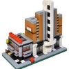
MOC: Townhouse Trio - Butcher, Barber, and Laundromat

Recommended Posts

WOW! You did great job! The butcher shop is my favorite. I also like how you did with the laundromat. You did awesome jobs at your past works too. I am very looking forward to see your next work and beyond. :)

Share this post


Link to post
Share on other sites

great set of modulars! the butcher shop is so matching in colour with the meat he is selling!

Share this post


Link to post
Share on other sites

I just picked up the Burrow on a 75% off sale, and I am inspired by your Butcher's shop to create something similar for my Modular collection. Makes me want to pick up another Burrow seeing how fantastically those bricks can be adapted.

Absolutely fabulous work here!

Share this post


Link to post
Share on other sites

I was very impressed with these buildings and then I went to your Flickr page and saw the Galaxy Diner and Empire theater. I was absolutely blown away by them. The detail of the interiors alone was insane especially in the theater. I've seen some diners in the past but not as well as yours. You've got some Lego museum quality buildings here. Great work!!

Share this post


Link to post
Share on other sites

Well, I took a photo of all my modulars together, but like I said I don't really have the setup for it so it is even less impressive than my standard photography. :sad:

5989075520_9f23e8da97.jpg

On a semi-related note, I just became a blogger over at Brick Town Talk so don't be surprised to see your creations featured there in the future. :laugh:

Share this post


Link to post
Share on other sites

I finally got around to taking a few photos of the furniture in the townhouses - it was hard to see some of it in my previous shots.

Here is what's in the one above the barber...

6019119589_51cf86baae.jpg

above the laundromat...

6019114577_ecdae72375.jpg

and above the butcher.

6019668970_5b03f4b233.jpg

Still not great shots, but hopefully a bit better than before. :classic:

Share this post


Link to post
Share on other sites

Wow, colour me gobsmacked! What wonderful, droolworthy creations! :wub: You really have an eye for the interiors as well, everything is so perfect. They fit in seamlessly with the official sets too... love it.

Share this post


Link to post
Share on other sites

I really like the colours you have used and the way the bay windows are done. I am looking for a way to do a corner of the street shop so may look to do something similar for that. I want a diagonal entrance. I like the idea of a butchers, I find it hard sometimes to know what to make given the bits available, but that works well.

Share this post


Link to post
Share on other sites

Wow, these are incredible. I have thougth about turning the Diagon into town buildings too... I am most likely going to print these pics out and study them. It's just amazing. The smaller scale is very welcome! CC and GE are very big structures. I like the one on the end best.

Share this post


Link to post
Share on other sites

I really love the green store-front; very nice little bayed design. Very suggestive of the sort of "business on the ground floor, and the owner lives above" sort of thing. Very clean, elegant town-house design; I particularly like the "triple windows" with the transoms on the back of each floor. :classic:

The laundromat is very good design wise, it takes the bay idea but does it's own round topped "turret," rather than a front-facing gable, which mixes things up very well, as well as adds charming and eclectic things like the balcony on the top level. My main objection here is that the colour scheme feels very dark, maybe grey rather than black for the bay and trimwork, though it's not too bad as it is. Just sort of imposing in a way that feels out of place in a town setting.

Again, excellent feedback that is very appreciated! I don't know if you have any educational or professional exprerience in the field of architecture, but you speak about it very well (I admit that I had to look up transoms on Google).

The laundromat is very dark, but I kind of like it. Besides trying to be faithful to the original set and using the windows in it, I think black and tan are a great combination and there are actually a lot of townhouses around where I am that feature predominently black elements. The horrible lighting in my photography makes it look worse than it is.

This does bring up my greatest frustration when building modulars, thought - lack of colors for windows, frames, and doors. Those 1 x 2 x 3 windows in the bay windows only come in 6 colors, half of which are useless like red and dark purple. There are no light grey or drak grey square windows in production, period, which is mind-boggling to me. Other size windows at least come in reddish brown and tan, I guess. Doors that fit the 1 x 4 x 6 frames, the one size that look appropriate at this scale, are also in far to few colors, almost all primary colors in addition to white and black. To have dark green, dark red, reddish brown, dark tan, or dark blue doors would be heavenly. Ok, enough ranting...

Share this post


Link to post
Share on other sites

Excellent MOC/MOD, loving the similarities and differences to the offical sets. Great details on the exterior and the interior. Great job! :thumbup:

Share this post


Link to post
Share on other sites

Again, excellent feedback that is very appreciated! I don't know if you have any educational or professional exprerience in the field of architecture, but you speak about it very well (I admit that I had to look up transoms on Google).

The laundromat is very dark, but I kind of like it. Besides trying to be faithful to the original set and using the windows in it, I think black and tan are a great combination and there are actually a lot of townhouses around where I am that feature predominently black elements. The horrible lighting in my photography makes it look worse than it is.

This does bring up my greatest frustration when building modulars, thought - lack of colors for windows, frames, and doors. Those 1 x 2 x 3 windows in the bay windows only come in 6 colors, half of which are useless like red and dark purple. There are no light grey or drak grey square windows in production, period, which is mind-boggling to me. Other size windows at least come in reddish brown and tan, I guess. Doors that fit the 1 x 4 x 6 frames, the one size that look appropriate at this scale, are also in far to few colors, almost all primary colors in addition to white and black. To have dark green, dark red, reddish brown, dark tan, or dark blue doors would be heavenly. Ok, enough ranting...

Well, I've not had any professional experience with the field, but I'm a student of it and it is in many regards my passion. I'm always a friend to a beautiful building, be it built of bricks and mortar or just of Lego. :) I do my best to give good and constructive feedback from my perspective, especially for people who build such great buildings as you do, so that they might be able to be able to become even better from my having contributed

Admittedly, I live in the United States, so most of our townhouses were built in the 19th century, and as a consequence are either one colour of stone or are brick with wood painted in some other colour (well, there are wood ones too, but those are far less common). I usually see them with trim in shades of green, greys, whites, and less frequently other colors to harmonize with brick work. Based on this one's colour (beige/tan brick), I think sort of a dark grey would go smashingly with it, but as you mentioned, the parts don't really exist since Lego doesn't make them. :/

My suggestion in regards to colour scheme (if you want to revise it) is that the trimwork of the building might look best in dark grey, with the windows being black. This would take care of the problem of the lack of dark-grey windows, but also lighten the building a bit.

That being said, however, I have to say that looking at the pictures more, the colour scheme has grown on me, I just think it should be positioned a bit differently on your layout (if you have one) by other lighter buildings to accentuate the contrast in its design. With the dark buildings around it, it just seems much too dark and closed in.

Share this post


Link to post
Share on other sites

Well, I got another window in the LEGO Store at Rockefeller Center - anyone in NYC from now through the end of February is more than welcome to go check it out! :classic:

6757811909_fddfba4bd3.jpg

Share this post


Link to post
Share on other sites

Wow! That's awesome you have a display at a LEGO store! I especially like the barbershop. It looks to fit the best with MS and PS.

Share this post


Link to post
Share on other sites

Sonicstarlight, i am amazed. These are very beautiful Builds. They are perfect. How do you get your inspiration? So much creativity. And i am sill building the Medevil Village Pub you have mad eto have his place in my Bricksterdam. When i am finished with this, i will certanly begin building one of these, because i am in need of a 16x32 house to fit in next to my Ice Cream parlor on Station Straat. Please keep on building and keep on inspiring guys like me to follow you.

Thanks for sharing this with us. :thumbup::wub:*oh2*

Share this post


Link to post
Share on other sites

Congratulations on making it to the LEGO store! I have seen these MOCs of yours before and because of your inspirational MOCs, I decided to get Diagon Valley once I can get it and be doing something similar (altough not modular).

Share this post


Link to post
Share on other sites

So many great details, amazing job! Even the back of the buildings is a pleasure for the eye..

Share this post


Link to post
Share on other sites

Create an account or sign in to comment

You need to be a member in order to leave a comment

Create an account

Sign up for a new account in our community. It's easy!

Register a new account

Sign in

Already have an account? Sign in here.

Sign In Now

  • Recently Browsing   0 members

    No registered users viewing this page.