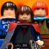
Clone OPatra Posted October 10, 2010 Usually I don't buy multiple sets at one time. But not this time! I saw Harry Potter, and I jumped! I've already reviewed The Burrow, so now it's time to downgrade to… Set Title: Hagrid's Hut Set #: 4738 Theme: Harry Potter Films Referenced: Sorcerer's (Philosopher's) Stone, Chamber of Secrets Pieces: 442 Minifigures: 4 Year of Release: 2010 Price at Release: USD $40, GBP 40, CAD 55, EUR 50 Buy It? Inventory? LEGO Bricklink INTRODUCTION Some of you may have seen prelim pics of this set and went: "Hagrid's Hut?" Another one? Seriously? … and what's with that stupid looking spider anyway? Yes, it's true, this Hagrid's Hut doesn't look all that different from the last one in pictures, but, not owning the last one myself, I can't really tell you how they compare. Since I never bought the previous two Hagrid's Huts, I thought it was high time I found out what this "rustic lodge" was truly like. This set is also the best way to get the main trio, since, excluding Diagon Alley, this is the only new set to have all three. If you are still skeptical about this set because you don't feel you need yet another Hagrid's Hut, come with me as I take you through a detailed look at it. That's why I bought it: so you wouldn't have to. Or maybe so that I could convince you that you want it. Or I dunno. Enough introduction anyway… BOX Here's a good place to start, the packaging! Like I said in my Burrow Review, it's kind of rare that LEGO puts out dark, night-themed packaging, but three of the six new HP sets are that way. I dig it. It's spooky and it's dark, but Harry Potter isn't exactly the brightest source material, you know? The background painting is beautiful. The back has the usual pasted-in-parchment over glorious red design, and it shows off the very limited amount of play features, including the swinging cauldron and light-up brick. There's also the splayed out Acromantula, looking silly. The top of the box has the 1:1 fig pics, although Hagrid is a bit too big. Notice how even here the figs have their non-happy faces displayed. There is not a single place on the box with their happy faces. INSTRUCTIONS Unless you're that kind of chap (or lass) that doesn't even bother building a set and just parts out all the pieces, instructions are mighty important. I'm talking, wouldn't want to build a set without them. Anywho, the front is the same as the box, except that since the instructions are large and square you get more of the pretty artwork to admire. I wouldn't mind a blown-up wall-poster of this, sans the set number. Steps are straight-forward and the pages are pretty empty. The emptier ones get the ominous photo of the trio, looking severe. The pieces take up a double page towards the back, and there are no ads for the other sets. STICKER SHEET Out of the box falls the… very crumpled sticker sheet. It didn't look so crumpled by the time I took the pic, but that took some serious flattening-out work. Why can't LEGO work up a better system than just throwing it in by now? In this set, if you don't like stickers, it really doesn't look too bad without them. These stickers really aren't so bad, though, and add good detail. Sure, I love printed parts too, but I've come to terms with the fact that it just ain't going to happen on big parts anymore. MINIFIGURES Ah, the night is young and we've already arrived at my favorite section. Since this set is the only new (non-exclusive) one to feature the trio, I thought I'd take this opportunity to compare them with their past incarnations, and see which versions of the figs are best. Be warned: this will take a little time, but certainly not time wasted. This is the first Hagrid's Hut to feature so many figs. The first one just came with Hagrid and Dumbledore, while the second one featured Hagrid and Hermione. This time, I guess LEGO thought it made the most sense to throw in the whole trio because they skimped on Ron in the Castle, so we get all four. Hey, that's fine with me! I'm going to talk about these guys way more extensively in their own sub-sections, but for now, obviously Hagrid isn't big enough, but oh well. The figures look nice in their school outfits. This is a great way to collect some Gryffindor torsos. The kids all have alternate expressions, while Hagrid has a ridiculously jolly face under that beard. That face is really not how I think of Hagrid at all, but since mostly it's hidden by the beard it is alright. At least the eyes and eyebrows are great. That scared face on Ron is superb as well. As you probably already knew, the kids have simple back prints as well. I love that hair on Ron; it looks great all the way around. Now I want all the other colors of it! That's them together. Now, let me delve into comparisons… Hagrid This is the third Hagrid, but the first two were very similar. The only differences were reddish-brown body, flesh colored face, and fleshy movable hands. I don't have the second one, so I'll merely compare the new one with the original. Wow! That's some difference! The new one's body has such a higher level of detail it is incredible. The old one with its brown hands and utterly simplistic print looks shamed. I might've said the new one looked too happy, but at least it looks way more appropriate than that old one! The old's one vacant eyes and tiny eyebrows don't work for Hagrid at all. What was LEGO thinking? Harry For all of the kids, I am skipping the flesh versions that are the same print as their yellow counterparts. Anyway, Harry's the main kid, so you would think LEGO would care a lot about making a perfect fig for him. Eh, or not, in 2001 anyway. Really, that original print sucks! That mouth is ridiculous. LEGO did get it right for the Goblet of Fire sets. The middle Harry looks mature and believable. A bit happy, yes, but I can certainly see this figure as the Harry battling Voldemort (if he had better hair). The new Harry, though… he does look way too young. It'll work just fine for MOCs relating to the first two books, maybe three, but after that it fails. Luckily, the angry reverse face looks a little older, so you could use the middle Harry for his happy moments, and the new angry side for the unhappy moments. Winner: GoF/OotP Harry Ron The original Ron had a terrible mouth too. Who was designing this figs, and why was he/she high at the time? Did somebody's hand slip on those original figs? LEGO went an interesting direction with the first redesigned Ron, making him look pretty dopey. The hair was all wrong by this point, but the face does suit Ron's typical obliviousness. It has a sleepy side too. Though I thought I'd hate the new one, it turns out to be the opposite. New Ron's smile is very subtle, his freckles are perfect, and his overall face is calm and subdued. I think it works perfectly for Ron, and the new hair is the best! Winner: New Ron Hermione Here's where it gets sticky. The original Hermione wasn't great, but her mouth wasn't wacked-out and her overall look kinda fit the character. Kinda. The redesigned Hermione, while she had the wrong hair for GoF, had a very snarky, Hermione-esque look. Truly, the character of Hermione is one that is extremely bossy, so those raised "huh" eyebrows and questioning smile work well for the character. And then, the new one. WTF LEGO? You're trying to tell me that's Hermione? That looks NOTHING like Hermione at all! That looks like your standard female face with brown lips instead of red! Doesn't this Hermione look just like a non-made-up version of Tamina? She sure does to me! That is totally unacceptable. I don't care what Tamina looks like, she's just some throwaway character in a throwaway movie, but Hermione is a major character in some awesome pieces of work! LEGO's laziness with this fig seriously pisses me off… Winner: GoF/OotP Hermione ACCESSORIES and ANIMALS Ok, I overcame my mad fit about Hermione, so now I can move on in the review. LEGO gives us three spiders which are tiny if they're supposed to be acromantula, a rat that is very likely Scabbers by the way Ron is shown with him on the back of the box, a dark green Norbert hailing from his cousins in the land of Kingdoms, and the grey and brown owls. Norbert's mould hasn't changed since the original one, though he was sand green back then, and though he's too big that's just the way it goes with LEGO. They can't possibly make a tiny dragon. There are plenty of accessories included for play fun with the figures, including three wands, an axe, a crossbow, a cauldron, a plate and mug, a drumstick and fish, a lantern, multiple keys, a barrel, and finally, Hagrid's fun pink Umbrella. Nice to have that thrown in. There are also eight swords, though they're not used as swords of course. Since all of the promotional photos of this set show the old octagonal hilts on the swords, I was wondering about what they would truly turn out to be. The PoP sets showed the octagonal hilts too. Well, it turns out, I got seven of the new square hilts, and one octagonal one. I highly doubt this is what everybody will get, but I suppose it means that all of the swords are mixed together, and that LEGO only molds the square ones these days. There were also some elements that surprised me, like the pumpkins. I had no idea they would have faces. It turns out LEGO just used the pumpkins they had already designed for Monster 4, which is pretty clever if you ask me. It opens up the possibilities for alternate figures, like so: But wait, did you strangely feel that something was missing? Ok, you probably didn't, so I'll remind you… FANG! LEGO left him out again! I cannot understand why LEGO keeps doing this; Fang is a very important character in Hagrid's Hut! They could've just used the old Belville dog if they wanted to be lazy; at least that would've been something! I have a feeling we will never see Fang realized in LEGO… ACROMANTULA Yes, LEGO calls the spider Aragog on their website, but I have decided they got it wrong and this is really just a stock Acromantula. Why? Well, for one thing, it's not big enough to be Aragog, and it's not blind, like Aragog is. Also, not calling it Aragog makes it seem like slightly less of a fail. Aragog or not, this acromantula is a bit off mark. But it has printed parts! But it's lame. In the films, the spider's legs clearly go up before bending back down. This looks like some stupid tall thing on sticks. Sorry, spiders don't look like that. Since it's legs are also not level with each other, the acromantula totters one way or another. That's pretty dumb. The back is ok though. Maybe that's because there isn't much to see. You might think the forehead looks ridiculously stupid, but I still like the printed face. It's pretty freaky. I think the problem is that this acromantula looks too cartoony for the source material. As it's own, LEGO thing, it looks cute and fine, but once you consider what it should look like, it fails. Harry and Ron bravely (or not so bravely) take on the giant spider! HUT - Exterior If there had been two 't's there, that would be the Star Wars sluggy thingamabob. But no, I'm talking about the 'rustic lodge' sort of hut. This hut is very hut-like. It looks slapped together out of stone and some wood-work, just as Hagrid's Hut should look. The stickers aid the stoney look. The steps and slight awning over the door are pleasant and welcoming. I don't know what sort of stone the sand green is supposed to be, but a little color is nice anyway, and sand green is certainly not too garrish. As I've said before, the new doors look a lot more solid than those thin older ones. I'm not sure if this is a problem or not, but Hagrid can barely fit through his own doorway! Not sure where Hagrid got the brass for his windows, but alright. I'm liking those different types of bley pieces used towards the bottom, and the fact that they went with both bleys for the hinges. It helps make the hut look less clean and more "carved-from-stone." The orange rounds are superb for growing pumpkins as well. The back side is plainer but not bad-looking, and those mushrooms are truly excellent back here. Looks like I turned one of the pumpkins the wrong way. But hey, I would be grumpy if I had a big green stalk sticking out of my head too. Now this side is ugly. The big red technic bit for the light-up-brick is garrish, and those piled-up plates are an eyesore. HUT - Interior As you likely already know, the hut open up to reveal a cramped but somewhat detailed interior. It looks plenty rustic on the inside, overall. Let's turn our attention to the back half. I don't really imagine Hagrid as the sort of guy who puts up paintings, so I'm not sure what's with that sticker there. The hanging accessories and multi-colored table are pleasant rustic details, though. I think LEGO just wanted to put a broom in every HP set, so they've stuck one in here too, but there's nothing keeping it in place. You just stand it there. There's a little bit of a 'play feature' here since the whatever-that-is comes off to reveal Hagrid's hidden stash of money and a letter. Perhaps Hagrid is waiting to deliver Harry's letter in Sorcerer's Stone? Is that the Sorcerer's Stone itself thrown in there? I also like the carrot top stuck in a bottle. Not sure what it is, but I'll take it. Time to turn over to the front half. Since there were steps going up, there are steps coming down, which is certainly a bit odd. I don't remember that from the films. Hagrid also seems to like to hang his food from the ceiling, which is also a sloppy practice, and looks dumb. The token 'play feature' over here is a cauldron that is on a hinge so it swings away from the fire, revealing the light-up brick. While that's not so interesting, I really dig the colored jars of stuff up on the shelf. Great detail right there. The light-up brick's casing, interestingly enough, is modular! I don't know why you'd want to take it off though, unless to replace it with a non-light-up equivalent. Let's test it… ooh, not-very-bright… The problem is that fires aren't yellow, so you get these trans-orange fire bits and then a yellow light behind them. It really doesn't look so good at all, and is not even so bright. The good news is that this set is superbly priced, even with a PF brick. Now let me put some figures inside. Obviously, when it's opened up there is plenty of room to play and recreate your favorite film scenes, or make up new ones! Here, Hagrid takes oversized-Norbert from the pot. There isn't a lot of space for all of the figures, but there is enough. Maybe Ron's scared since he's vomiting slugs, and Hermione is angry about being called a 'Mudblood.' Looking down, though, there is really very little floor space at all. I know the hut is small in the films, but I would say that it is bigger than this. CONCLUSION Overall, not a bad entry into the HP line. The hut itself is certainly pleasing from the outside, and probably has as many little details as is reasonable for LEGO to cram in on the inside. Still, it's a bit dull I'd say for the kiddies, and the inside really looks tiny when closed up. Putting all of the figures inside doesn't work that well when it's split apart anyway, because then it looks like they're shouting across the room. The Acromantula is honestly a poorly designed piece of work. Sure, you can tell it's a big spider, but it looks nothing like the spiders in the film. Those might be too freaky for little kids, though. Still, this spider is not so hot. Then there are the figures, which I find a very mixed bag. Ron and Hagrid are great, Harry is average, and Hermione is freaking terrible. The selection of figures is good, but Hermione is just designed excruciatingly poorly. RATINGS Parts: 9/10 - Some great stuff here like the pumpkins and mushroom caps, plenty of accessories, stone pieces, etc. Use of swords as spider legs is lame though, and the light-up brick is extraneous. Design: 6.5/10 - That's quite low for me, but the spider does suck majorly. The exterior of the hut is great, but the fireplace side of the interior isn't too hot. (Like that pun there?) Minifigures: 6/10 - Selection good, but Hermione horrendous and Harry meh. Playability: 5/10 - I'm not seeing much here. A light-up brick and swinging cauldron? That's not very many play features. This set is left up to role play with the characters, but the way the hut opens up makes it difficult for you to play with them altogether in one space. Price: 10/10 - If I'm miffed about all the other sections, then why full marks here? Because it's 442 pieces, for $40. As Ron would say: brilliant! Overall: 7.3/10 - In U.S. terms, that's just a pass. Not a failure, but just scraping by. That reflects how I feel about this set well; it certainly doesn't suck, but there's not much to do with the model, the spider is poor, and Hermione pisses me off. Well, that's a wrap on my second HP review. As I said in my Burrow Review, I'm going to be reviewing more HP sets, so you can look forward to it. I'm not sure Harry's too happy about me not liking his new face so much though… Share this post Link to post Share on other sites
prateek Posted October 10, 2010 Great reveiw. The plant life and interior are great, but Aragog is horrid! Share this post Link to post Share on other sites
Matn Posted October 10, 2010 Fantastic review, you're becoming better at it with every review you make. The pictures are just perfect and they make me even want the set more. I already own the first version of Hagrid's Hut, but as I wasn't really much into LEGO (I think) during the release of the Prisoner of Azkaban, I never bought sets from that film at the time. I really wanted to get my hands on the second version of it, but I'm actually very happy with yet another release of the hut. I loved the first one as a child, and then I thought it looked actually awful with the paper roof, but I've rebuilt it recently and I still love it. I think I'm going to like this version also, although I don't agree with the superb pricing. 40 dollars is nowhere close to the 50 euros we're supposed to pay for it, luckily there are people who see that and change the price to a more reasonable 40-45 euro. I have to agree with the figures, Ron and Hagrid are really great. An angry Hagrid would have been nice too, with frowned eyebrows. I noticed the freckles of Ron for the first time on the first picture on your review, and I was positively surprised! It's nice to discover things I've not seen before. Ron is really perfect, the hairpiece matches exactly with Rupert's hairstyle. I wonder if TLC designed it for this figure and then saw they could use it for the Collectable Minifigures? Harry is alright, although he's too young. I wished TLC designed an angry face for Harry in the Goblet of Fire sets. He actually had an angry face, but it had gills on it. Hermoine is... indeed a bit of a failure. I like the figure though, she can be a Hermoine to me, but it doesn't look like her at all. I'll mix and match a bit with these figures. I think Hagrid's Hut is wonderful. Especially the interior, nice and cramped like I imagined it. I also like the fish hanging to dry, although I don't know why a chicken bone is hung to dry. The exterior is also nice, but I think the outside of the fireplace would have been nicer if it were similar to the 2001 version. Lots of nice details and accessories, animals and I also like the acromantula (although I'm one of the few). I can't wait to compare it with the 2001 version, and hopefully someday with the 2004 version. I think this little building would fit in every little (medieval) village, surrounded by some trees, just like all of the versions. Again, great review and keep on going! Share this post Link to post Share on other sites
Big Cam Posted October 10, 2010 Awesome review clonie, I love the comparison of the older figs. This set seems to incorporate most of what I want in a Harry Potter set, I may have to pick it up now, after reading your review. Share this post Link to post Share on other sites
lightningtiger Posted October 10, 2010 Thanks for the review 'I O'Dine', great set with that one drawback.....Aragog.....but kids won't care....they'll have the threesome plus ther big guy ! The light up brick is a neat idea and the whole set is very playable, only limited to one's own imagination ! Keep on ......reviewing ! Share this post Link to post Share on other sites
Izzy Posted October 10, 2010 Really nice review Cloney. I have the second version of this set and can see a few improvements, mostly getting more figs is really nice but the biggest complaint I had about the last one was the lack of Fang too. Very sad that TLG didn't add him yet again. Very sad indeed. I also can wholeheartedly agree with your opinion about Hermione. That really is a cheaters way out to use such a boring, unoriginal face when there are new faces coming out left right and center. I guess the only consolation you can take is to be glad that you have the really nice one in your possession and so you can update the hair and still be happy with her. Share this post Link to post Share on other sites
def Posted October 10, 2010 So far all these HP sets are looking nice. I think you were pretty harsh on the mini-figs though. The detail on the student's torso is superb; the flowing movement of the collars, the thin stripes on the tie. Even the waste line of the sweater has a great movement to it. The faces give me no trouble, but I'm haven't seen the last few movies to be so demanding about them. Share this post Link to post Share on other sites
Clone OPatra Posted October 11, 2010 I think you were pretty harsh on the mini-figs though. The detail on the student's torso is superb; I agree that the torsos are great, but for the characters I find Hermione's face to be all wrong, and so this greatly detracts from the figure. Truly, I don't rate figures by parts; rather, on their whole look. Though I do make my own figures with the different parts, when rating them for a review I decide how well the figure rates as a whole. Maybe that's not the best way to go about it, but that's the way I like to do it. Share this post Link to post Share on other sites
jonwil Posted October 11, 2010 That light brick needs a "warning do not stare directly into the light" warning, if you look at it directly (especially if its close to your face), its blindlingly bright. I agree that it should have been orange but I dont know if orange LEDs exist or how much one would cost compared to the yellow LED. Share this post Link to post Share on other sites
Oky Posted October 11, 2010 (edited) Thanks for this exceptional review! You did a great job, and even almost made me want this set, but I think I'll stick with my copy of the first edition which really wasn't so bad as Matn says. The only thing missing in the review would be a comparison pic of the new hut with the old one(s). Harry's the main kid, so you would think LEGO would care a lot about making a perfect fig for him. Eh, or not, in 2001 anyway. Really, that original print sucks! I'll try not to be offended by that. Seriously though, I agree with def that you were a bit too hard on the figs, especially Hermione. Yes, she does look too generic and not very accurate, but you can still tell it's supposed to be her. And her face is definitely different from Tamina's. The differences are subtle, but they are there. I think the problem is that TLG tried too hard to make her non-book-specific and to stick to the current facial style for minifigs. Not to mention that the hairpiece they chose doesn't look like Hermione's hair at all. I'll probably switch it for the original fig when I get it. PS: I love what you did in the lower right corner of the title pic! Edited October 11, 2010 by Oky Wan Kenobi Share this post Link to post Share on other sites
Vindicare Posted October 11, 2010 That light brick needs a "warning do not stare directly into the light" warning, if you look at it directly (especially if its close to your face), its blindlingly bright. I agree that it should have been orange but I dont know if orange LEDs exist or how much one would cost compared to the yellow LED. The warning is called common sense . You should know it's not smart to stare at bright lights. Didn't your mom ever tell you it wouldhurtyour eyes to stare at the sun. Share this post Link to post Share on other sites
Lordofdragonss Posted October 11, 2010 Ehh This set is so expensive, and now i have to decide to get hut or burrows...But I was a fan of Hagrid (and I' am still), so I will probably get just this set. Ahhh so many good items! Share this post Link to post Share on other sites
Masked Builder Posted October 11, 2010 Nice work! That new Hagrid looks a lot better. Share this post Link to post Share on other sites
CMP Posted October 11, 2010 Wonderful review! I like your old/new comparisons. I'll try to get this, even if it's just for a more complete Hogwarts and extra Gryffindors. So far, I've been going with that that sticker is a picture of Hagrid's father. (he had one in GoF) I got the original Aragog, so I can safely concur the new one does suck. If I were to design it, I'd use the old one's body design with the brownish colors of the new one. Share this post Link to post Share on other sites
fred67 Posted October 11, 2010 (edited) I bought the four least expensive sets last week... built the quidditch match and Dobby's rescue, and this will likely be next... I have to admit that I must not have been paying attention - that Aragog looks terrible. I mean, I picked up the box, looked at it for a while, along with the others; I've seen the pictures for months and months... and I just never noticed how terrible it is. I suppose I was concentrating on Hagrid and the hut. Luckily I've looked up the old Aragog and I have the parts to make it, along with the newer brown parts as CallMePie suggests... The bonus is I get a handful of new swords to use with other themes! I want to thank who (whom?) ever at LEGO decided to make these sets... I missed them completely way back when. Edited October 11, 2010 by fred67 Share this post Link to post Share on other sites
CMP Posted October 11, 2010 Luckily I've looked up the old Aragog and I have the parts to make it, along with the newer brown parts as CallMePie suggests... Great! Post some pics when you get it built. Share this post Link to post Share on other sites
Aanchir Posted October 11, 2010 Awfully judgmental, aren't you? From the photos you took, all the figs look fantastic. Aragog is kind of bothersome, particularly his second and third pairs of legs. The front and back legs look just fine to me, for their size. If Aragog were larger, then they could have been made more detailed, but as it is he's at a decent scale to the minifigs and helps keep the price of the set lower. He's also a definite improvement over the way-too-cartoony depiction in his original set appearance. I don't see why the spiders are a bad size-- after all, they are still pretty huge compared to a regular fig (remember that the original CoS sets used printed 1x1 tiles for depicting some of the smaller spiders). Certainly not the size you'd expect of the more mature members of Aragog's "tribe", but the spiders in the Aragog scene from CoS varied greatly in size and I think it's appropriate that this set reflect that. The Hermione figure is good IMO. While it doesn't look like an exact replica of Emma Watson, it does look like it would fit in with actual minifigures. To make a long story short, minifigs are supposed to be heavily simplified. The GoF/OotP figs were excessively detailed IMO-- not as much as those horrendous licensed NBA figs from 2002, but getting pretty close. These figs by far come out looking the most like faces that actually belong in a LEGO set, rather than photographs of the real people wrapped around a flesh-colored cylinder. It's also worth noting that the current Hermione face with the poutier mouth is not at all a far cry from the picture of Emma Watson in the corner of the box art. The fact that Harry looks more childlike than the OotP/GoF version is also a plus IMO, since again minifigures are supposed to look kind of cartoony. Minifigs don't age the same way that people do-- Just look at the figs from the Atlantis and Power Miners themes. Even the ones with beards and stubble have pretty much the same facial proportions as your standard smiley-face fig-- not the stretched-out-looking proportions of the GoF/OotP figs. Figs who are meant to look decidedly older and more mature do so with tiny details like more pronounced cheekbones and more serious-looking eyelids and eyebrows-- not with visibly-altered facial proportions. And I understand that your preference for LEGO minifigs to vary visibly with "age" is not abnormal in the LEGO fan community. I remember a lot of people were sorely disappointed when the Indiana Jones fig did not get greyer stubble in the KotCS sets. But still, you've got to remember the constraints of the minifigure medium, or as I've said you end up with the excessive detail of the NBA licensed minifigures. As for the portrait in Hagrid's hut, when I saw it in your review, my first thought was "that could be his dad!" Don't have my Harry Potter books with me, but one of the chapter illustrations for the US edition of one of the books showed a picture of Hagrid's dad, who looked somewhat like that. You can sort of see a family resemblance between Hagrid and the person in this portrait. The hanging food in the hut is a bit odd, but he has to have something to throw to the Fang figure in this se... oh, wait. =P Seriously, though, I don't hold it against LEGO for not including Fang, since he's a minor character many buyers wouldn't recognize (besides appearing consistently in many scenes with Hagrid, he doesn't actually do much that's particularly memorable). You do make a good point about the Belville dog, of course-- for a huge dog like Fang it might actually work. Not sure if the breed would look adequate, though. Your photos definitely make the hut itself look a lot more appealing than the photos from the last review of this set. The colors and textures don't feel quite so randomly-arranged. Of course, I'm notoriously inconsistent about how I tend to interpret this sort of aesthetic improvement in well-lit, well-arranged photos-- ideally, I feel a LEGO set should look good no matter what quality of lighting you happen to have, since obviously not everyone will have clean, white lighting for the shelves where they display their sets (or the floors and tables where they play with them). On the other hand, I still consider a set's appearance in ideal lighting to be the most honest portrayal of a set's aesthetic quality. Details are made perfectly clear, and colors are a lot easier to distinguish. Regardless, I'm glad to see a review by someone who's got as much know-how and experience about the reviewing process, including the ever-so-important stage of actually photographing the sets. I'm kind of indifferent about the pumpkins. Since Hagrid's pumpkins are picked from a garden, it doesn't make sense for them to look like it's perpetually Halloween. But on the other hand, I would never have imagined that the jack-o-lantern heads from Monster 4 had such gorgeous printing quality, even on the back. So they're good in some ways and bad in others. Anyway, I've rambled enough for now. You did a very good job on this review, and it gives me a great perspective on this set! I'm unsure if I'm going to end up picking it up, but it certainly looks great and would be a great way to get a good selection of versatile Harry Potter minifigures for a reasonable price. I'm glad to hear you're planning to review other Harry Potter sets from the new wave... I look forward to seeing those in the future! Share this post Link to post Share on other sites
LegoFiend Posted October 11, 2010 Awesome review clonie, I love the comparison of the older figs. This set seems to incorporate most of what I want in a Harry Potter set, I may have to pick it up now, after reading your review. I second it.. Share this post Link to post Share on other sites
Clone OPatra Posted October 11, 2010 While it doesn't look like an exact replica of Emma Watson, it does look like it would fit in with actual minifigures. To make a long story short, minifigs are supposed to be heavily simplified. The GoF/OotP figs were excessively detailed IMO-- not as much as those horrendous licensed NBA figs from 2002, but getting pretty close. These figs by far come out looking the most like faces that actually belong in a LEGO set, rather than photographs of the real people wrapped around a flesh-colored cylinder. It's also worth noting that the current Hermione face with the poutier mouth is not at all a far cry from the picture of Emma Watson in the corner of the box art. I really can't understand some of your points here. First of all, if you consider the different versions of the figs next to each other the GoF ones are barely detailed at all. There aren't extra bits and lines showing off expressions; they're really pretty basic, but, at the same time, convey that the characters are slightly older. I have never seen a minifigure that looked like it had a photograph of an actor wrapped around its head. Ok, the NBA figures were pretty dumb (nice for some diversity though), but if you take a look at the HP figures they've never looked like that. Minifigures are cartoony no matter what, and they obviously don't resemble their actors too closely (except Dr. Jones, I could see Sean Connery right there). I cannot see how you think the GoF figures were "excessively detailed," they look very simple to me. My gripe with the current Harry is not only that his mouth is too close to his glasses, but also his excessive smile. If you notice, the original Harry's smile was not as close to his glasses as this new one, and it was certainly not as "smiley." As to Hermione, I don't think she resembles the pictures much at all, especially not her happy face. Overall, I understand that you are of a different opinion, but I think you have gone overboard in trying to defend the new figs. I don't see the older figures being at all how you described them. Share this post Link to post Share on other sites
Mrlegoninja Posted October 11, 2010 Great review. I will try to get this set, but might not. Share this post Link to post Share on other sites
Djole Posted October 11, 2010 My gripe with the current Harry is not only that his mouth is too close to his glasses, but also his excessive smile. If you notice, the original Harry's smile was not as close to his glasses as this new one, and it was certainly not as "smiley." I actually like this fact and I like it a lot, it is definitely a big step back (or forward) to our beloved "classic-smiley" (where most of the face was focused in the very center of the head) and I'm sure that designers did it that way in order to maintain (or bring back) LEGO's graphic identity which was certainly lost in the examples you've used for comparison. Therefore this Hermione (as well as the rest of the crew) works well and it's the best one yet. At least for myself ;-) Greetings from Serbia! Share this post Link to post Share on other sites
Ceroknight Posted October 11, 2010 Thank you for the review! And I actually like hermione cause she has different hairstyles has she matures. What I don't like is Harry and the whole idea to release random sets from book1-7 Harry looks young and that's fine with sets like 'Dobby's release' but not good for the Hogwarts castle and such. Also I wished they would have made a different hairstyle cause his hair grows shorter in the movies. Oh well I am only going to get the cheaper ones anyways.. Again, great review! Share this post Link to post Share on other sites
XimenaPaulina Posted October 12, 2010 Brilliant review as always I O'dine/Cloney. It's good to finally see Ron getting a much-needed makeover (he looks much better now). As for Hermione, she's quite ok but I think her previous hair would have been much suited for the new fig. Nothing special about the set, except for the pretty good minifig selection, perfect for those who'd want to get these 4 main characters in one buy. Share this post Link to post Share on other sites
SpiderSpaceman Posted October 12, 2010 Lovin' the pumpkin warriors, and you're right about new hermione Lego can never get aragog right, but they've done some pretty terrific spider designs that they should just adapt to his role. take the wild collection spider Share this post Link to post Share on other sites
Aanchir Posted October 12, 2010 I really can't understand some of your points here. First of all, if you consider the different versions of the figs next to each other the GoF ones are barely detailed at all. There aren't extra bits and lines showing off expressions; they're really pretty basic, but, at the same time, convey that the characters are slightly older. I have never seen a minifigure that looked like it had a photograph of an actor wrapped around its head. Ok, the NBA figures were pretty dumb (nice for some diversity though), but if you take a look at the HP figures they've never looked like that. Minifigures are cartoony no matter what, and they obviously don't resemble their actors too closely (except Dr. Jones, I could see Sean Connery right there). I cannot see how you think the GoF figures were "excessively detailed," they look very simple to me. My gripe with the current Harry is not only that his mouth is too close to his glasses, but also his excessive smile. If you notice, the original Harry's smile was not as close to his glasses as this new one, and it was certainly not as "smiley." As to Hermione, I don't think she resembles the pictures much at all, especially not her happy face. Overall, I understand that you are of a different opinion, but I think you have gone overboard in trying to defend the new figs. I don't see the older figures being at all how you described them. I'm talking about level of detail in the sense that these minifigs go a little bit too far to set themselves apart from the standard minifigure template. The Harry fig was OK, besides that his mouth is ridiculously offset from where a minifigure mouth is expected to be. In fact, that's really the only thing that makes it any different than the current Harry fig. The smile is also more subdued than on either of the previous figs, but still has enough of a smile to contrast with the "angry" expression on the reverse side. As for Ron, he's got those ridiculous dimples and bags under the eyes, as well as a rather awkward grin. When he and Hermione first appeared in the GoF set for the second task, I thought this was forgiveable. "OK, it's just to show that they just woke up from their 'trance', so of course they look a little out-of-it." I was appalled when later sets made it clear that these figs were just supposed to be normal depictions of Ron and Hermione. With Hermione, the problem is the same as with Harry, but a bit worse. The mouth is offset from where a minifigure mouth is expected to be, and that one-sided dimple takes what could have been a manageable smirk and takes it a step too far. That look in her eyes also distances her from typical minifigures. She also is a far cry from a generic female fig-- rather than curved eyebrows like are normally found on female figs, her eyebrows are more of the angular shape they had even in the previous iteration (this is obvious in the Tamina comparison pic). But they lose a bit of that ferocity that their earlier size lent them-- instead, they're more on par with the eyebrows of the original fig. The mouth, too, is closer to the original fig's gentler expression, instead reserving that rebellious look for the "angry" expression where it makes so much better sense. I also was a bit incensed about mention of LEGO's laziness-- it always bugs me when people assume a design they don't like had less work put into it than other designs-- so I may have been a bit harsh in my response to your feelings on the Hermione fig. Overall, the problem is just this. Even ignoring that these figs are fleshies (something I have never had qualms about for licensed themes), the second-generation figs just looked out-of-place among normal minifigures. The current iterations restore proper minifigure facial proportions rather than having custom-tailored proportions for each individual figure, and simplify the designs accordingly. For this reason I think the current iteration of figs far outstrips the previous one (perhaps the previous two-- I have always been hesitant to use Harry Potter figs to depict non-Harry Potter characters, given their complex facial expressions). Share this post Link to post Share on other sites