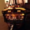
Cousarmy0001 Posted August 15, 2020 So I've been working on this project for some time now, and due to life circumstances, it's going to be a while before it's done, but that's just as well because I haven't really been satisfied with any of the designs I've come up with for one of the centerpieces of this. It's a wharf for the bluecoats, I've got 10 buildings designed for it at present, but nobody that I've shown it to has liked the state houses that I've designed. Thus far, I've come up with roughly four designs, two are generic state houses, one is heavily based on the VOC headquarters, and there's a shrunken version of that design that allows for more space in front of the VOC headquarters. I've gotten tepid responses from people on each of them, so I keep working on a redesign of the state building. My most recent effort models the state house after the Stockholm Slott. The time period I'm shooting for is the later 1700s, but I'm worried what I have looks more like something from the 1860s or so. I'm not done with the exterior yet, much less the interior, but I wanted to get input before I spent more time and effort on this design. Could I get the community's thoughts on this so far? Share this post Link to post Share on other sites
Jack Sassy Posted August 16, 2020 It looks quite amazing, but the biggest one seems a bit unfinished on roof, maybe adding higher railing on sides and a chimney or two would do the trick, the entrance stairs for it might need another step. Those two state houses look somewhat medieval and 18th century alike, however they are very long and would work if there's no alleyway between them. Good job on the buildings, love the architecture of them. Would love to see how it all looks once it's finished, even if it'll take years (ok, maybe i'm overexaggerating). Share this post Link to post Share on other sites
Count Vroskri Posted August 18, 2020 @Cousarmy0001 No complaints from me. I'd give it a roof. But I have to say, this would be so amazing in real life. I'd love to see the fourth design. You are very, very good at these colonial buildings and this is only your first post of this nature. Keep up the good work! Count Vroski / Jimsmocs Share this post Link to post Share on other sites
Cousarmy0001 Posted August 26, 2020 (edited) @Count Vroskri Thank you for the feedback. As I said in the OP, this is an incomplete design. I wanted to make sure I wasn't making something that would look out of place before I put in the time and effort to finish the thing. Here are the two designs that I have on my Flickr. The shots include the rest of the buildings in the planned scene. [ Edited August 26, 2020 by Cousarmy0001 Share this post Link to post Share on other sites
Count Vroskri Posted August 26, 2020 @Cousarmy0001 I'm not sure which I prefer, but its really great overall. I think I prefer the second one, but they both showcase excellently the style you are trying to achieve. Count Vroski Share this post Link to post Share on other sites
Cousarmy0001 Posted August 28, 2020 @Count Vroskri when you say "the second one", do you mean the tan one (with the wall and two clock towers) or the brown and white one (VOC hq)? Share this post Link to post Share on other sites
Count Vroskri Posted August 29, 2020 @Cousarmy0001 The Voc hq. Share this post Link to post Share on other sites
kurigan Posted August 29, 2020 (edited) It doesn't seem to register as 18th century, that's true. To my eyes it seems more like and early 20th c. interpretation of of 19th c. style. It feel like a school, if that makes sense. I think is comes from a few elements which may be remediable. To start with, as was said, there's not enough around the top, in terms of decoration. The very plane cap around the roof line just seems too modern for what you're going for. The chosen colors read as bare brick and molded concrete, both very late 19th/20th c. things. You could go with white or gray for bare stone, or any color for painted plaster over masonry, which was very common in the 18th and 19th centuries. I don't think the Tudor style muntins, in black, work. I'm not sure what to suggest, besides checking out some of the methods used over on Town. There's a lot of constructed window types, that might increase the scale, might still work better. From this eagle's eye view, i also think the flat roof is making the whole thing seem more modern. It's not, necessarily, but I think a pitched roof, while complicating and parts consuming, would look a little more convincing to the whole thing. All that being said; why not that second one? The brown and white, with the high pitched roof and cloister in the middle. I like that one and think it fits the waterfront well. Anyway, sorry to be tardy to the party. Dave Edited August 29, 2020 by kurigan Share this post Link to post Share on other sites
Cousarmy0001 Posted August 30, 2020 I'd like to emphasize (in re-reading my initial post, I could've been a lot more clear on this), this is unfinished. There is at least another floor planned on top of this one (just in the back, not over the two parts reaching towards the street), and a roof. I wanted to get feedback before I put in that much effort because like Kurigan said, this seems a bit modern to me (roof notwithstanding). From the pictures I've been able to find, the Slott does have a flat roof, but with a ornate fence looking bit around the edges. The real thing doesn't look very mid-1800s ish, but what I've done in LDD does to me- and apparently to @kurigan as well (the "school" comment is spot on). On that note, Kurigan, thank you for the Town tip (I've only ever looked at this forum and very briefly at BoBS before feeling massively overwhelmed and retreating back here). Since I've gotten your attention with this, I did consider using grey in this build, but thought it might look too old or plain in comparison to the other buildings. An all white building seems a bit more colonial in nature to me (though I'm sure there are dozens of examples of white European buildings from this period to prove me wrong). Are you sure this would look appropriate? Incidentally, I believe the Slott has 8 panes in each window? But I went with the Tudor ones specifically because I was worried a more literal interpretation would make it look more modern while the terraced windows might make it look older. Perhaps I'll try it the other way. Given that most of the issue seems to be with the roof itself, perhaps by finishing the build it will look more appropriate. I'll keep going. Thank you all for the input (and I welcome anything anybody has to add). Share this post Link to post Share on other sites