MakutaOfWar Posted December 6, 2015 It's that time of the year already? I've got to stop sleeping so much. And no comics on the boxes anymore? :I Share this post Link to post Share on other sites
Dr_Chronos Posted December 6, 2015 Received Tahu and Ikir in the mail from LEGO today. No review embargo, so here's my thoughts as I'm currently processing. No photos yet, but soon. *(Thoughts) Getting ready to set my photo studio up and take some quick teaser photos. Thanks DV! Can't wait to see your review. I'm happy to hear that the swivel function has good friction and is removable. Tahu's texture problem was expected, along with his lanky-ness. Just a little request, could you take pictures of how the unity piece (Technic shell) looks with various addons? Really interested in seeing how that looks. Share this post Link to post Share on other sites
Konahrik Posted December 6, 2015 It's that time of the year already? I've got to stop sleeping so much. And no comics on the boxes anymore? :I It seems that they are in the instruction pamphlets now. Share this post Link to post Share on other sites
dviddy Posted December 6, 2015 It seems that they are in the instruction pamphlets now. There are comics on the Toa boxes. Share this post Link to post Share on other sites
Konahrik Posted December 6, 2015 There are comics on the Toa boxes. Oh, ok cool. Glad to see they are still on some of the boxes. I was just going off of Terak's review. Thanks for the clarification! Share this post Link to post Share on other sites
xboxtravis7992 Posted December 6, 2015 A review of Terak Creature of Earth has shown up on BZPower today! Looks good :) Share this post Link to post Share on other sites
dviddy Posted December 6, 2015 More in the review, these are quick rough shots just so you can all see some things. Share this post Link to post Share on other sites
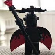
MakutaOfWar Posted December 6, 2015 Yikes, I want to love him because of the sentimental value Tahu is to me, but there is way too much gold. D: I didn't want to believe people when they said it, but now my eyes are open. As well as the legs, I'm not a huge fan of CCBS figures with longer thigh bones then lower leg bones(lack anatomy knowledge, how did I ever graduate), plus that Technic shell does stand out, but I'm willing to excuse that due to nostalgia. On the pro's, however, I love that mask, the weapons, and Ikir's wings. Thanks for the pics! Share this post Link to post Share on other sites
Dr_Chronos Posted December 6, 2015 (edited) The Skull Cloth addon (and Tahu) looks so much better when combined. Ikir's wings and tail feathers really help the jagged, fiery look. Now it's the piston addon and Technic shell that bother me. Edited December 6, 2015 by Dr_Chronos Share this post Link to post Share on other sites
WARHEAD Posted December 6, 2015 Maaan that looks awkward. Gonna have to pass on this one. Share this post Link to post Share on other sites
YellowCorvette Posted December 6, 2015 Tahu looks great when combined with Ikir, but I still think that Tahu's mask looks kinda odd and there's still way too much gold on him. Share this post Link to post Share on other sites
Kalhiki Posted December 6, 2015 Combined mode doesn't look too bad, but your other comments, DV, don't give me high hopes for the individual figure... Share this post Link to post Share on other sites
Takanuinuva Posted December 6, 2015 That molding hole on the mask looks awful. The 2015 one at least had it inset in the mouth. This one just sticks out like a sore thumb. Tahu doesn't look to bad in those photos. But I'm still passing on him. Can't wait to see Ikir's review though. Share this post Link to post Share on other sites
Vinyl Scratch Posted December 6, 2015 Here hoping Umarak doesn't disappoint. Share this post Link to post Share on other sites
bidiminished Posted December 6, 2015 So is the new brainstalk even worse? Share this post Link to post Share on other sites
Dr_Chronos Posted December 6, 2015 So is the new brainstalk even worse? Good question. I suppose they are don't pop off the mask as easily, but they also look like they have the same lighting problem as before. I thought with the ends of the mask being translucent it would allow for better light-piping, but it doesn't look like that's the case. Share this post Link to post Share on other sites
YellowCorvette Posted December 6, 2015 (edited) I think that the 2015 eyestalks are better than the new one. Both of them has the same lighting issue, but the design of the 15 eyestalks allow the masks to been pop off much easier. Edited December 6, 2015 by ArmstrongYong Share this post Link to post Share on other sites
VBBN Posted December 6, 2015 Still holding off judgement until my review copies get here, but I'm struggling to find much that I actually like about Tahu. Share this post Link to post Share on other sites
xboxtravis7992 Posted December 6, 2015 I'm kind off intrigued that he is so gold. Makes me think its a Kingly version of Tahu, with the Gold and the Wings, the creature being like a crown. It is a distinct departure from the red/Gold of 2015; and especially the G1 colors. With that said, I hope 2017 has a significant return to red pieces for Tahu. If we get another gold and trans-orange Tahu again I'll be upset. Share this post Link to post Share on other sites
dviddy Posted December 6, 2015 Still holding off judgement until my review copies get here, but I'm struggling to find much that I actually like about Tahu. My favourite part of the set is his two solid red parts. Because they are size 6 shells in red. I'm so happy for this you don't even know. Share this post Link to post Share on other sites
DuplexBeGreat Posted December 6, 2015 Daaaaaaang. I was bandwagoning initially, with the whole "he has too much gold" thing, but WOW he really does have altogether way too much gold. Share this post Link to post Share on other sites
DraikNova Posted December 6, 2015 I think his look could actually work if they replaced the orange with more tr. red. The orange just doesn't fit with the rest of his color scheme, especially with the blade pieces being right next to tr. red and tr. yellow flame pieces. Share this post Link to post Share on other sites
Shakar Posted December 6, 2015 (edited) I think the gold wouldn't be so bad if most of the trans orange was replaced by red. Basically the same mistake they made with 2014 Laval- nowhere near enough contrast. So is that Mata Blue or Gali's Dark Azure? Gali's new 4M shells seem like they would look pretty good on him. Colours aside, the weapons still look lame to me, but I do like his overall figure, more so than I thought actually. Still at the bottom of my list among the Toa however. EDIT Draiknova read my mind Edited December 6, 2015 by Shakar Share this post Link to post Share on other sites
dviddy Posted December 6, 2015 So is that Mata Blue or Gali's Dark Azure? Gali's new 4M shells seem like they would look pretty good on him. The Bohrok eyes are the beautiful dark azure. Share this post Link to post Share on other sites
Shakar Posted December 6, 2015 Thanks! Really nice, glad that colour is getting used more. I actually like it more than Medium Azure. Share this post Link to post Share on other sites