SteampunkDoc Posted April 24, 2013 Smauglock by SteampunkDoc, on Flickr Well, what all is completely horrible? Can't say I've ever done a comic like this before, but it's not half bad if I do say so myself. Never mind, I'm seeing a bunch of flaws already, I know it's bad, so try to break things to me easy. Share this post Link to post Share on other sites
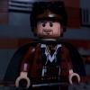
XimenaPaulina Posted April 25, 2013 Hi SteampunkDoc, Thanks for taking the interest to learn about comic dialogue. Here are my initial thoughts on your work: 1. First thing I observed are the uneven thickness of the speech balloon borders, that's one thing you need to fix. What editing program did you use BTW? I think you won't have such issues using Photoshop (following my lesson on this topic). 2. The chronology of the speech balloons is ok (top to bottom), but the positioning can still be improved since the top and bottom balloons are near the edge of the image. Is that the original image (taken by the camera)? Or did you crop it from a larger image? If it's the latter then I suggest you allow for more space both above and below the image so the top and bottom balloons are not touching the edges. But if that is already the final image then I guess the only fix you could do is to slightly decrease the size of the balloons. 3. The text size is quite ok at this size of the image, it's understandably small since you have to fit a lot of words on the balloon. Just make sure this image/panel wouldn't be reduced further in size since it would make the text hard to read. 4. Minor grammar issues in the top balloon: typo: experence = *experience / delete doubled word = have have Try to fix these issues and come back with a revised version of your one-panel comic. If you have further questions, don't hesitate to ask. ~ KDM Share this post Link to post Share on other sites
SteampunkDoc Posted April 25, 2013 1. GIMP, and I figured out the problem. It was not the program, it was the idiot trying to run it. 2. Done, and that's the original. Sadly I didn't account enough for the large speech bubbles when snapping the pic. 3. Alright, I'll keep that in mind. 4. And that's what I get for not proof-reading it a third time. Share this post Link to post Share on other sites
XimenaPaulina Posted April 25, 2013 Now that looks much better. I'm already quite satisfied with your work, but there's one last "trial assignment" I'd like you to do: - I noticed you used "regular caps" in the dialogue text. The convention used in comics text is all caps, but it is not a strict rule and you may use regular caps if that's the way you'd like to do it (artistic freedom). I'm curious to see how the conventional all caps text compare visually to this regular caps version you did. Try to make the dialogue text all caps and let's see how it will look like. - I assume since the image of Bilbo is opaque it means he is "invisible" by virtue of wearing the One Ring (I'm sorry if I'm not aware of the story of The Hobbit ) right? If that's the case, there's one additional effect you could experiment: how about decreasing the opacity of Bilbo's speech balloon to differentiate it from Smaug's? Probably make the color of the balloon border and text grey to match the "invisible" Bilbo? Again, this is just a curious trial exercise, so let's see how it will compare to this one you did. Also, I'm not familiar with GIMP, so I'm curious to how it will look like if done with Photoshop. Could you provide me with the original image without the speech balloons? (size 640 x 360 since the one in the first post is smaller). I'd like to try it myself and make a comparison between the GIMP and PS-edited versions. Share this post Link to post Share on other sites
SteampunkDoc Posted April 25, 2013 Here, the pictures are 1600 X 900, but they're private, so I'm not sure if you can see/download them or not. http://www.flickr.co.../in/photostream and http://www.flickr.co.../in/photostream (One with, and one without Bilbo.) And yes, he is using the One Ring. Here's the new one: Share this post Link to post Share on other sites
XimenaPaulina Posted April 26, 2013 Here's what I did using Photoshop: The borders using PS looks much smoother and more consistent throughout (body to tail) than using GIMP, but that's just me being meticulous. As it is, the one you did already looks good. I also used the standard font used in comics, Digital Strip. Note that I also emphasized the word Death by making it bold. It took some re-arranging of the text to fit in Smaug's long dialogue into the limited space of the two speech balloons. I would've wanted to make the font smaller to have better spacing inside the speech bubble, but the text might become hard to read so I stuck with 13px font size. These are just the things you could explore when adding dialogue to your comics. Ultimately, the elements you will use (font type, size, spacing, balloon types and borders, etc.) and how you will use them will depend on your own visual 'taste'. Hopefully, with this couple of simple trials you have grasped the basics of this subject in comic-making. You may now proceed with the next lesson of your liking. Share this post Link to post Share on other sites
SteampunkDoc Posted April 26, 2013 Thanks! And thanks for creating this great lesson, and taking the time to grade my work. But I have to ask, is there a reason Bilbo's speech bubble isn't going to his mouth? Share this post Link to post Share on other sites
XimenaPaulina Posted April 26, 2013 Thanks! And thanks for creating this great lesson, and taking the time to grade my work. But I have to ask, is there a reason Bilbo's speech bubble isn't going to his mouth? No problem, 'glad I could be of help. And good catch! I overlooked that detail. While it's not a universal rule that speech bubble tails should always point towards the speaker's mouth, I think your Bilbo speech balloon looks much better with the tail pointing towards his mouth than the one I did pointing to his body. Share this post Link to post Share on other sites