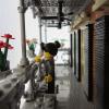
eliza Posted April 28, 2015 A little urban renewal to transition the Detective Office part of town with the more classy modulars... my latest modular is "Chop", a small Asian fusion bistro in an Art Deco storefront. Oddly enough, I've wanted to use fish as an architectural element for a long time. 1st floor interior: Decorative wall panels. 2nd and 3rd floor feature a nice but somewhat cramped 2 bedroom aparment. Next to a couple of my other mocs. Thanks for looking! (Sorry the photography isn't great.) Share this post Link to post Share on other sites
lightningtiger Posted April 28, 2015 I like it, the styling and the interiors too ! Brick On 'eliza' ! Share this post Link to post Share on other sites
gazumpty Posted April 28, 2015 Really nice work eliza.. I like your external details and the use of the fish in the facade Your interior work is nicely put together..nice idea with the arranged 'cheese slopes' behind the trans-window! genius! Share this post Link to post Share on other sites
Hobbythom Posted April 28, 2015 Awesome build! The exterior in that moody gray works really well! Those decorations inside steal the show though, how do you keep them in place? Share this post Link to post Share on other sites
PastVPresent Posted April 28, 2015 Very nice looking modular! I like all the unique detailing/parts use on the front facade (swords, fish, robot arms, 1x1 rounds, etc), restaurant wall panel decoration behind glass, and the small but very complete/realistic apartment - lots of details all work together very well! Share this post Link to post Share on other sites
ER0L Posted April 30, 2015 Great little building, very stylish as usual! I especially like the facade (though shouldn't the fish look at each other?), the lettering, and also those nice wall panels - guess I haven't seen something like this before. Great job! Share this post Link to post Share on other sites
cgarison Posted April 30, 2015 Lots of really nice detail. The interior looks like a couple Asian restaurants that we frequent in this area. Great Job! Share this post Link to post Share on other sites
LAKAbricks Posted April 30, 2015 I like all the details in the design, Eliza, not least the fish. And how you made the red/black decoration around the bistro's window. And nice contrast between the colourful facade of the bistro and the dark grey facade of the upper floors. Share this post Link to post Share on other sites
Kristel Posted May 1, 2015 This is great! The top half of the facade is my favourite on this building, especially the effect created with the metallic silver round plates and the continuous frame on the right hand side. I also like how the hexagonal window is carried through into the hexagonal wall decorations inside the restaurant. Share this post Link to post Share on other sites
bnuleoprt Posted May 1, 2015 (edited) the interior looks like a couple Asian restaurants that we frequent in this area. Edited May 1, 2015 by bnuleoprt Share this post Link to post Share on other sites
Withacee Posted May 1, 2015 Nice one! Great front, with some nice asymmetry built in. Fits in well with your other MOCs! Red, white and dark gray work very well together. Very creative. Nice interior too. The restaurant looks a bit darkish (it might just be the lighting of the picture; maybe a tan floor?), but it does work well in combination with the rest. Share this post Link to post Share on other sites
peedeejay Posted May 1, 2015 I like the realistic look on this one. Even though you used pretty much only one color for the upper floor facade, it looks very nice because of the clean execution. The interior is also very charming. :) Share this post Link to post Share on other sites
eliza Posted May 2, 2015 Thanks for the great comments everyone! Those decorations inside steal the show though, how do you keep them in place? You're not the first person to ask so I made a quick example. Simple trick really - Share this post Link to post Share on other sites
stevkir Posted May 3, 2015 Not particularly impressed with the color choice of the outside but once you put it with the other 2 you have it pops in a whole new way and I love it. I am a HUGE architecture buff and there are buildings out there that do need others around it to be appreciated and to see the contrast between the different buildings around it. Seeing the dark gray against the lime green is very nice and I love it. I think for what you did to the outside of this building, my favorite part is that you split the building visually down the middle with different textures instead of a beautiful cornice, which again adds a different contrast to the other 2 buildings you have it nestled in between. Great job!! Look forward to seeing more of your work. Share this post Link to post Share on other sites
peedeejay Posted May 3, 2015 Thanks for the great comments everyone! You're not the first person to ask so I made a quick example. Simple trick really - Hah! This is what I usually do with wall panels at a PAB wall to squeeze more parts (usually tiles) in. Never thought of using it within a MOC like this. Great idea. :) Share this post Link to post Share on other sites
Legocity2713 Posted May 5, 2015 Small yet detailed. Love it. It could totally double as a bar in any time period in history. Great work, keep it up. :thumbup: Share this post Link to post Share on other sites
wooootles Posted May 6, 2015 Wall decoration is unique, I like it when I see something rare and innovative even if we're all using the same bricks A fan of dark grey walls, it balances the other 'bright' buildings adjacent to it---well done! Share this post Link to post Share on other sites