slovakiasteph

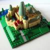
MOC: Modular hotel, corner building

Recommended Posts

indexed.gif B-OM-19E

lego_019.jpg

My largest MOC was inspired by a building in Lucenec, Slovakia: the Reduta, built in 1856. Here are a few pictures of the original building (I had to take pictures from a booklet I have, so they're not very clear):

lego_049.jpg

The front of the building... this picture shows the colors most accurately

lego_047.jpg

From the side... I didn't go with the original depth, though.

Just to give you a little background, I teach English in Slovakia for two weeks every summer, and we eat our dinner at the hotel restaurant each night. In the original building, the hotel is actually in a tower behind the building, and this one contains an ice cream parlor, bank, many smaller shops, restaurant, and convention/ball room.

The first floor, with the ice cream shop/snack shop, hotel reception, bank, hallway, and garden:

lego_040.jpg

Another shot of the ice cream shop. It has my favorite ice cream in town. :classic:

lego_012.jpg

Hotel reception... the police have come in to inquire about a few escapees. (Slovak police wear dark blue, but close enough).

lego_009.jpg

The bank, with couches for waiting (although they don't seem to be very busy now). The panel on the wall has the exchange rates, and the man is at the exchange desk.

lego_005.jpg

lego_013.jpg

I incorporated a garden in the corner that you can see from the hotel reception and bank, just to give the place a little more color.

lego_007.jpg

Up the stairs to the second floor. We have a restaurant and bar, kitchen, and a large private dining room on the far right.

lego_037.jpg

lego_036.jpg

lego_039.jpg

The final third floor, with three guest rooms.

lego_041.jpg

The most expensive end suite with a bed, chairs, TV, and cupboard.

lego_023.jpg

My favorite middle blue room:

lego_022.jpg

And the end economy room where we find a hide-out:

lego_044.jpg

Link to brickshelf folder in case you haven't been overwhelmed by pictures already: http://www.brickshelf.com/cgi-bin/gallery.cgi?f=504247. This also has pictures of each room, sometimes from various angles.

Thanks for looking and hope you enjoyed!

Share this post


Link to post
Share on other sites

A beautiful building with a great interior! :thumbup:

Though I think the top floor is a bit too high – removing one row of white bricks beneath the windows might look better and more like the original, I think.

Share this post


Link to post
Share on other sites

Though I think the top floor is a bit too high – removing one row of white bricks beneath the windows might look better and more like the original, I think.

Good idea, and I think you're right! Plus, I'll have extra bricks for other projects. :laugh:

I do plan to keep this around for a while, so if anyone else has suggestions, please contribute!

Share this post


Link to post
Share on other sites

Very neat building. It looks very similar to the original, which is always a nice plus. I agree about removing a layer of white. It would allow the upper windows to be in better scale with the rest of the color scheme, I think.

I like the concept of the variety inside. What is your favorite ice cream flavor?

The hide-out is very neat, adding in some play value.

Keep up the good work! Can't wait to see more.

Share this post


Link to post
Share on other sites

A wonderful creation 'slovakiasteph', I :wub: all the detailing on the inside, though one suggestion tile the counter top in the bank. :wink:

Still it's an excellent piece of MOC building, Brick On 'slovakiasteph' ! :sweet:

Share this post


Link to post
Share on other sites

Excellent modular! The different floor patterns are really neat :thumbup: The ice cream cooler works very nicely, as do the tables in the restaurant.

Keep up the good work :classic:

Share this post


Link to post
Share on other sites

Fantastic, accurate creation slovakiasteph! Red arches would better but I actually like it how it is. The interiors are richly decorated and varied, the tiles really bring a lively feel. The only thing I would like to see is glass in the windows.

Share this post


Link to post
Share on other sites

Very neat building. It looks very similar to the original, which is always a nice plus. I agree about removing a layer of white. It would allow the upper windows to be in better scale with the rest of the color scheme, I think.

I like the concept of the variety inside. What is your favorite ice cream flavor?

The hide-out is very neat, adding in some play value.

Keep up the good work! Can't wait to see more.

Will definitely take out a layer of white bricks.

My favorite ice cream (zmrzlina) is coconut, or pineapple. In Budapest I can get mulberry ice cream. :cry_happy:

Also, had to use all of those criminals that were gathering for something! :D

A wonderful creation 'slovakiasteph', I :wub: all the detailing on the inside, though one suggestion tile the counter top in the bank. :wink:

Still it's an excellent piece of MOC building, Brick On 'slovakiasteph' ! :sweet:

I had thought of that but then wasn't sure of a color... I already have light and dark tan, dark blue and dark red in the room. Dark bley, perhaps? Maybe I should see if I have enough tiles of any color, and that will decide. :laugh:

Nice building with a lot of details. I like it!

Thanks a lot!

Excellent modular! The different floor patterns are really neat :thumbup: The ice cream cooler works very nicely, as do the tables in the restaurant.

Keep up the good work :classic:

The ice cream cooler is basically from an old Paradisa set I got in the 90s.

Fantastic, accurate creation slovakiasteph! Red arches would better but I actually like it how it is. The interiors are richly decorated and varied, the tiles really bring a lively feel. The only thing I would like to see is glass in the windows.

I wanted to add glass because the windows look empty from the front, but 1) I don't have enough windows and 2) the arches make it more difficult. I could do GE-style windows if I ever collect enough.

Share this post


Link to post
Share on other sites

You just got to like the interior. The floortiles are realy nice. I myself have trouble with that part. very creative. When i saw te first picture, i thought i saw a convent, perhaps the original use of the building? The use of colours is great.

Share this post


Link to post
Share on other sites

You just got to like the interior. The floortiles are realy nice. I myself have trouble with that part. very creative. When i saw te first picture, i thought i saw a convent, perhaps the original use of the building? The use of colours is great.

I love playing around with floor tiles, but I think I'm running out of patterning ideas!

Share this post


Link to post
Share on other sites

Create an account or sign in to comment

You need to be a member in order to leave a comment

Create an account

Sign up for a new account in our community. It's easy!

Register a new account

Sign in

Already have an account? Sign in here.

Sign In Now

  • Recently Browsing   0 members

    No registered users viewing this page.