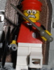
Infomaniac Posted March 26, 2009 (edited) Vig. 67d The Imperial War Room It is in this room where many a nation have fallen. Captain Colossal, Admiral Anxious and Baron Bureaucrat have assembled here, on Captain Colossal's ship, to discuss their next move in the war. The captain's charming wife is in the room ironing his favorite purple robe. The leaders are completely un-aware of the prisoner revolt going on below Furniture includes a war desk, a bookshelf, a bed, a fireplace, a globe, a wardrobe, a chandelier, a flag, an ironing board and a fish bowl This scene is based on one that takes place in Pirates of the Caribbean For more pictures see here Comments Appreciated Thank Ye Edited November 16, 2009 by SlyOwl Share this post Link to post Share on other sites
Patriot720 Posted March 26, 2009 That looks great! But I would suggest adding some tiles on top of those brown and white studs on the walls. Share this post Link to post Share on other sites
Infomaniac Posted March 26, 2009 could a moderator please put 'Entry' at the end of my topic description can't believe I for got that Share this post Link to post Share on other sites
General Armendariz Posted March 26, 2009 Wow, this is the winner! Great entry. What I like 1. The picture of the map 2. The wardrobe 3. The fireplace and many, many more! What could be improved 1. The odd wall climbing rat that looks weird 2. Im pretty sure on a ship theres no gray/metal walls change it to brown or white 3. Add more movement in the guards below overall its great! Share this post Link to post Share on other sites
Erdbeereis Posted March 26, 2009 Very nice entry Infomaniac! You've packed in lots of nice detail, for example that lovely globe, the shelf with books, and the fireplace. Good job with the SNOT deck, it looks very smooth and the colors are very appropriate. My favorite part though is the uptight officers planning their battle. Great torso and head choices, especially using Henry Jones Sr.'s outfit. Improvement ideas: 1) Just a minor thing, but that rat on the side is just a bit odd. But I think he would look great somewhere on the lower level. 2) With the current pictures you have, there aren't any that really show the lower level. I would include one that shows that important part of your entry. 3) The top part just seems a bit unfinished to me with the inverted slopes showing and such. I would maybe build the walls up one more brick, which would probably make it look a bit neater. Then you could even tile it if you want. 4) I can't help but feel that the brown whips and triangle clip on top of the fireplace look a bit out of place. I think just leaving the black parts of the fire would be better. ============================================== That's all for the upper section. I can give you some more feedback on the lower part when we see a clear picture of it. Excellent work on this, and best of luck to you! Share this post Link to post Share on other sites
General Armendariz Posted March 26, 2009 4) I can't help but feel that the brown whips and triangle clip on top of the fireplace look a bit out of place. I think just leaving the black parts of the fire would be better. I think its a deer or goat head if you squint at it, it looks like one. Share this post Link to post Share on other sites
Erdbeereis Posted March 26, 2009 I thought it resembled a head of some sort, but I still feel plain would fit in better. Share this post Link to post Share on other sites
Guss Posted March 26, 2009 great entry Infomaniac! I love your "round map " ( don't know the english word for it) , and the stick they use to make their "strategy", that's cool, plus all the furnitures are really cool ! I wanted to see more detailed pictures of the low part of the moc, but your BS gallery is not public yet :/ Share this post Link to post Share on other sites
Zorro Posted March 26, 2009 This looks like a really good entry, Infomaniac. Unfortunatly I can't give creative critic anymore, I leave that to the others! Share this post Link to post Share on other sites
Infomaniac Posted March 26, 2009 Just updated the pics Thank you for all the comments Share this post Link to post Share on other sites
Dwarfinator Posted March 26, 2009 Nice names for the Captains. The battle down below looks... heated. Improvements: The rat on the side of the platform. Pretty good. Captain McSkivvies Share this post Link to post Share on other sites
Ratshot Posted March 26, 2009 Wow, the amount of details is AMAZING. THINGS I LIKE 1.The globe is very impressive. I wish TLC would make one 2.The map on the wall is fantastic and the frame looks wickedly awesome 3.The table with the Generals sitting around it looks awesome. POSSIBLE IMPROVEMENTS 1.Maybe you could tile the side of the MOC, it doesn't look good with the studs hanging out. 2.The soldiers don't tend to be to busy, persay. Maybe one or two could charge the pirates or help the hurt guy. And could someone point out that stupid rat that everyone is talking about, I cant see him. P.S don't make fun of me cause I am blind Good job and good luck Share this post Link to post Share on other sites
Erdbeereis Posted March 26, 2009 He got rid of it Broadside. That looks much better Infomaniac. It seems much more "finished" now. The chandelier looks excellent, and the added tiles on top clean that part up nicely. Improvement Ideas: 1) I think tiling the sides of the SNOT areas would suit the rest of the smoothness well. 2) A little budle of wood next to the fire would be a nice detail ==================================== Excellent work improving your entry. Good luck! Share this post Link to post Share on other sites
SlyOwl Posted March 26, 2009 Very nice entry! You've got a lot of good things going here. Regarding the globe, would it be possible to have remove the outer socket thing, and hold the two hemispheres together somehow (a tyre over the two sticky up things?), to make it a bit more globe-like? You could then use one hole to attach it to the table, and put a continent (Arctic) over the top one. Aw nuts, I missed the stupid rat too Share this post Link to post Share on other sites
Infomaniac Posted March 26, 2009 (edited) Aw nuts, I missed the stupid rat too I'm glad you did it was funny but creepy updated it again info out Edited March 26, 2009 by Infomaniac Share this post Link to post Share on other sites
Fluyt Posted March 27, 2009 Unfortunatly I can't give creative critic anymore, I leave that to the others! Oh, creative!... in that case: *stands on head while giving comments* Anyways, this is a fine looking moc you got there infomaniac! Possible improvement points: 1. The sword over the fireplace doesn't look right somehow, maybe some "classic crossed swords over the fireplace" would be a good touch. 2. The "rigging" mechanism for the chandelier, it is creative, but it does look a bit weird with the rest of the moc in my opinion. Allthough I wouldn't really know a better solution for it, so maybe this is the best option. 3. Maybe the back of the fireplace could be black, it is very unlikely that is is still white after all those fires lit in it. Good points: 1. The clothes and wig/hat are a very nice touch, as well as the wood in front of the fireplace, model boats, "pointing stick thingies" for battleplanning, the globe, ironingboard, and the list goes on and on, great detail. 2. Very pleasing colour combination. 3. The extra scene in the basement/dungeon is a good addition to an allready great moc. Share this post Link to post Share on other sites
Sir Wellington Posted April 7, 2009 How did you make the globe? It looks great! Share this post Link to post Share on other sites
Infomaniac Posted April 7, 2009 I used 2 of these and one of these in brown I printed out stickers of a dark world map then I cut the individual continents out and stuck them on There you have it the globe infomaniac way p.s. I tried putting a tire in between the two hemispheres and taping it, but it ripped my stickers Share this post Link to post Share on other sites
Sir Wellington Posted April 7, 2009 Thanks! Great moc! Share this post Link to post Share on other sites