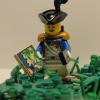
Frank Brick Wright Posted January 2, 2013 [pid][/pid] You can check the small prologue, called Sabre Island, here. I know my entry is a bit different both in stile and in theme from the others excellent ones we have seen in this forum. Nevertheless, I hope it will be appreciated by the community. This round theme was: Islanders. In order to justify my entry, I would like to add that an islander is, by definition, a native or inhabitant of an island. This is because I had this idea that using "traditional" islanders in an entry about islanders was a bit too mainstream Criticism/comments are very welcome as always. Go bluecoats! Share this post Link to post Share on other sites
Grimmbeard Posted January 2, 2013 Great comic! Hipster bluecoats FTW! Share this post Link to post Share on other sites
moschino Posted January 2, 2013 I know my entry is a bit different both in stile and in theme from the others excellent ones we have seen in this forum. Nevertheless, I hope it will be appreciated by the community. This round theme was: Islanders. In order to justify my entry, I would like to add that an islander is, by definition, a native or inhabitant of an island. This is because I had this idea that using "traditional" islanders in an entry about islanders was a bit too mainstream This aspect has been discussed before and I think the rules were that we must use some elements from official Islanders theme made in 1994. I saw another entry from Redcoats where were used some natives from POTC. If the rules are so easy to avoid, we should all know as we may find easier to not open Islanders boxes as long as we don't must do it. If your entry is accepted, this is good to know for the next entries. Your entry is good (even without Islanders), and I laughed to see how primitive Redcoats are. Share this post Link to post Share on other sites
Cara Posted January 3, 2013 This aspect has been discussed before and I think the rules were that we must use some elements from official Islanders theme made in 1994. If thats the case then show the redcoats now dressed as ragged isalnders in the first picture. Very amusing =) Share this post Link to post Share on other sites
Brickington Posted January 3, 2013 Good Comic (if it is accepted ). Share this post Link to post Share on other sites
MstrOfPppts Posted January 3, 2013 I'm not too fond of the first picture. It is different then most comics, though looks a bit unfinished. You could have used plain grayscale and darken it a bit. It's not too clear wether you wanted to make a nightshot or just a different first picture. The effects look a bit too pixelated. (Just my first thoughts). The comic is smooth and also a bit chaotic, but not hard to follow. Maybe black background would make it look a bit more organized. Else I'd resize and rearrange the gray boxes with supporting text, to not look just like they're thrown in. Clearly a different approach, maybe I'm just a bit too classical. The story is great and well written, photography is nice and clear only the smart bluecoat is clearly made up Share this post Link to post Share on other sites
Admiral Croissant Posted January 3, 2013 I had to think about this entry for quite some time, and I guess your entry should be accepted. Of course we meant islanders from the classic islanders theme, but the rules didn't state this very clearly. I hope members won't fill every gap in the rules this way (I thought it would be funny to see classic islanders and pirates in the entries, and I hope we will), but in this case your entry will be allowed. Anyway, it's a very nice entry. I like the parts were the "flagship" is being shown and where the hat blows away Share this post Link to post Share on other sites
moschino Posted January 3, 2013 I hope members won't fill every gap in the rules this way (I thought it would be funny to see classic islanders and pirates in the entries, and I hope we will), but in this case your entry will be allowed. Well, I'm glad this is accepted because in fact the point is to have as many entries as possible, but on the other side, this is pretty unfair for some other participants where they bothered to print Islander torsos and not only. If you remember this entry, effulner had to do changes in order to be accepted and it wasn't easy for him. Share this post Link to post Share on other sites
Admiral Croissant Posted January 3, 2013 It wasn't easy? He changed it rather quickly: I finished updating the pictures. Whadaya know? It didn't take me so long after all. In his case, I wouldn't even have made a big point of it if he had only added the name islanders in his comic, but I preferred an islander minifigure (which would also increase the quality of his comic) and he could change it quite easily.The main purpose of this tournament is to have fun, and I hope we won't get too much talking about rules. I hope to see many islanders as I think this will be funny and it could add a nice new element to the Tournament. But if it's really hard for you to make an islander minifigure, then a solution like this is also possible. Share this post Link to post Share on other sites
Purpearljellyblob Posted January 3, 2013 Nice comic! Loved your story. Great work! Share this post Link to post Share on other sites
Frank Brick Wright Posted January 3, 2013 (edited) It wasn't easy? He changed it rather quickly: In his case, I wouldn't even have made a big point of it if he had only added the name islanders in his comic, but I preferred an islander minifigure (which would also increase the quality of his comic) and he could change it quite easily. The main purpose of this tournament is to have fun, and I hope we won't get too much talking about rules. I hope to see many islanders as I think this will be funny and it could add a nice new element to the Tournament. But if it's really hard for you to make an islander minifigure, then a solution like this is also possible. My apologies to the staff for creating such problems. My intention was not to take advantage of gaps in the rules. The truth here is that I do not have any islander nor any minifig which could be adapted, moreover my Lego budget at the moment is 0. Then I had this idea that since redcoats are so primitive/dumb they could easily be taken as islanders/turn into islanders. Since it fitted in the rules I saw no problem, but it clearly generated a lot of discussion. Well, I'm glad this is accepted because in fact the point is to have as many entries as possible, but on the other side, this is pretty unfair for some other participants where they bothered to print Islander torsos and not only. If you remember this entry, effulner had to do changes in order to be accepted and it wasn't easy for him. Unfair? I don't think so -- even if I am not imparcial in this case. I must say I hadn't quite understood what efulner's entry had to do with islanders when I finished reading it, whilst my entry has a clear point: redcoats turn into islanders. You can say that there aren't any islander figs and that is true; but the main theme of the sotry is nevertheless their turning into islanders. I'm not too fond of the first picture. It is different then most comics, though looks a bit unfinished. You could have used plain grayscale and darken it a bit. It's not too clear wether you wanted to make a nightshot or just a different first picture. The effects look a bit too pixelated. (Just my first thoughts). The comic is smooth and also a bit chaotic, but not hard to follow. Maybe black background would make it look a bit more organized. Else I'd resize and rearrange the gray boxes with supporting text, to not look just like they're thrown in. Clearly a different approach, maybe I'm just a bit too classical. The story is great and well written, photography is nice and clear only the smart bluecoat is clearly made up I have to agree with your first critic, the first photo was a night-shoot and moreover its on black-and-white, thus the created effect is odd. Your other remarks, however, seem all off to me. Chaotic? Lack of organization? Boxes thrown in? But that was more or less my idea when I made it! I'm glad I succeeded. I don't know whether or not you are a great fan of bd -- I am. This is not a classic comic. On of my great inspirations was The Sandman by Neil Gaiman (a true masterpiece). My idea here, for the story, was a bunch of redcoats which ask red-hat/bandana for a story, their story. While he tells his story, images pop in, like memories, whilst the narrator voice keeps sounding in the back. Thus the "thrown in" boxes! The panels are misaligned for some reason, also, it is part of the aesthetic principles I was following, indeed not classic ones Again, this tournament is all for fun, so let's have it! Let's not ruin it for details or exhaustive discussion of the rules. Edited January 3, 2013 by Frank Brick Wright Share this post Link to post Share on other sites
Antonio Posted January 3, 2013 Nice entry!The begining is a bit of confusing,but its alright when you continue to read the comic,you understand it.And why redcoat "turn" into islanders?I think they are islanders since their begining .A true bluecoat will sacrifice himself ,even if that means to turn red, for the his nation (bluecoats) Share this post Link to post Share on other sites
moschino Posted January 3, 2013 (edited) My apologies to the staff for creating such problems. My intention was not to take advantage of gaps in the rules. As I mentioned, I like you entry and I have no right be against it as long as I'm not a part of the staff, but I just thought (and still think) that comments are allowed no matter what they say as long as they are not offensive language. I have nothing against you, or against any participant and I read all comics with much enthusiasm no matter the color "red" or "blue". The thing that caught my attention was that after I have read the "rules" thread all over the time and I saw lots of discussions regarding them, lately I noticed much more tolerance when the first round is getting closed. If we read the "rules" thread, many participants asked for allowed minifigs for passing as islanders and some of them were rejected. Yeah you can use the two on the left. The other two are too recognizable as being non-islanders. However some kind of islander attribute could add to the islander look if you have any. Let's just consider that it was my fault for not seeing that here are some minifigs very recognizable as being islanders. My apologies. Edited January 3, 2013 by moschino Share this post Link to post Share on other sites
Sir E Fullner Posted January 3, 2013 Somehow I am thinking of Franz Kafka while looking at this. Maybe this will explain it: http://en.wikipedia.org/wiki/Metamorphosis_(novel) I always knew that bluecoats should keep to blue and redcoats to the greatest color of all. You look a bit like an old lobster wrapped in map paper. Plus, you're not fooling anyone with your Redcoat accent. I mean, I could do a perfect bluecoat accent without slicing a vocal chord. However, you cannot even keep your thoughts in your mind. Hmm... Share this post Link to post Share on other sites
MstrOfPppts Posted January 3, 2013 Your other remarks, however, seem all off to me. Chaotic? Lack of organization? Boxes thrown in? But that was more or less my idea when I made it! I'm glad I succeeded. I don't know whether or not you are a great fan of bd -- I am. This is not a classic comic. On of my great inspirations was The Sandman by Neil Gaiman (a true masterpiece). My idea here, for the story, was a bunch of redcoats which ask red-hat/bandana for a story, their story. While he tells his story, images pop in, like memories, whilst the narrator voice keeps sounding in the back. Thus the "thrown in" boxes! The panels are misaligned for some reason, also, it is part of the aesthetic principles I was following, indeed not classic ones Ok, I see that even feeling quite young I'm getting old very fast. As said I'm too classical since I only read our Slovenian classic comics, which were all squares and nice ordering unless something extremely chaotic happened ... I haven't read any American superheroes comics let alone any modern comics from anywhere. It's just what I understand as a comic and first thing that comes to my mind ... Anyway I didn't want to say yours was bad, just different. Now that you've explained it a bit I understand that gray boxed text is actually what Red Hat is saying and that's why it's different from the first square which is the real supporting text. At first it looked unfinished since textboxes were different but makes more sense now. Still I think maybe a gray background (or a tiny border around everything) would help the overall layout a bit since the default forum background is white, and it's hard to tell where the comic ends. I like to imagine it how it would look printed on a paper. Maybe I'll try improvising with my comics a bit too Share this post Link to post Share on other sites
Sebeus I Posted January 3, 2013 Again the bluecoats show their skills with another brilliant plan . It's a different style than other entries but I enjoyed it a lot, quite some text I must say though, nicely done Share this post Link to post Share on other sites